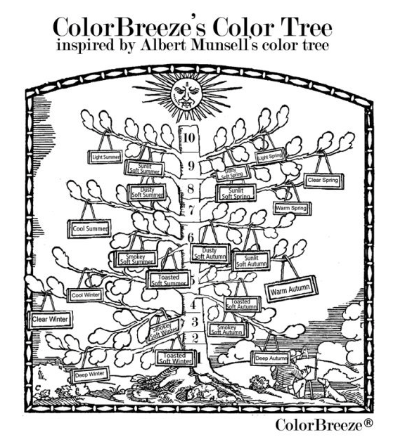
Ever since I have studied color I have hoped to crack the color code. Is is naive to believe one system is correct? Yes. But one could be “more’ correct for a particular individual. As well, that I’m not convinced that everything has been accounted for. For example, environmental factors (e.g. lighting, window tints, view on “full spectrum” or “natural” lighting) and within the developed system itself. Some systems only have 12 seasons where some have many many more seasons and more options for softer seasons.
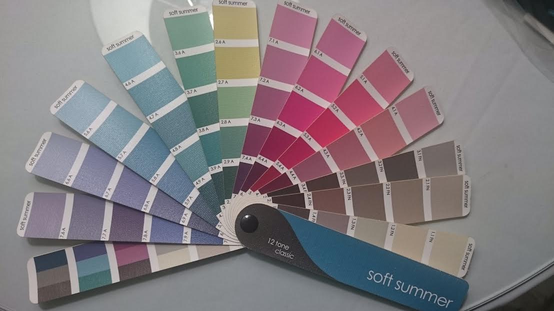
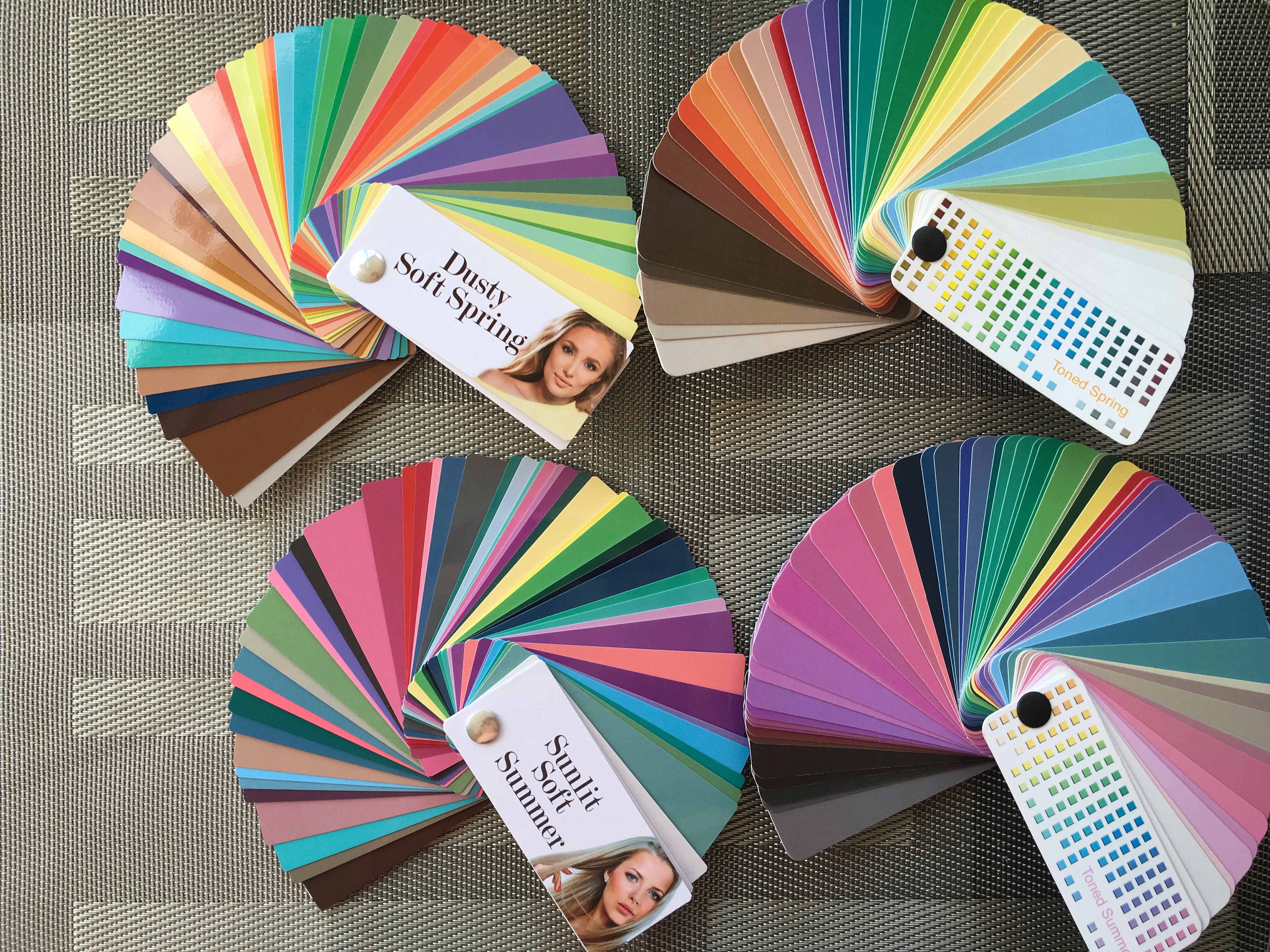
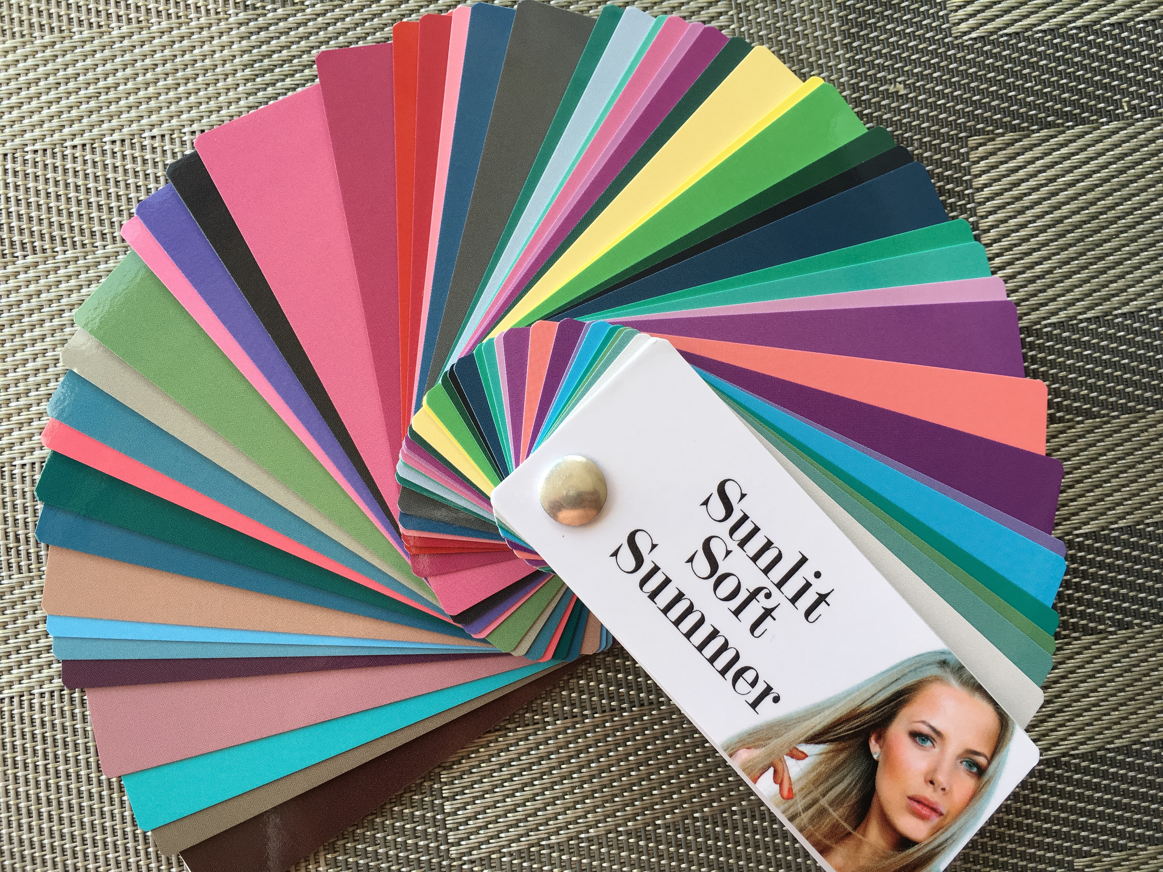
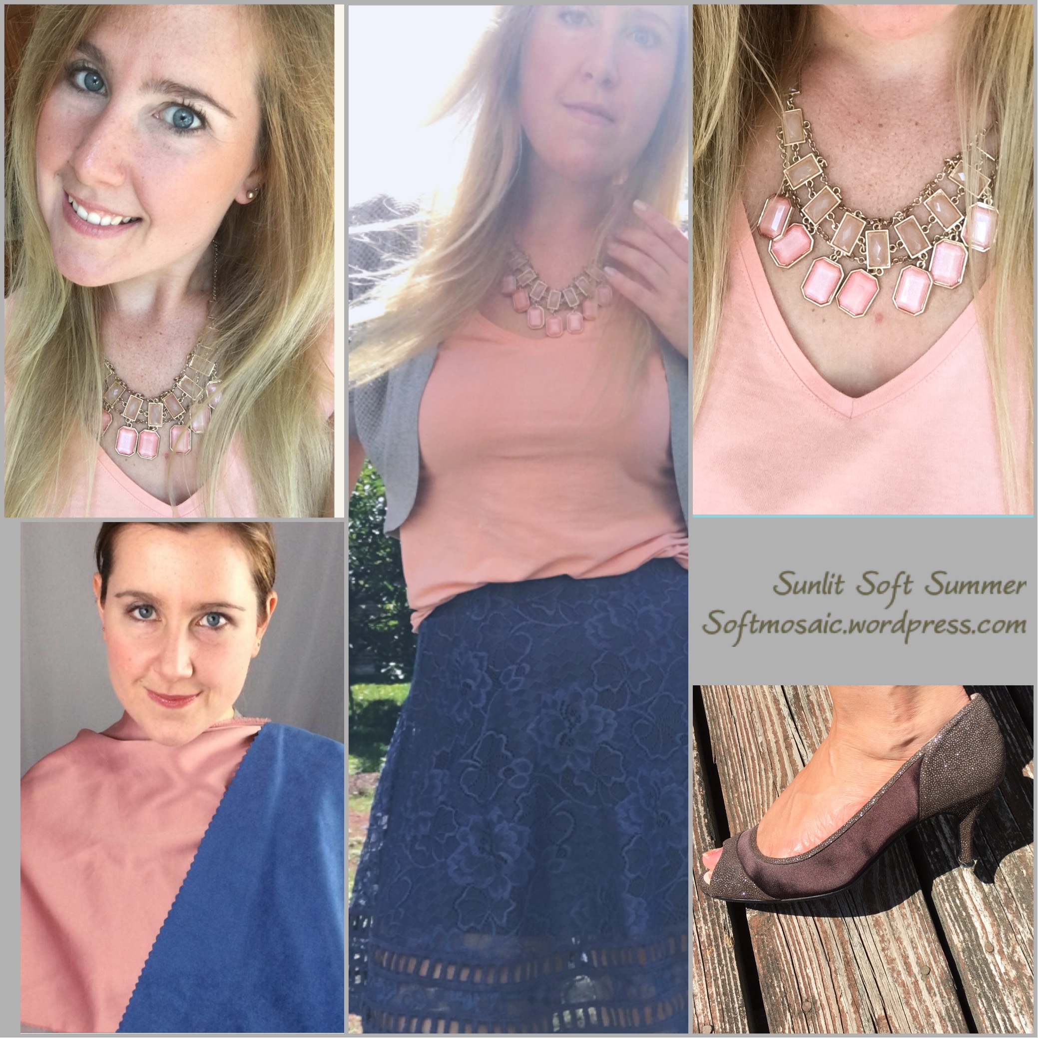
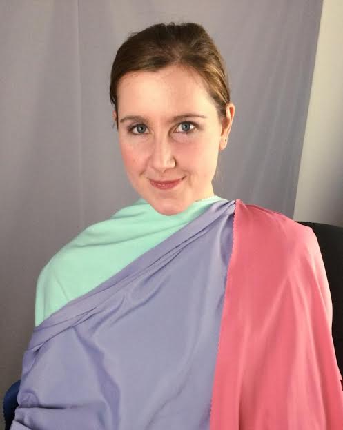
This is the Soft Summer fan in entirety. This fan has a mix of softer and slightly more saturated swatches. Overall the clothes I pick out tend to be too muted. The overall fan seems to buy me these results. Let’s look at another Soft Summer fan in another system called “Color Breeze” by Lora Alexander.

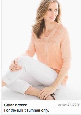
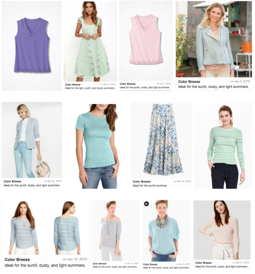
The Color Breeze Toned Summer fan, which is also known for Soft Summer Light. It’s more saturated then the fan posted above. I like this fan a lot more. Also, it does not feel as “chilly” or more cooler toned colors to my eye and has some warmer options.


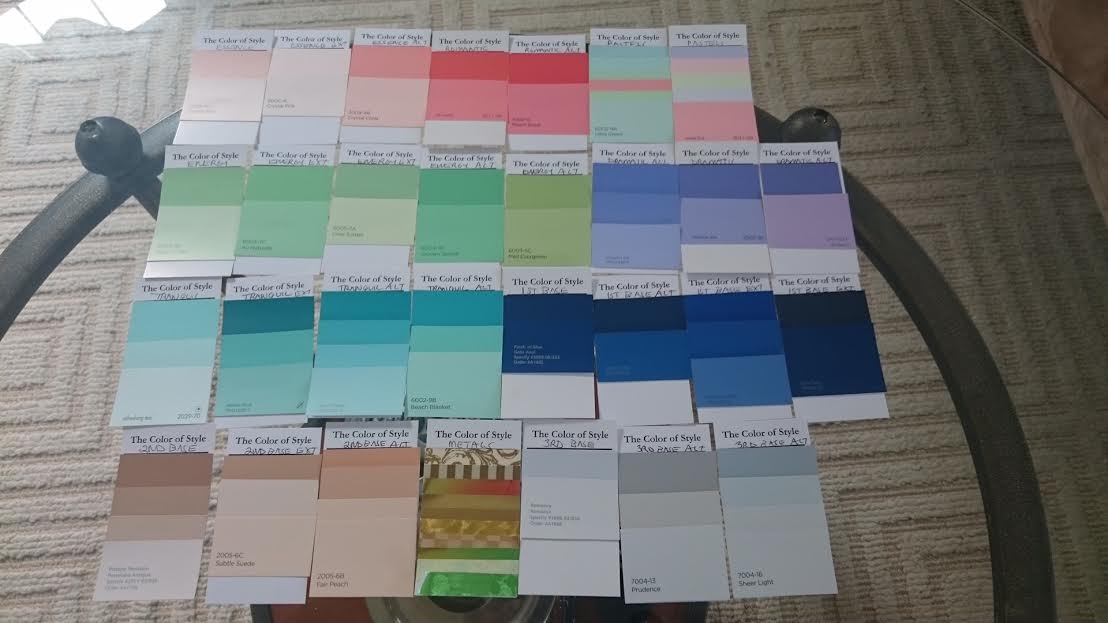
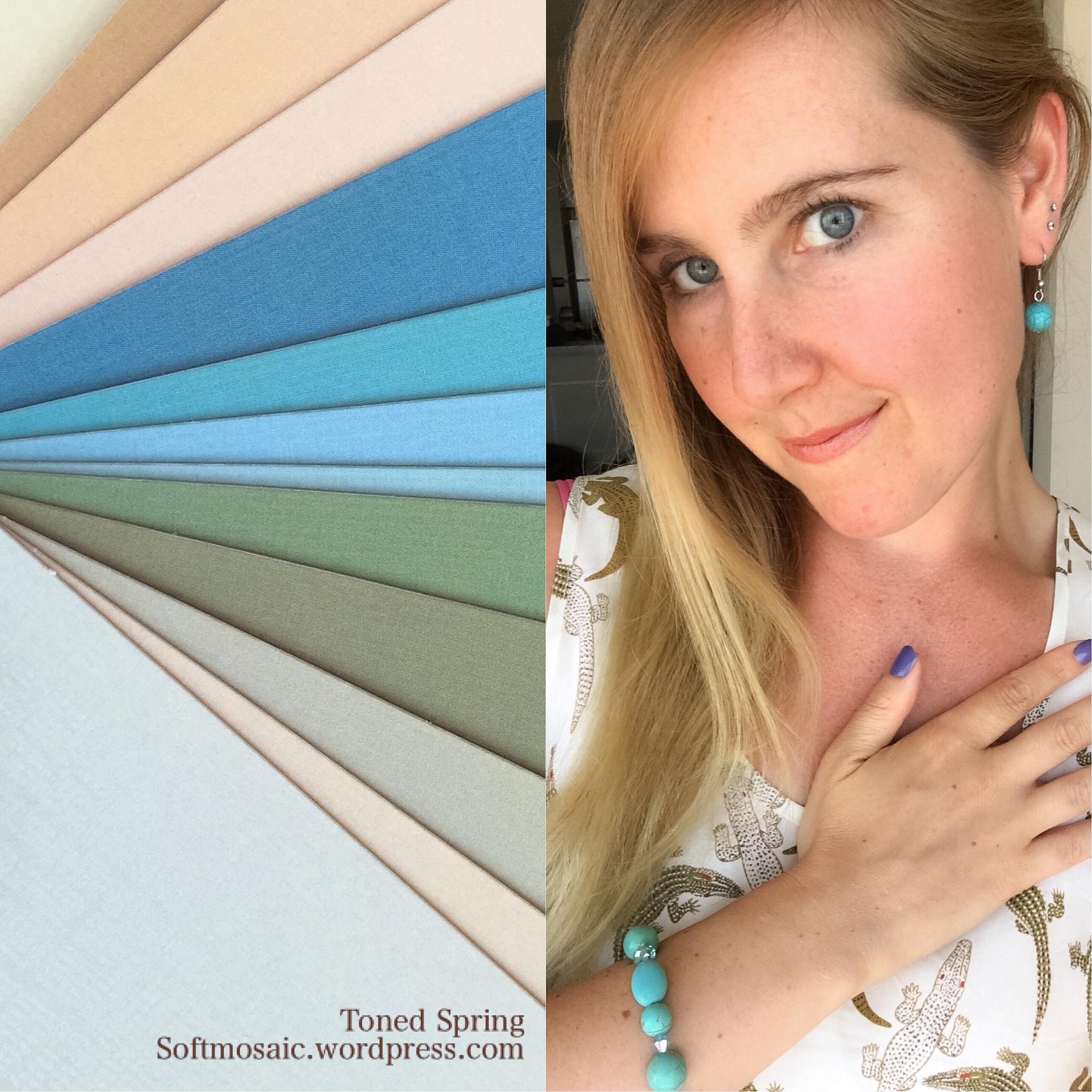
My best colors are soft or muted. I am neutral, neither all warm or all cool in coloring. Toned Spring is neutral warm with an “autumn” muted roasting of Light Spring. Toned Summer is the neutral cool lighter side of the Soft Summer palette. These are combination palettes which means they could be used together or may share some similar colors but have distinct differences.
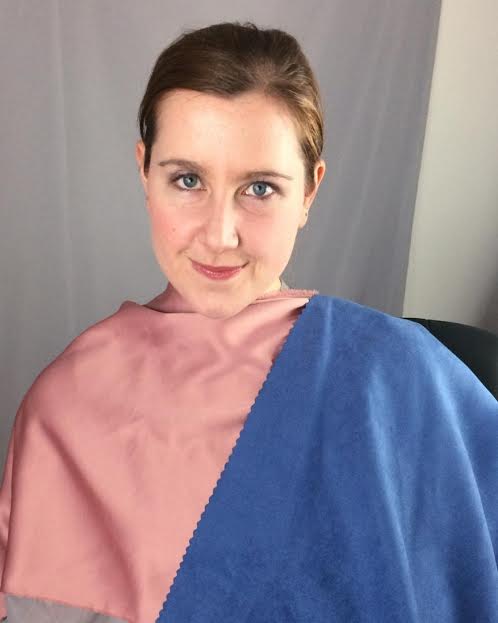
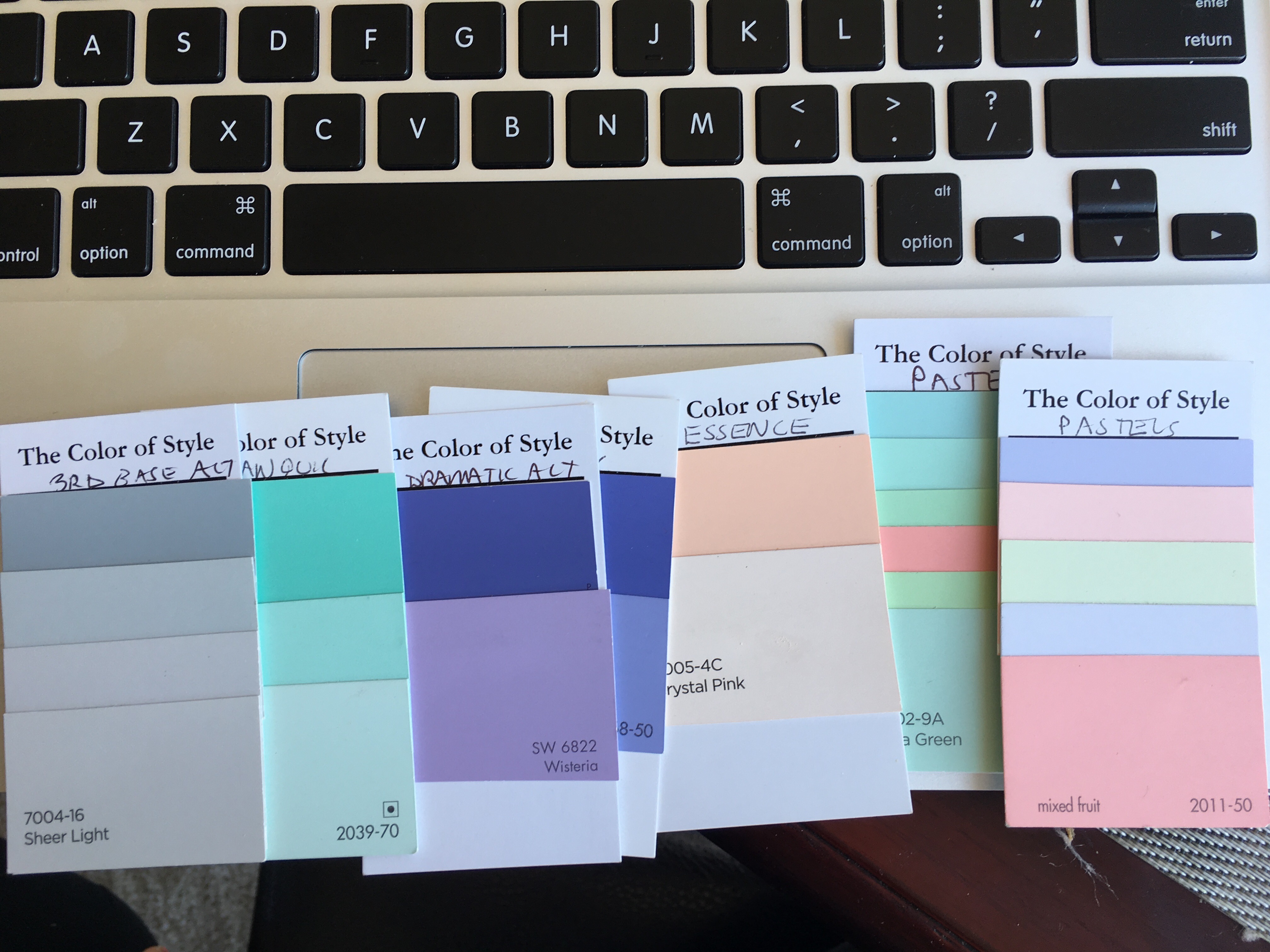
My custom Zyla palette…

If you took and broke down my Zyla palette, you would get a split between Toned Summer and Toned Spring.

Some of these toned spring colors look pretty good with the 12 tone (12 blueprints system) Soft Summer fan. But you can see the Zyla palette is slightly more saturated and if I were to use them to purchase clothing I guarantee they would buy different results in clothing colors and even outfit combinations.
I see the Toned Spring colors in my skin. 12 blueprints system would say these are “overtones” and incorrect bad color reactions on skin that is cooler then the palette creating “yellowed skin”. Other systems would believe this “IS” the colors of your skin.

My Kathy palette is a system like this, that intact looks at the colors of your skin, eyes, and hair and gives you colors based on what is seen visibly.

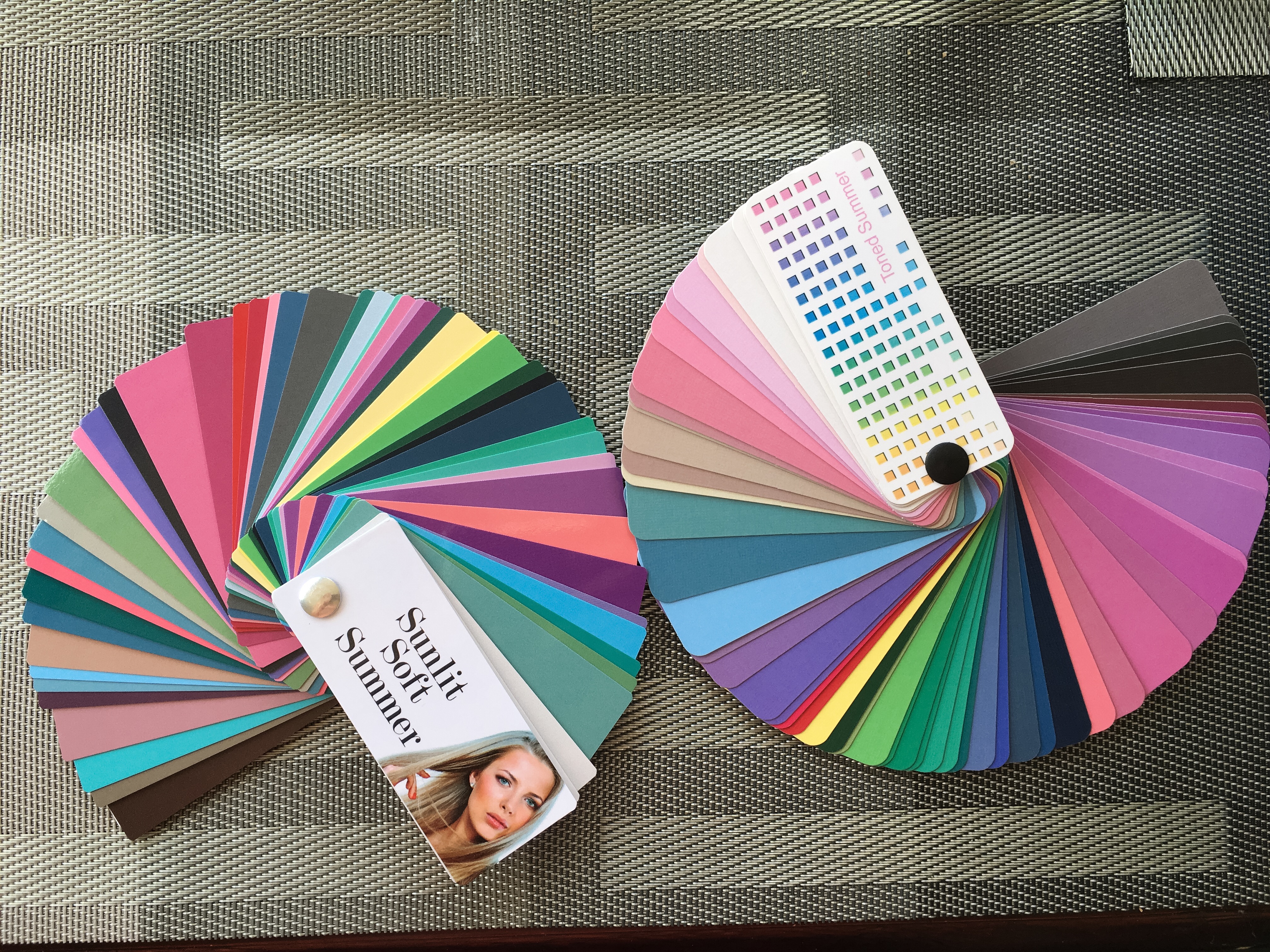
Here are my more preferred colors on the Toned Summer fan.
Here is the whole fan. I like the depth, one that Toned Spring seems not to have for me.
I much prefer warmer pinks of Toned Spring to cool mauve of Toned Summer and the warmer grey or browns of Toned Spring to the cooler grays of Toned Summer.

I feel divine in that orange pink that much more Toned Spring then Toned Summer. Bit it is so close on the line between the two seasons. Toned Summer does not go soft orange. I find seashells all the time that have this silvery orange color that is amazing, probably my favorite color since I was a child. Where would that color fall on a season? It’s soft but more neutral.


These two seashells are orange. At the beach recently, I realized that orange I love in seashells are a soft orange. And what palette does that exist in? Not muted enough to be Soft Autumn right? It’s like that Marigold color, clearer then autumn and gentle like Toned Spring.

The one shell on the right has a shine to it, but it’s not too shiny. If it were jewelry it would be the perfect amount of shine I could handle as a Soft Season person.
The shells harmonize very nicely with the Toned Spring fan. Looks clownish on the Toned Summer fan (neutral cool) which does not have orange or milk chocolates.
See how the seashells are too muted for the light spring fan and too bright for the soft autumn? These are 12 tone (12 blueprint system fans) That is why they fall into Toned Spring (Light Spring Soft) which is a different system.
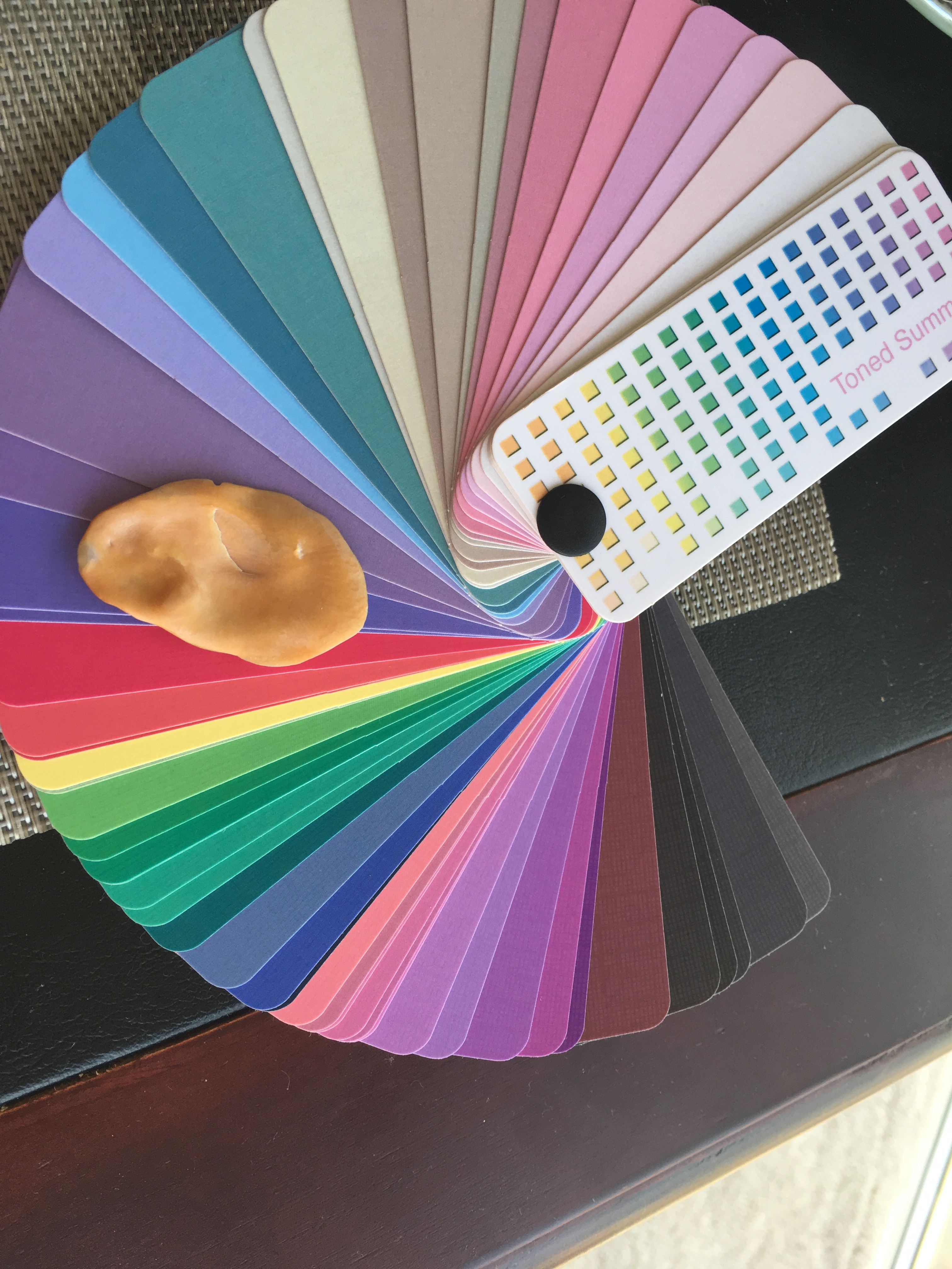

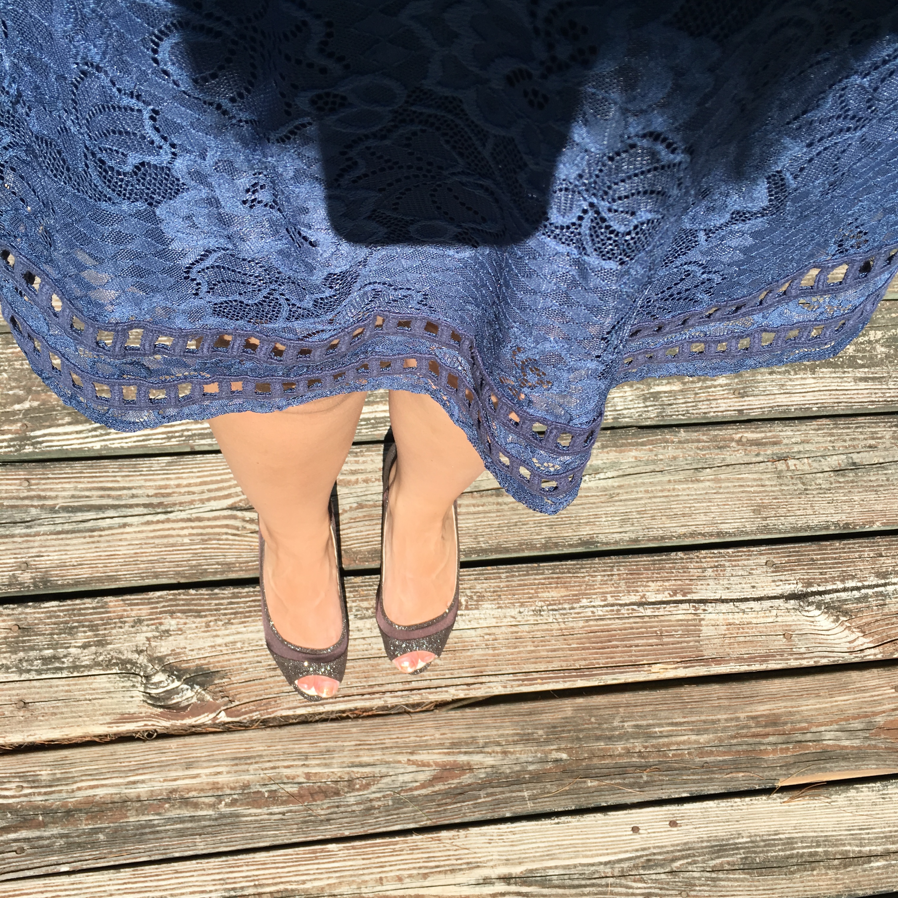
The soft orange sinks into the Toned Spring fan (R.), and sits on the Toned Summer fan (L.)
The other side of the soft orange seashell has orange and a cooler gray. This seashell is a perfect example of the existence of a mix of Toned Spring and Toned Summer. But when harmonized with the whole fan which color palette fits in the best?

My Zyla palette has this mixture of Toned Spring and Toned Summer…If this is a real life example then why does this or can’t this exist in people?
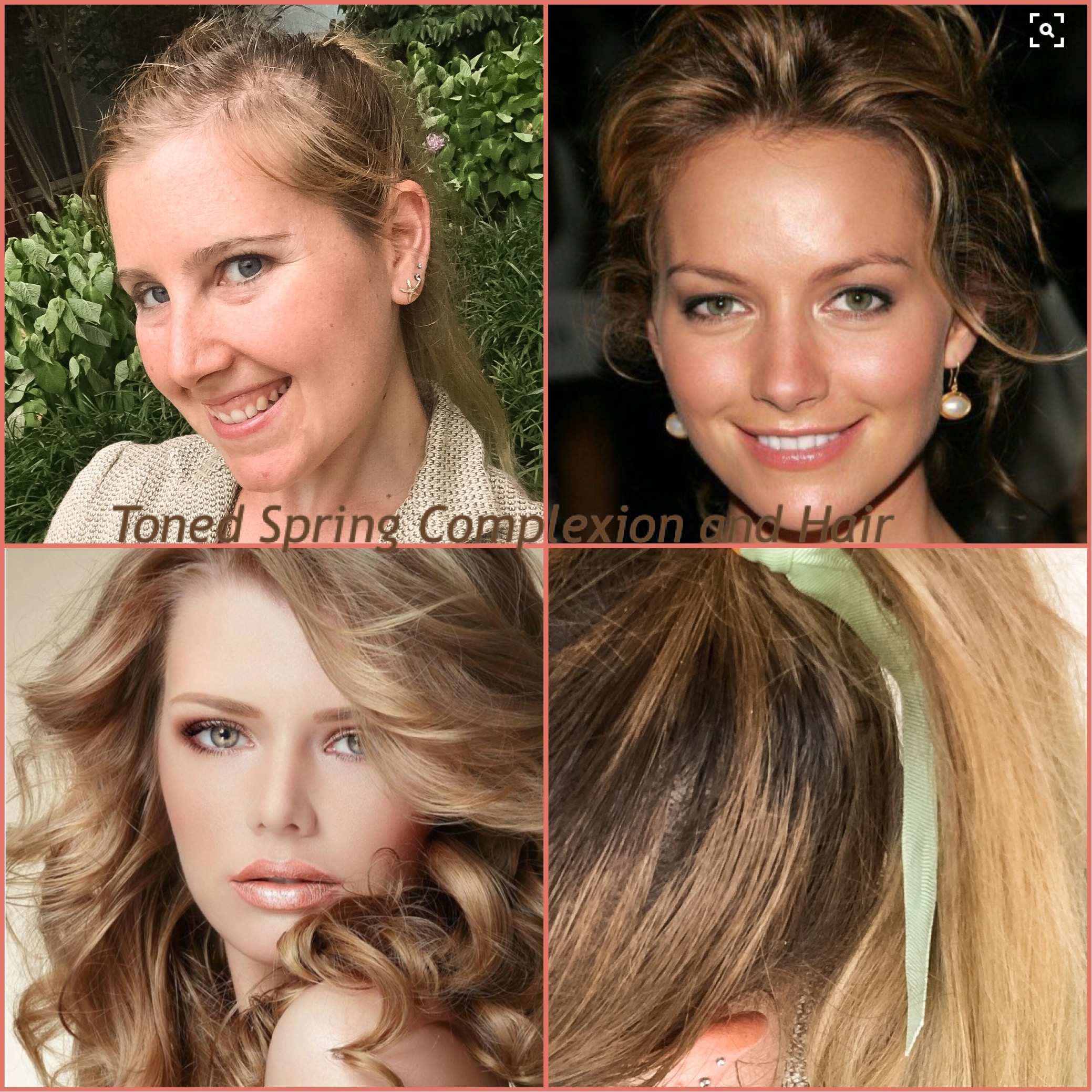
Here is a collage I made comparing myself to the 16 seasons, Toned Spring. My hair is very similar to these people and so is my coloring. I think the main difference is that their eyes are warmer looking as in more visible soft gold/yellow.


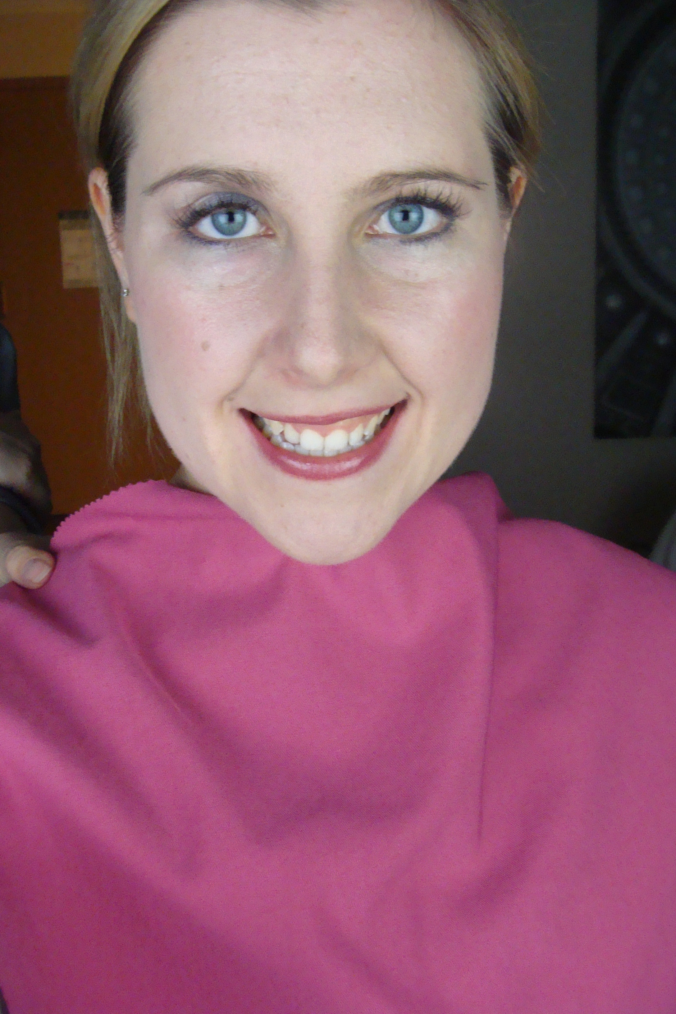
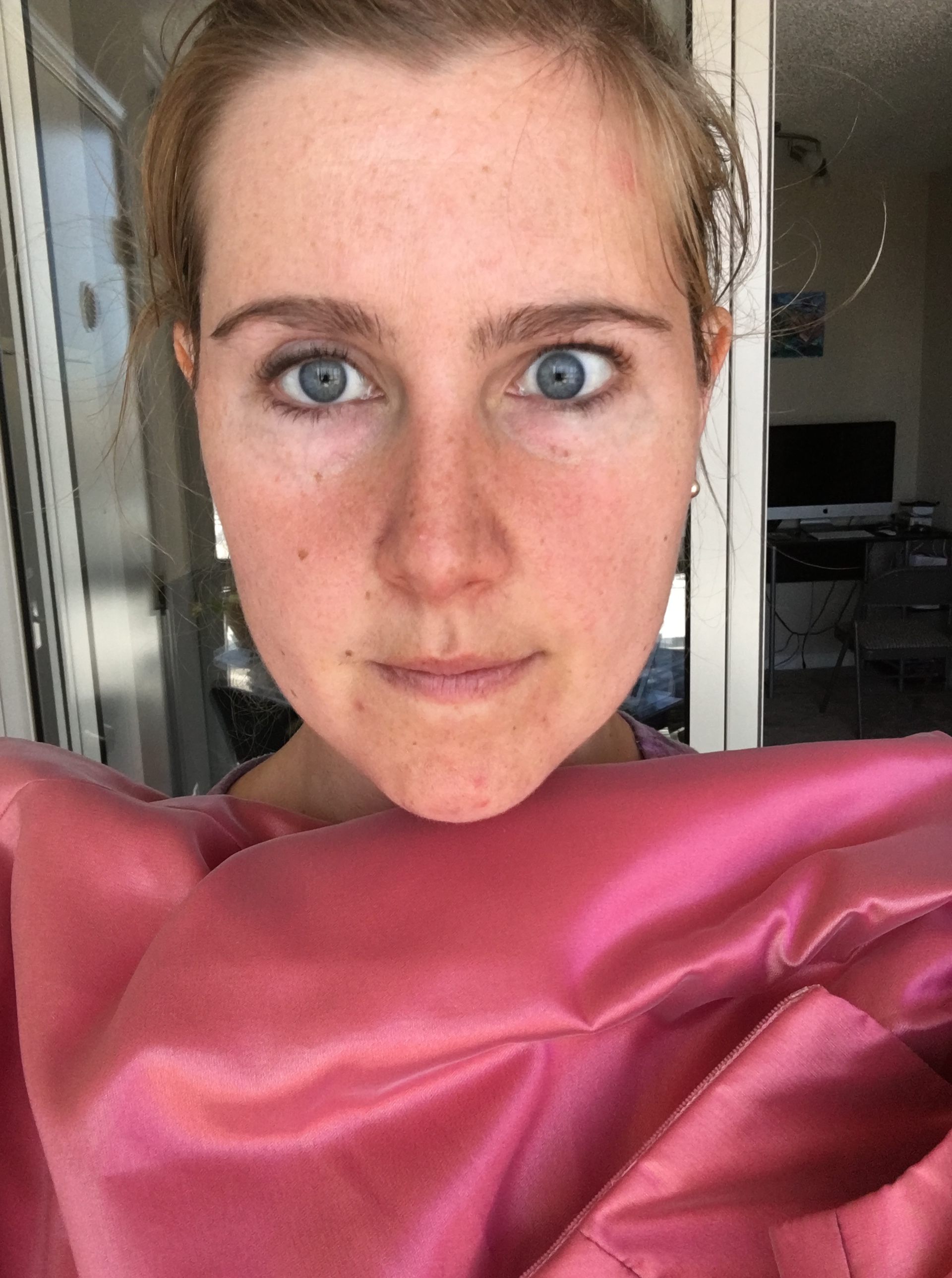
My eye is a neutral blue or you could say blue/gray/green coloring with a star pattern and wavy lines that start at the pupil outward.

With refraction my eyes have a warmer look almost seafoam and moss…

The water above and a close up shot of my eyes below.


Toned Summer fan comparison to my eye color. It has the right depth.

Toned Spring eye colors. It has the right warmth.
Here is the common theme again, Soft Summer or Toned Summer has correct depth but Toned Spring has some colors with correct warmth.

I might have all of these colors in my eyes. Most color systems would say that okay, that’s fine, you can be neutral cool but have warmer eyes or even neutral warm and have cooler eyes or a mix of both. 12 blueprints focuses on the skin. The thing is my skin is much finicky like my eyes where it’s split I believe between palettes. The question is which one is stronger, if you had to pick one? Or why pick one, that’s what the custom palette is for…
So let’s honor 12 Blueprints system and look at skin reaction with drapes. No makeup, just skin reactions to the colored draped clothing.


Toned Spring Vs. Toned Summer Greens. L. Toned Spring and R. Toned Summer. The bottom green is almost split between Toned Spring and Toned Summer, tricky!

It looks like it could fit into either. Your eye tries to automatically make the similar swatches in the fan connect to the clothing articles being examined, so hide them…but it’s still so hard to tell…


Toned Summe dark grey Vs. Toned Spring Chocolate browns. The dark chocolate is an eyebrow color match and both browns a hair color match. The light chocolate is the natural highlight in my hair. So if my hair has these colors, I’d say that those colors should be a part of my palette, why not?
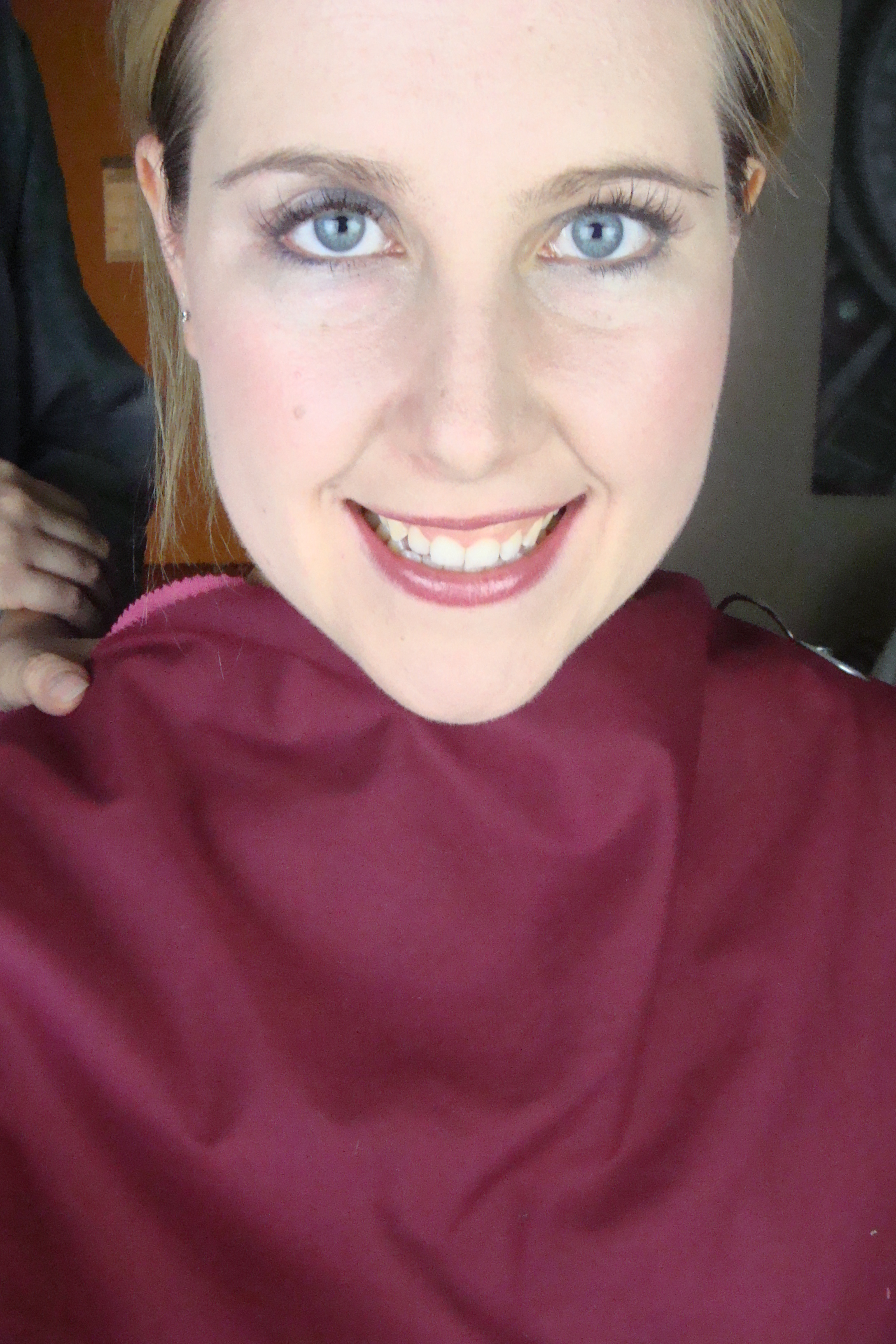
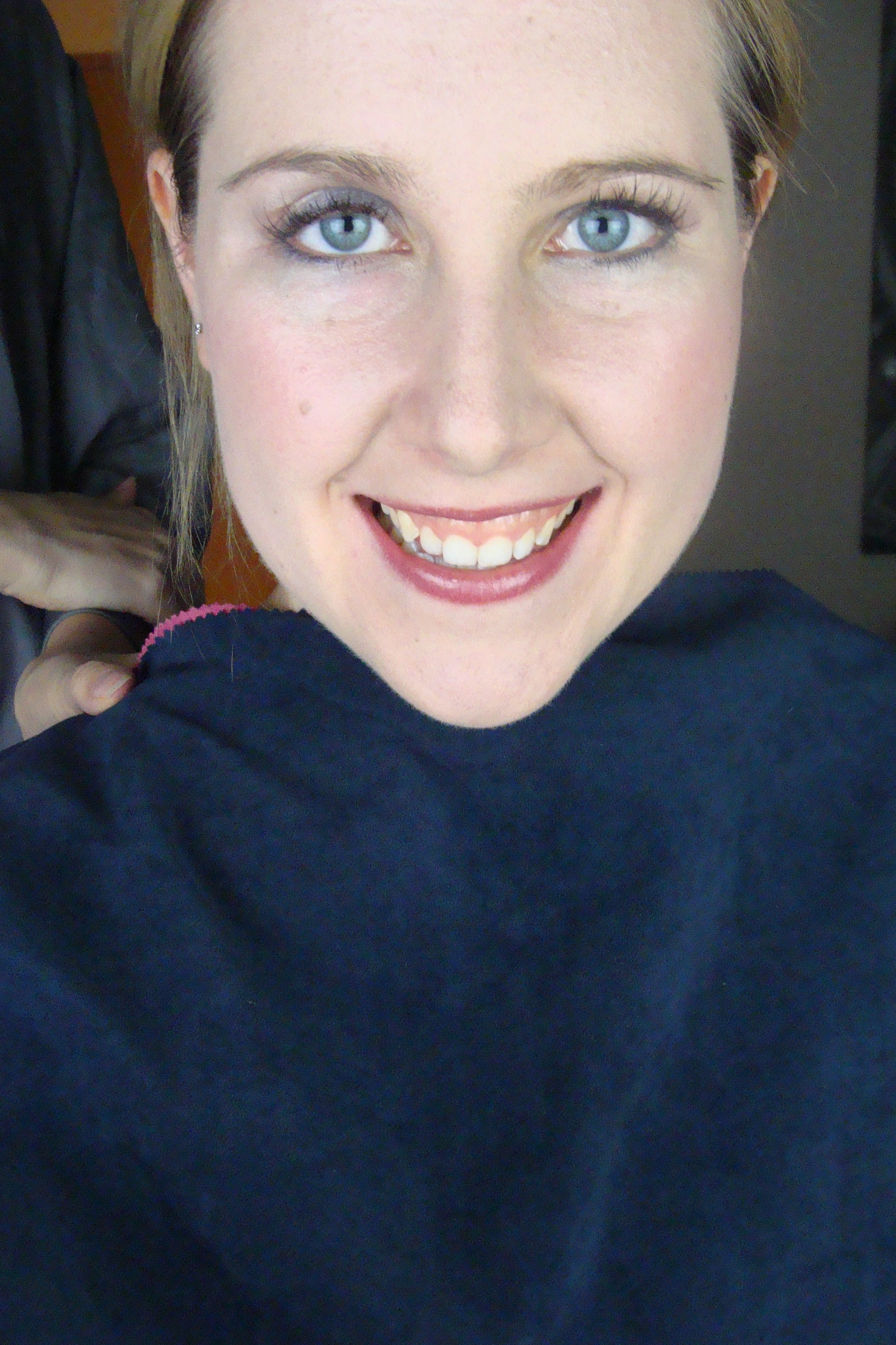
Toned Summer top and Toned Spring bottom.

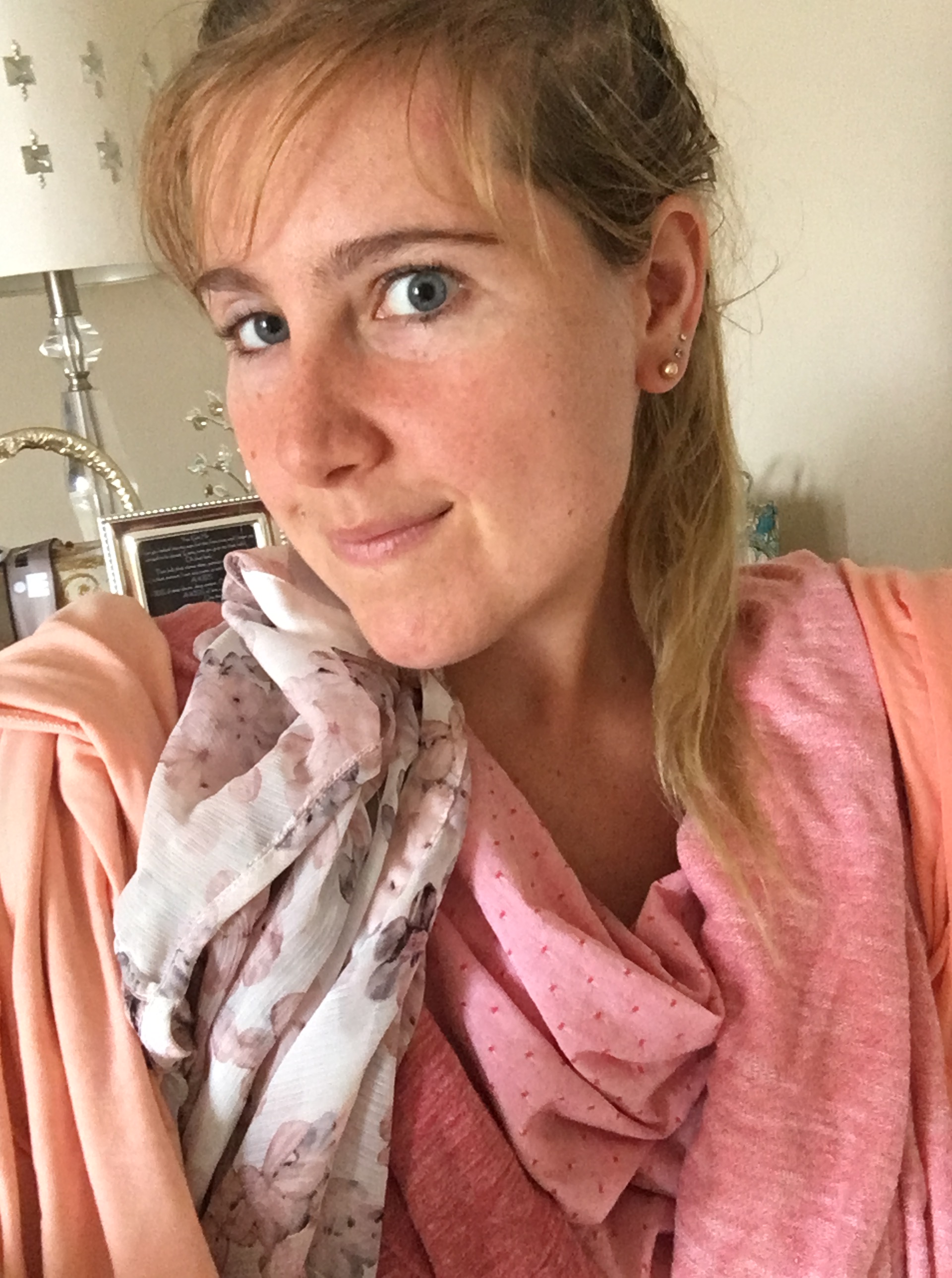
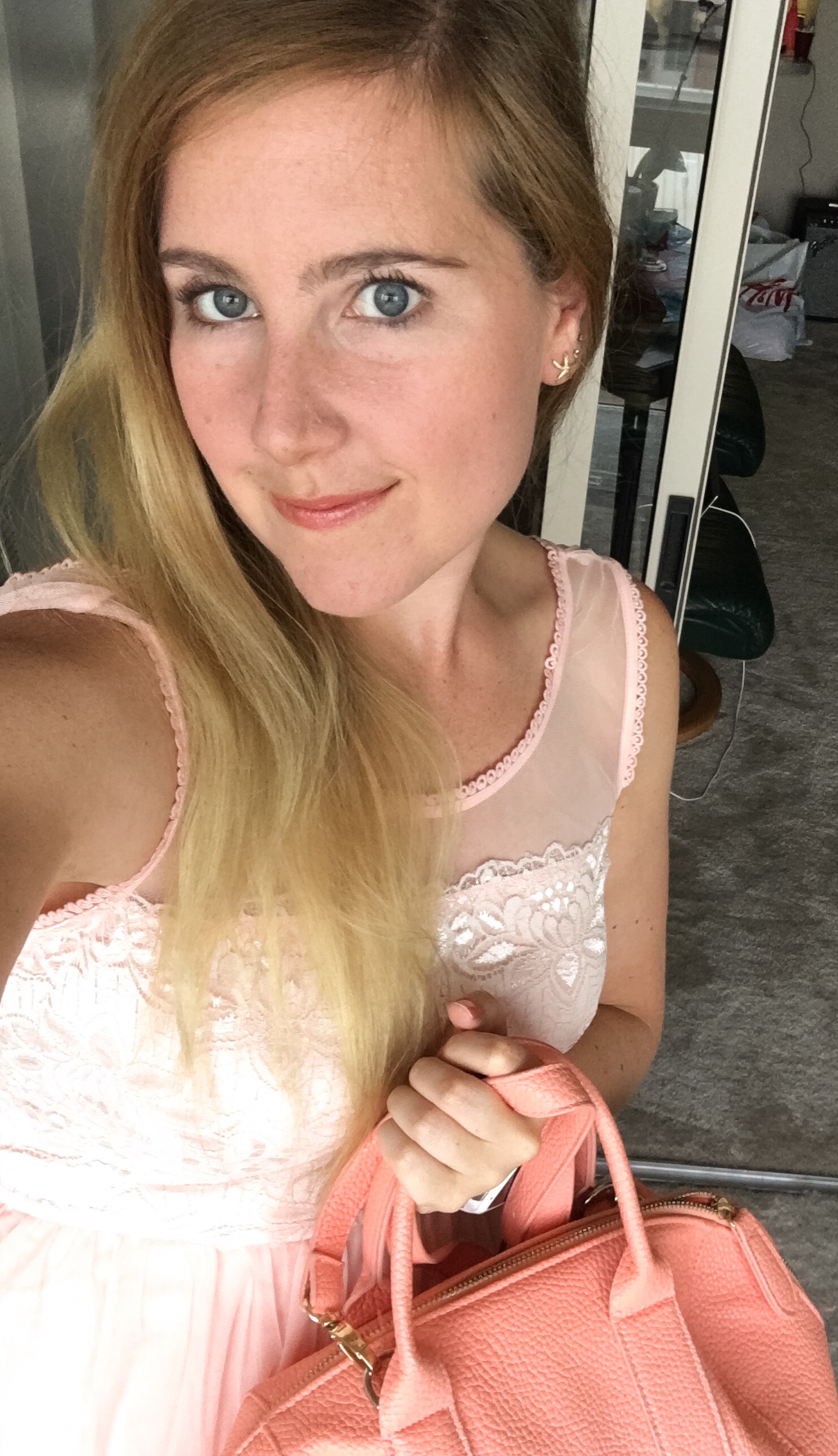
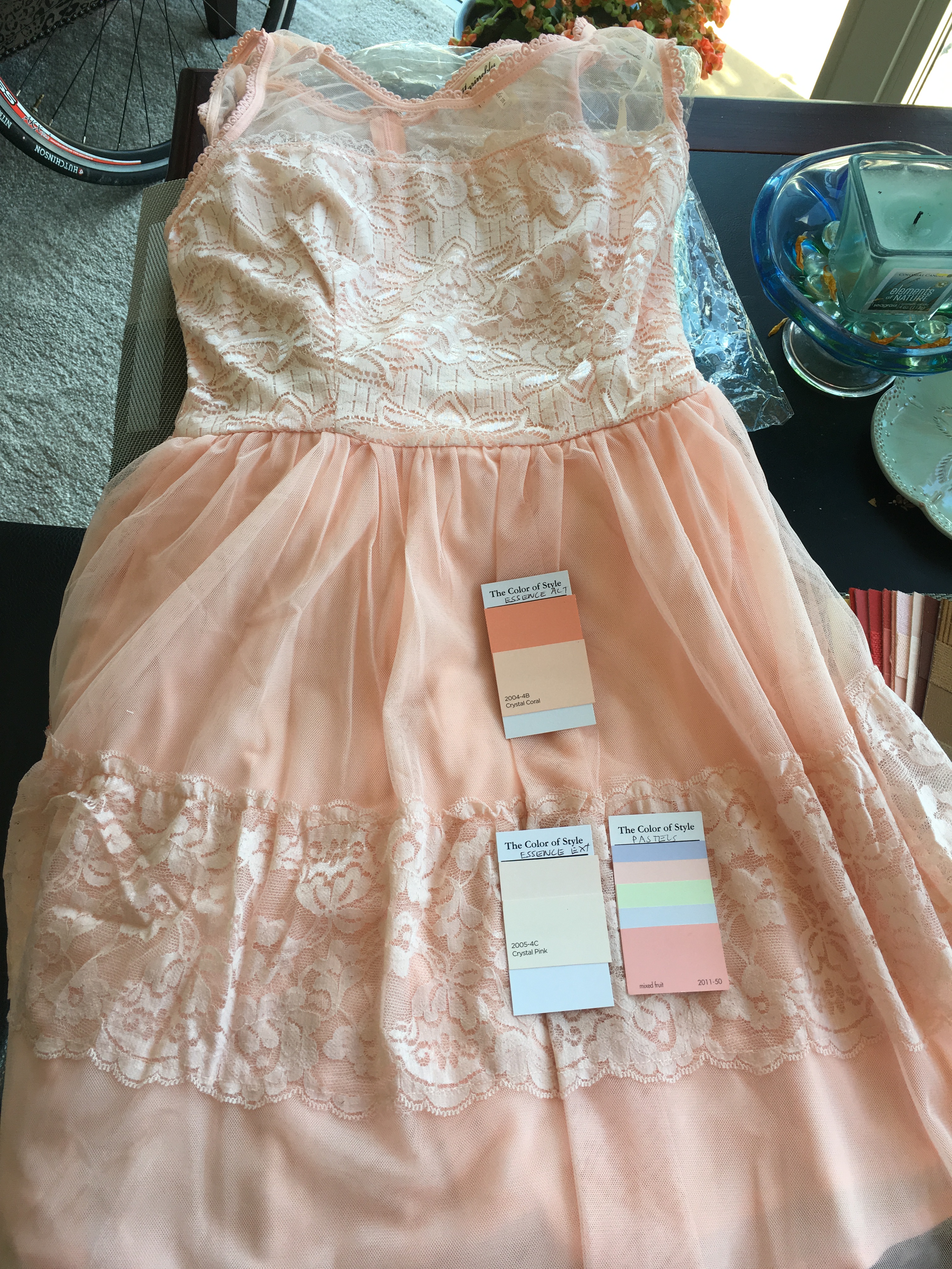
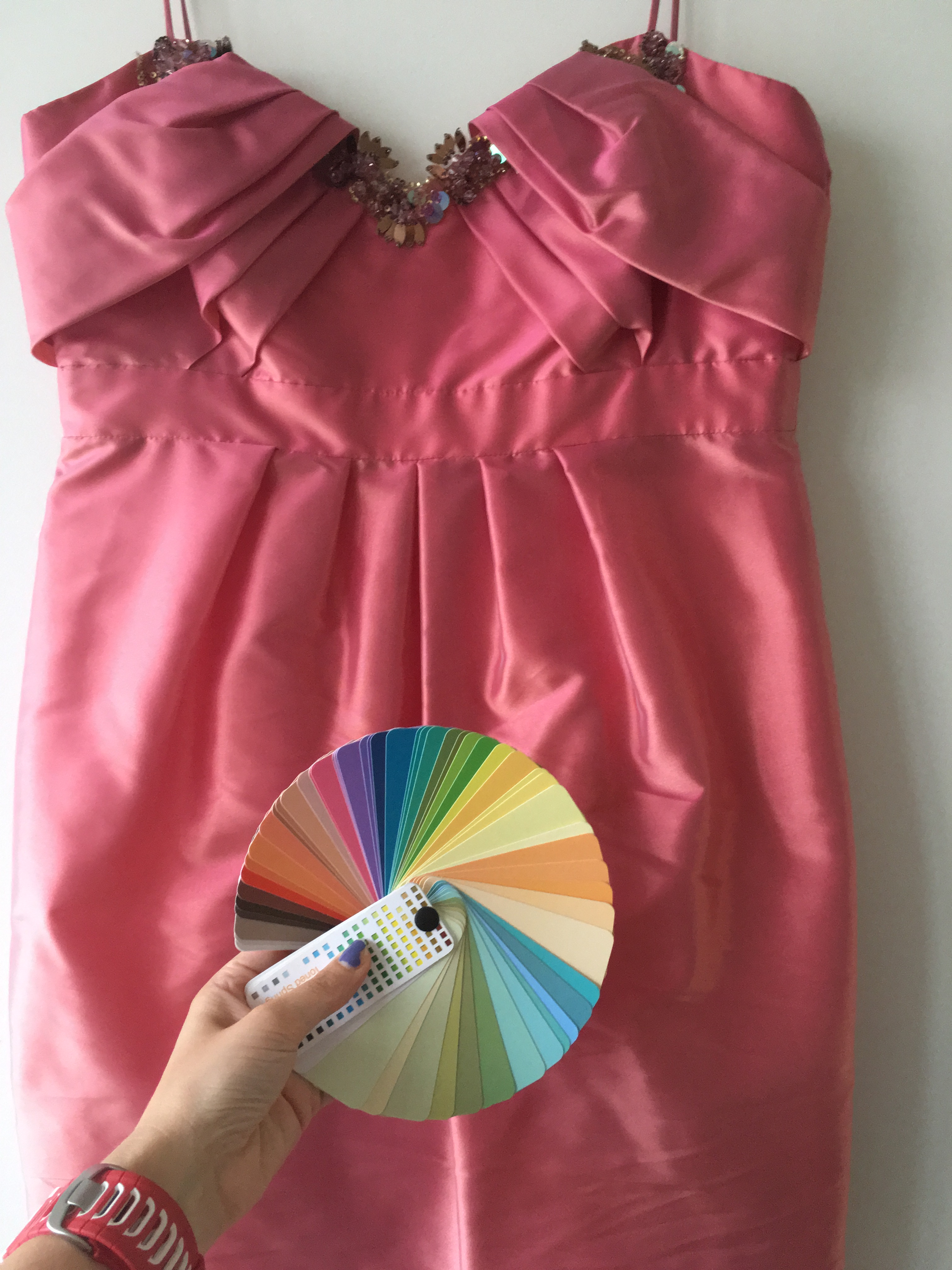
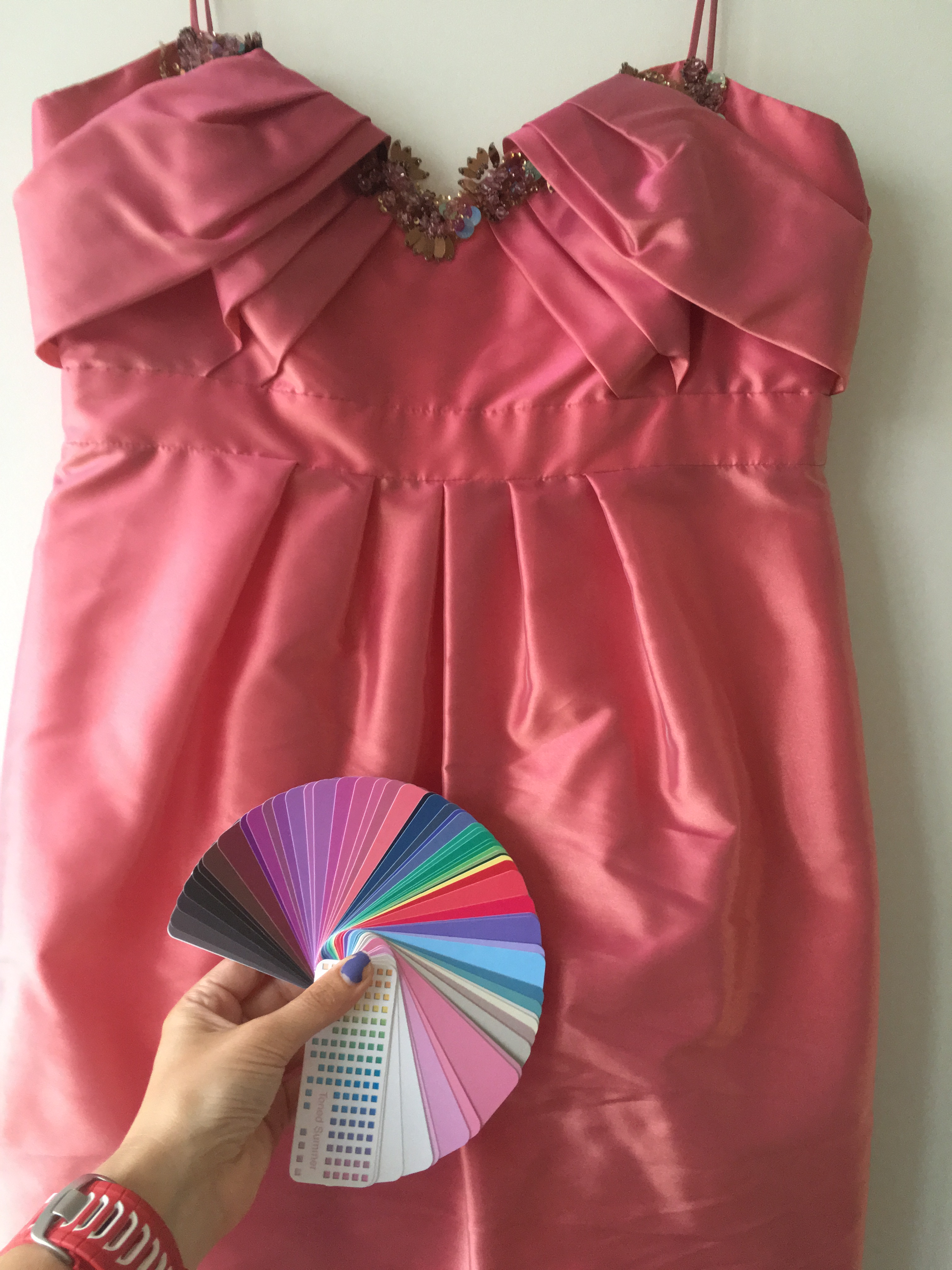
This was the in-between pink which does posses some orange Toned Spring if you can make it out but also a tad cooler looking purple mauve shimmer that could be why it also seems as if it could be Toned Summer. It’s the color of my lips…That’s why it is so awesome.


In the side by side, the Toned Summer top and Toned Spring bottom. Is one washing me out a tad because it’s too warm or is one yellowing me a tad because it’s too cool for my skin?
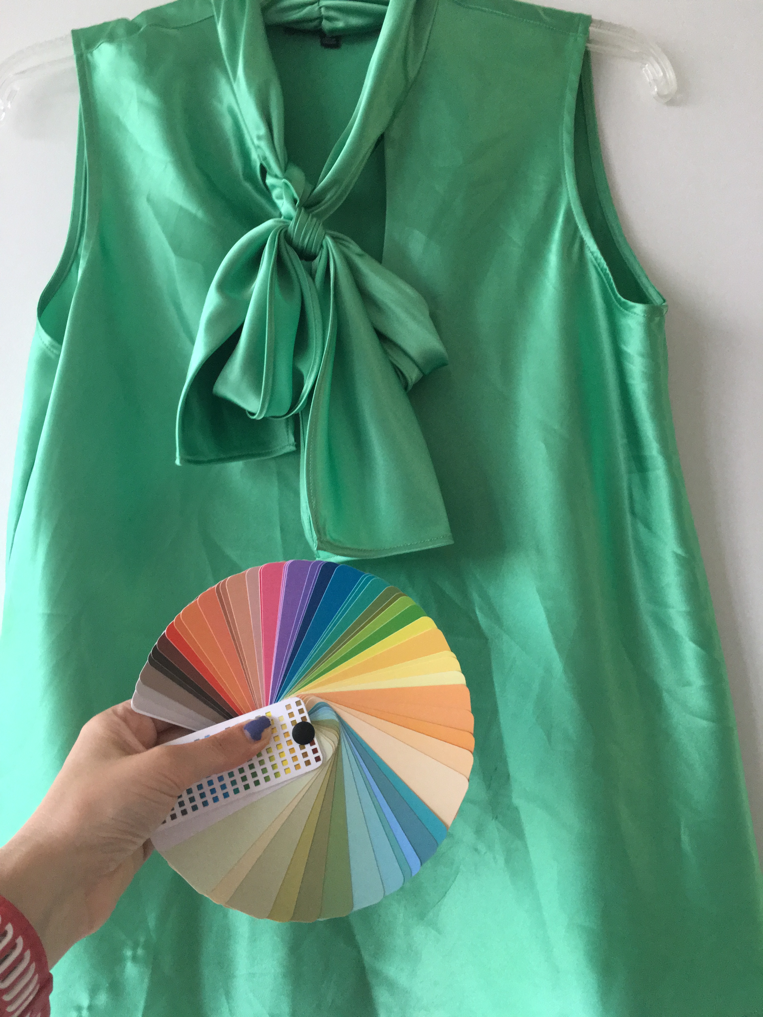
My two favorite colors seem to encompass elements of both Toned Spring and Toned Summer right precisely almost on the boarder or paradox of the season. If we compared 12 blueprint fan then these colors are not Soft Summer because it doesn’t go this saturated but the Pretty Your World 16 season Soft Summer version Toned Summer does go this saturated…
Here the 12 blueprints fan doesn’t go as saturated or as warm as Toned Summer/Toned Spring. Therefore it cannot provide me my best colors.
Here the colors are the right saturation and warmth the yellower in the green shimmer and the orange shimmer in the pink.
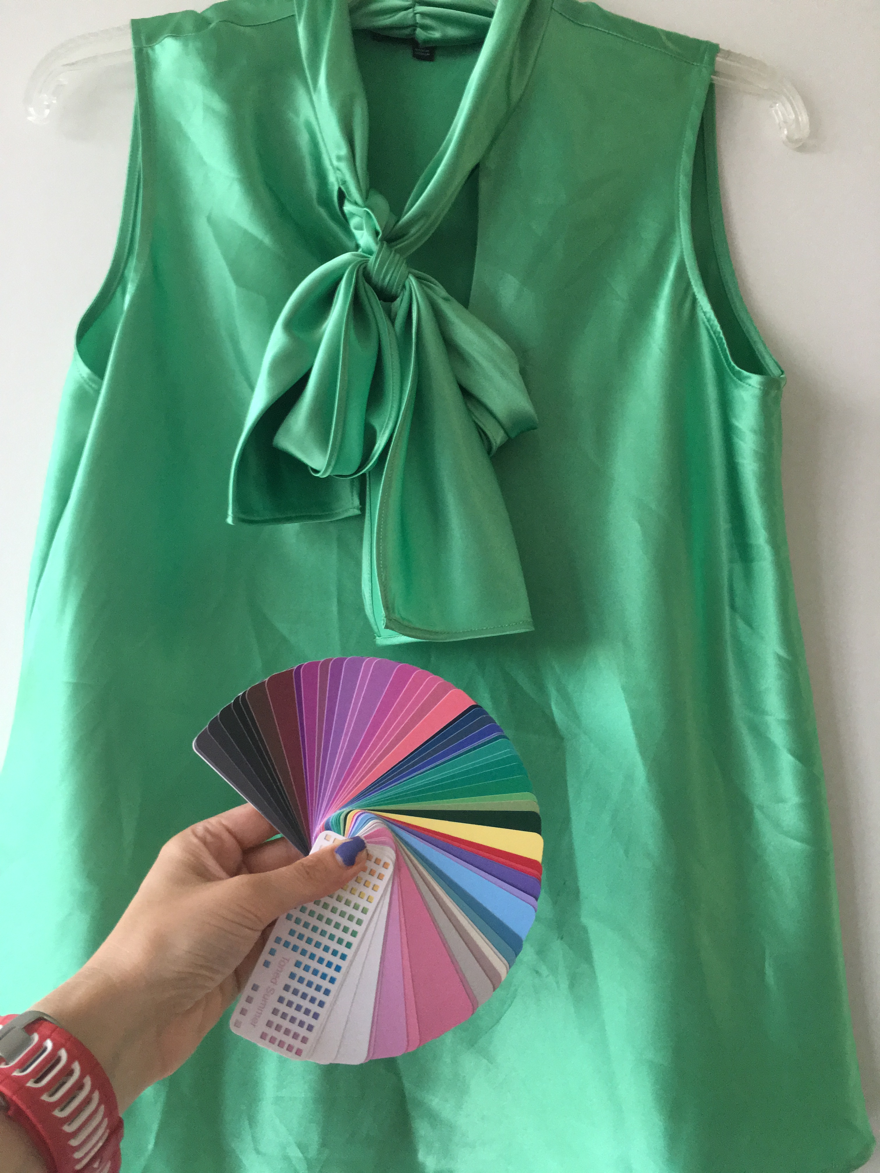
Here the colors are the right saturation and just a tad warmer in the green and pink but has shimmers of color that tie it close to this fan such as a cooler green and slight purple mauve shimmer.
80% needs to be in that season and 20% can be its neighbor. So wear 80% Toned Spring with 20% Toned Summer or vise versa 80% Toned Summer with 20% Toned Spring.


L. picture majority Toned Spring w/ T. Summer charcoal, R. picture majority Toned Summer with T. Spring chocolate.

Majority Toned Spring with T. Summer green.
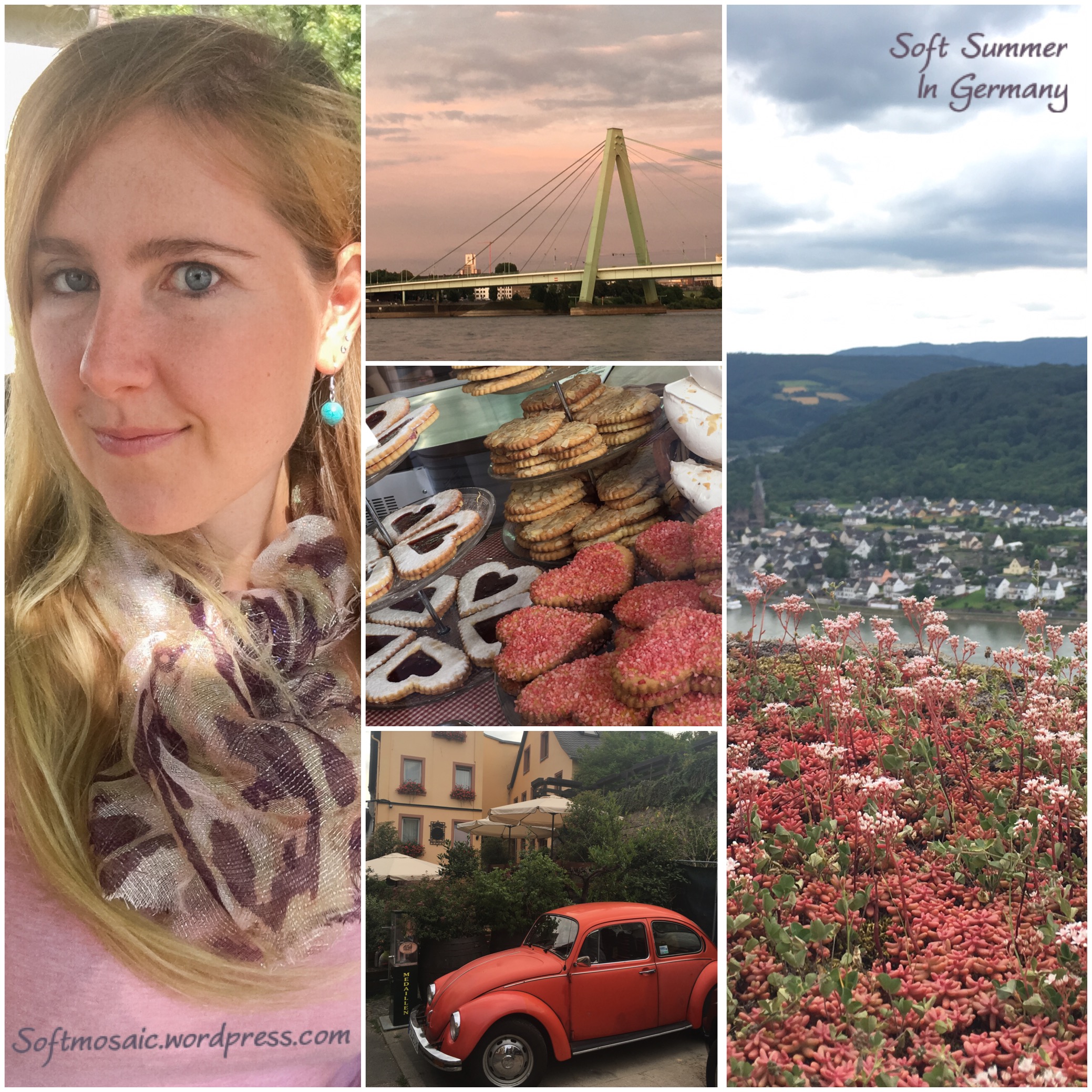
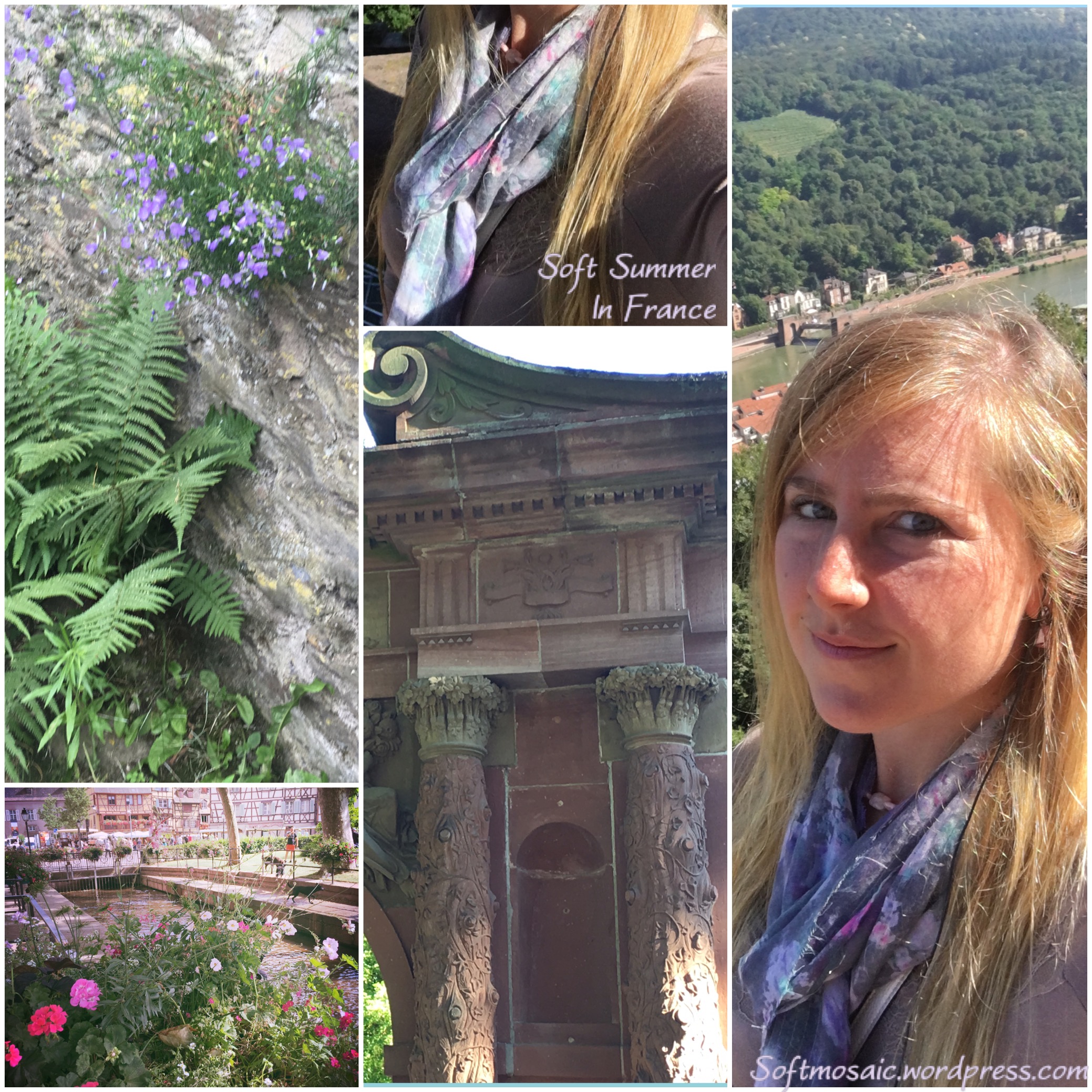
Left picture animal print (Toned Spring), Middle Picture Toned Spring scarf, Right picture Toned Summer scarf.
Thanks for reading!
~Softmosaic