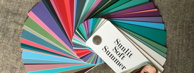
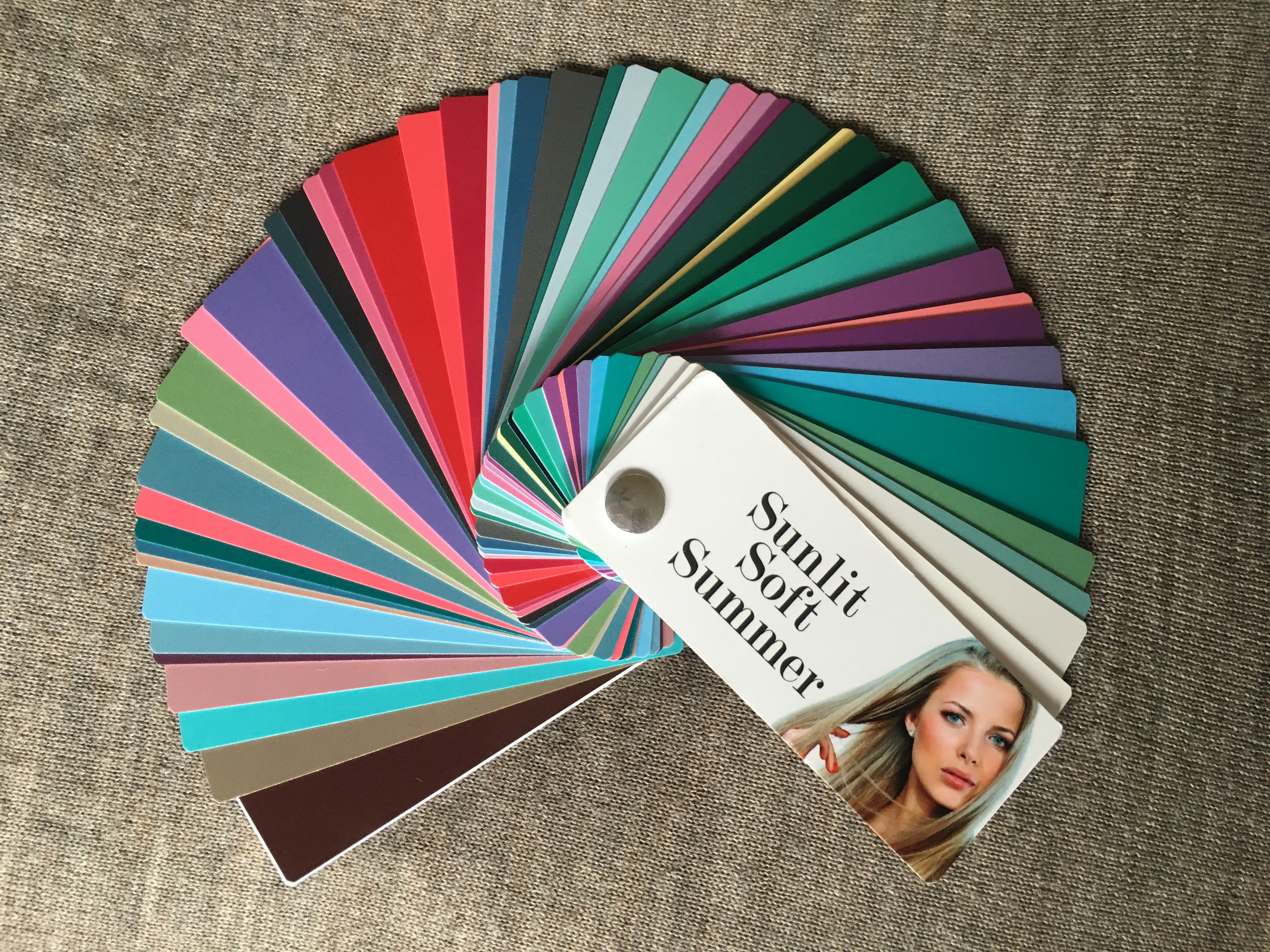
My Experience with House of Colour in Pittsburgh with Julie Shields
Intro
My Mom’s Color Analysis
My Color Analysis
Final Reflection
Intro:

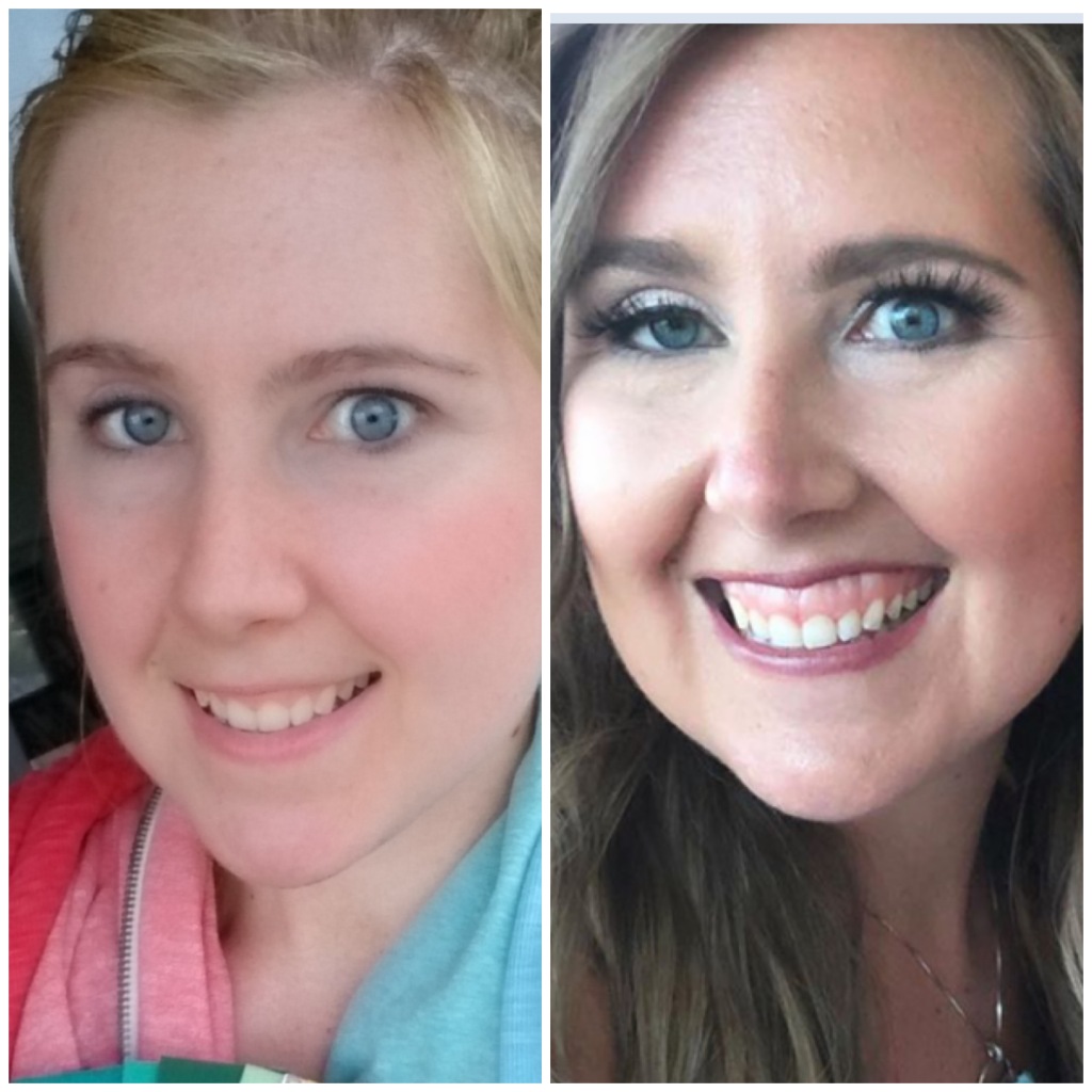
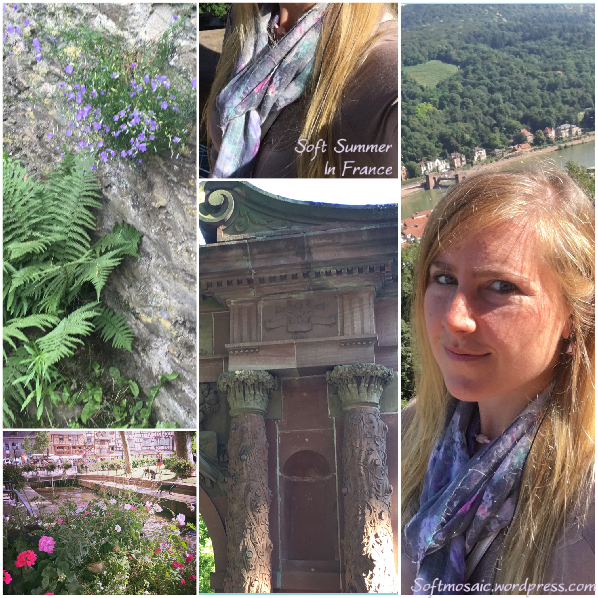
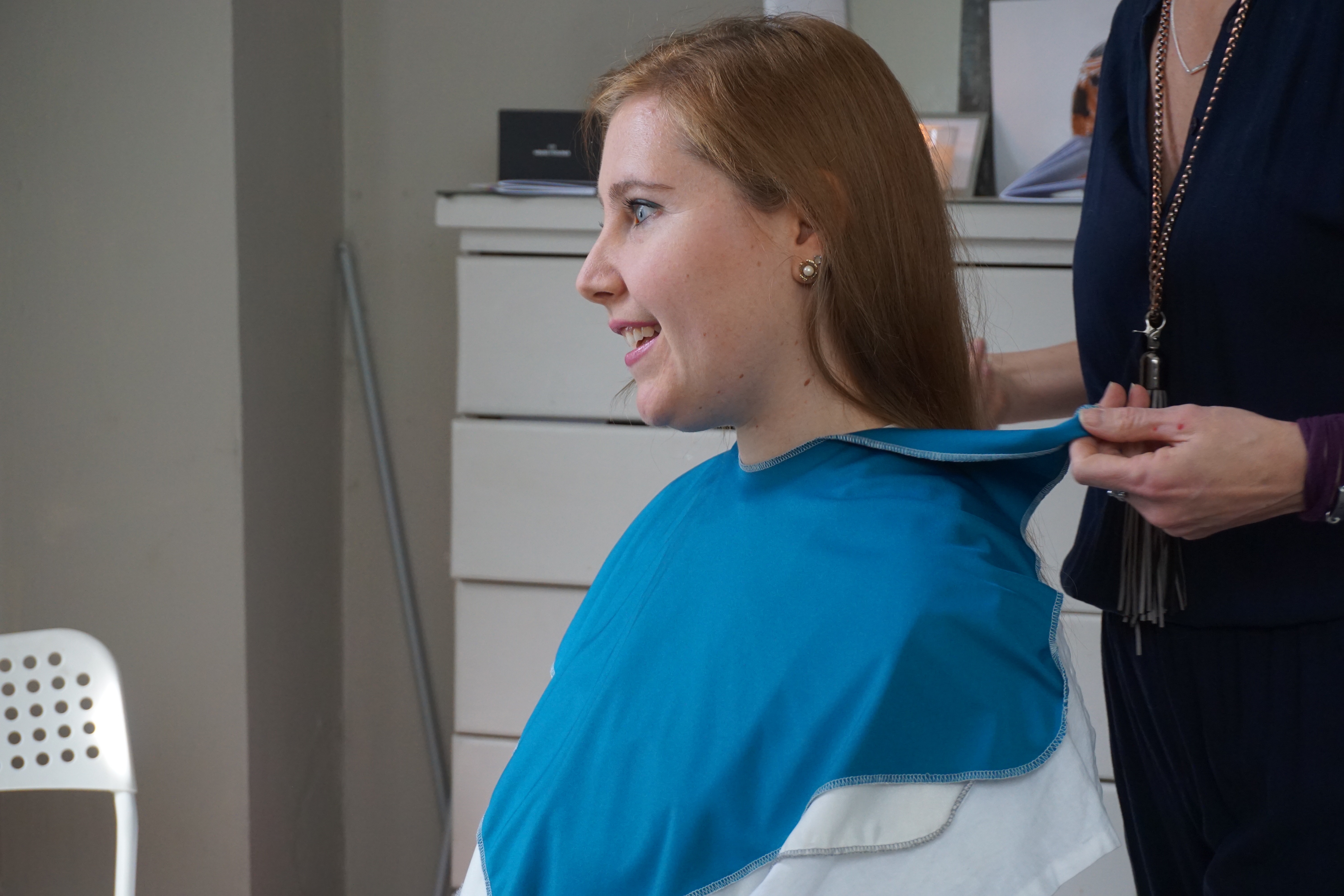
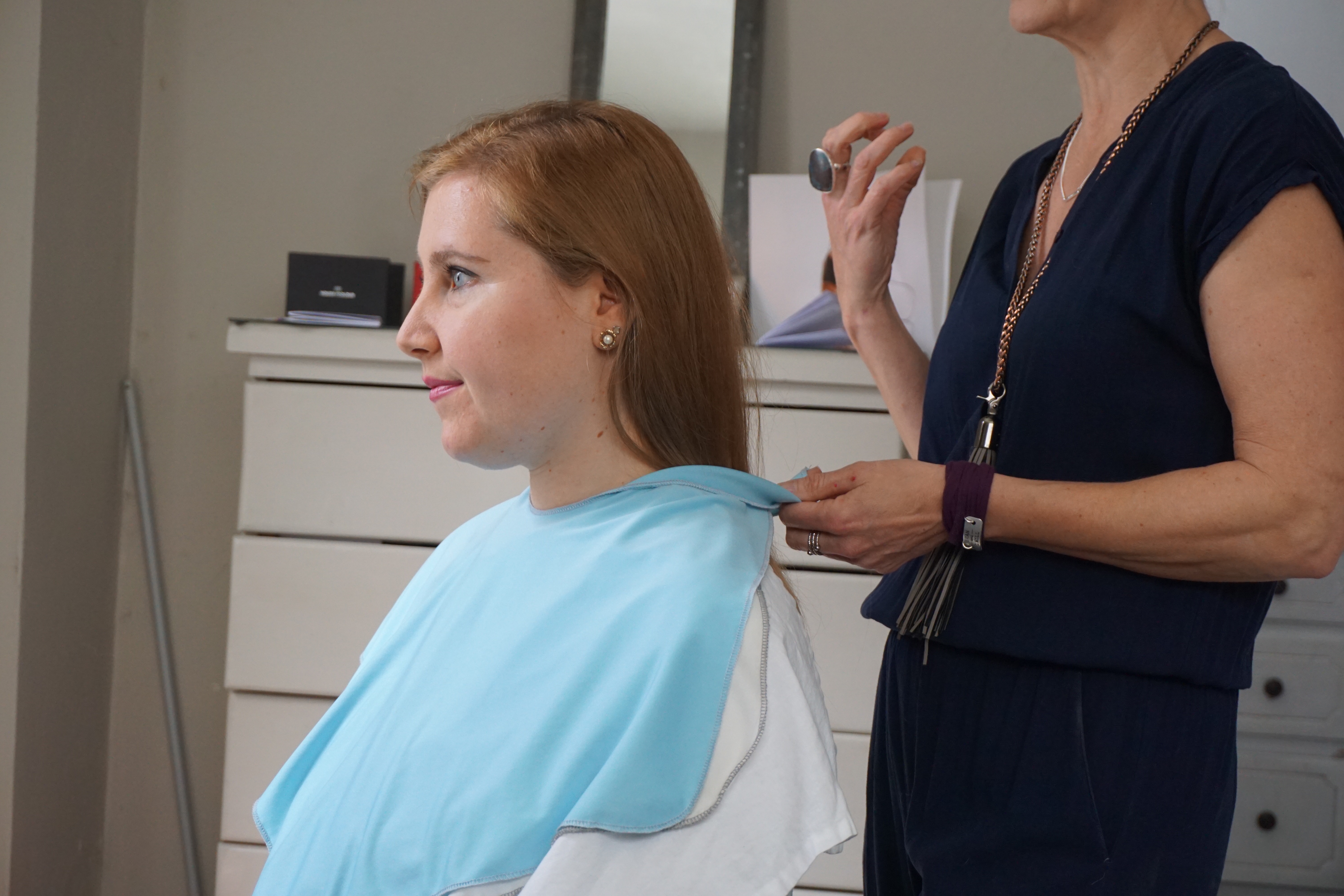
I live in the DC area and traveled with my mom and partner to Pittsburgh which took a not-so-bad 3 1/2 hours.

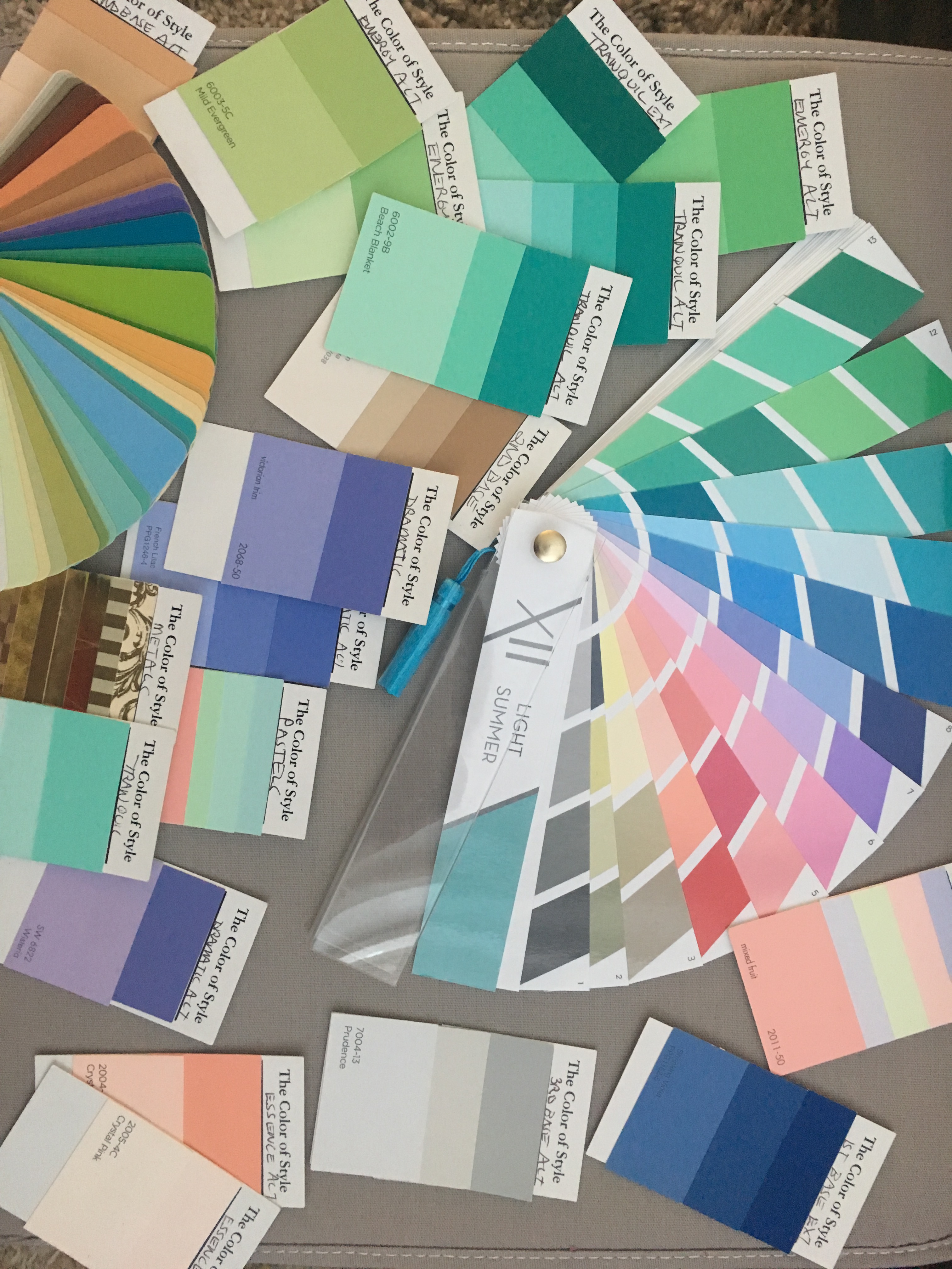
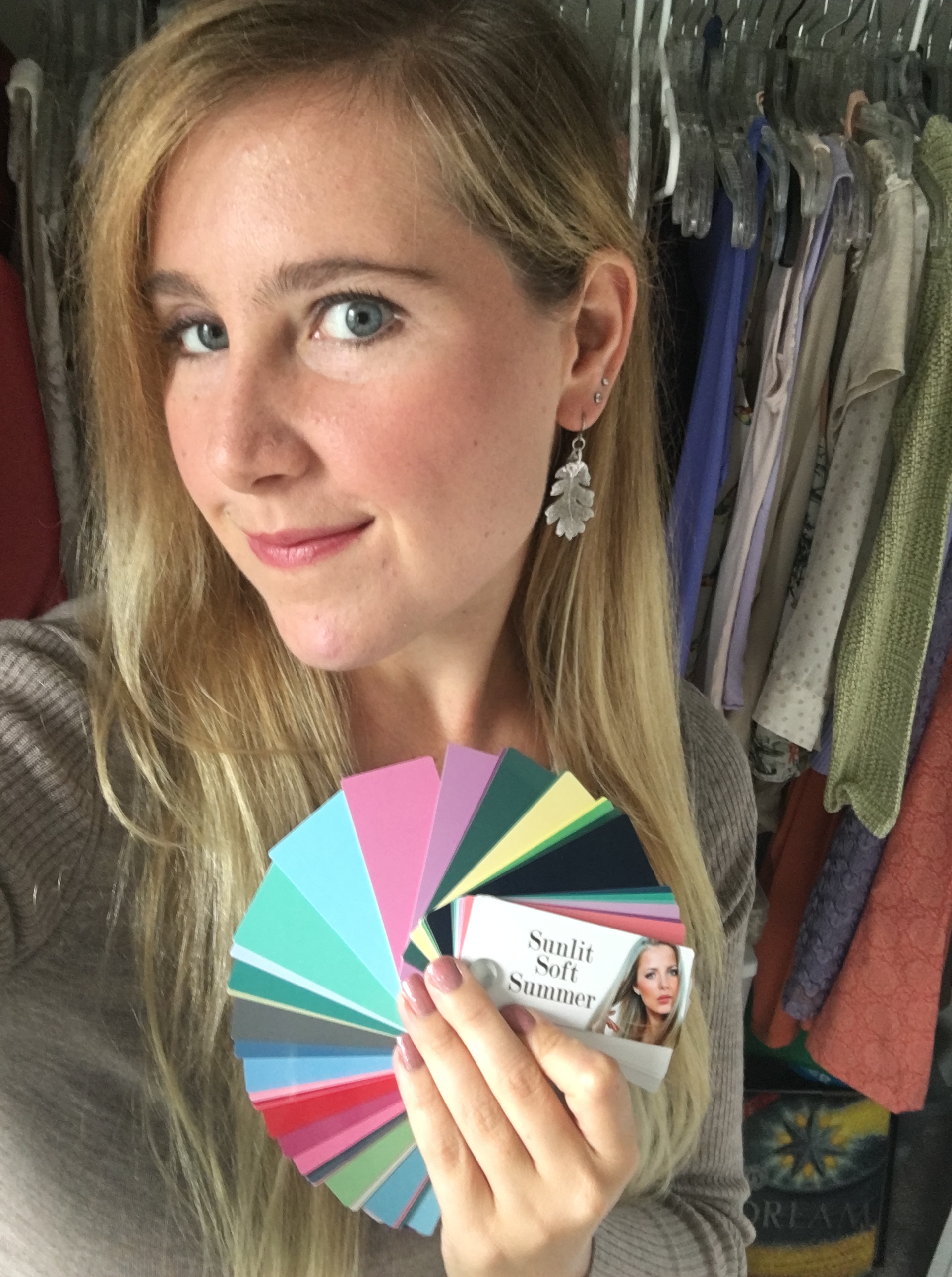
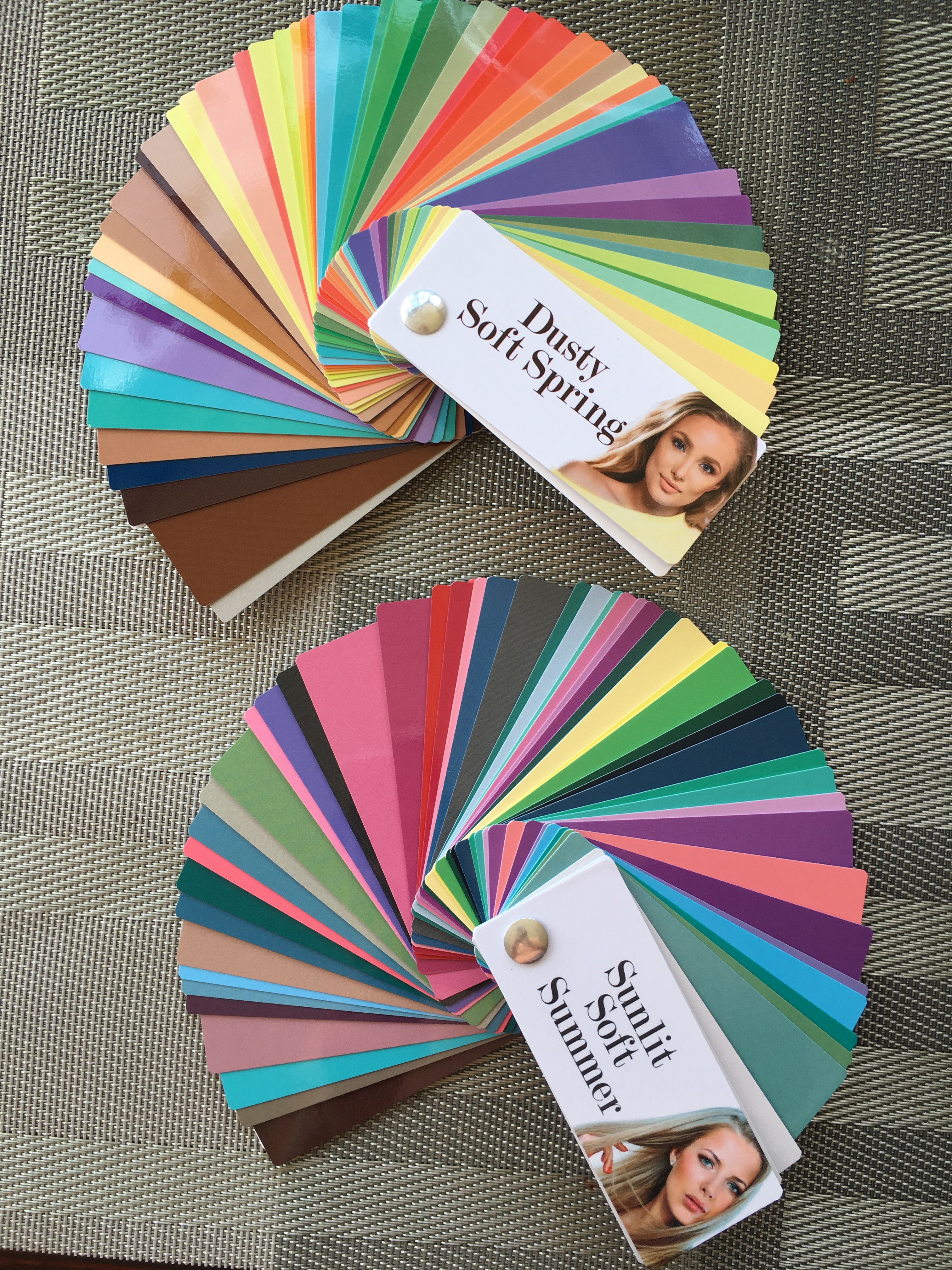
We enjoyed the city! The trip was a fun mini vacation and learning session about color analysis in the House of Colour world. Of course, as many of you know, I am obsessed with color analysis and have been analyzed in many different systems that use drapes including Sci-art, 12 blueprints, Color Alliance, Color Breeze, Kim Bolsovar, and now HOC (House of Colour).
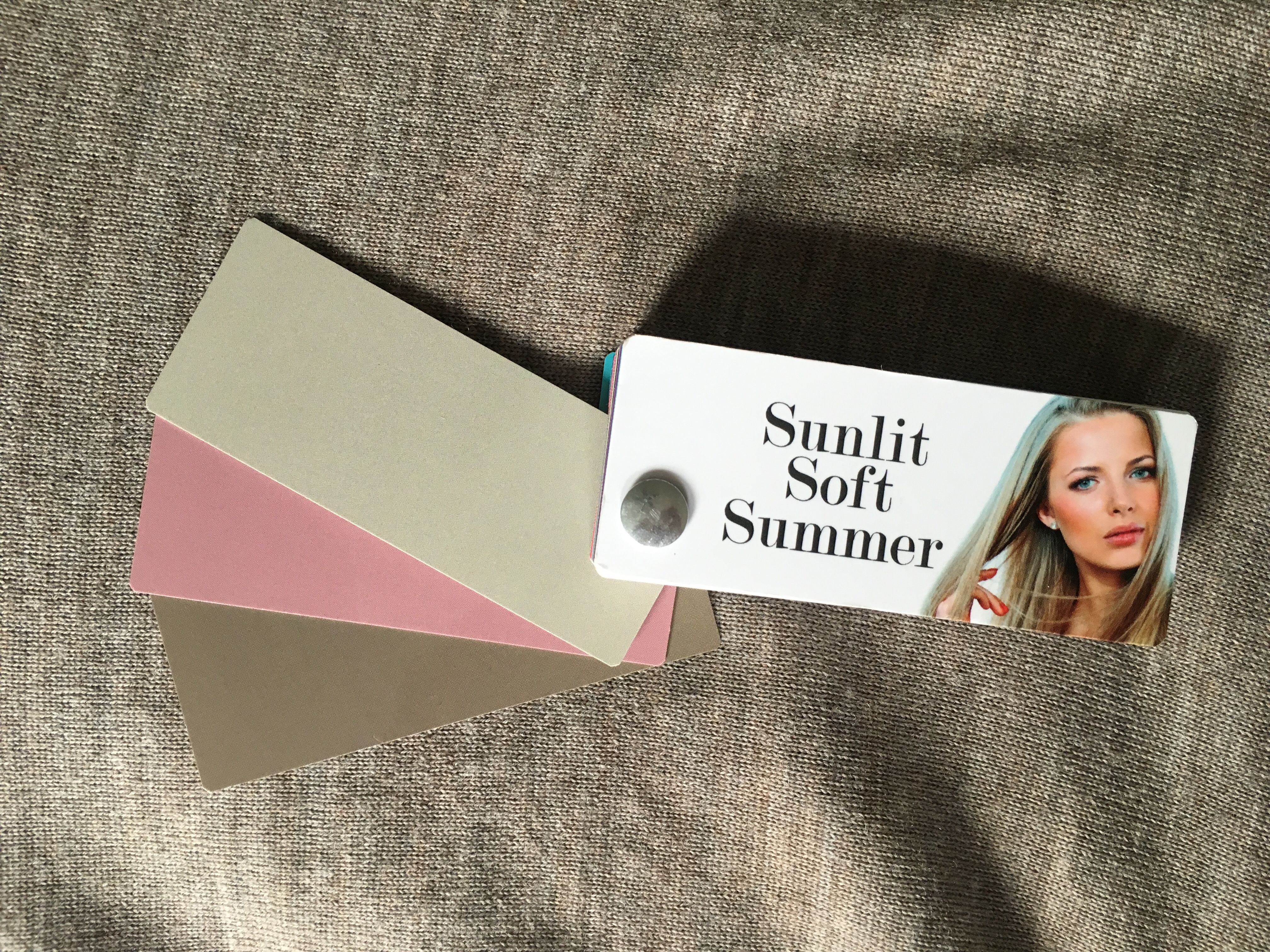
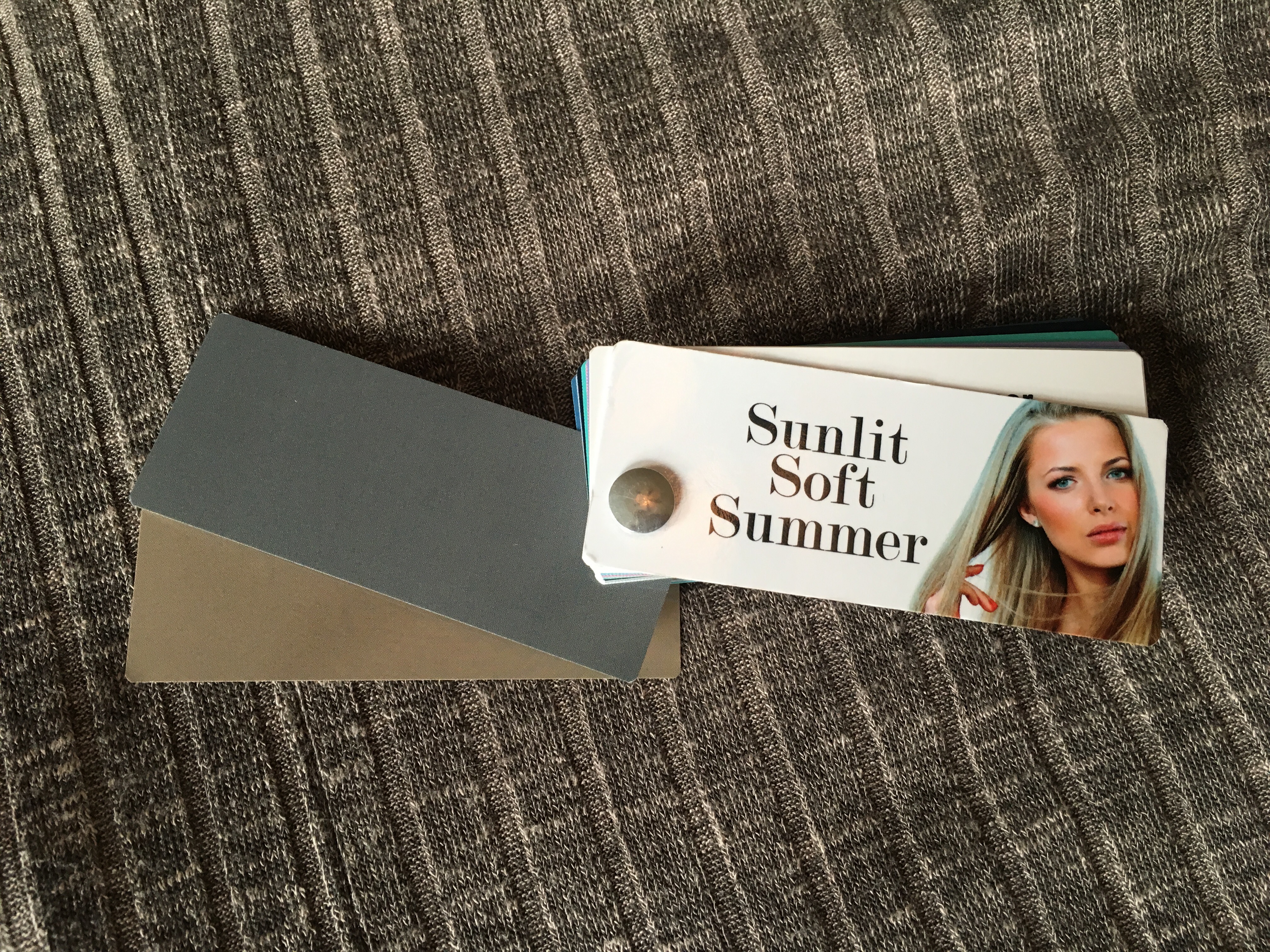
I have been analyzed using drapes as a Soft Summer in sci-art/12 blueprints and a summer in Color Alliance. I was analyzed as a Spring or Light Summer in a few online analysis. Nothing has ever really felt 100% right which I theorized came down to the drapes themselves being used, the limitations of the system at hand. I know this is true because I own the Color Breeze drapes and analyzed myself as a Soft Summer (light) with exception of loving the navy drape from Deep Summer Soft but not caring for the other drapes. I wanted to try something different like House of Colour, and who knew…maybe I would end up a unique season, or the drapes would show something different about me and why nothing seemed to put my color season puzzle together.
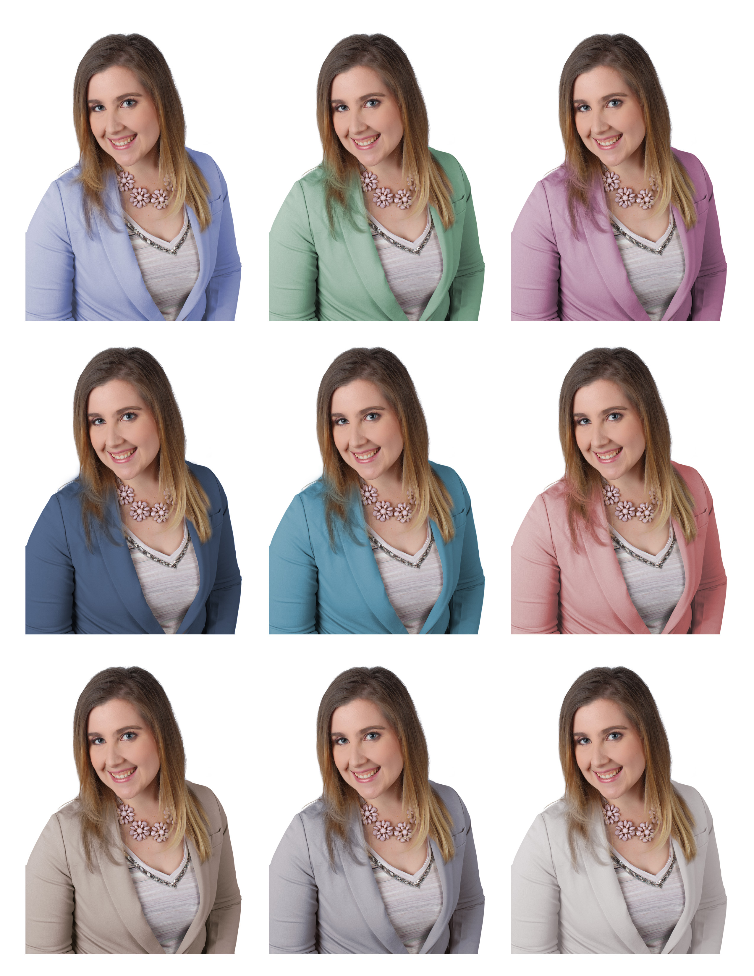
We started with a House of Colour educational session about the different seasons and yellow and blue based colors.
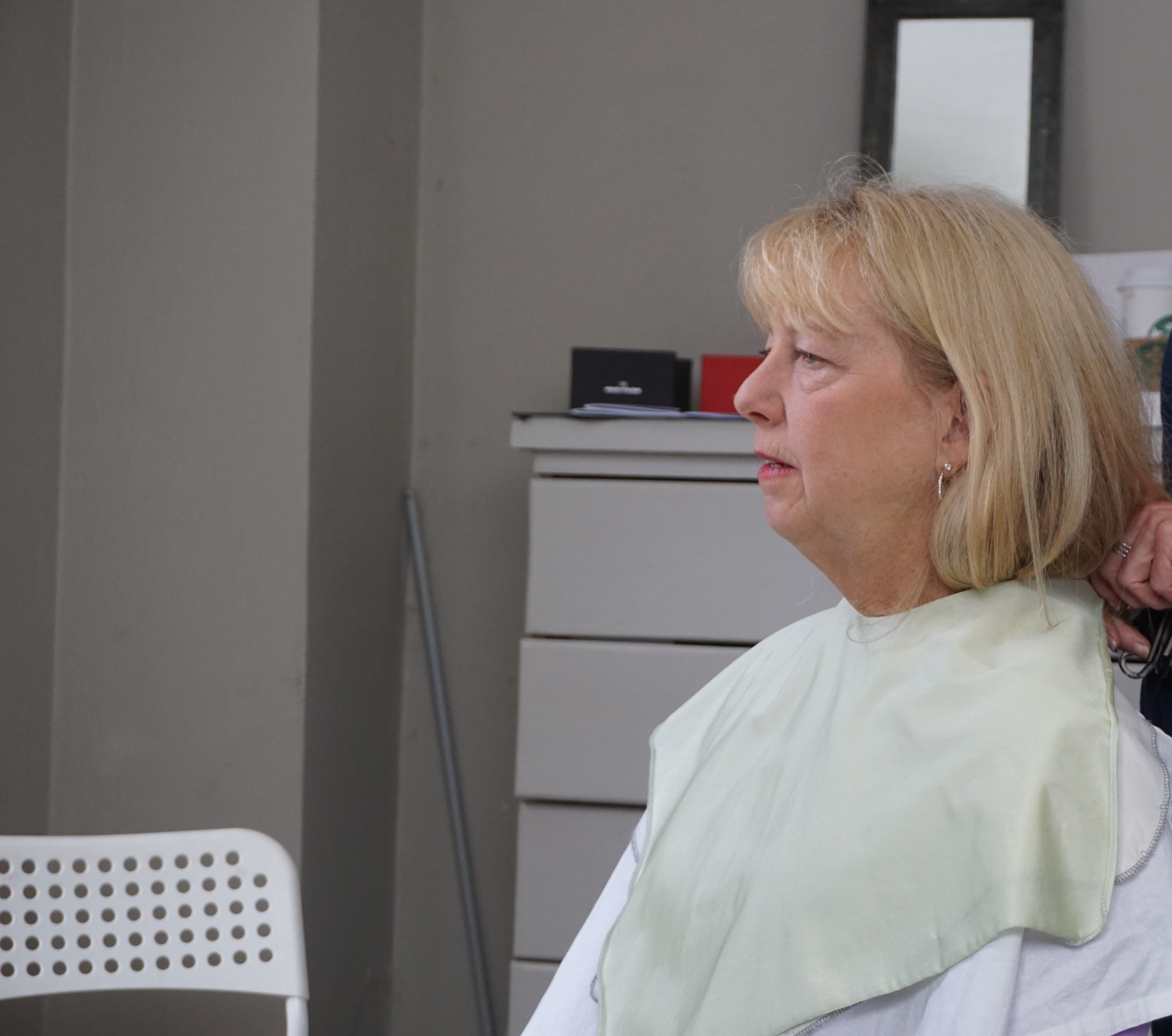
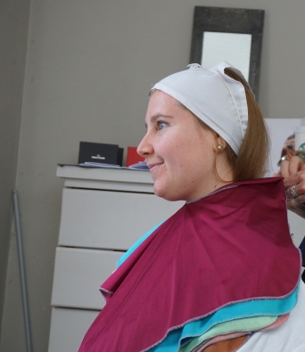
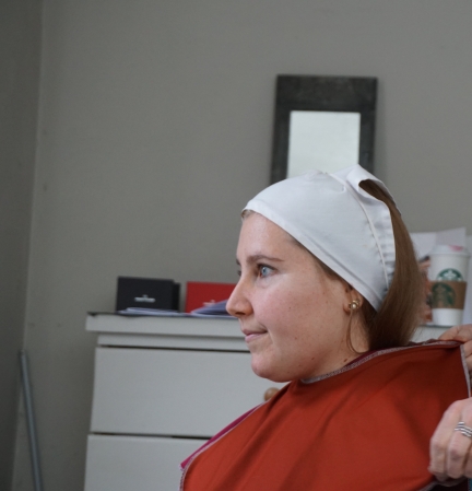
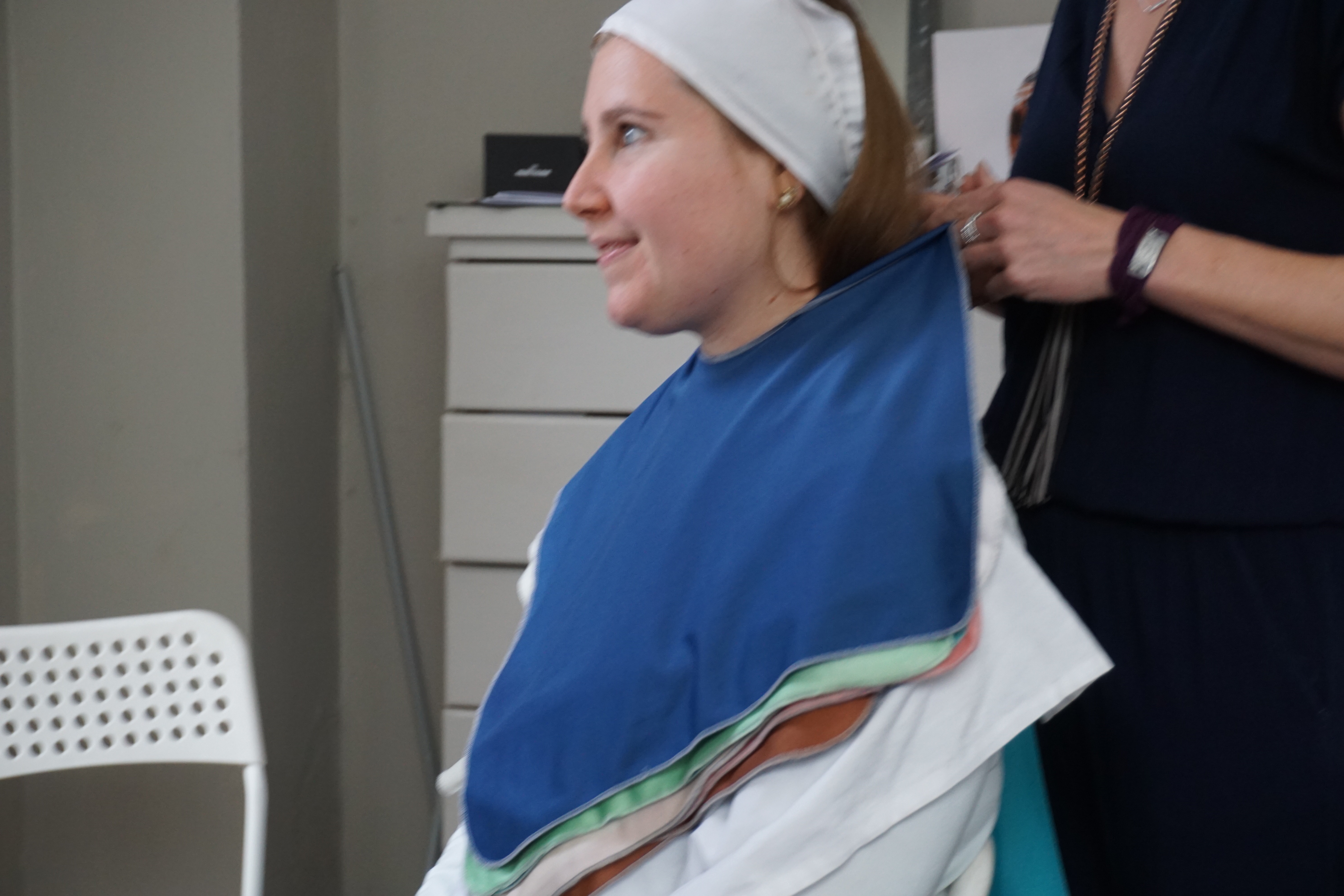
My Mom’s Color Analysis:
My mom went first! Julie noticed that she had brightness right away and tested for Winter and Spring. Julie knew it was unlikely my mom was a Winter but tested to be sure. The winter blue and white is cutting her off down the middle which is undesirable.
Here is spring white and brown and looks much better.
Since my mom is warm we checked Autumn, but it was so heavy and blah on her. Summer was not great either and washed my mom’s warm complexion out.
Makeup time for my mom! This got her out of her comfort zone because she does not like to wear a lot of makeup and does not like bright makeup. It was a tough adjustment for her after the makeup was put on. I have draped my mom before as a Light Spring in the Color Breeze system. My mom is fair and feel like a little goes a long way and prefers the natural look.
She is all made up with makeup! and ready to see the drapes from her season! We gave her a lot of positive talk about how the makeup looked good. Makeup can be purchased at : https://www.houseofcolour.co.uk/shop
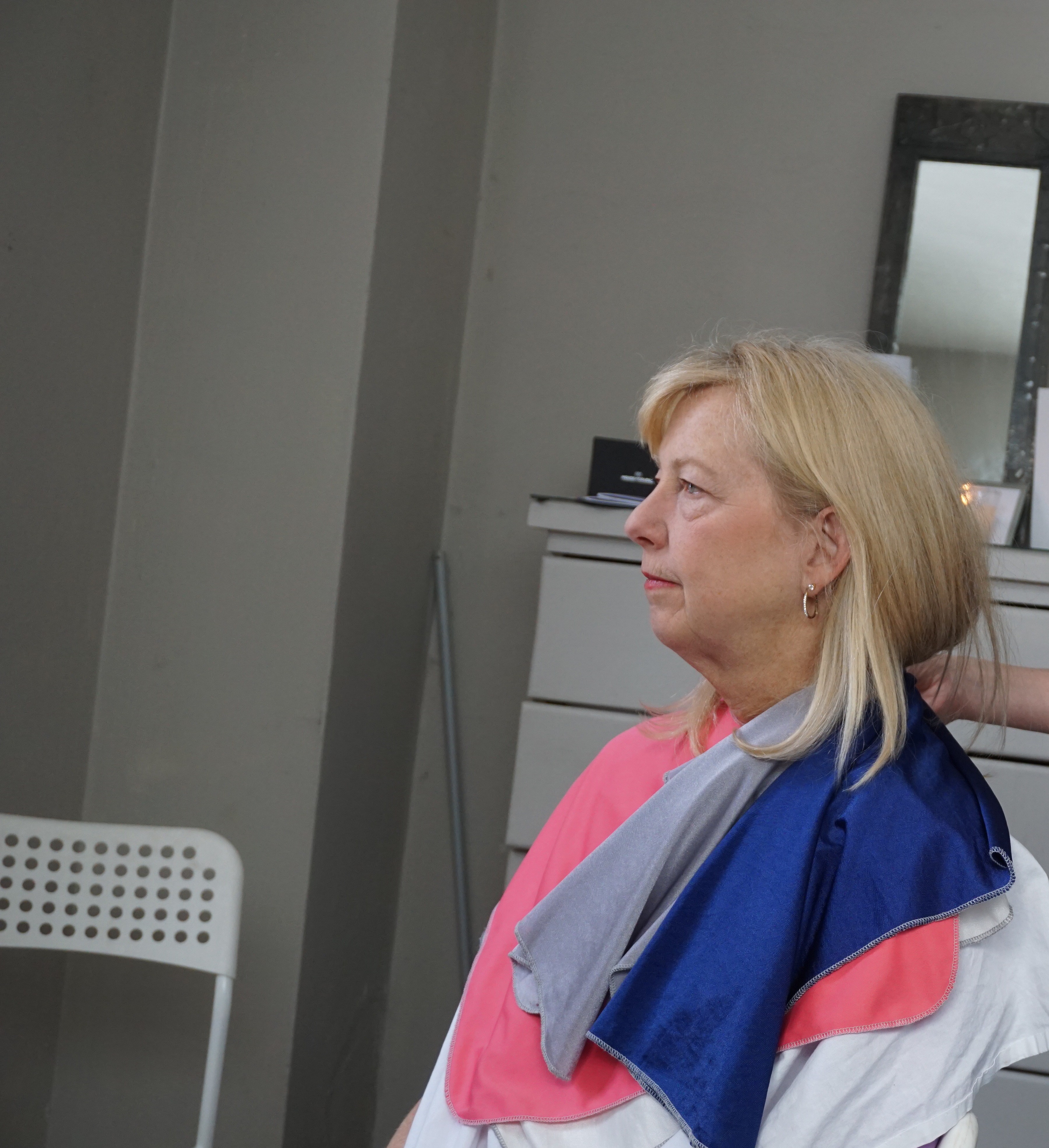
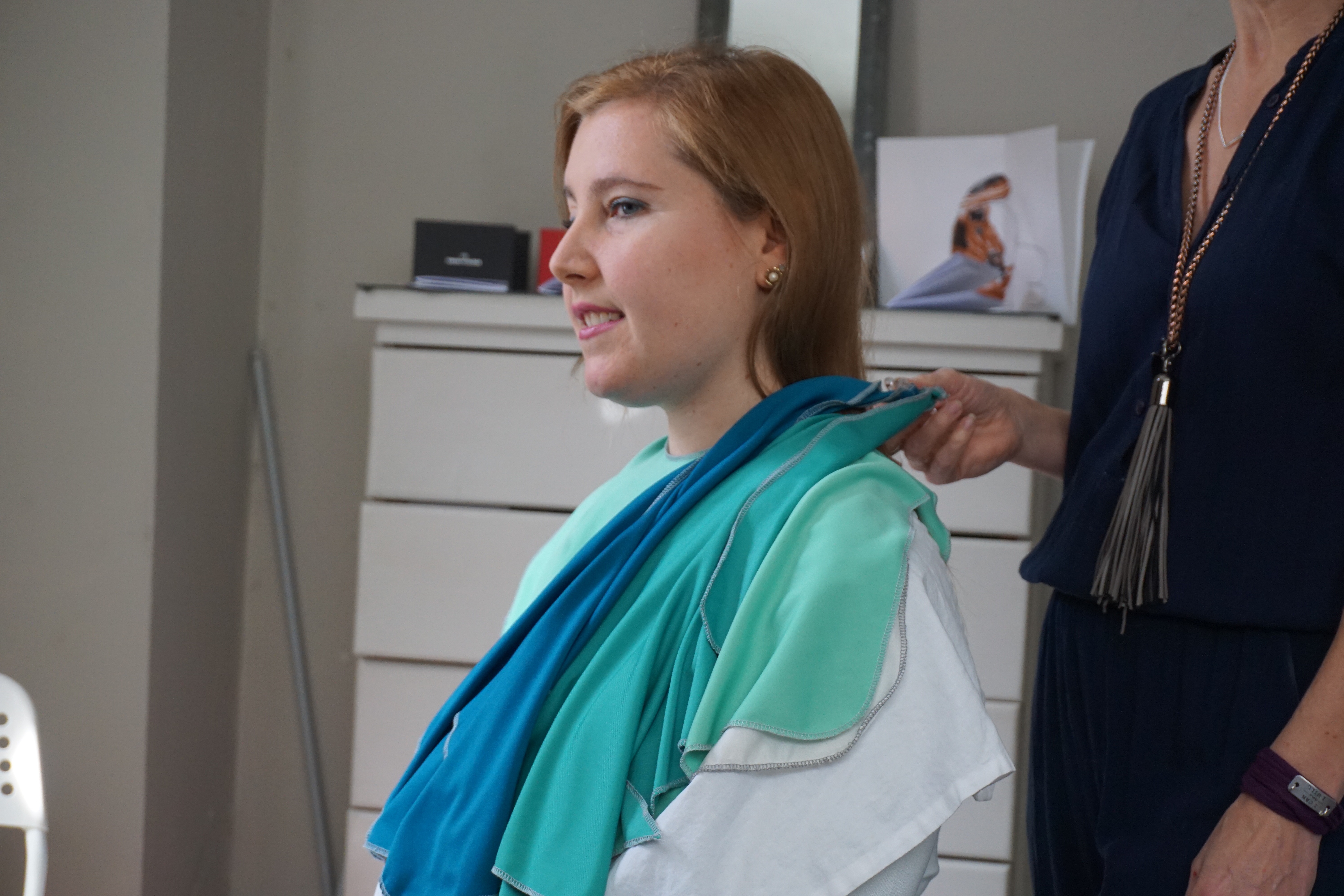
Here Julie talked about how you can combining colors in outfits by showing the drapes paired together beautifully.
Colors can be used in color pops like a scarf.

We loved the coral pink on her with her spring pink lipstick.
I am floored every time I see my mom in this apple green drape and the fact that she can pull that color off! She looked beautiful in the apple Color Breeze drape too when I had analyzed her in the Color Breeze system.
Julie really loved this Geranium colored drape on my mom. I would never imagine my mom wearing this color but after contemplating about it, I could definitely see it worn as a dress and perhaps farther from her face with a scoop neck for a special occasion.
The light yellow was amazing on my mom and it brought out her natural highlights. Julie loved her hair and said the hair color added warmth around her face which helped keep my mom looking bright and warm.
A really pretty aqua color from Spring palette.
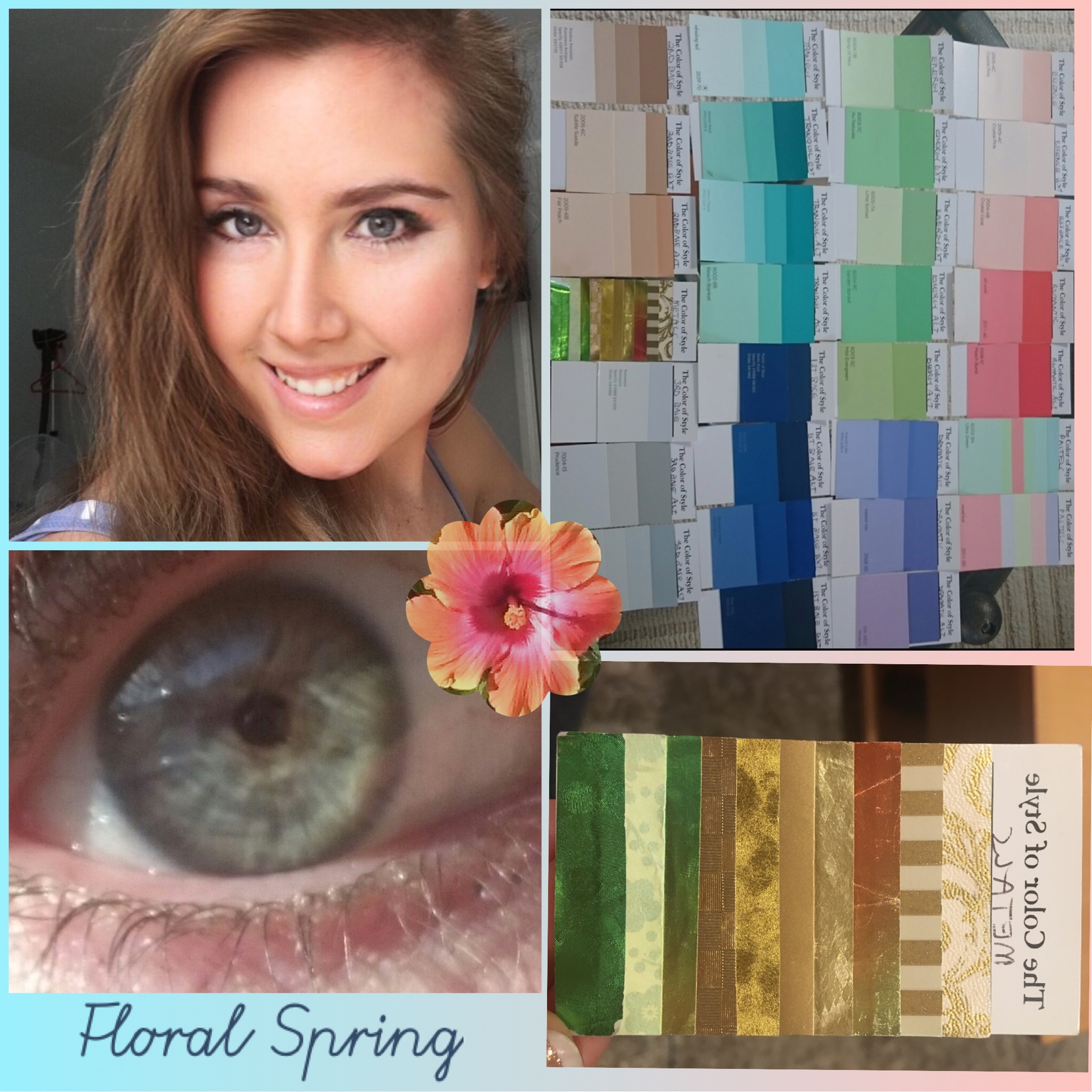
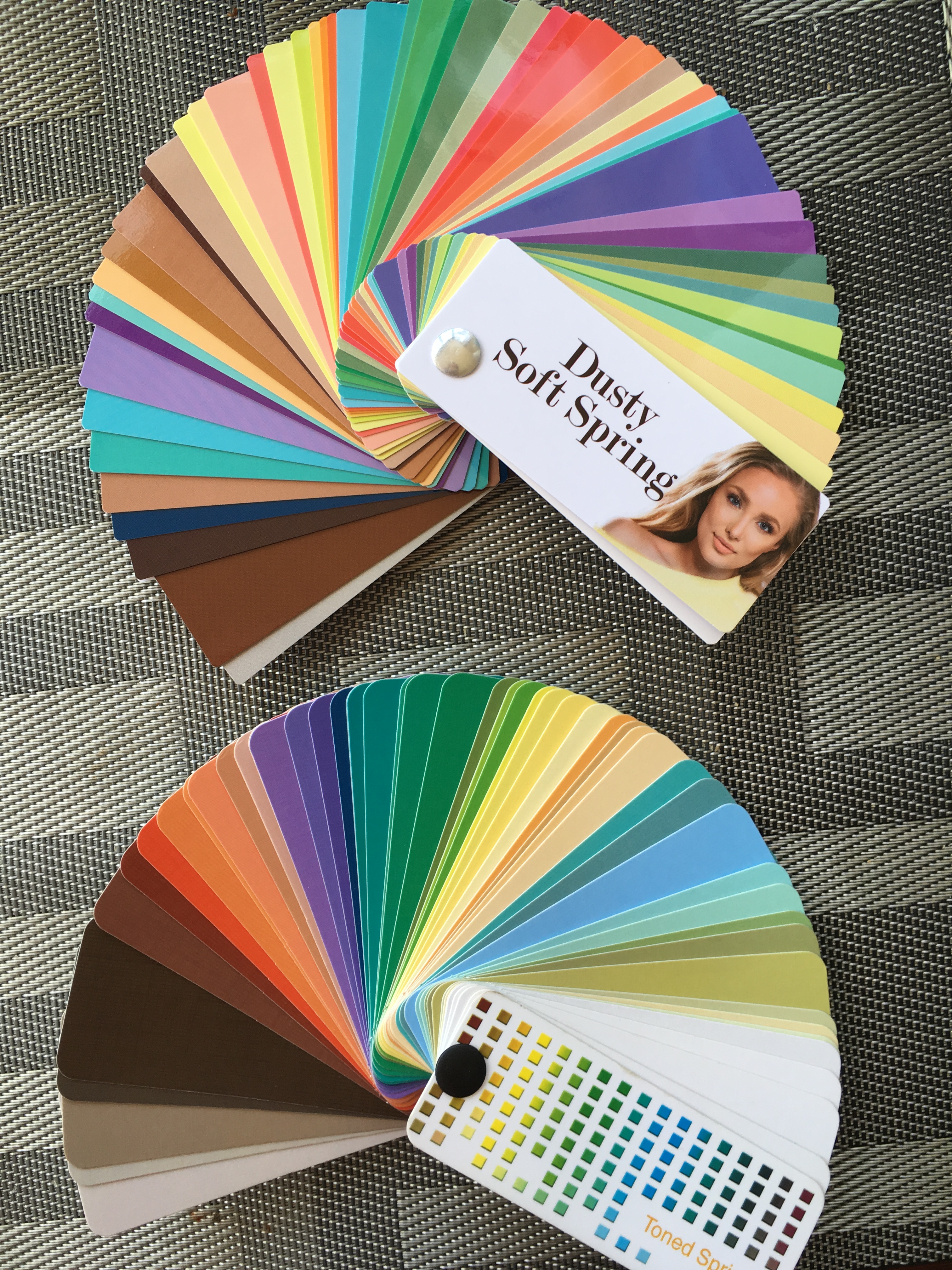
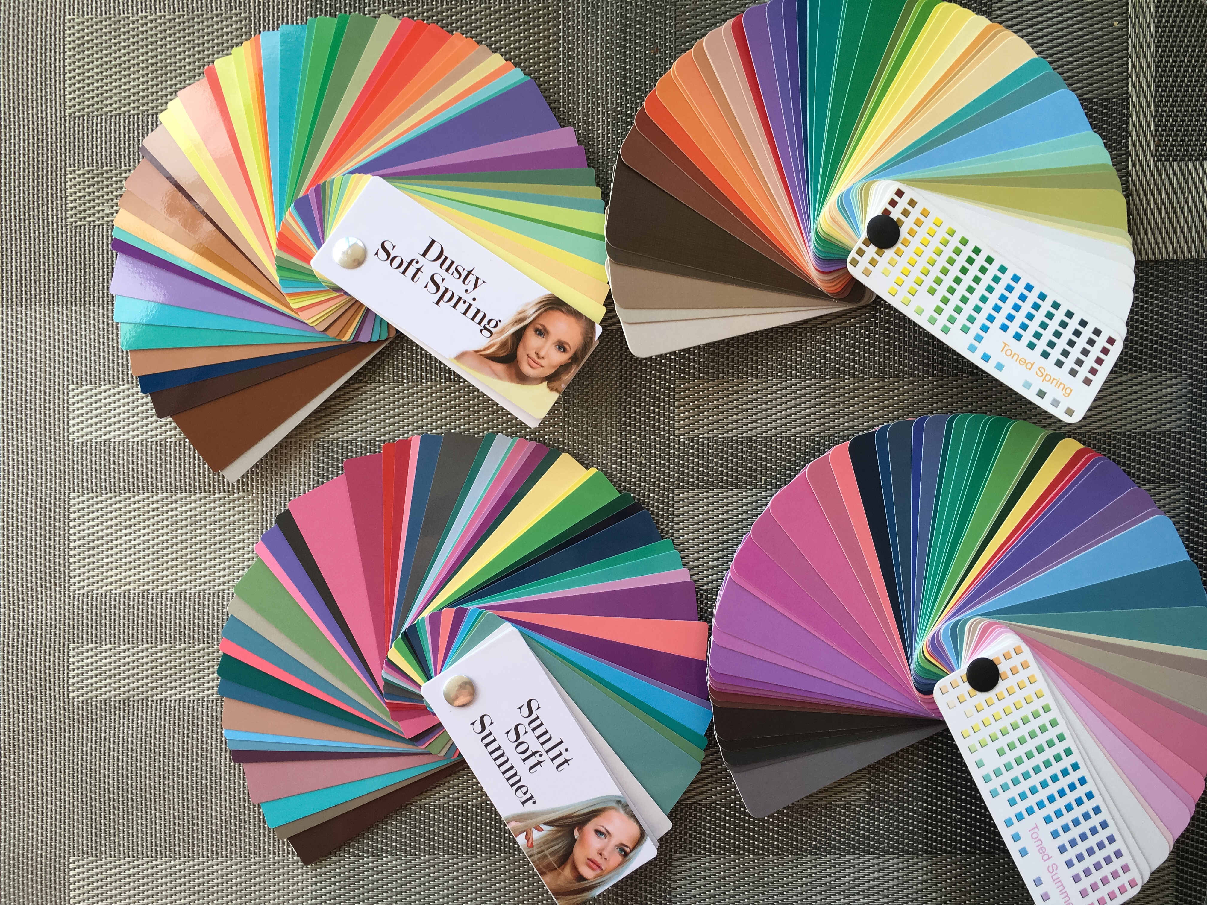
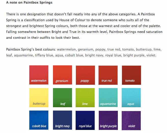
….and drum roll……My mom is a Paint Box Spring!
Find out more about the Kettlewell Spring seasons here. Since my mom could wear many of the colors in a wide colorful variety, almost like all the colors in the Crayola crayon box, my mom was announced a Paintbox Spring. Julie said she thought my mom might have been her first Paintbox spring.
Reflection on my Mom’s Analysis
I was definitely surprised my mom didn’t get the Pastel Spring, she did look fabulous in all of the Light Spring pastels. For sure if she was analyzed in 12 blueprints, I’d bet she would come out a Light Spring. I do again think that this comes down to preference and the Color Analyst is using their own artistic eyes and preferences.
Even though analyzed as a Paintbox Spring my mom can still wear many of the colors from the overall Spring palette. Her sub-season was determined by the 2 star ** colors that Julie said my mom could wear from Head to Toe (100%). However my mom received many other double stars in her 75% range (coat, suite, dress) and 50% range (top, sweater, pant, jacket, skirt that were the lighter pastels of Spring.
It did seem like some of the bolder colors really are very nice on my mom so I do like Julie’s eye for my mom to wear some of the bolder and warmer color mixes from the palette and not to just stick to the pastels.
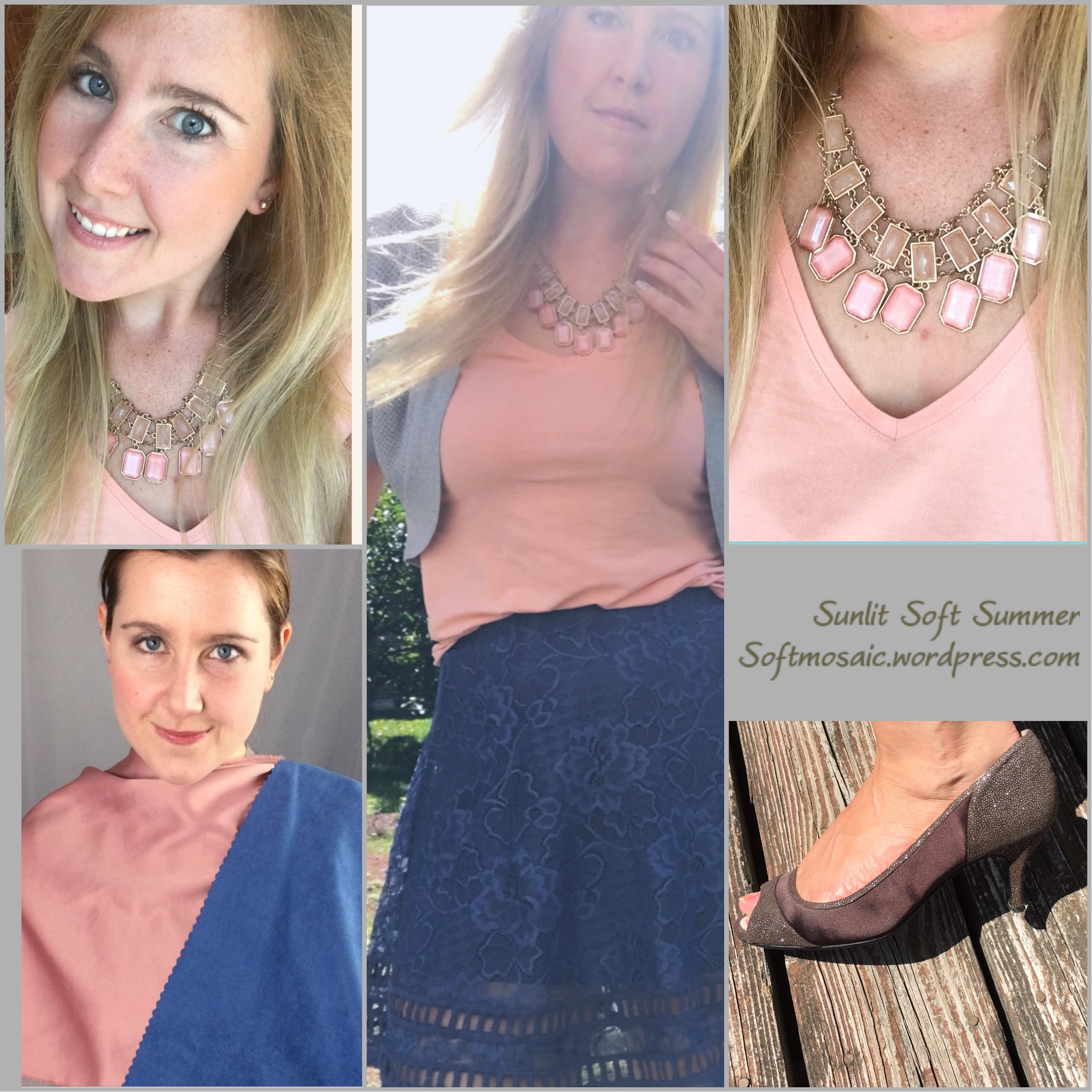
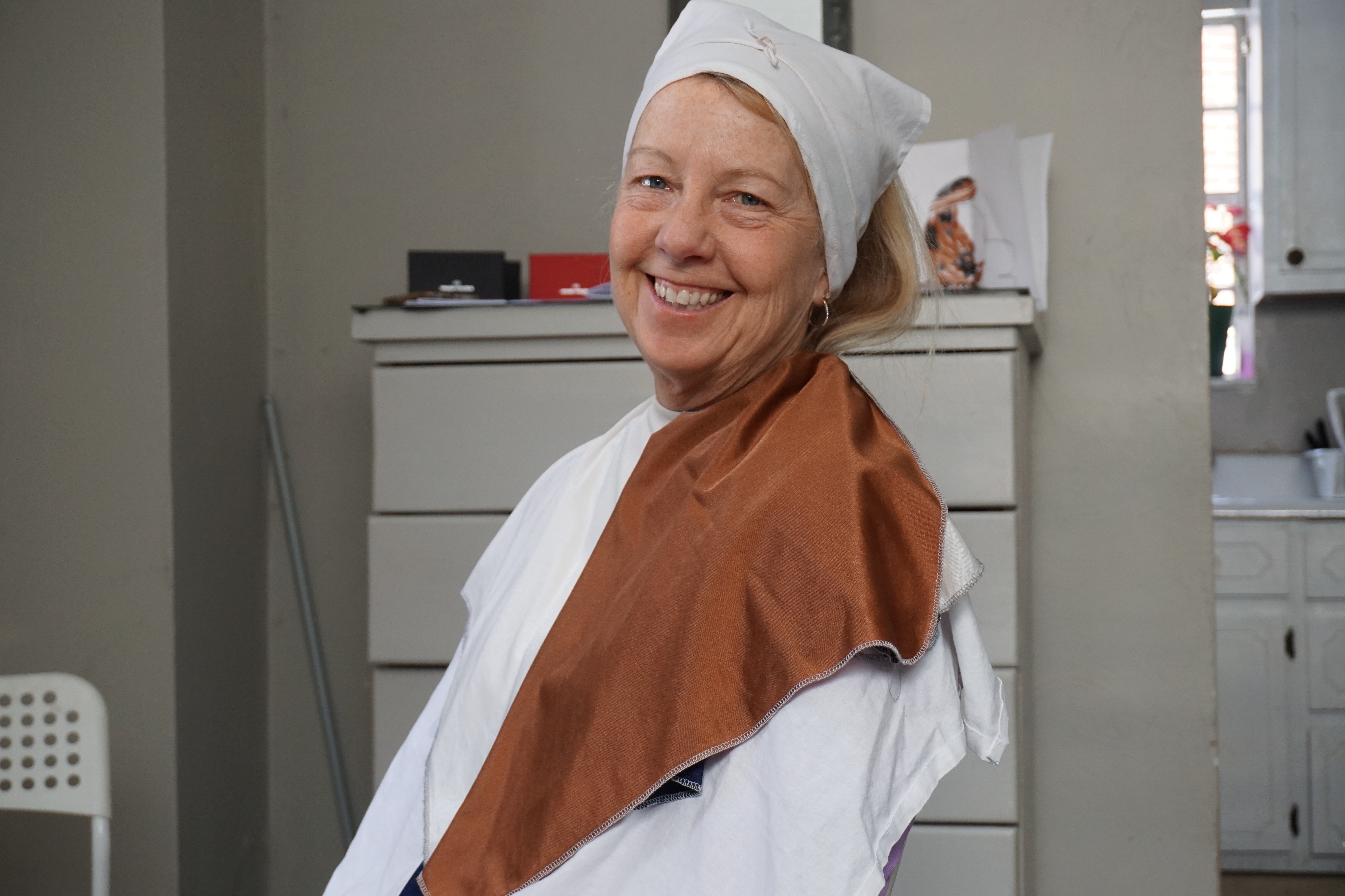
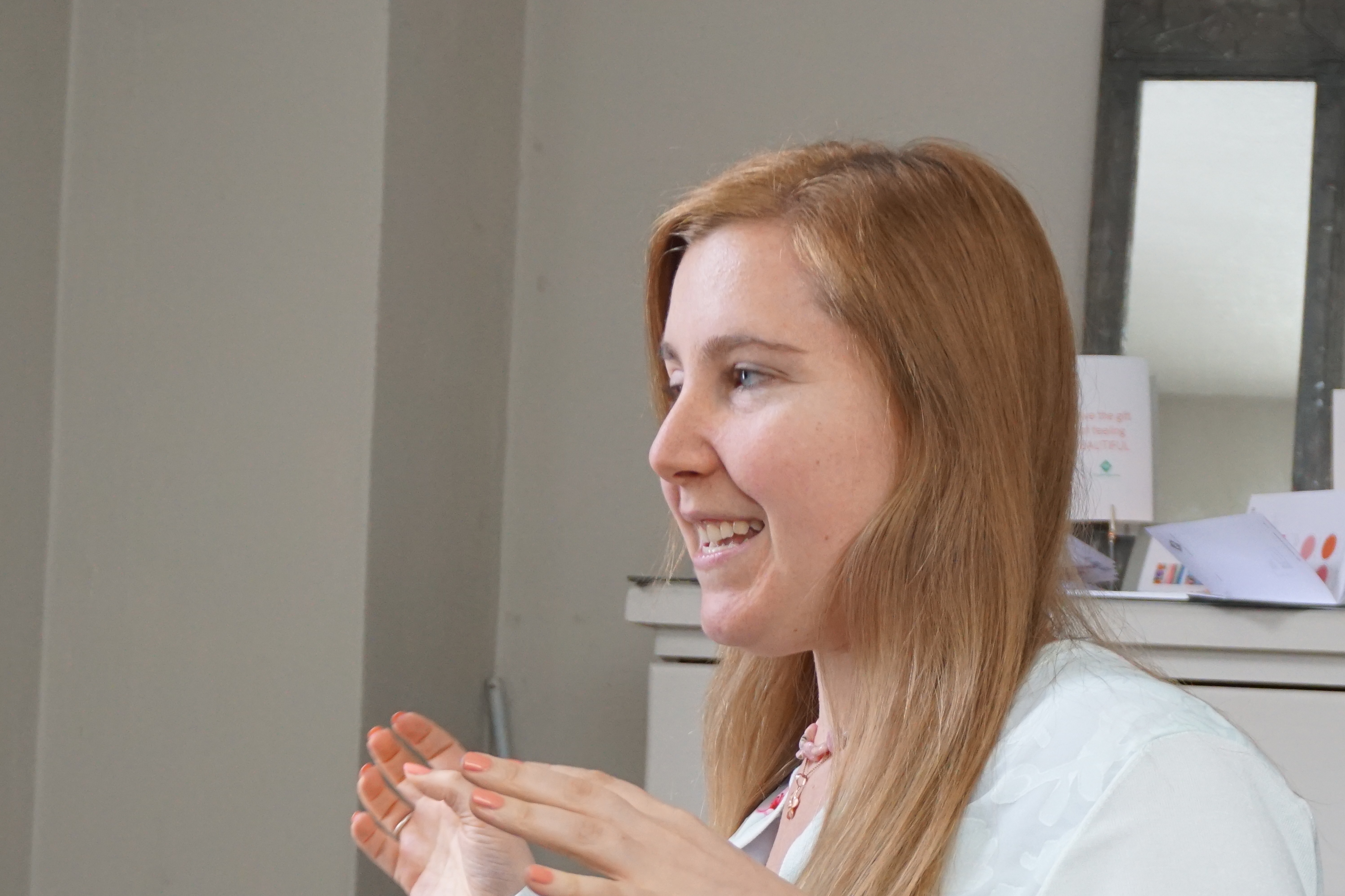
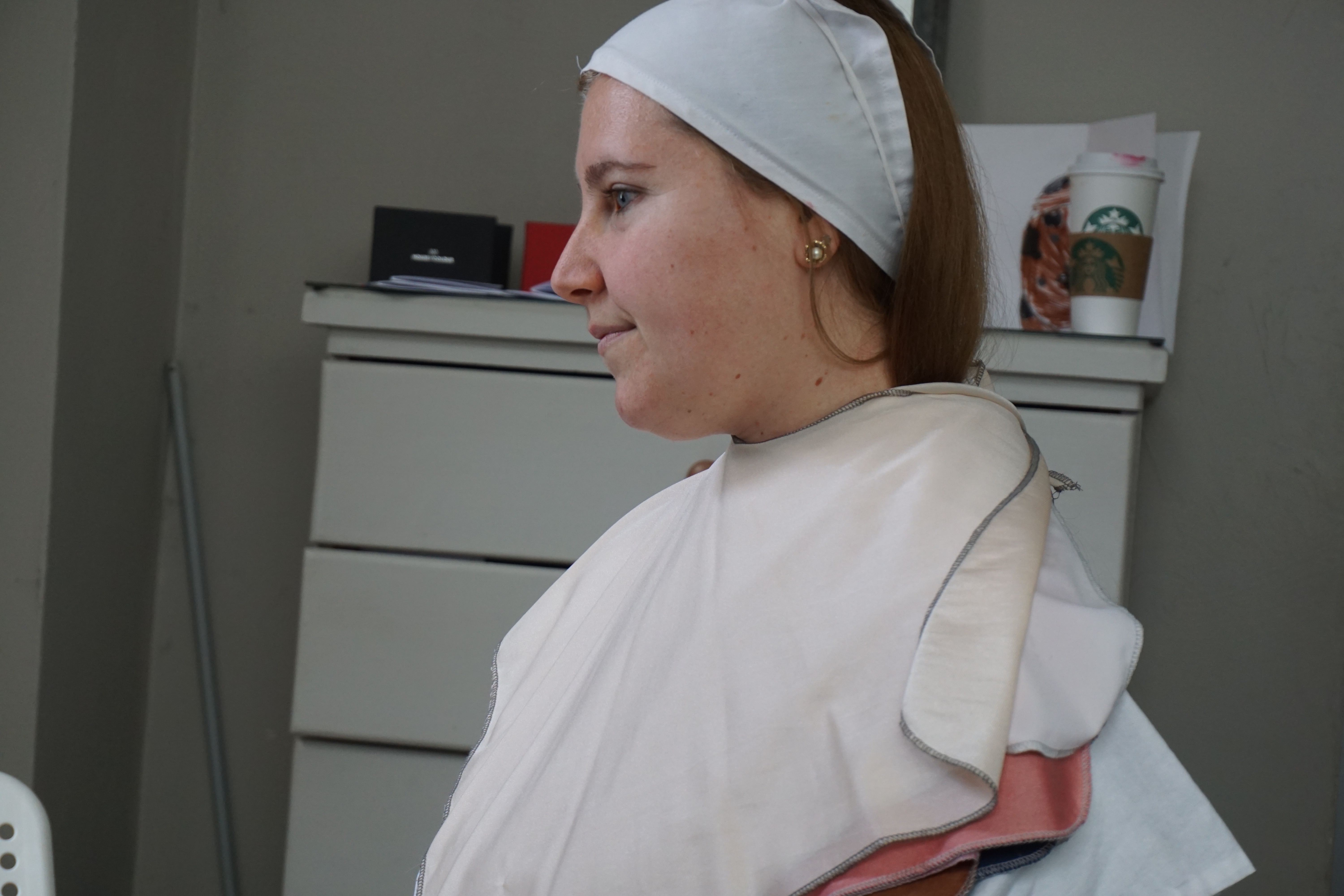
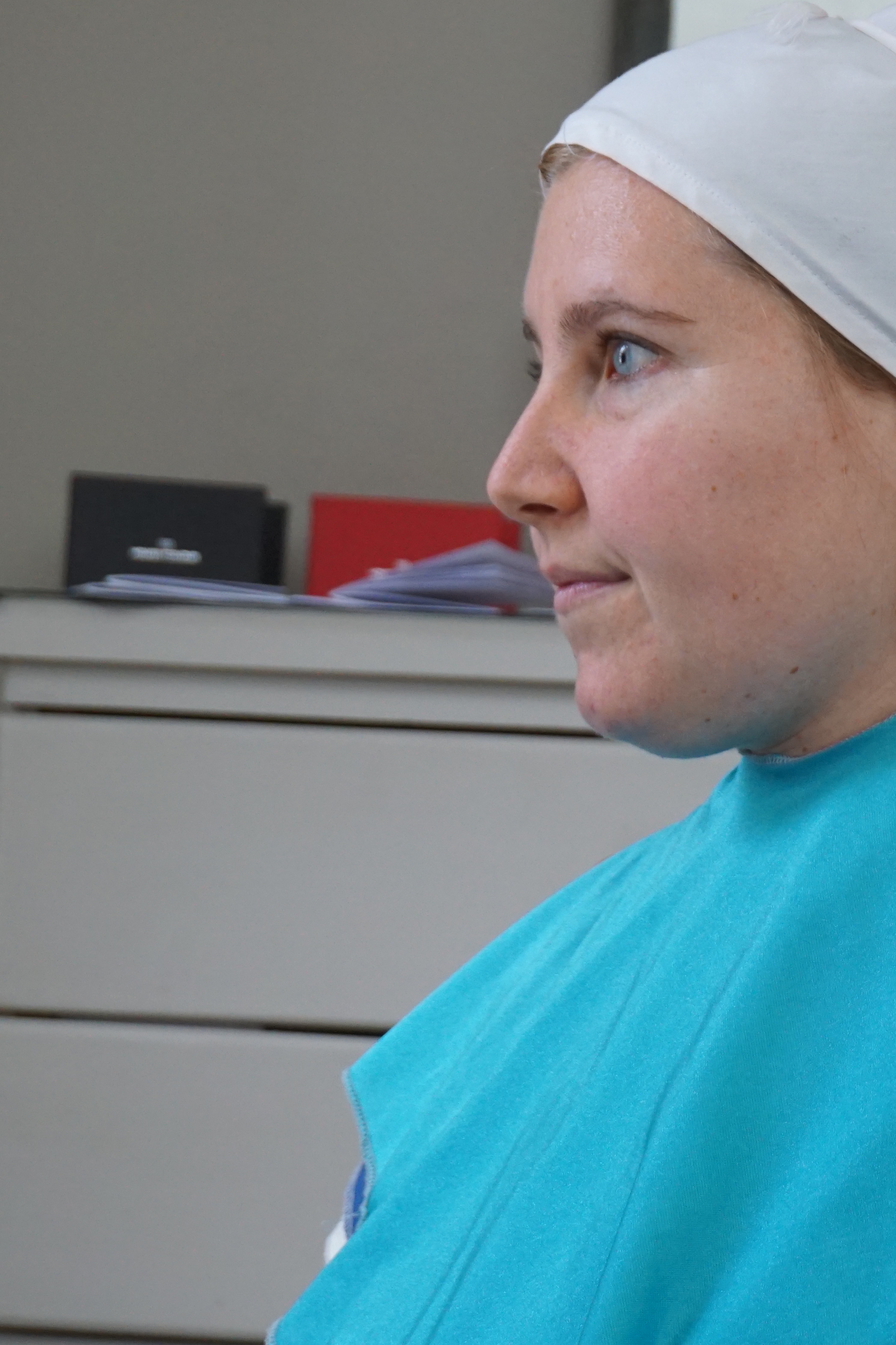
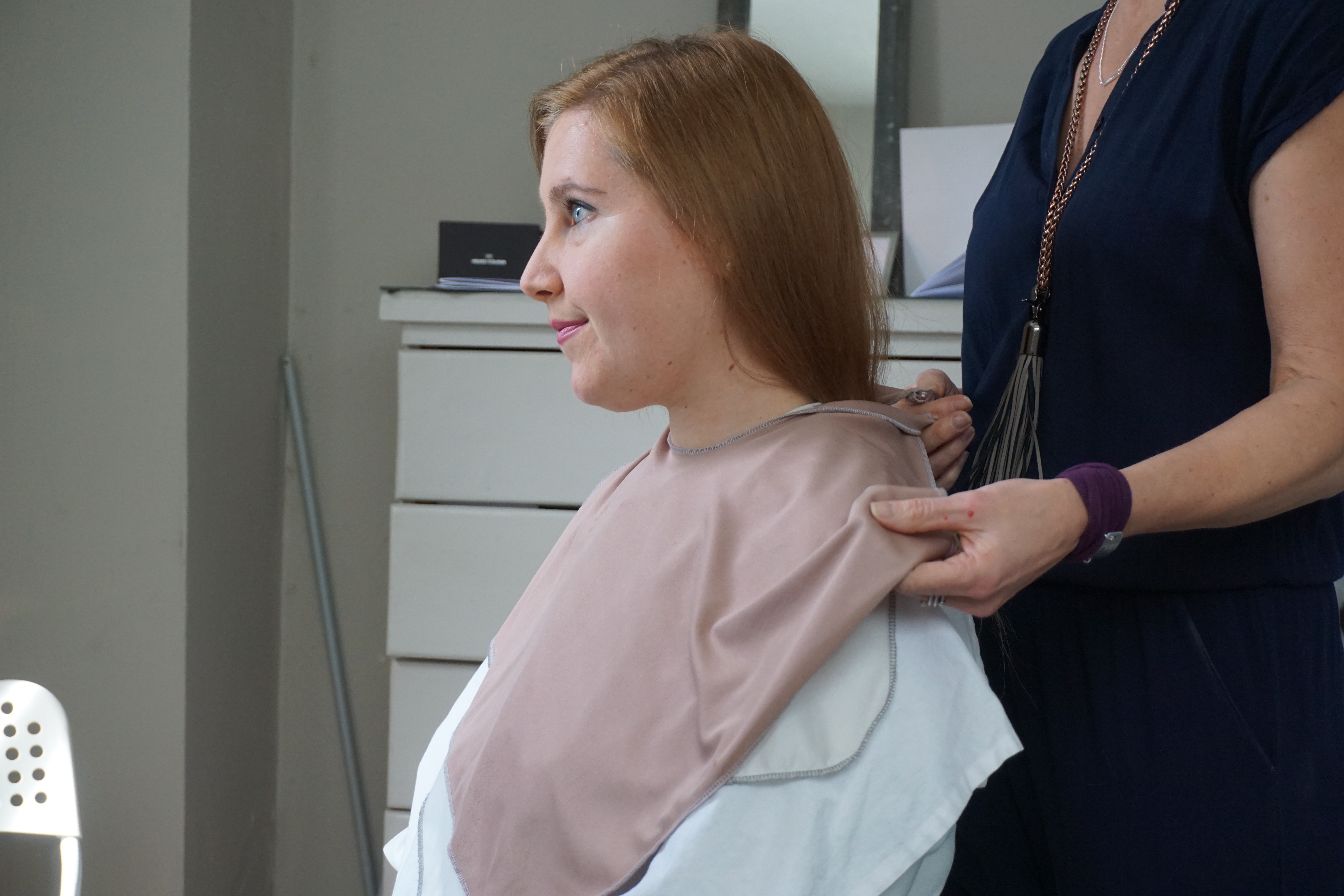
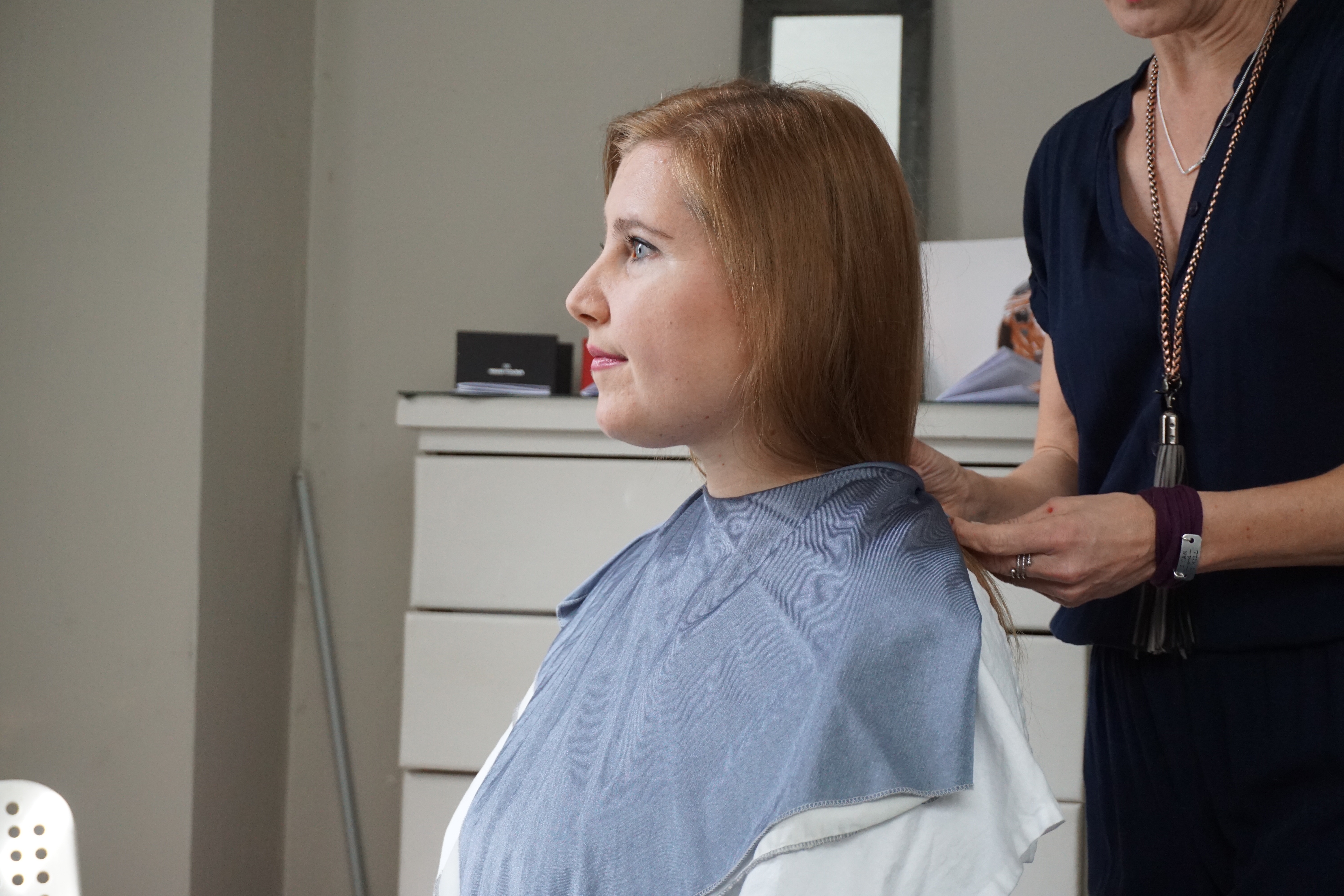
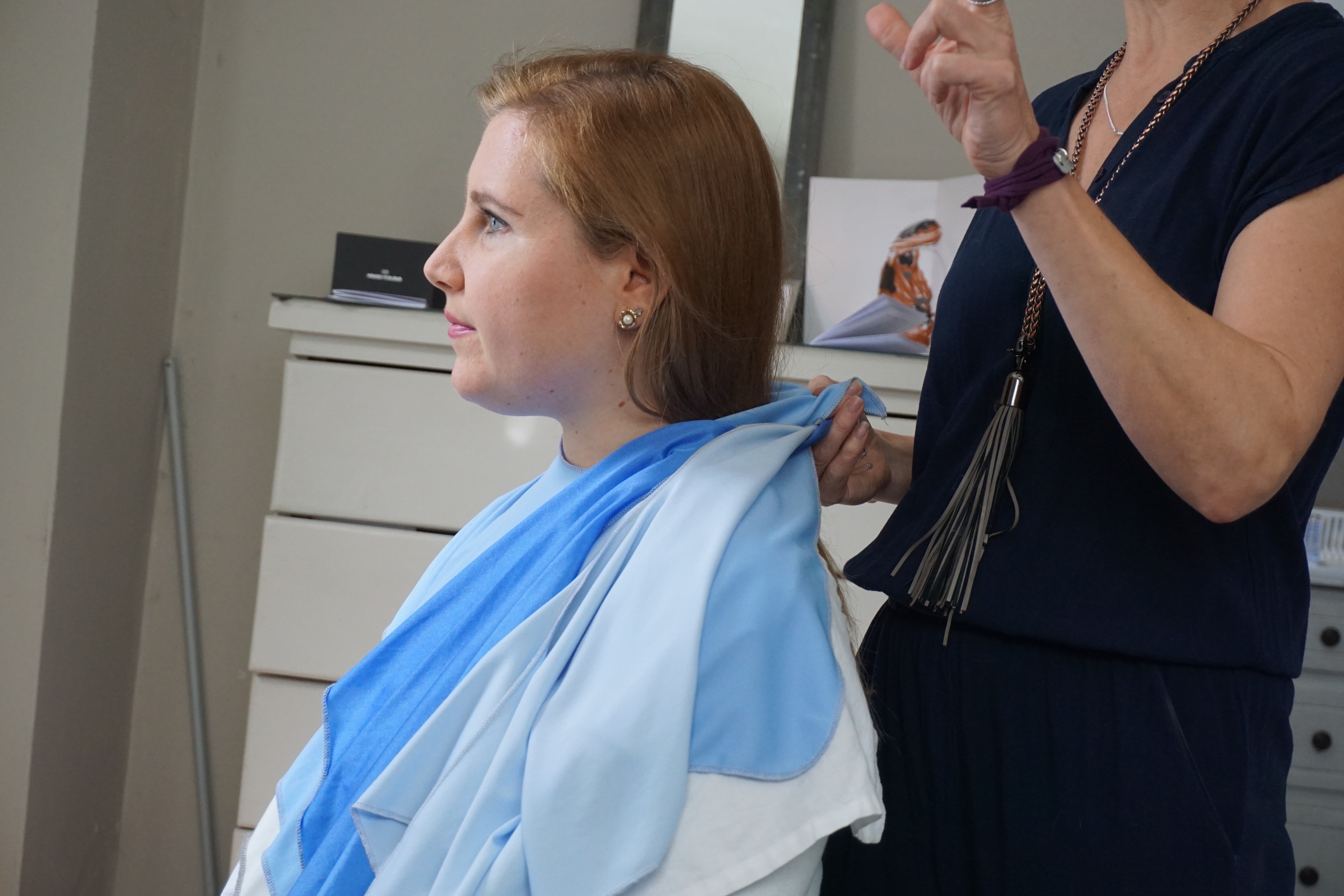
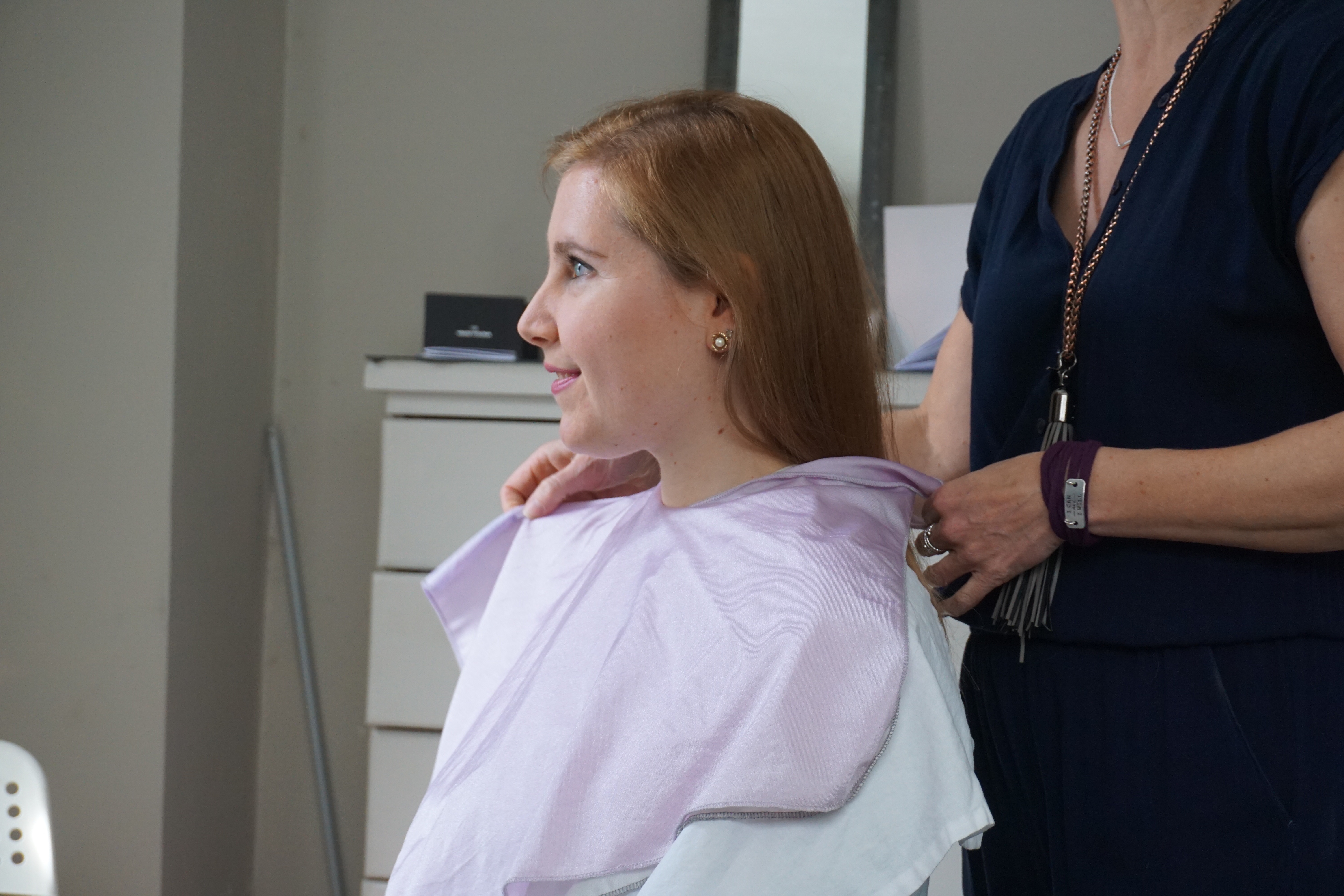
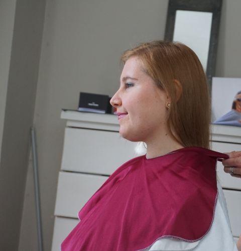
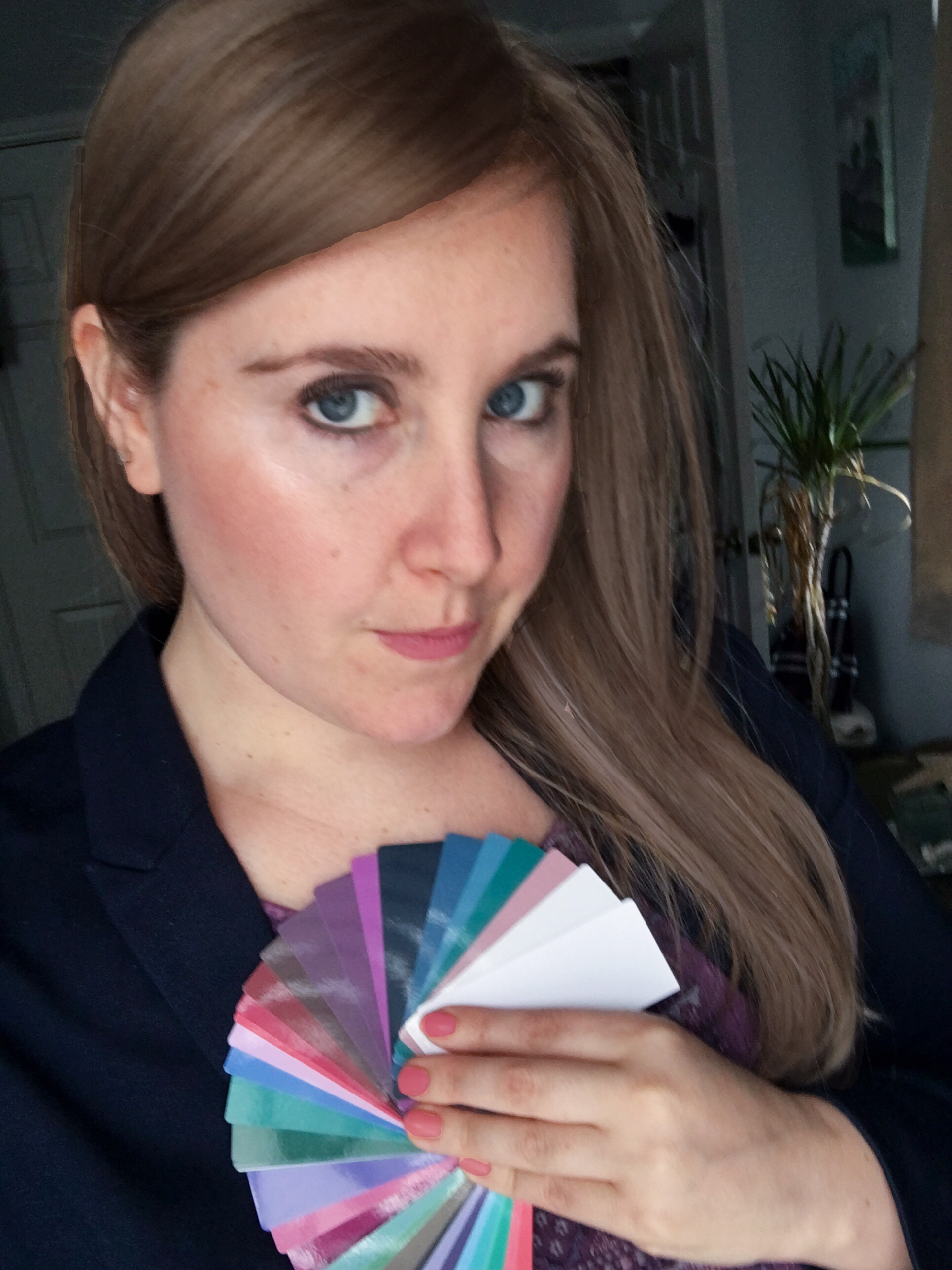
My Color Analysis
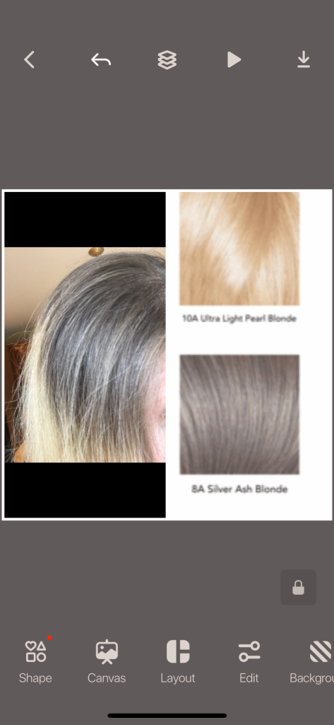
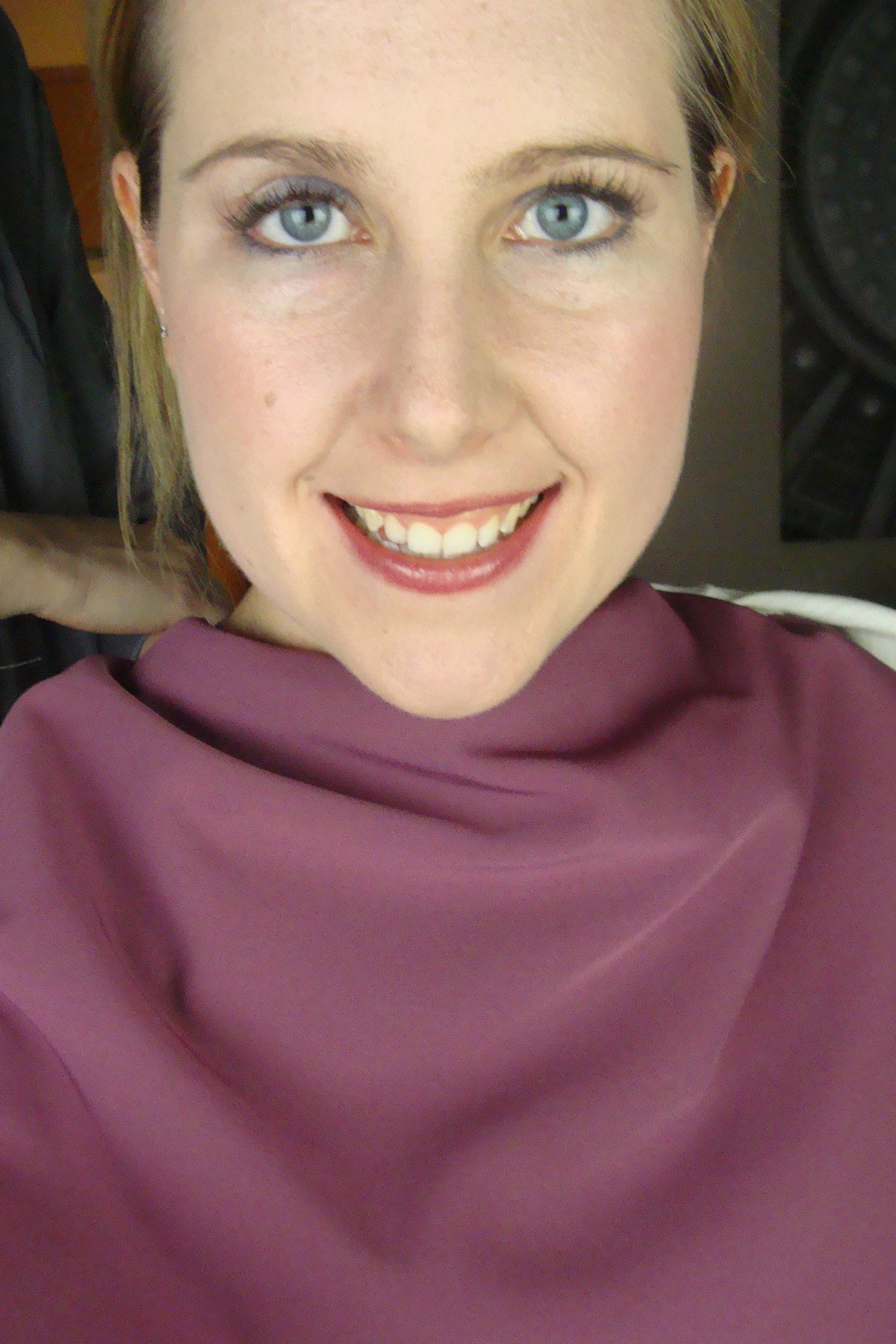
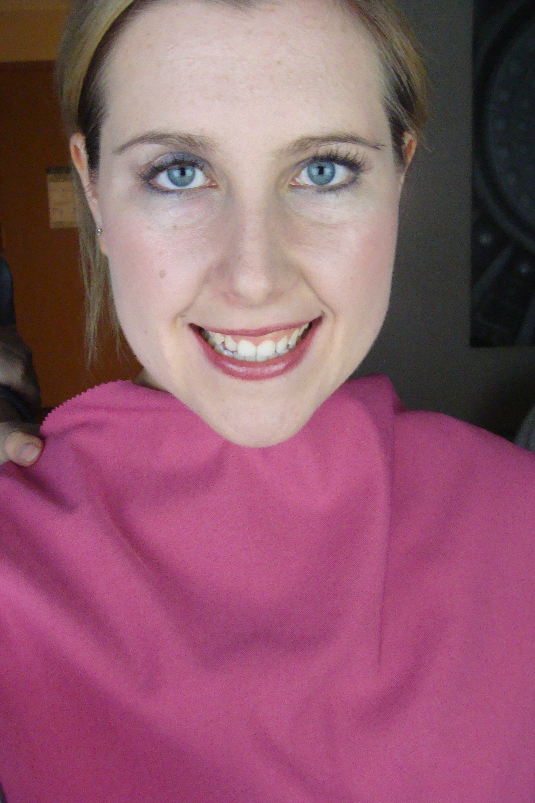
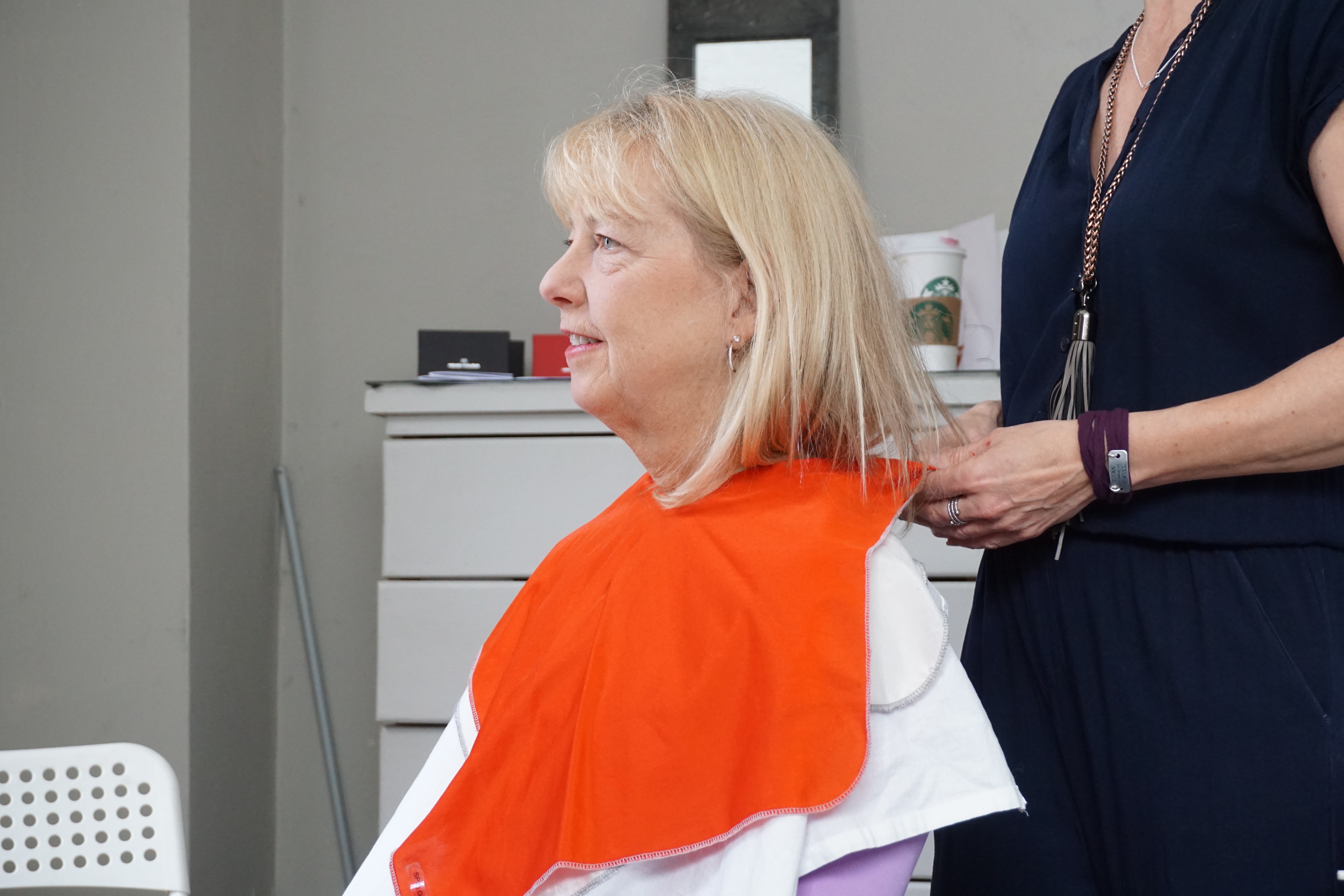
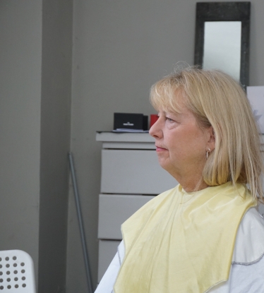
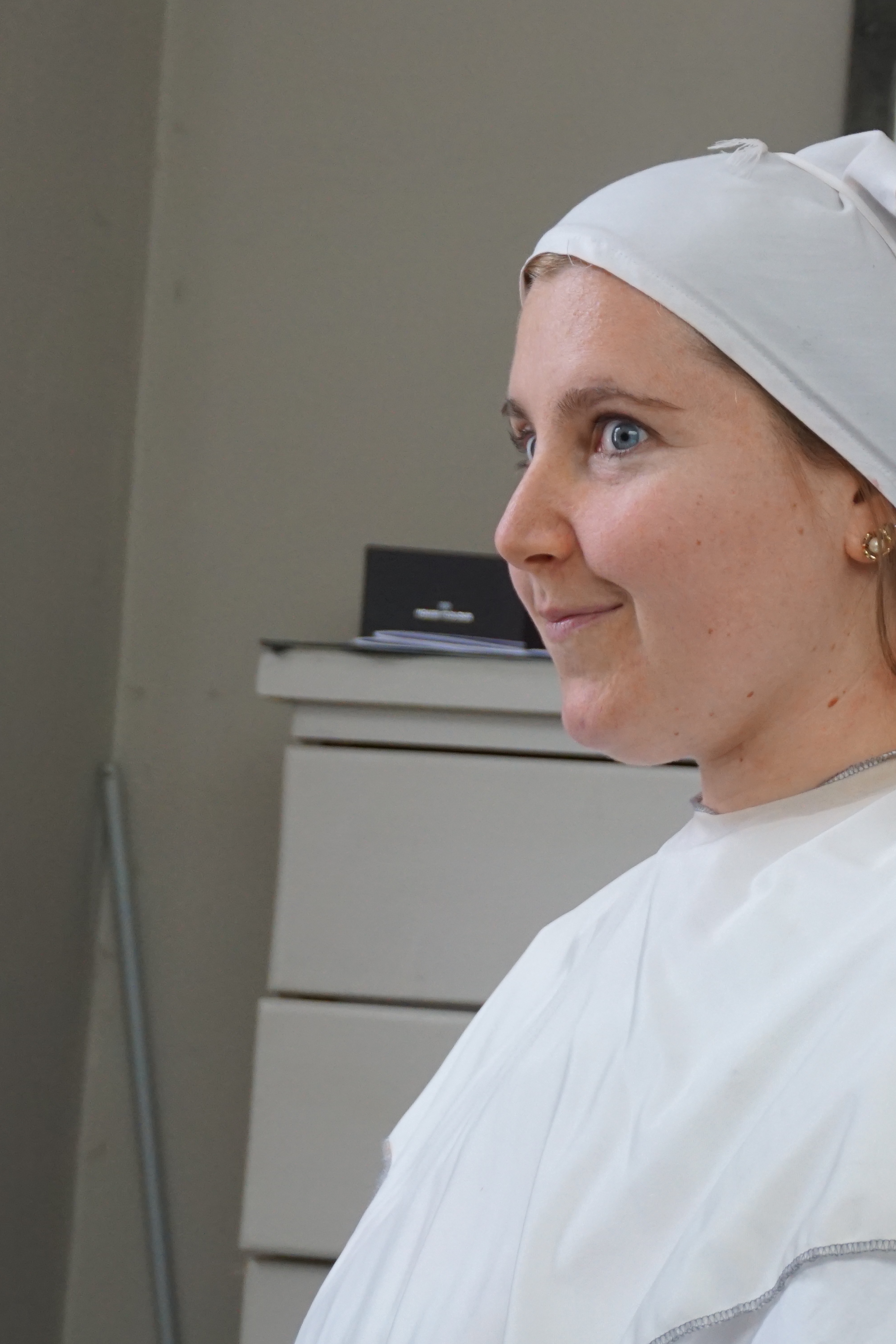
Here my hair is pretty warm and brassed after many Coconut oil treatments to help heal my hair and of course me being neutral I am pulling this off a tad more then what one would think I should. Julie asked me if my hair was natural and she said it looked good. I told her it was dyed and went a little warm and by a little sort of a lot! My partner shouted out that my hair isn’t this orange color naturally, haha so now there was no question.
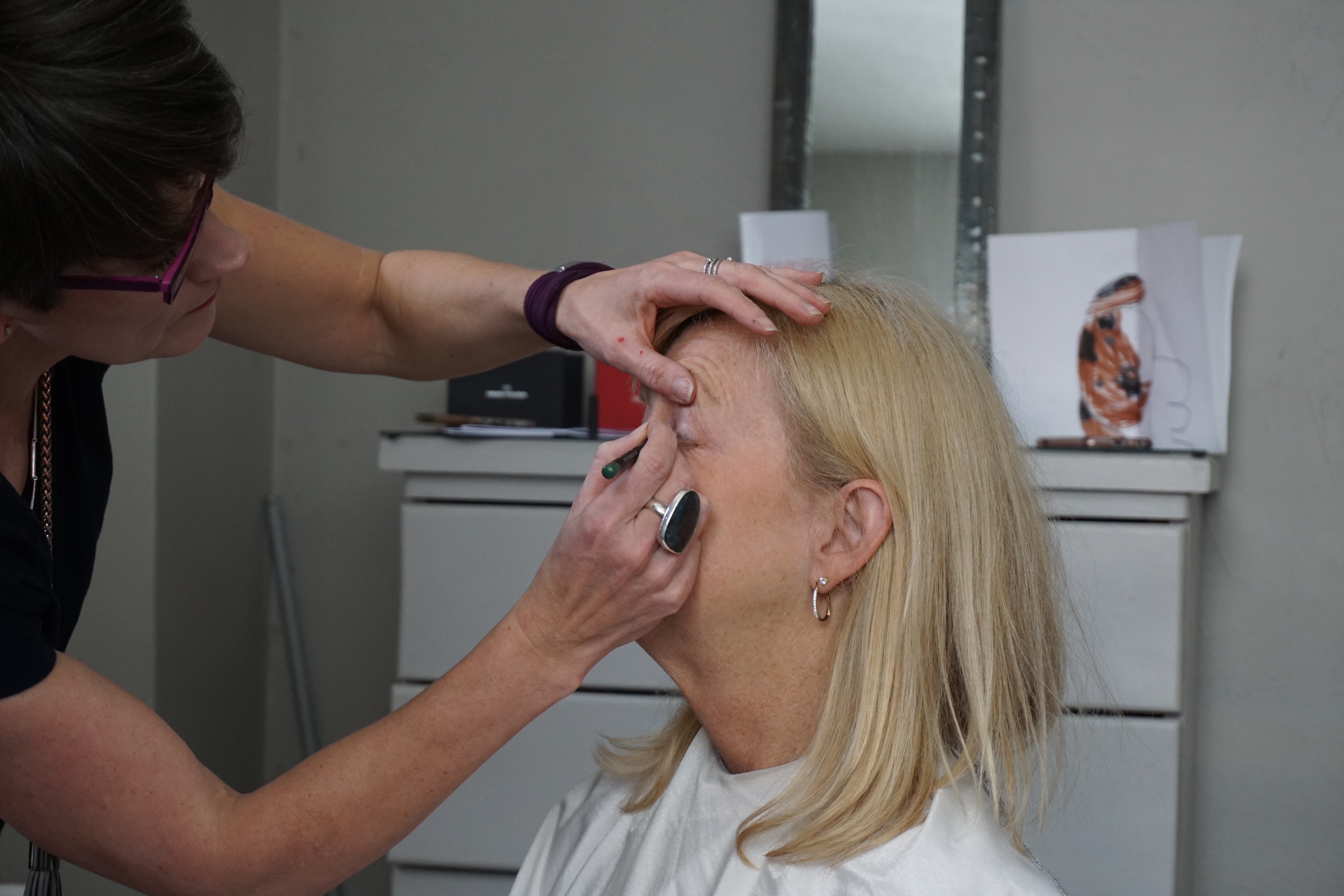
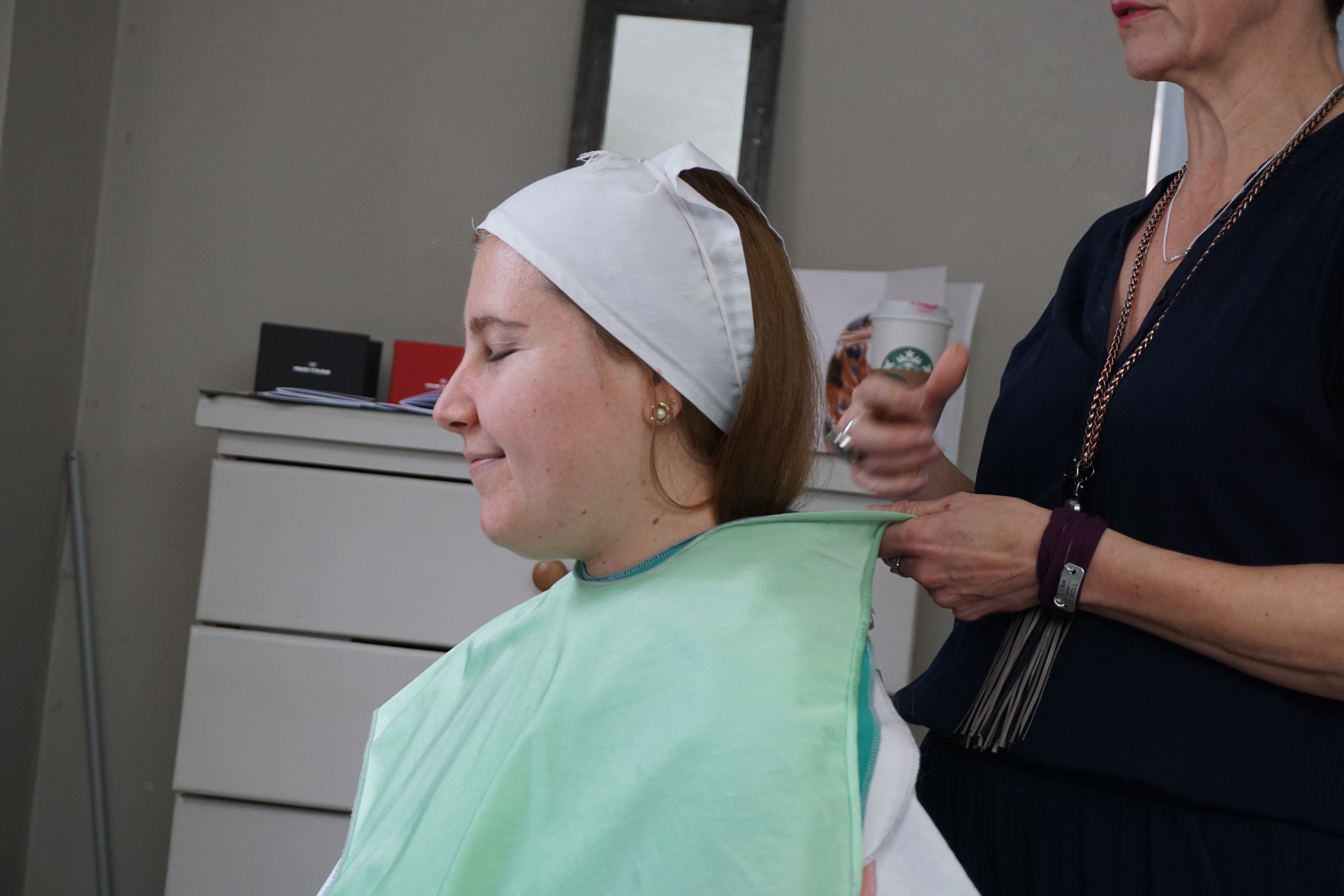
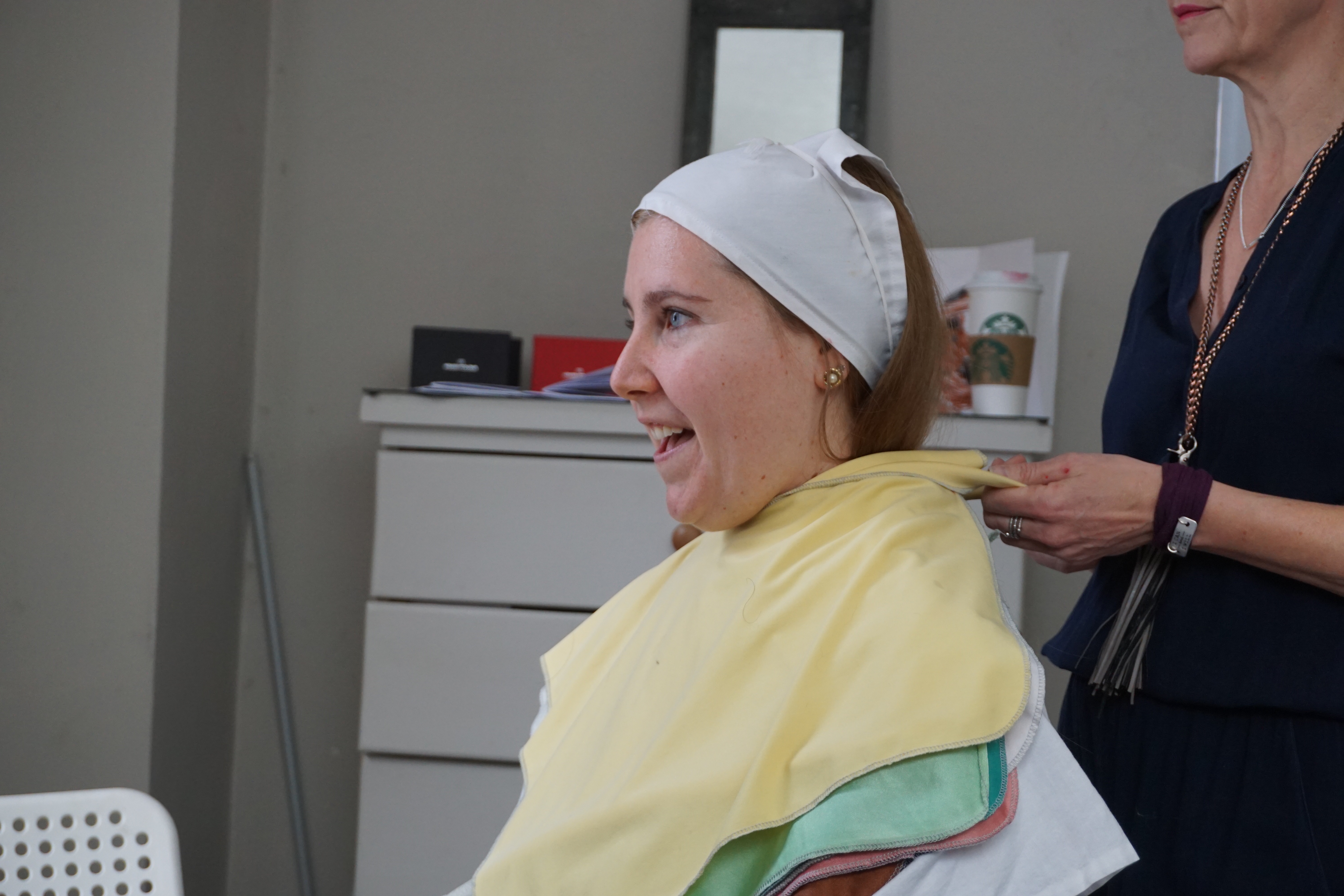
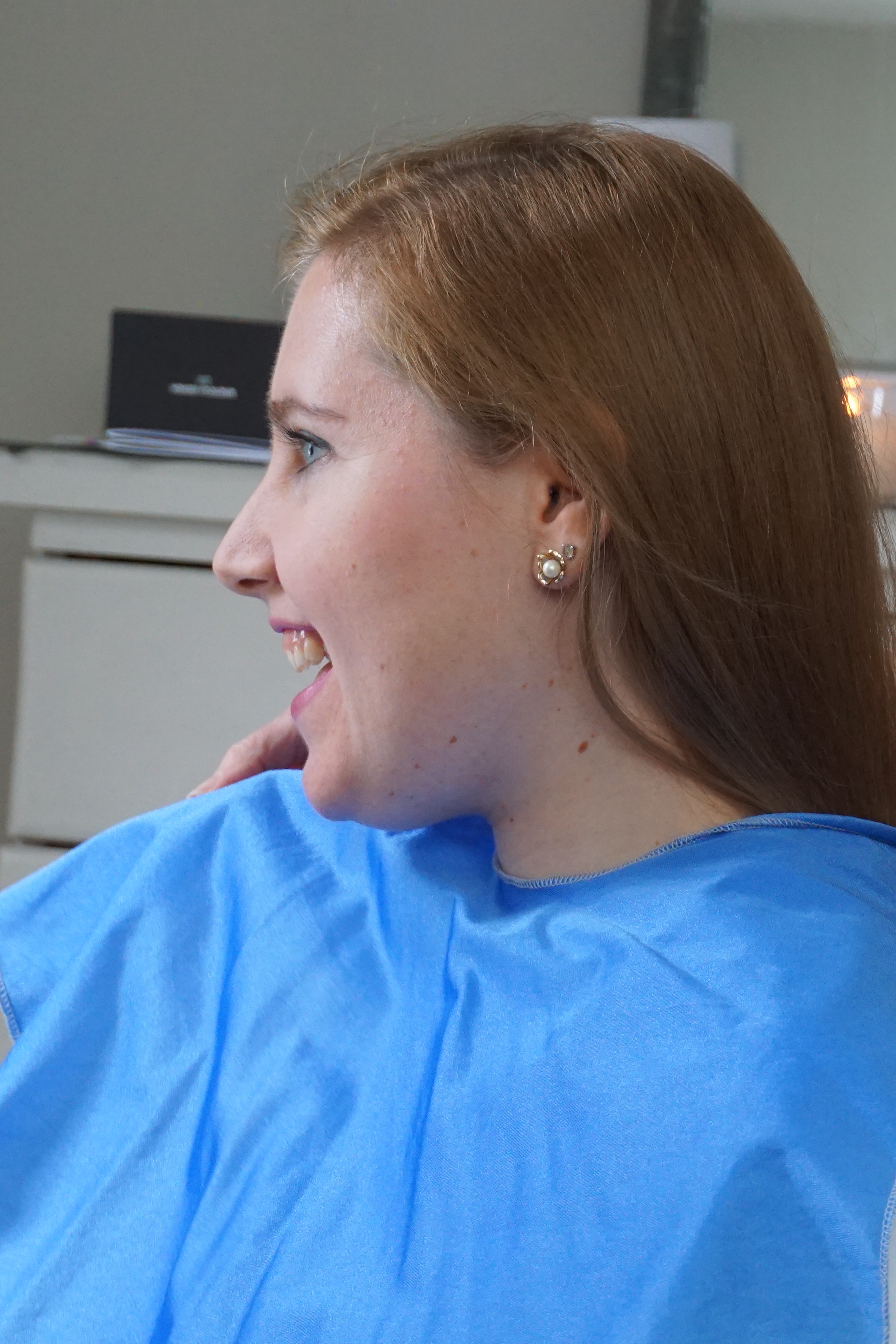
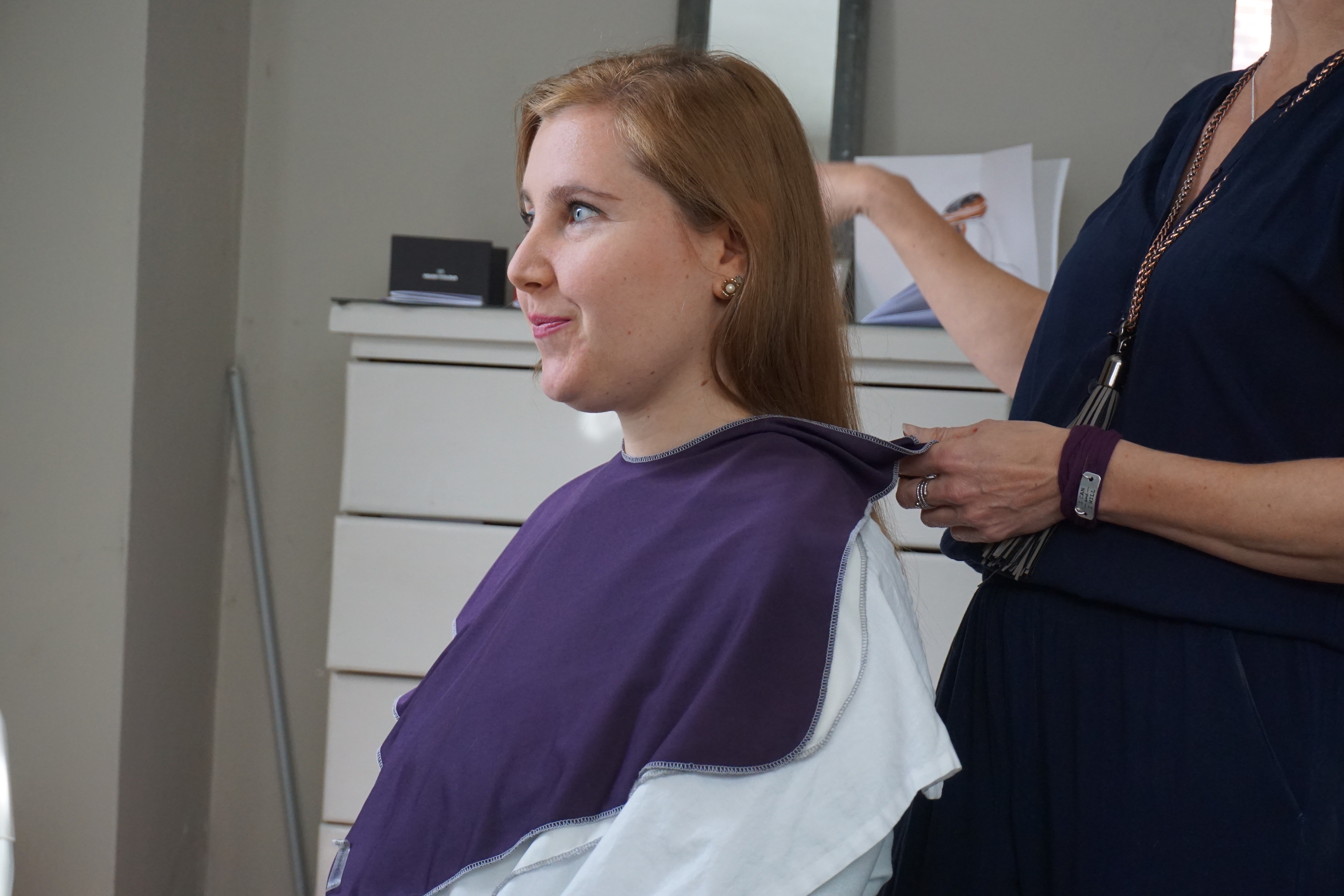
My hair is pulled back, and I am excited. Trying to keep in my expressions or my opinions because I have become very opinionated about colors over the years on me from studying color.
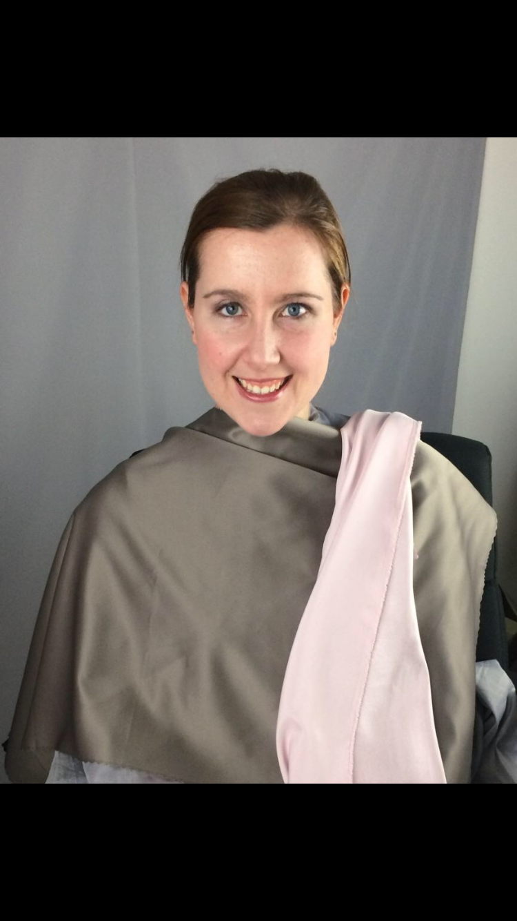
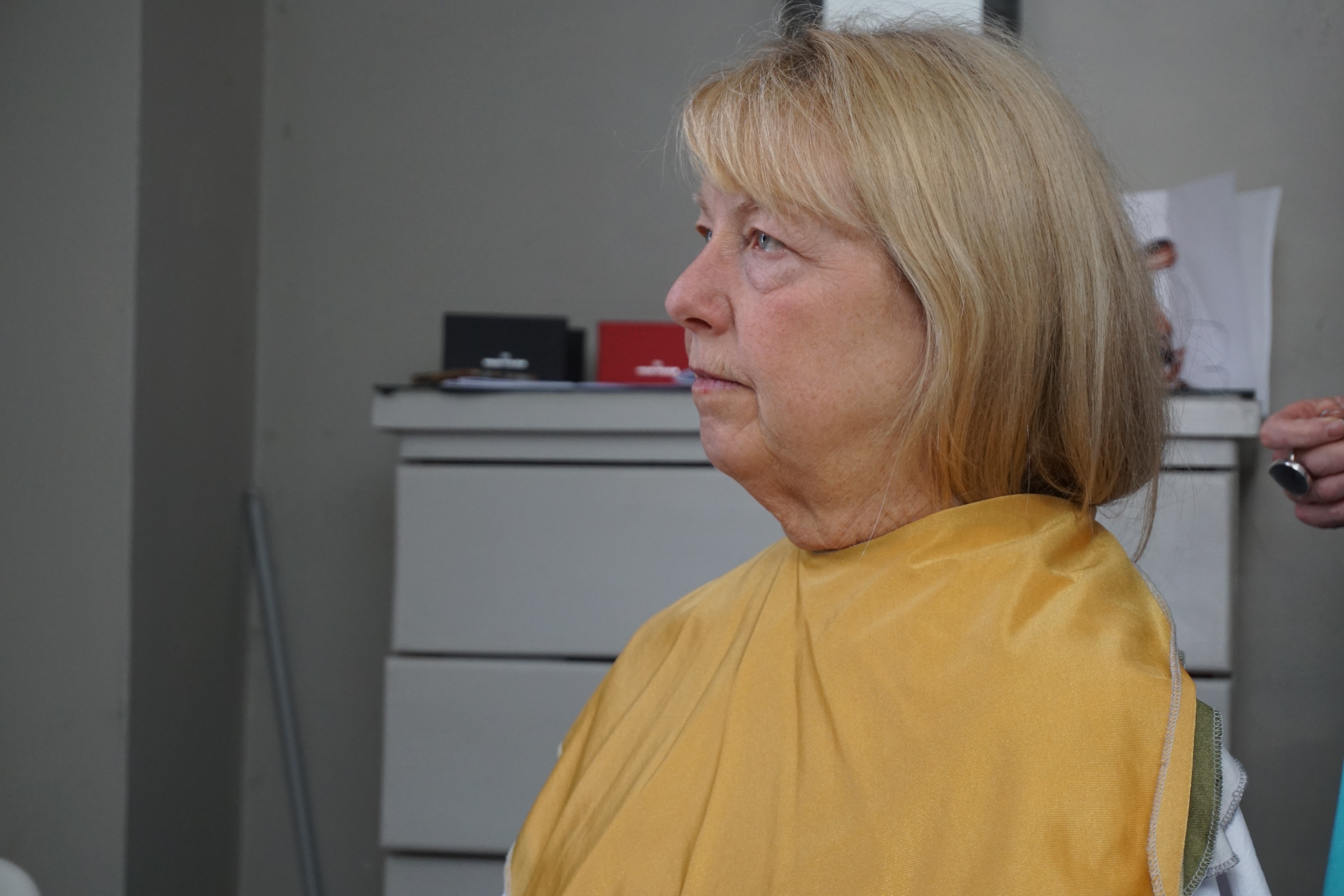
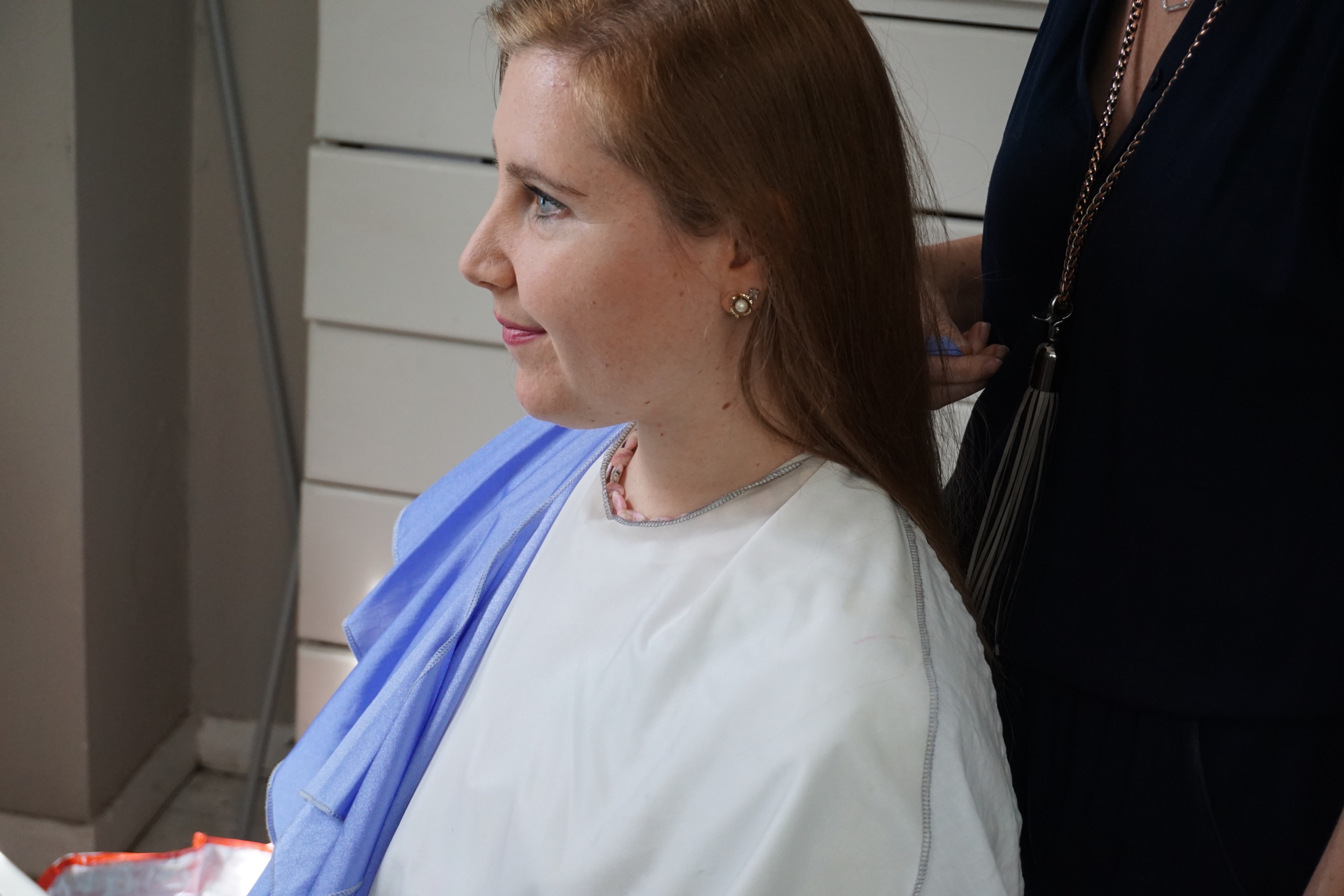
So here, I looked pretty okay in both the warm and cool drapes. There is no “high spectrum lighting” on me which in my opinion washes and cools out subtle warmth like mine immediately. I was tricky at first. Julie said that I am not as bright as my mom but still had some brightness and definite brightness in my eyes. I personally also think my skin has an unusual “soft” brightness.
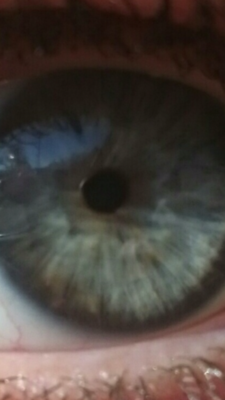
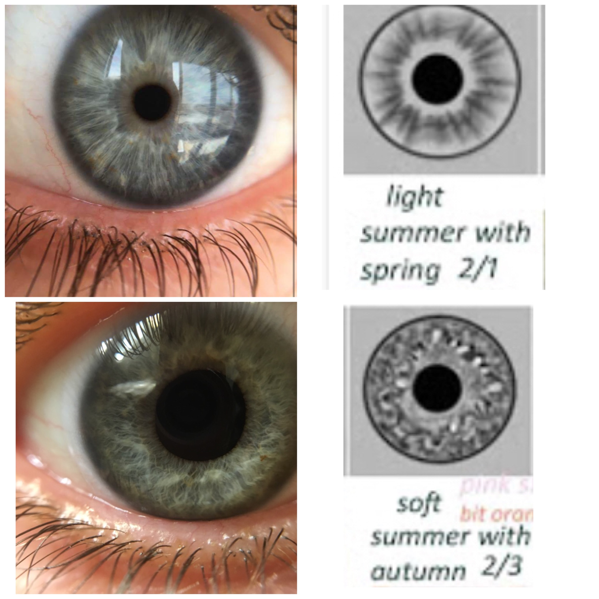
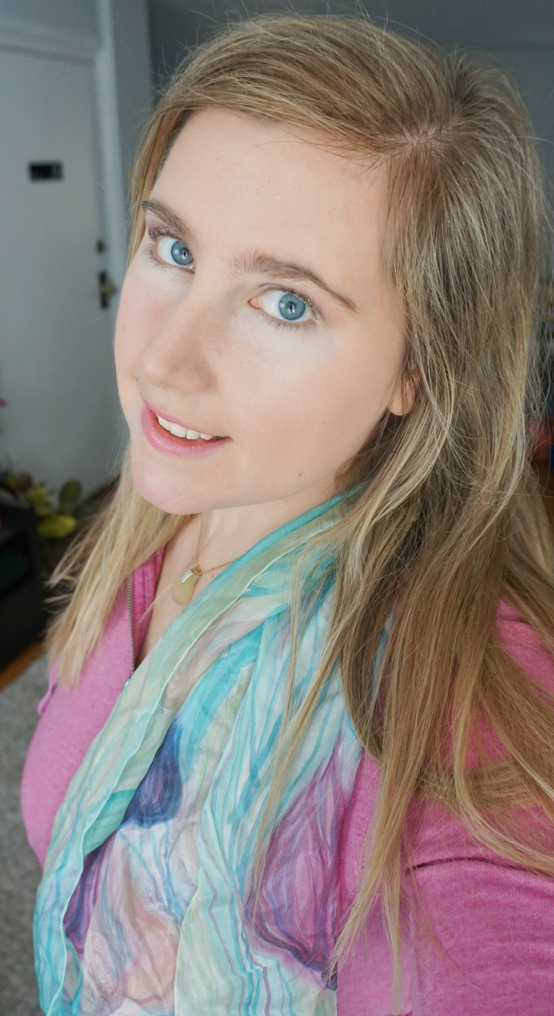
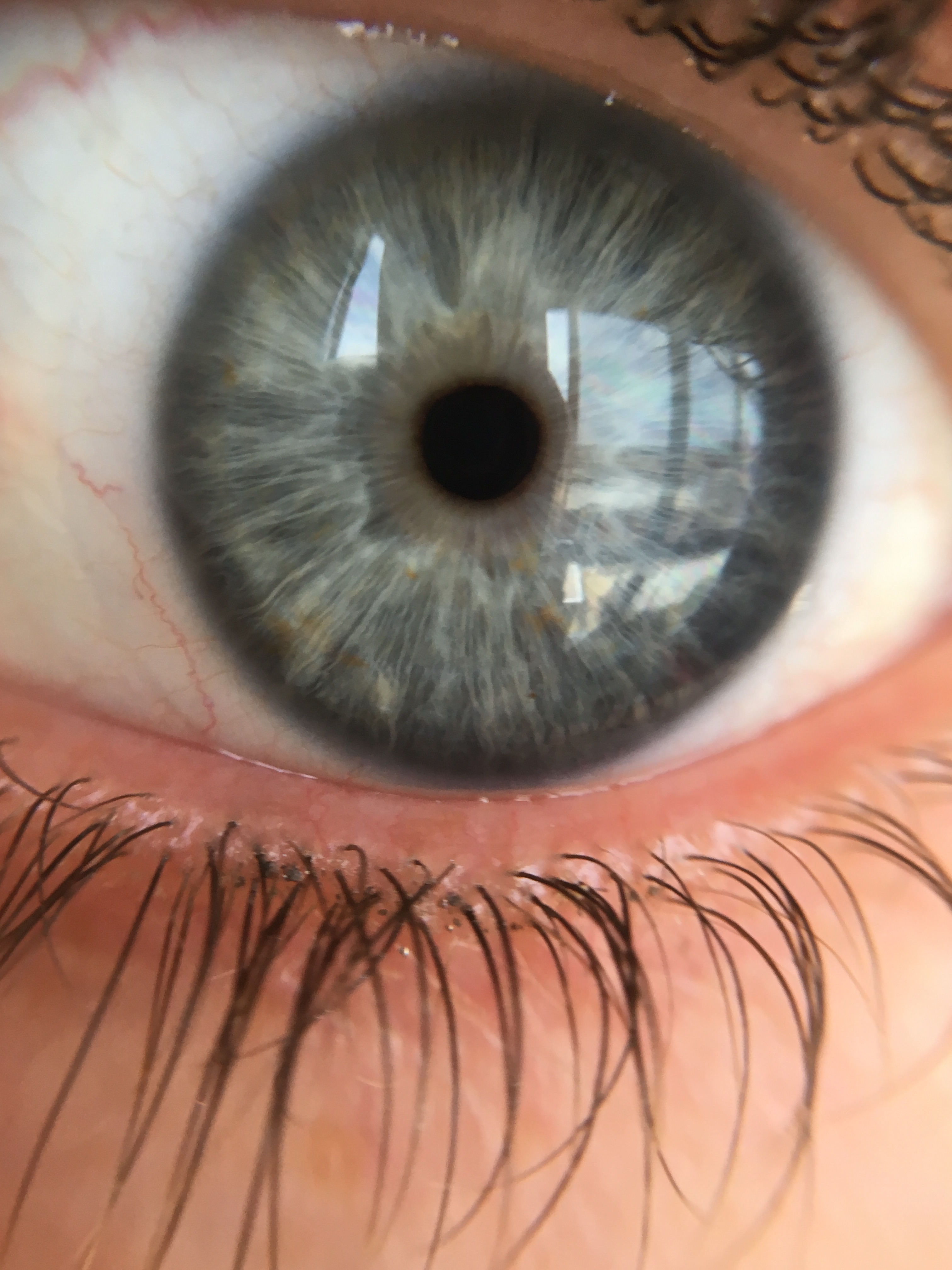
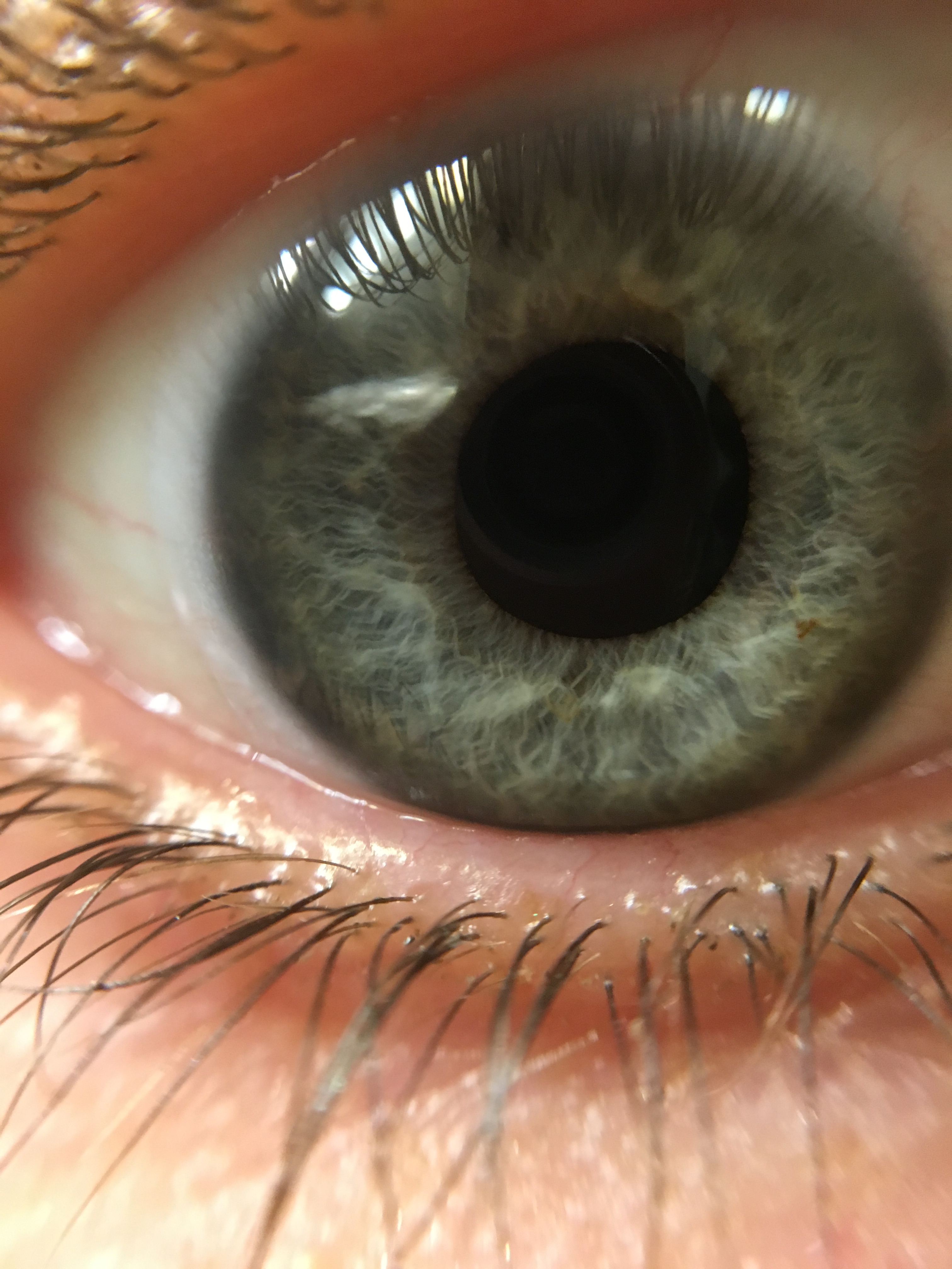
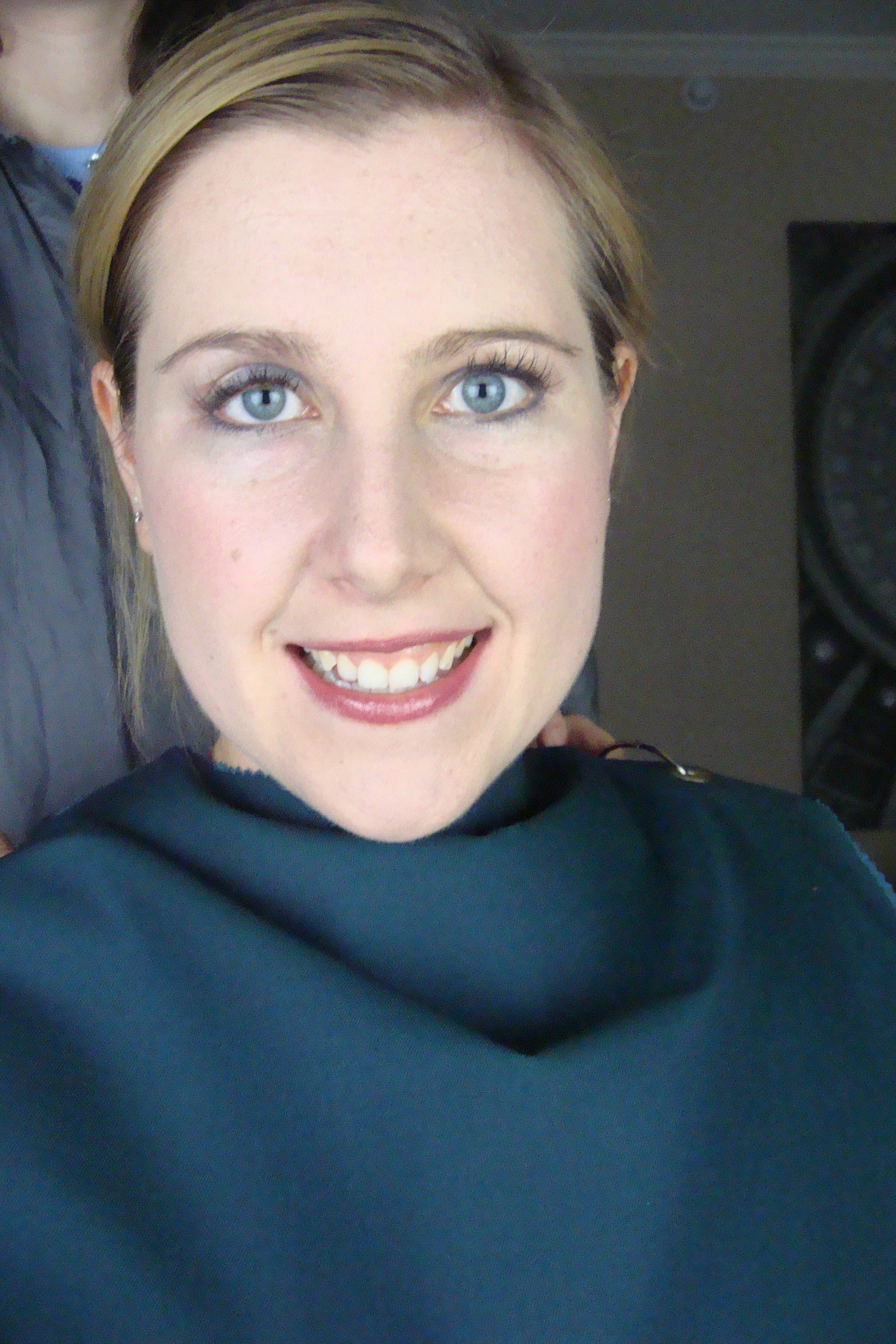
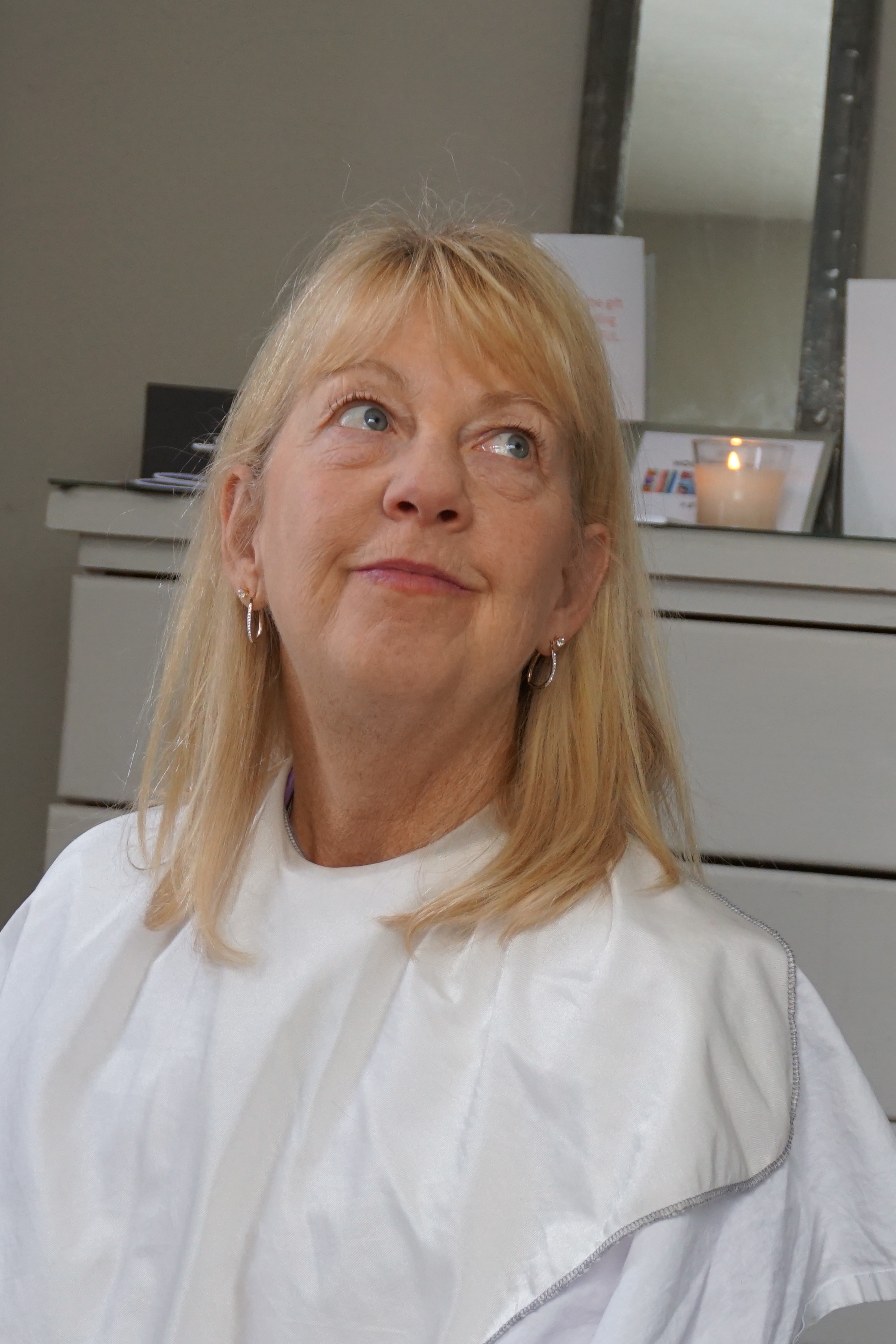
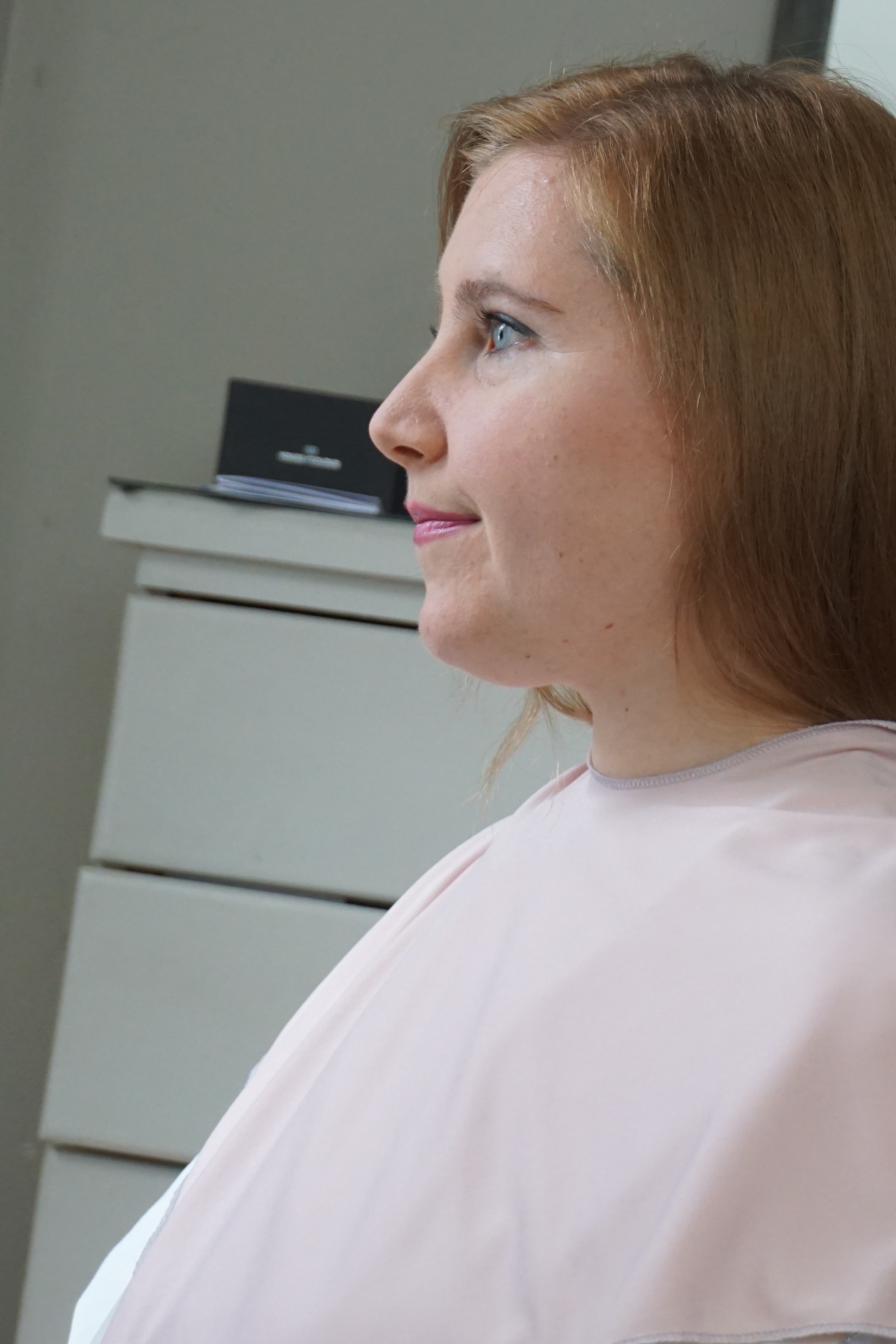
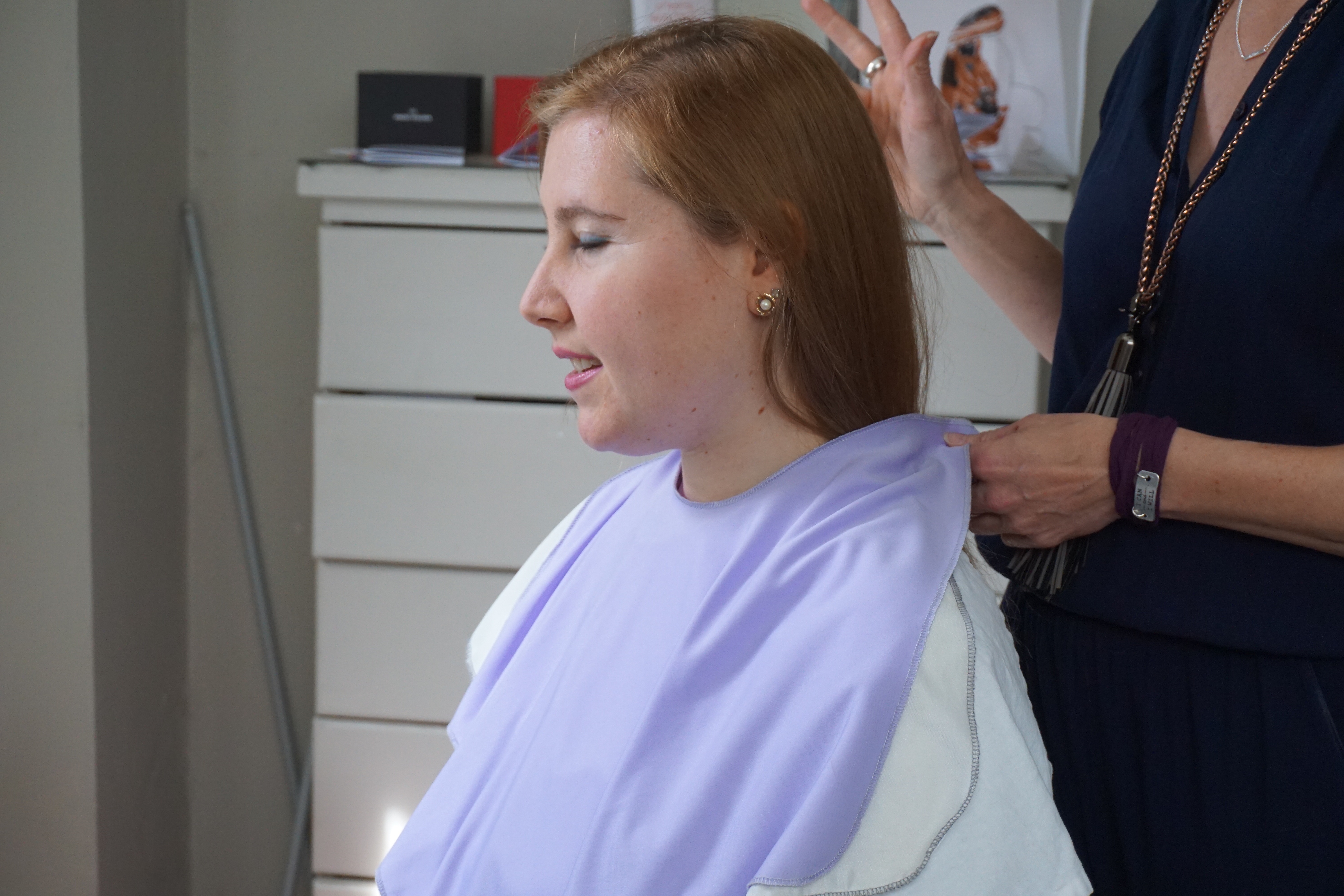
Here is my eye color and my natural hair color. You can see my eyes have some clarity and my hair can look darker when it has no sun influence, but give my hair some sunlight and my hair is a much lighter and warms up with less visible ash.
We looked at ivory verse a blue based white and really it wasn’t obvious at first for Spring or Summer.
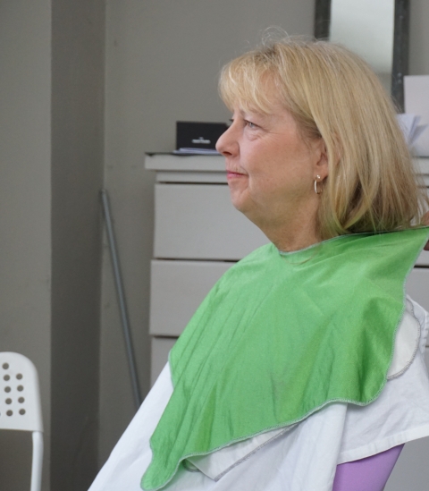
The apple green looks surprisingly okay on me from side view but was creating some blotchy skin from front view. I don’t seem to look as great in it as my mom did.

So many decisions to make here!
Oh the yellow! For sure, yellow is not my best color, even in my own season it’s not great and it certainly was not great in Spring.
Again the Spring blue is a bit much and blotchy on my face, but I didn’t think it was terrible just not really harmonizing.
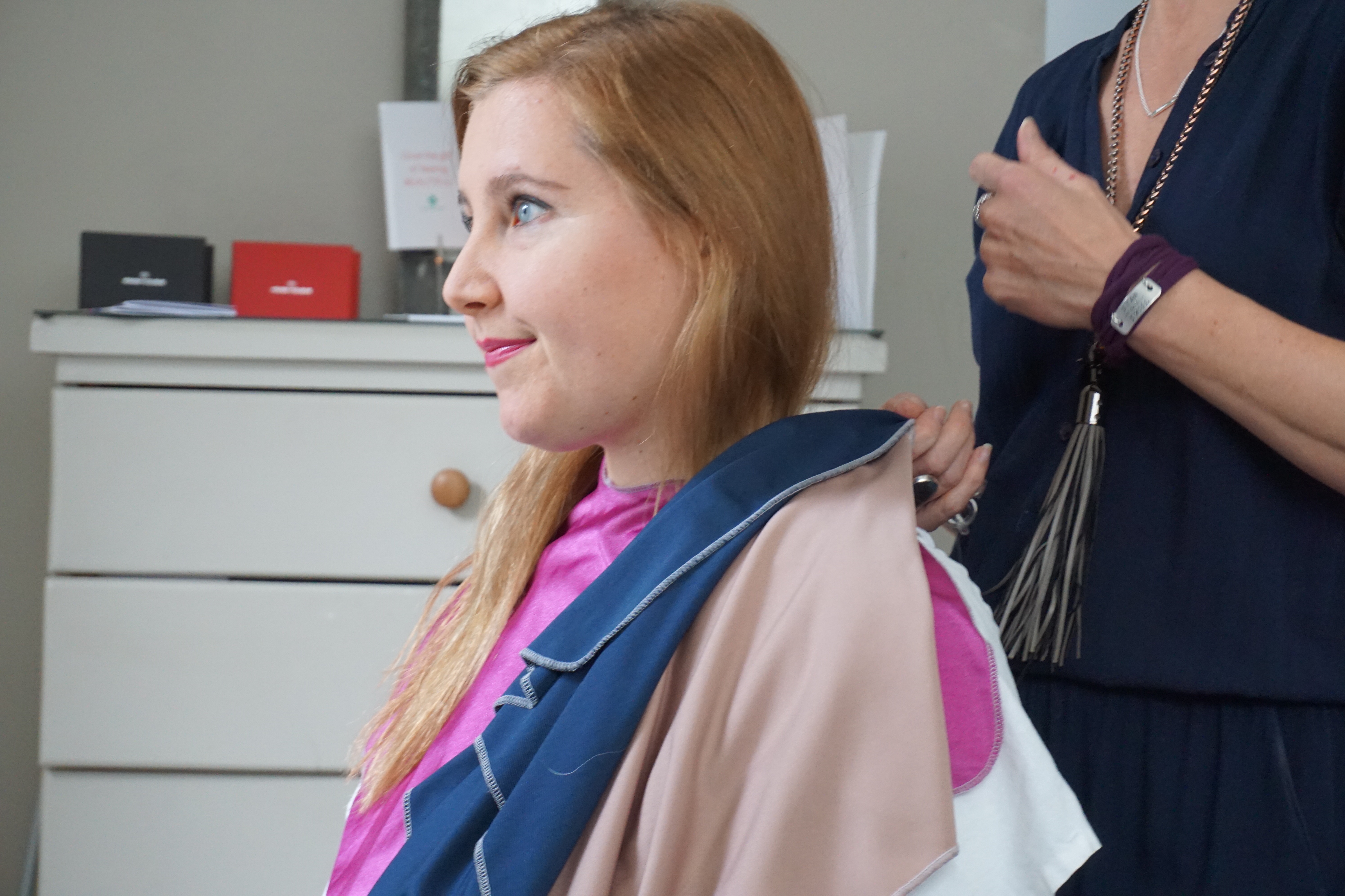
Finally in a cooler, darker and brighter color my face started to clear and look good.
Autumn was the worst on me in my opinion. I was so surprised how bad it was!
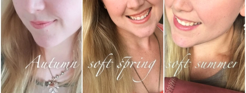
In Color Alliance my best two were Summer and Autumn and it was right between the two seasons. I don’t remember my worst. I was a newbie to color analysis.
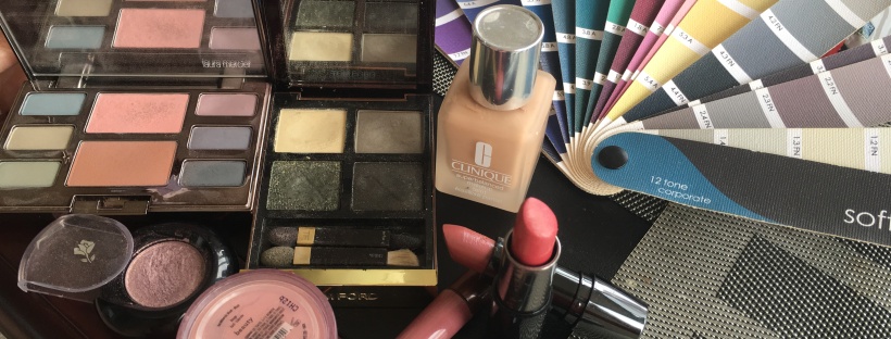
In Sci-art, Summer was best but we looked at Deep winter, there was something about it good on me but then I just couldn’t fully pull of the saturation. My analyst suggested the 12 tone corporate fan and to avoid the dusty colors on the end.
In 12 blueprints, Spring/Winter was my worst and I did like a soft autumn brown on me but other then that summer was clearly better. We gravitated towards the lighter side of the Soft Summer palette this time as a final result with the 12 blueprint luxury drapes, and I went home with the 12 tone classic fan.
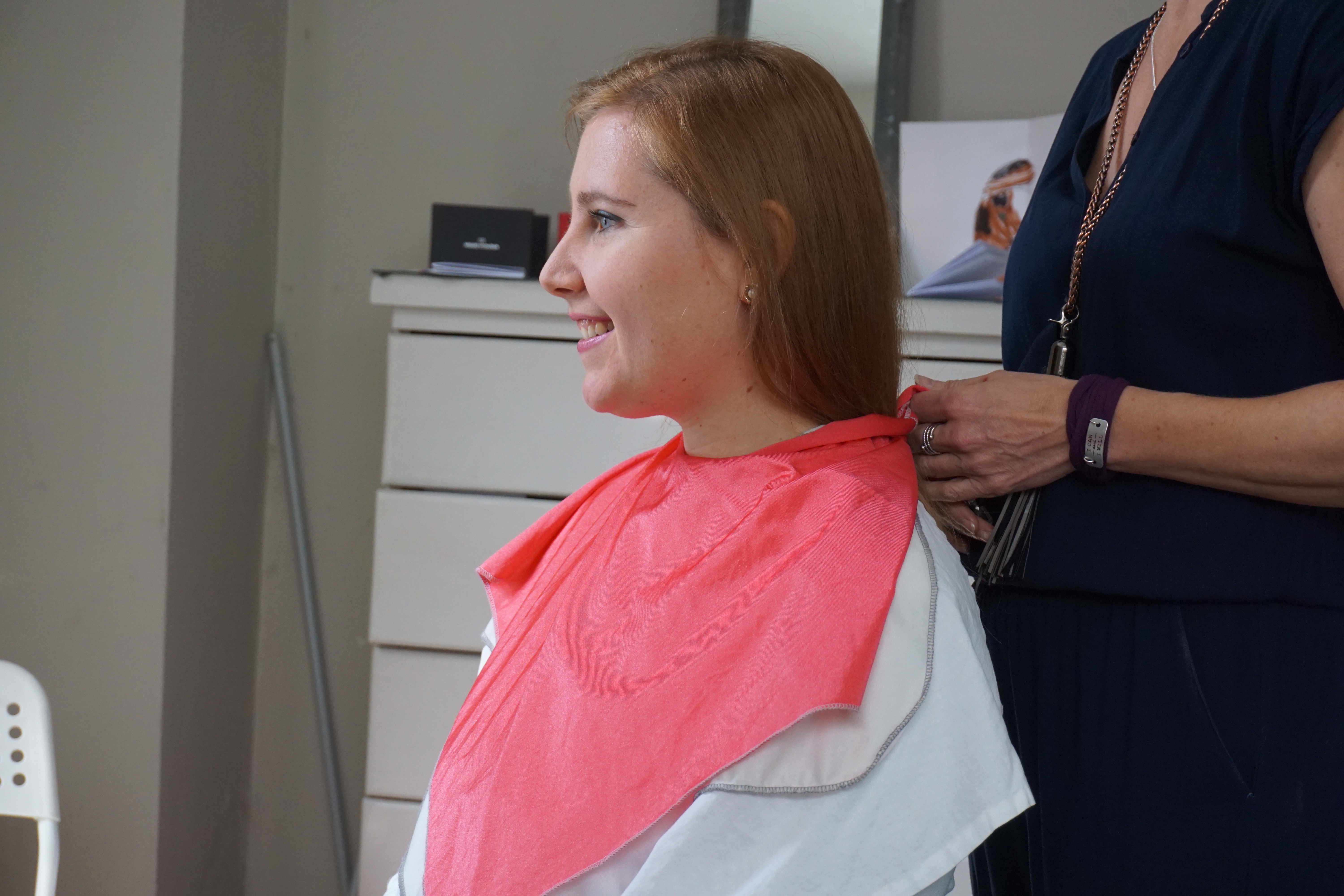
In HOC, Autumn seemed to put a dull dirty blanket over my face and clash with my coloring the most! Spring was okay but not great. and we’ll find out about winter in just a bit!!!! ……
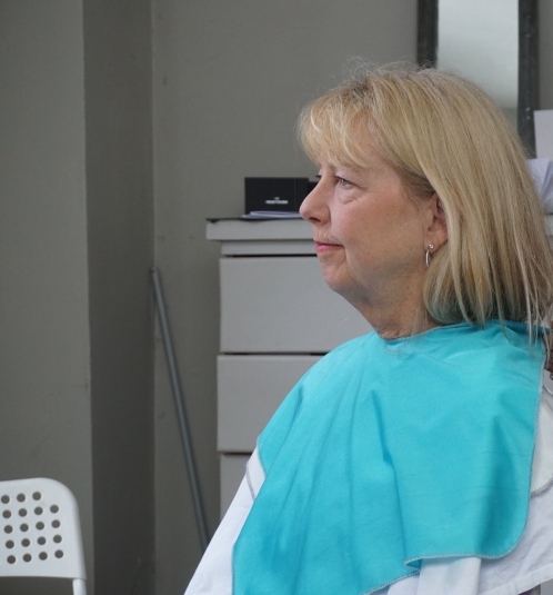
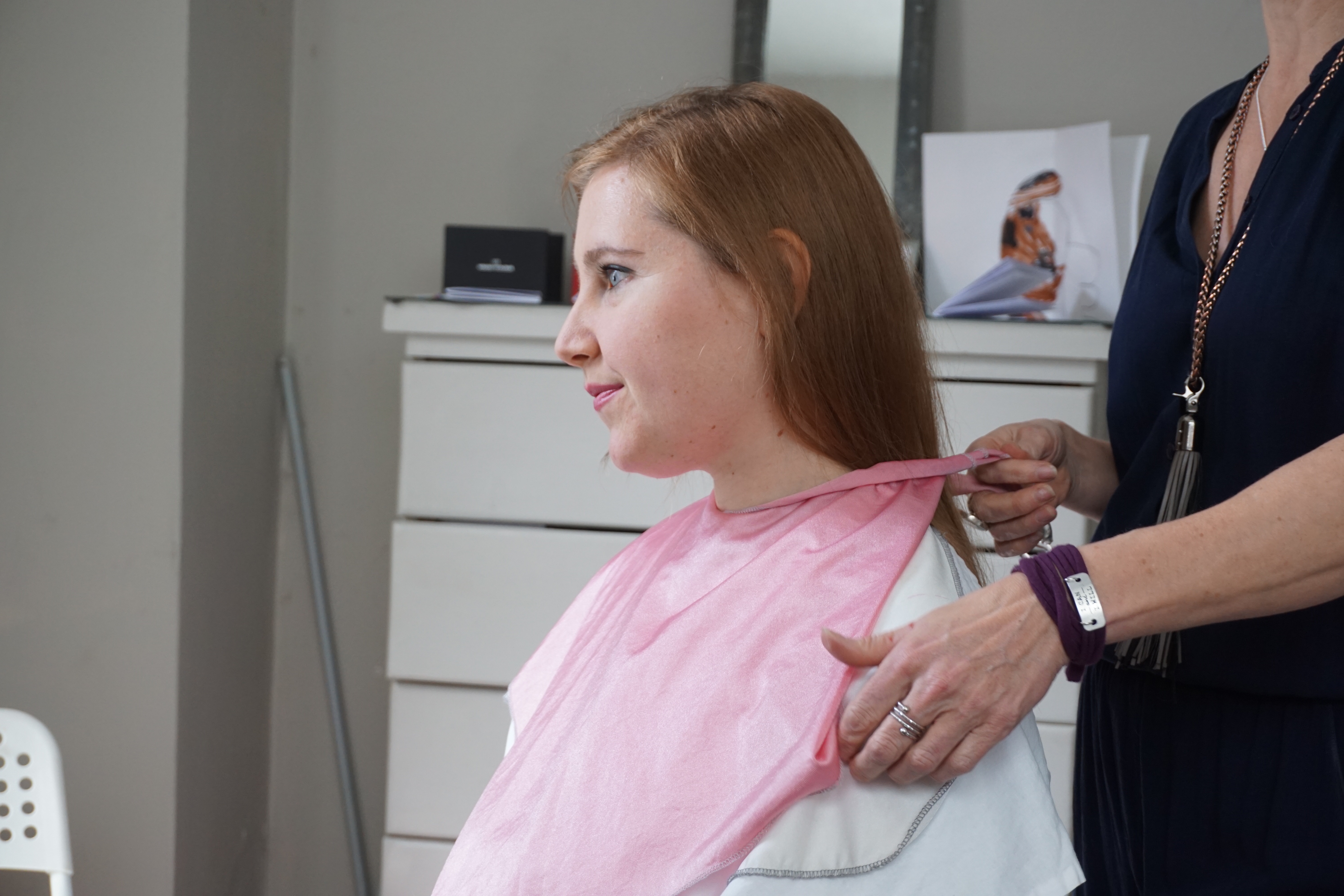
Summer blue was great on me and even though much like my color analysis with sci-art (Heather Noakes) we decided Winter wasn’t best even though I had a tad more clarity but again not a light clarity (light Summer) and not a winter clarity (Deep Winter) but a darker clarity still.
Summer V. Winter blues. Here we are testing Winter since I just seemed to have this darker brightness to me but not a Summer lightness aka Light Summer.
Summer V. Winter Magentas
Winter just too much and too much the main focus. Although the colors are exciting for sure.
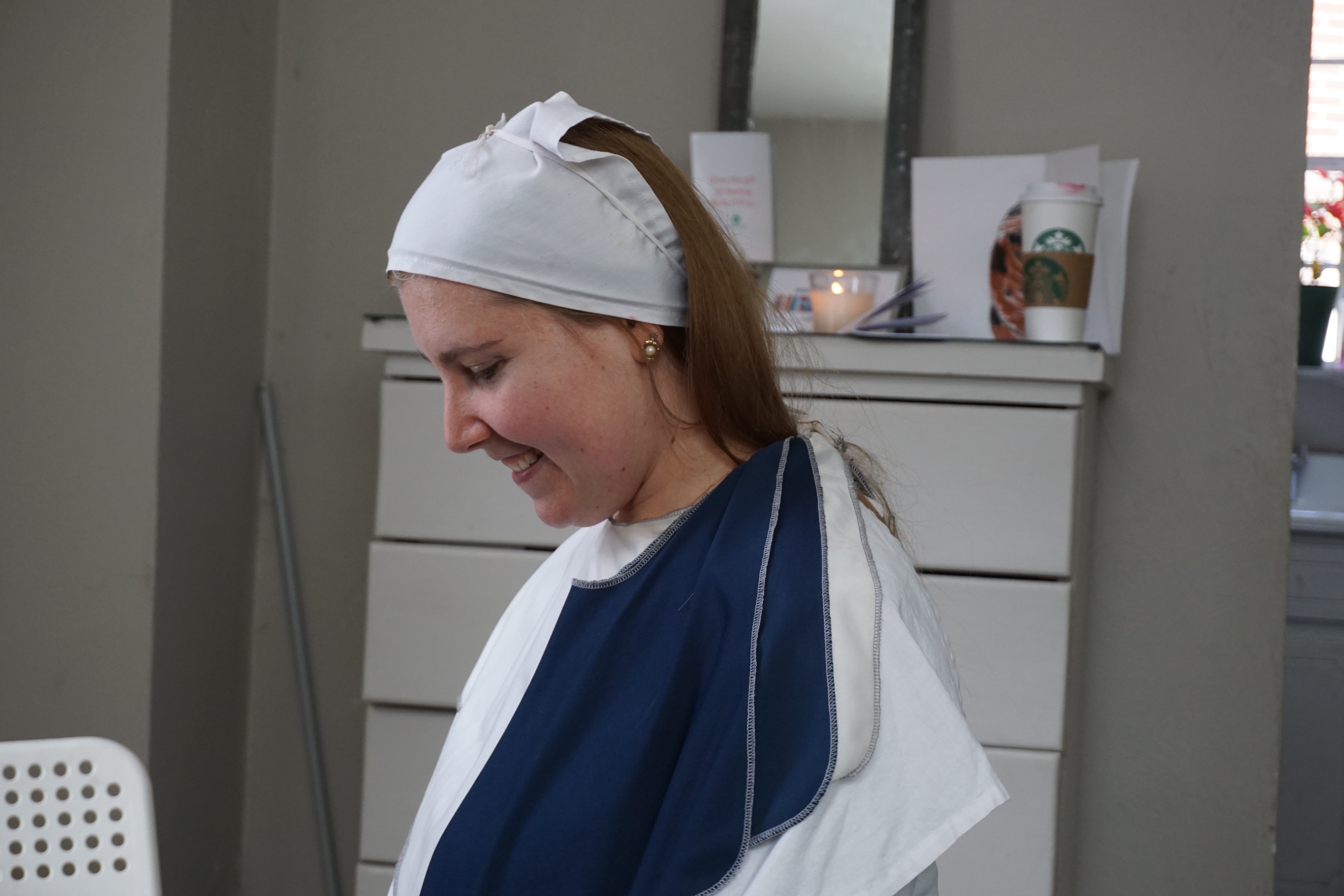
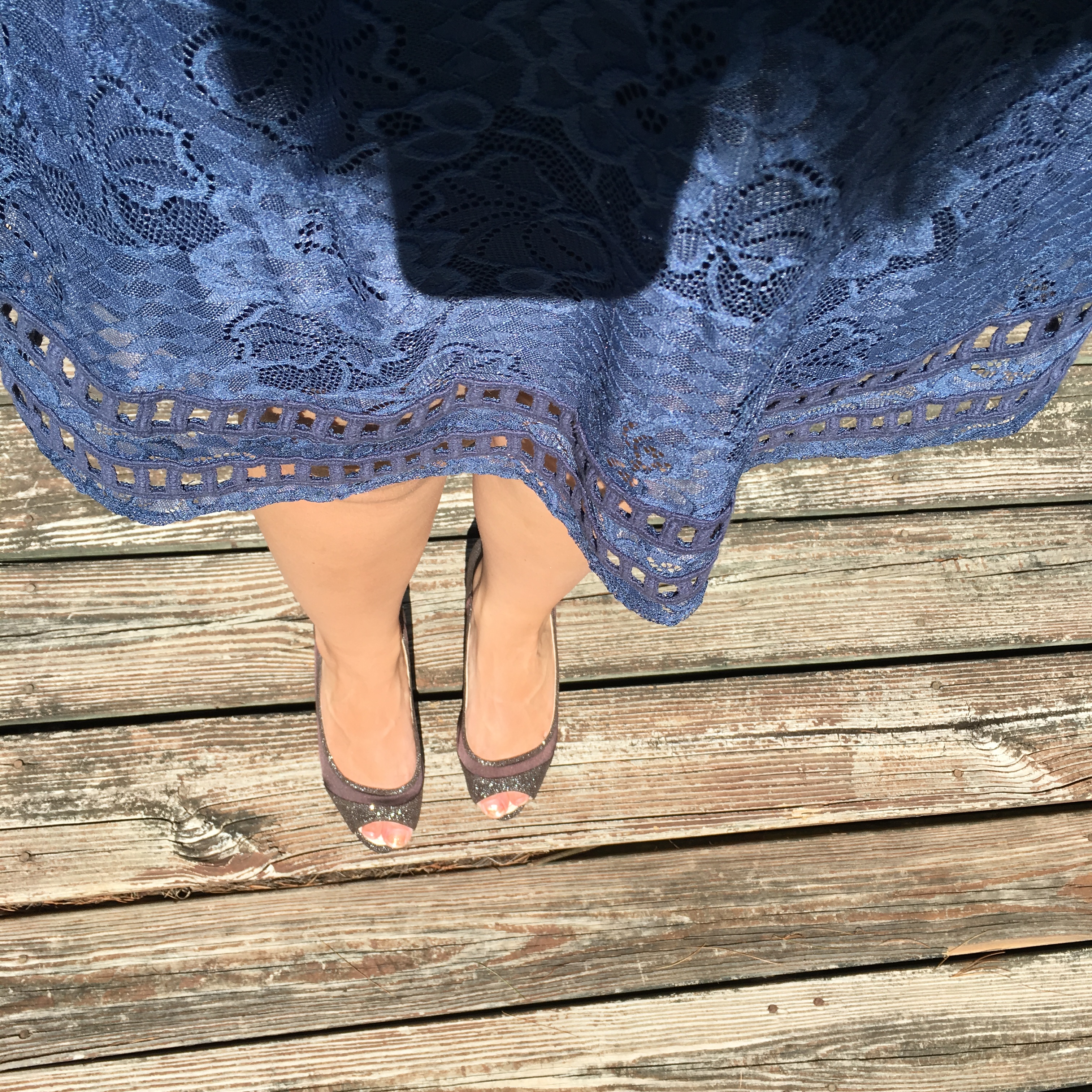
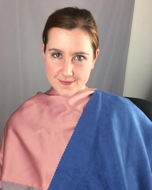
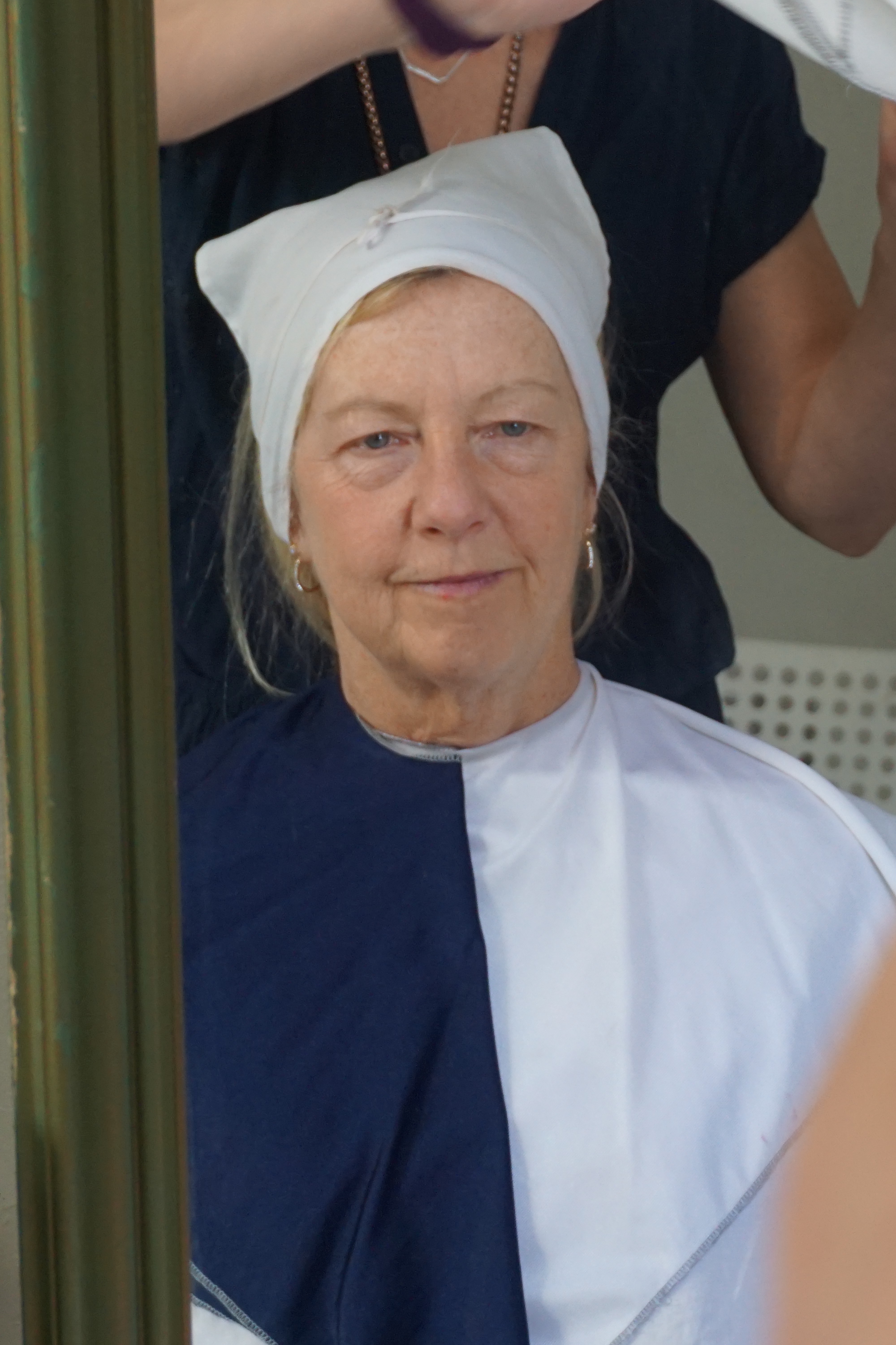
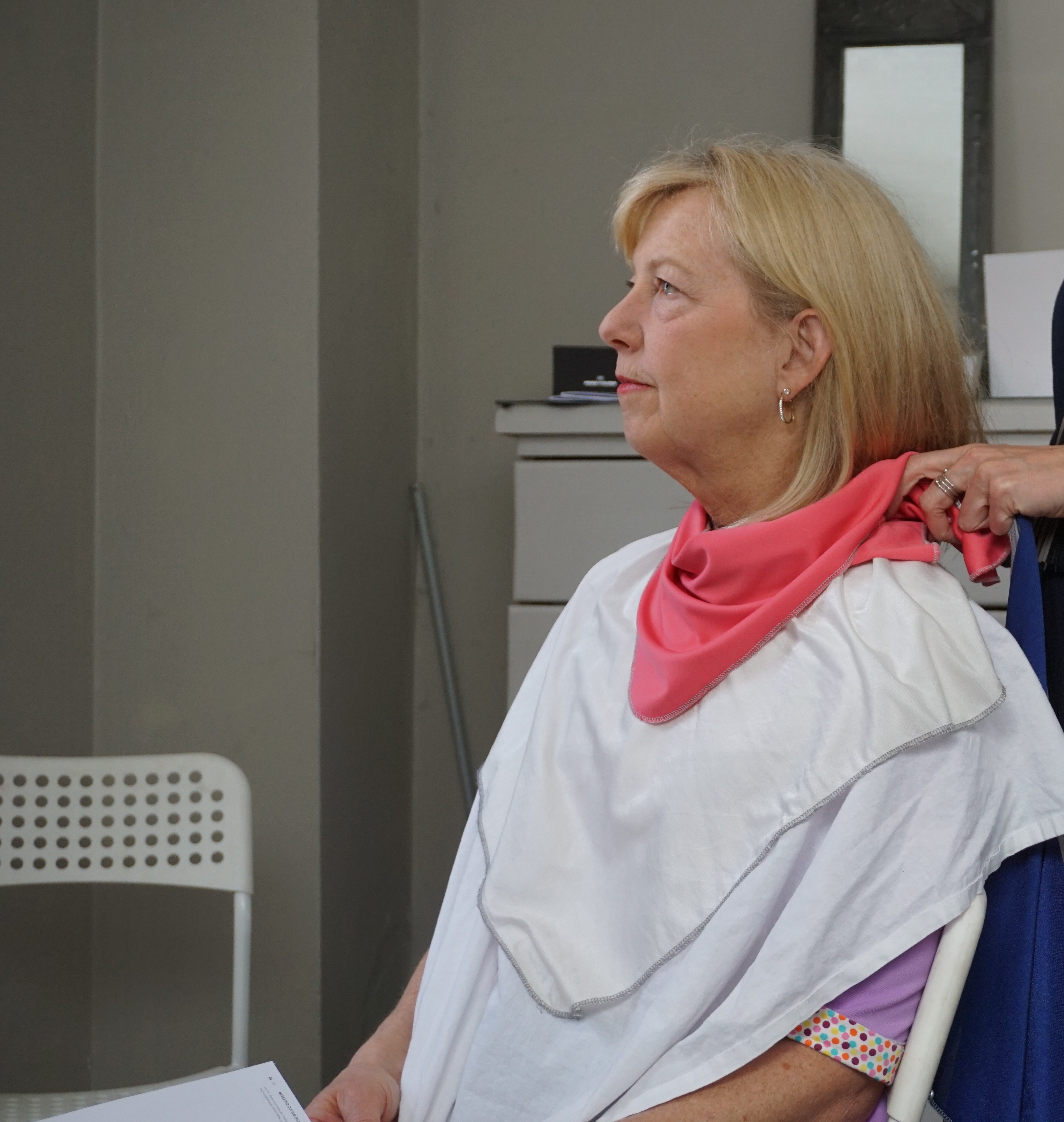
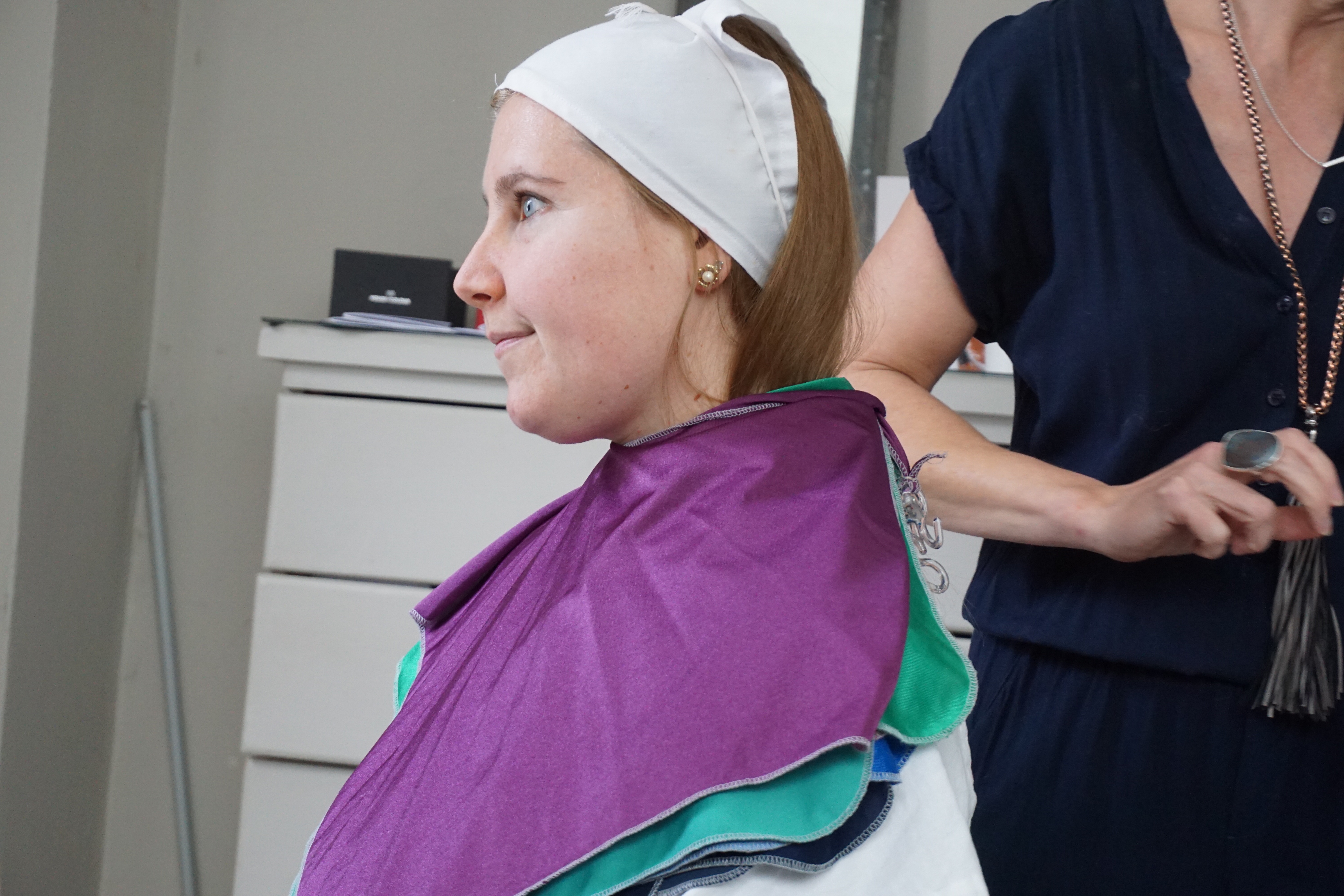
Winter cut a line down me with the white and Navy and SUMMER it was!
What is my Summer Sub-Season?
Applying my Summer makeup.
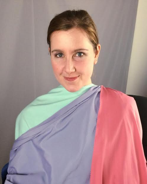
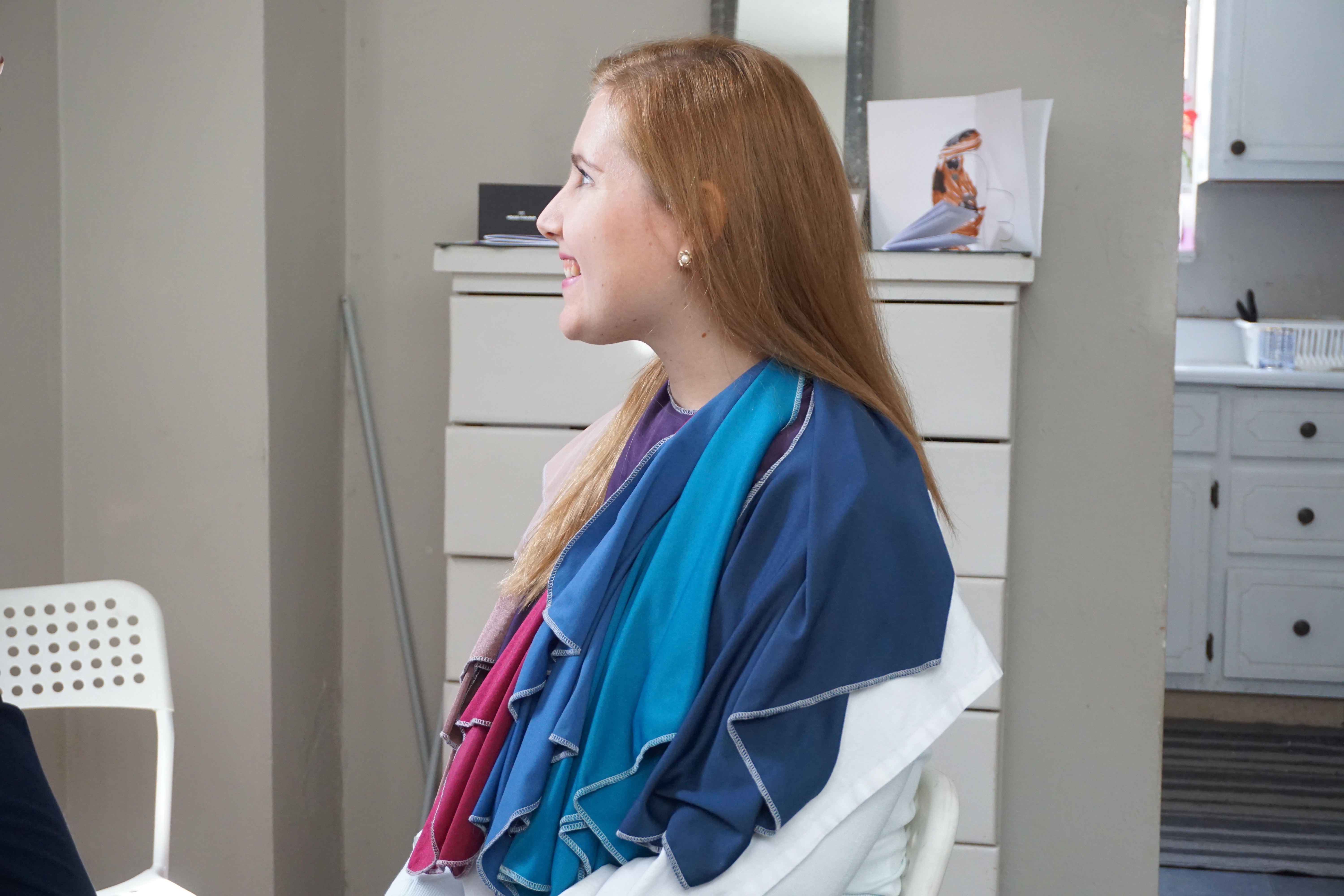
Here I am seeing a combination of colors I could use, colors of 3 will always look interesting on me. I love this idea because I am not too big into monochromatic. The 3 colors included clothes and accessories.
I loved this color and immediately wanted to know where I could buy a top in this color!
My skin is peaceful and like porcelain here!
I did like some of the lighter colors, wow they looked so cool! I can imagine this is a button up shirt under a blazer. It looked really cool with my eyes and changed my eyes to this color!!!
Blues were so good on me, they were just phenomenal. When I was younger, teenage years at least, I knew that Navy and Black has a darkness that clears my face. Now I know black isn’t my best and a bit harsh and I should opt for charcoal but I innately went for these darker cool colors, until well, someone told me I dressed in too many bruised colors! Which I took too seriously, and started to try to wear other colors for better or for worse.
Another really pretty light color that just was so amazing with my eyes!
A combination of blues!
This drape was a bit much! And I was like “wow” okay! too much and not great lol.
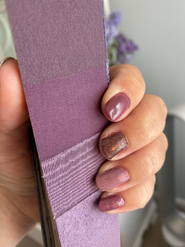
I also love my purples, they are so pretty!
Very pretty but I can see why this one is not 100%.
Oh the blues! So good and 100% 2 stars **.
I love the sea-green.
Okay, so this whole time, in all these drapes I feel like I’m wearing color and I feel vibrant! Even in the pictures I posted, the drapes on me look like I’m wearing color and not neutrals. I felt like I was wearing neutrals all the time with my 12 tone soft summer fan purchases and some of the 12 blueprint drapes. There were drapes I did love in 12 blueprints like the rose coral and blues and plum, and brighter pastels but some I just wasn’t crazy about and just couldn’t see how the 12 tone classic fan was my best palette overall.
I love the bright blue greens!
Sky Blue! It was good on me! I was suprised!
Smoked Grape was also one of my best 2 star ** colors.
3 drapes that really were not my best. They just seemed too disconnected with my natural coloring.
The red was a lot. So I wasn’t really a fan of it.
This was better then the red! It was 75% 2 star.
I wanted to like the coral a lot more then what I did on me. Too bright and Light but it is a fun color!
A lighter softer pink was better then the coral or red. But really didn’t do too much for me. This is much how I feel when I see the Soft Summer 12 tone classic fan, doesn’t seem to do much, but this color seems more exciting then some of those dusty pastels from the 12 tone classic fan in contrast.
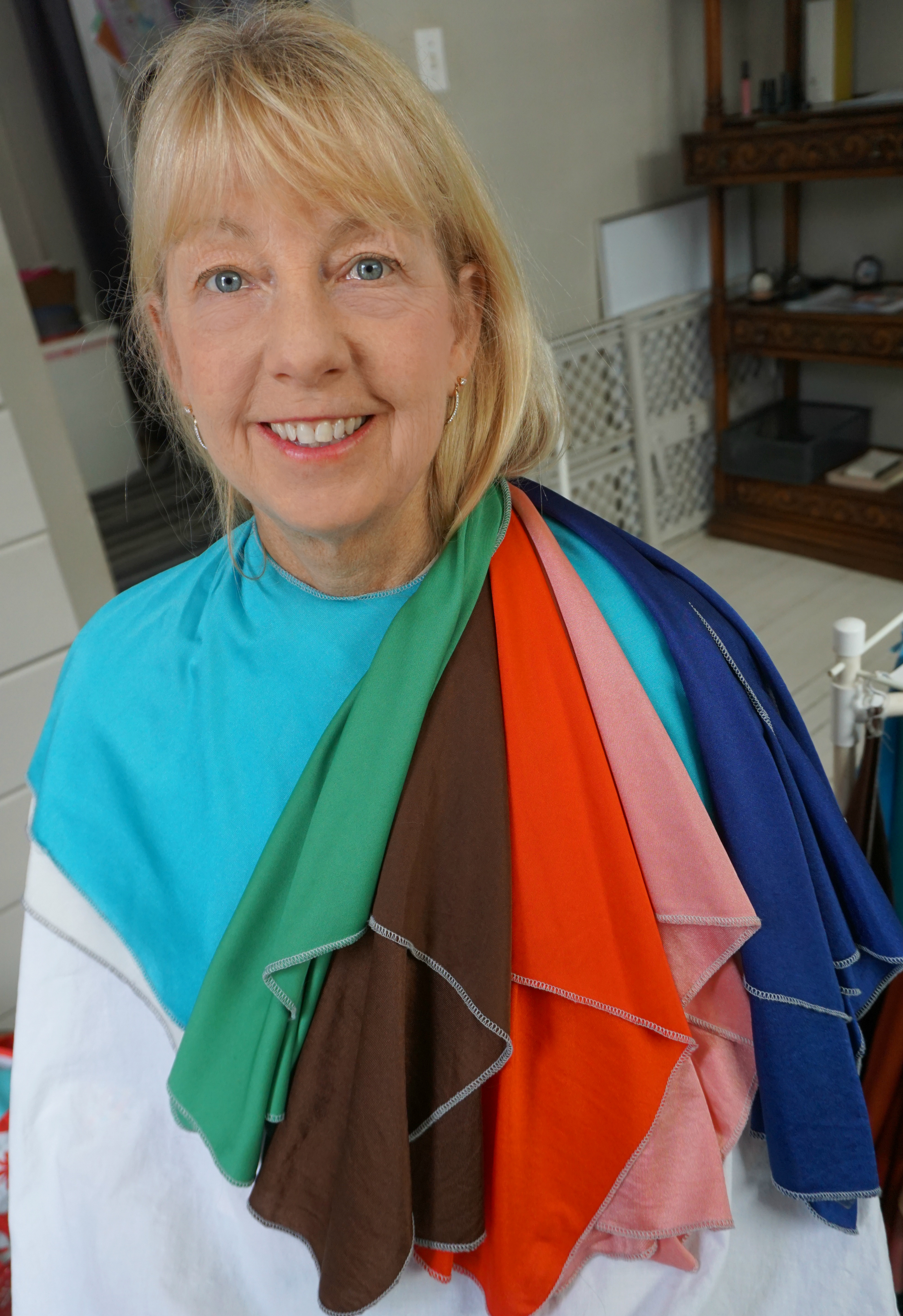
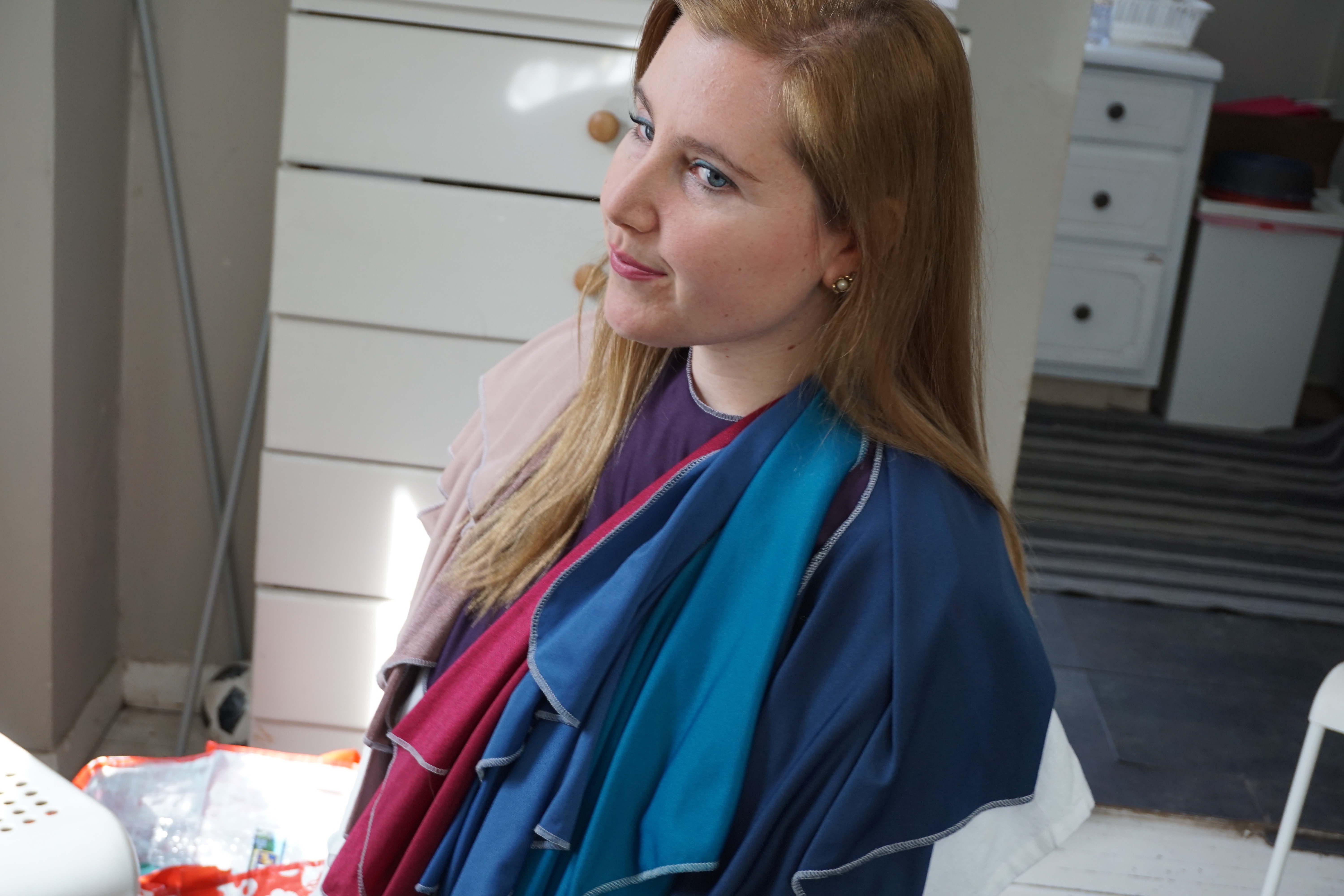
All my 2 star ** drapes for 100% of my outfit head to toe.
So without further wait, my sub-season is ………………..
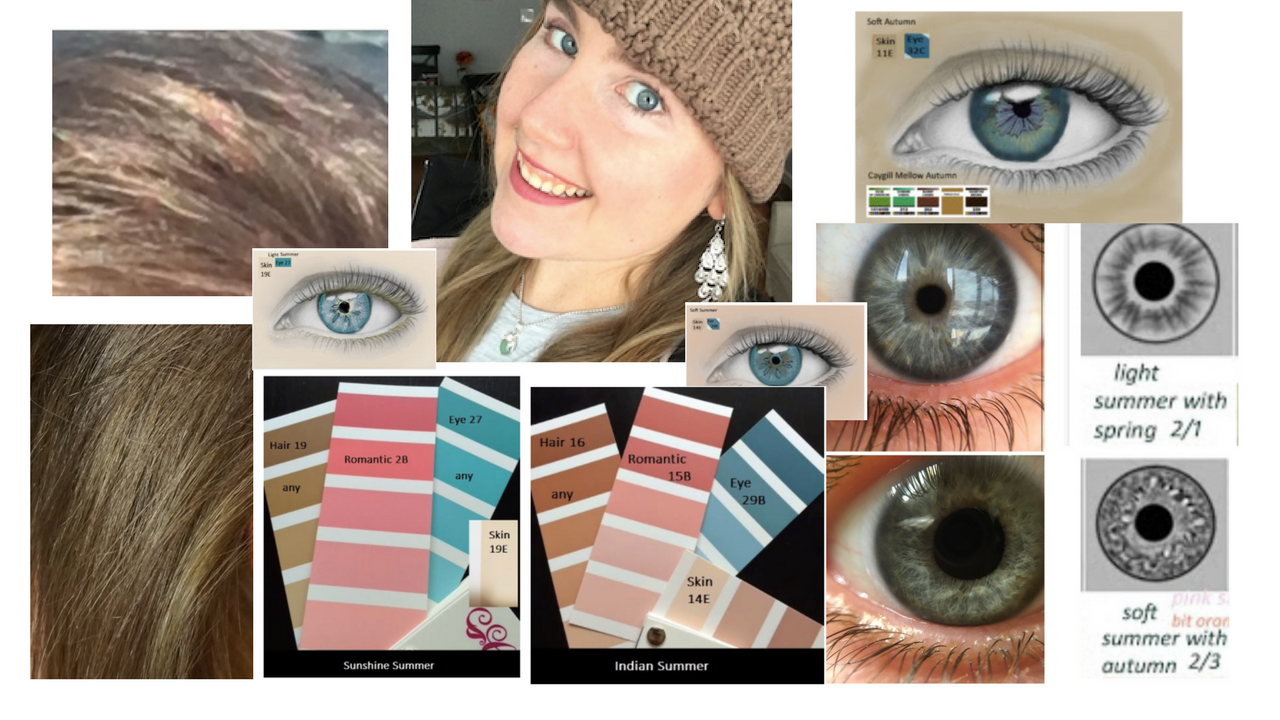
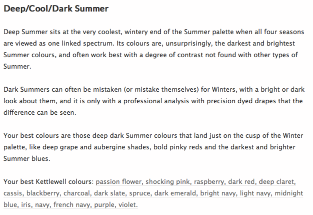
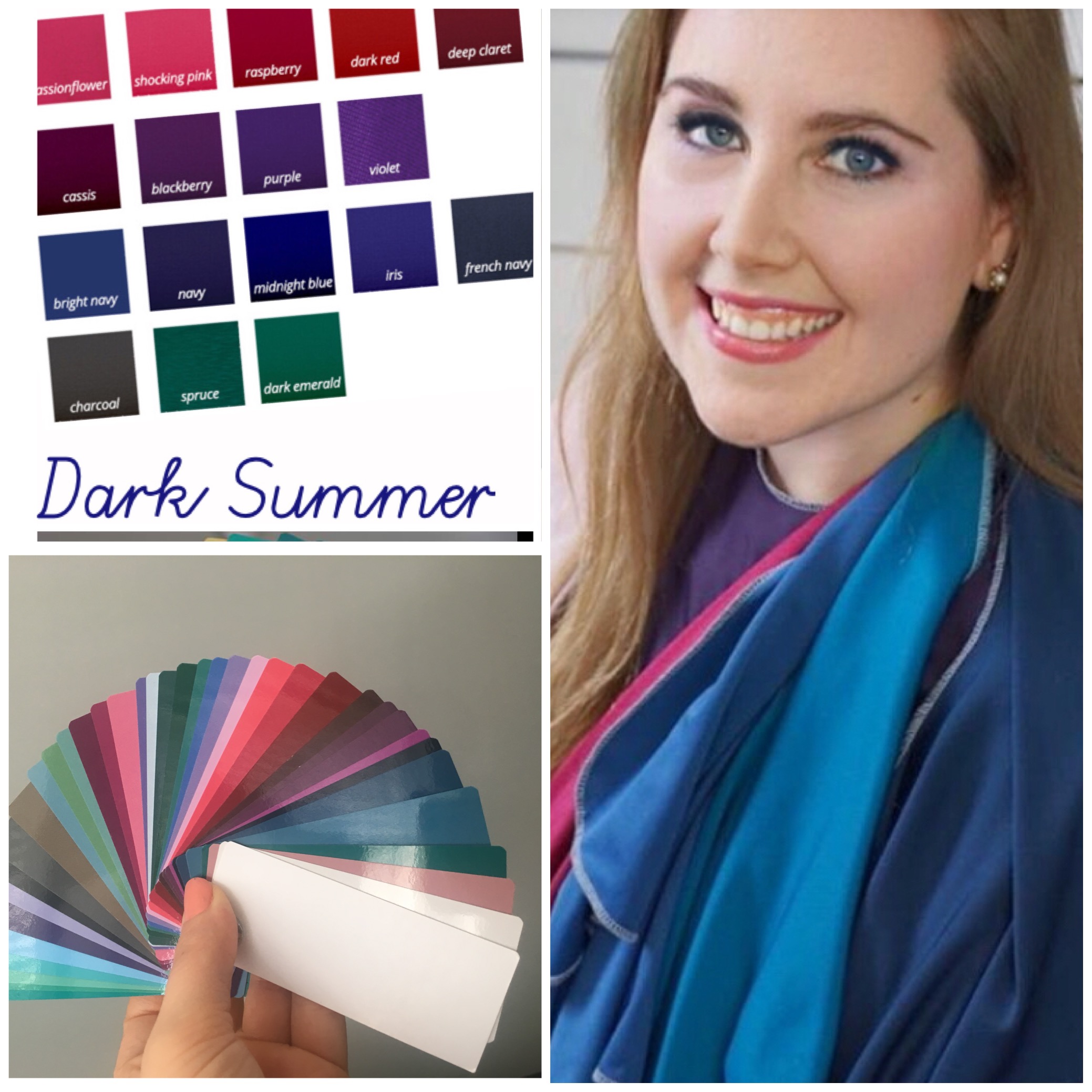
Dark Summer! But wait what is Dark Summer?!
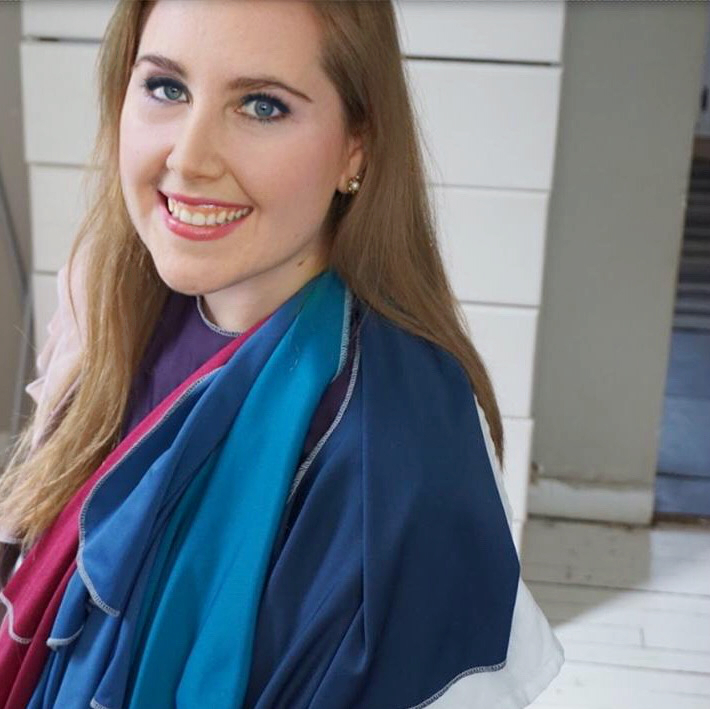
Because the darkest brightest end of the Summer palette looked the best on me, my season is the Dark or Deep Summer!
Check out more here at Kettlewell about Dark Summer or other summer sub-seasons.
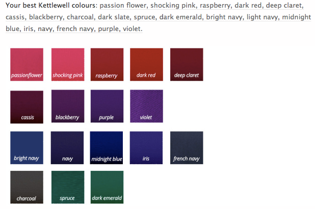
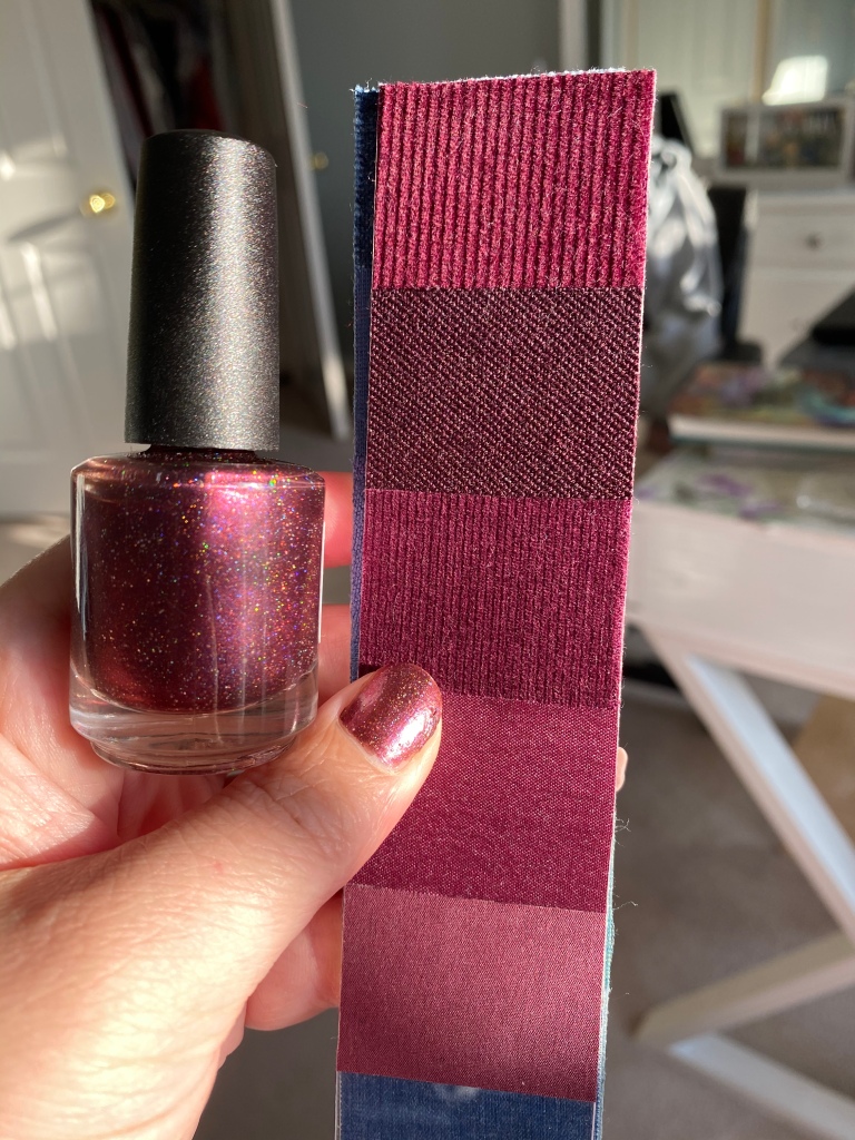
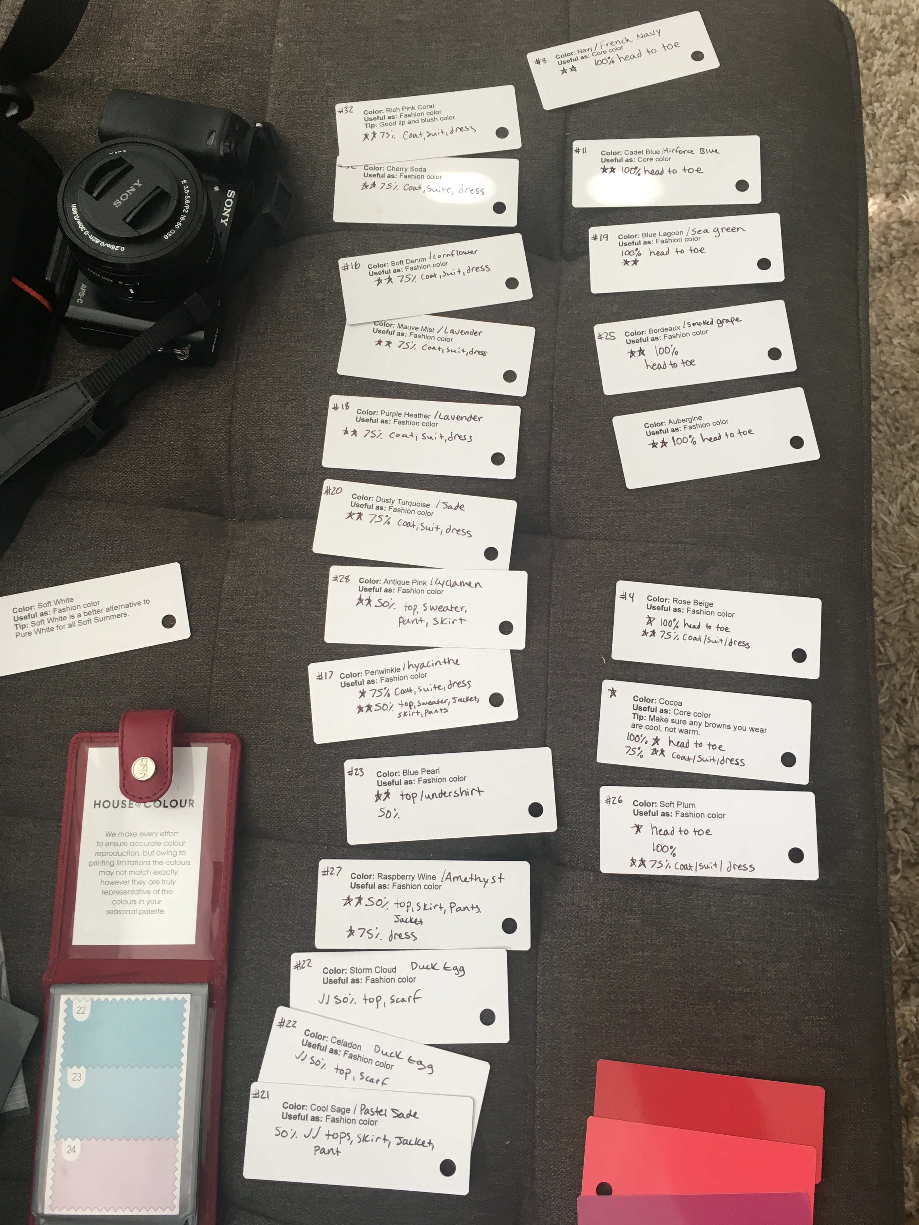
I was pondering that I would end up a Brown Summer, but I didn’t. Some of the colors were good but they just were not bold and dark enough to be my 100% 2 stars ** . Mushroom, Taupe, and Plum ended up being my only 1 star * at 100%. My 2 Stars ** at 100% were French Navy, Air-force Blue, Sea-green, Smoked Grape, and Burgundy. We added some of my one star 100% drapes since I only had 5 100% 2 star colors for the final draping picture.
Now you might be thinking I look to “fair” to be a Deep or Dark Summer but you’d be wrong to stereotype because I have a brightness to my skin and eyes and an ability to handle dark colors with skin perfection. My complexion doesn’t lie when the darker and more vibrant summer colors are put near my face.
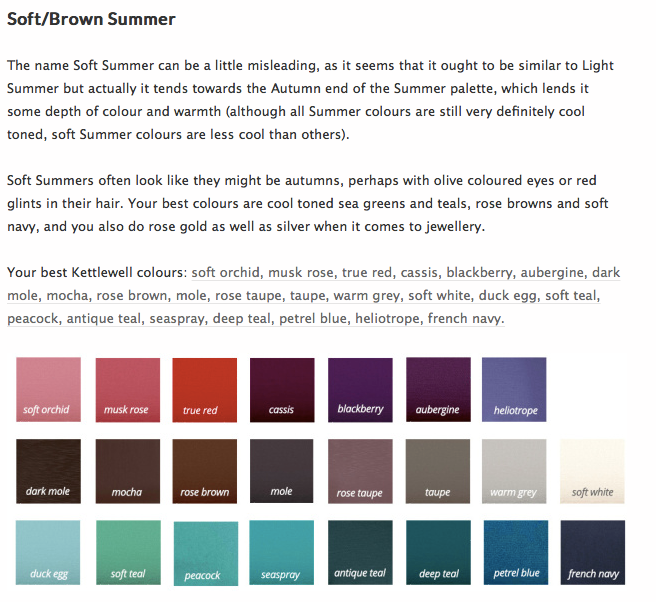
Here is some detail about the Soft Brown Summer below which I did not drape as. But I can wear a variety of colors from it’s palette along with the Pastel Summer:
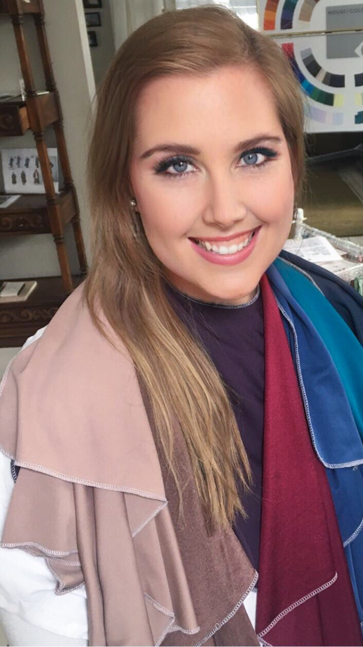
I will admit I did doctor this photo up with my photoshop skills, and took the red out of my hair and messed around with my eye makeup to make it more dramatic. But this is a good representation of the drapes! Unfortunately, the Plum drape did not make it on me but it should have been there.
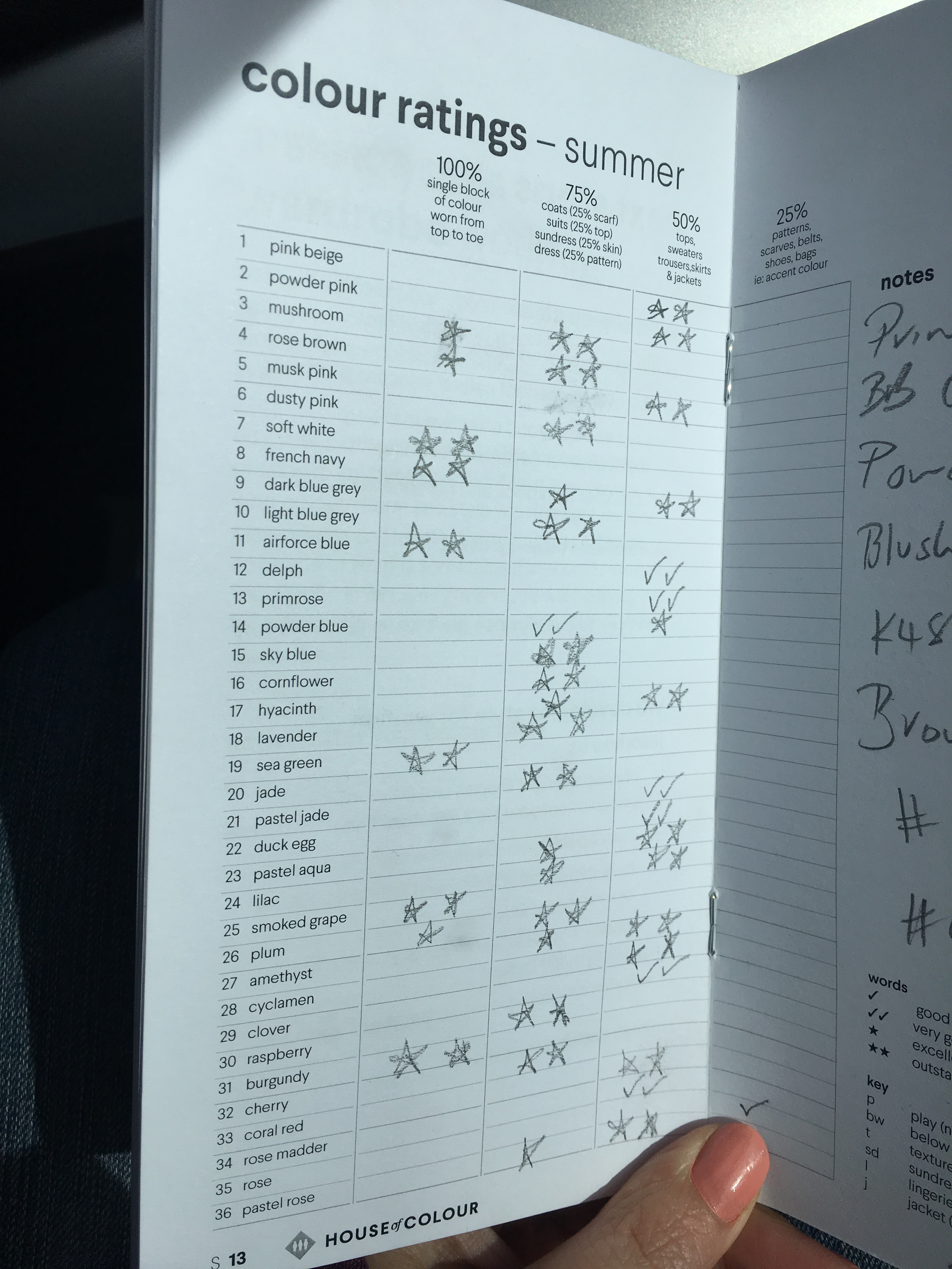
Below is the color rating book for summer and my results
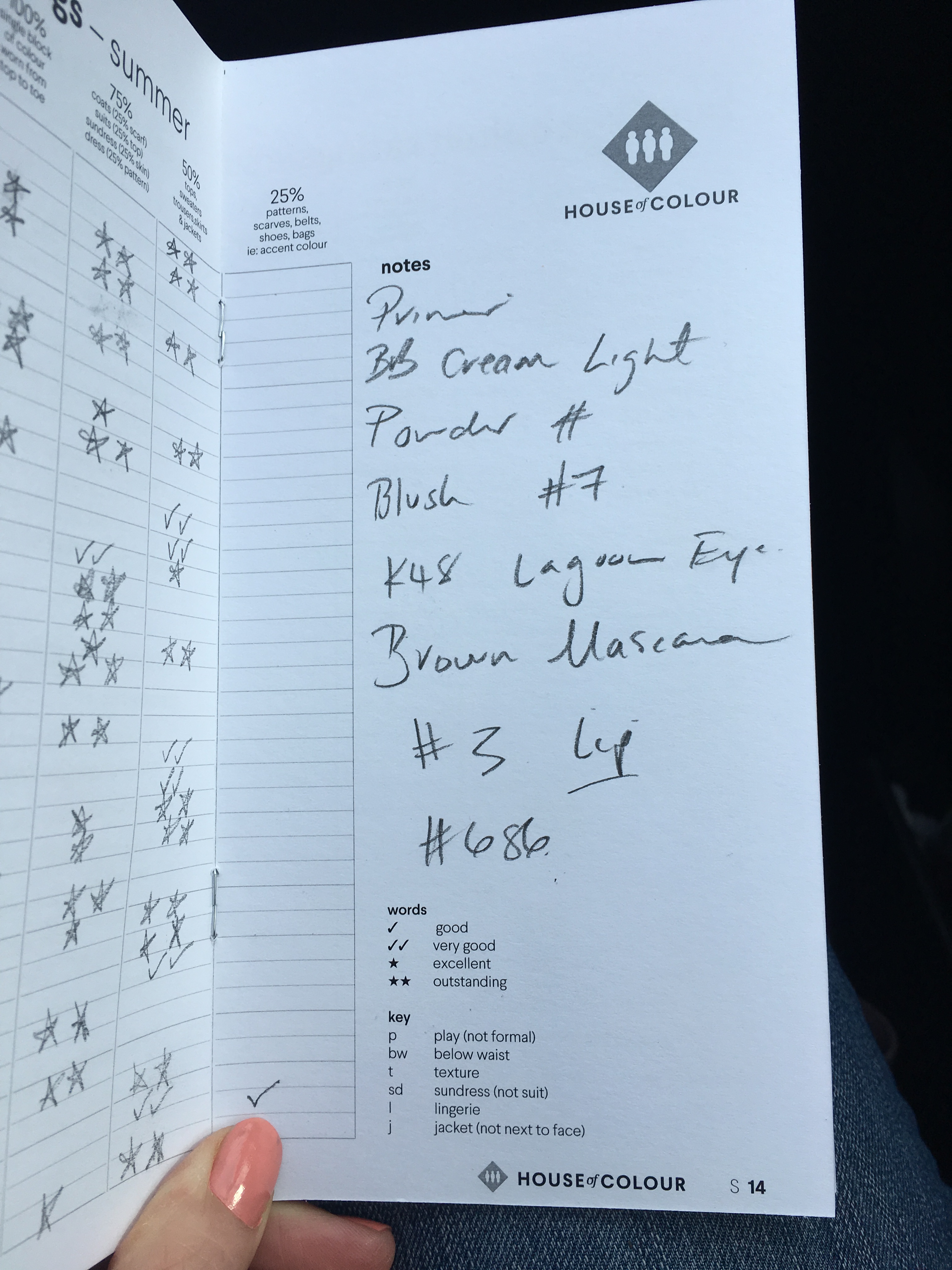
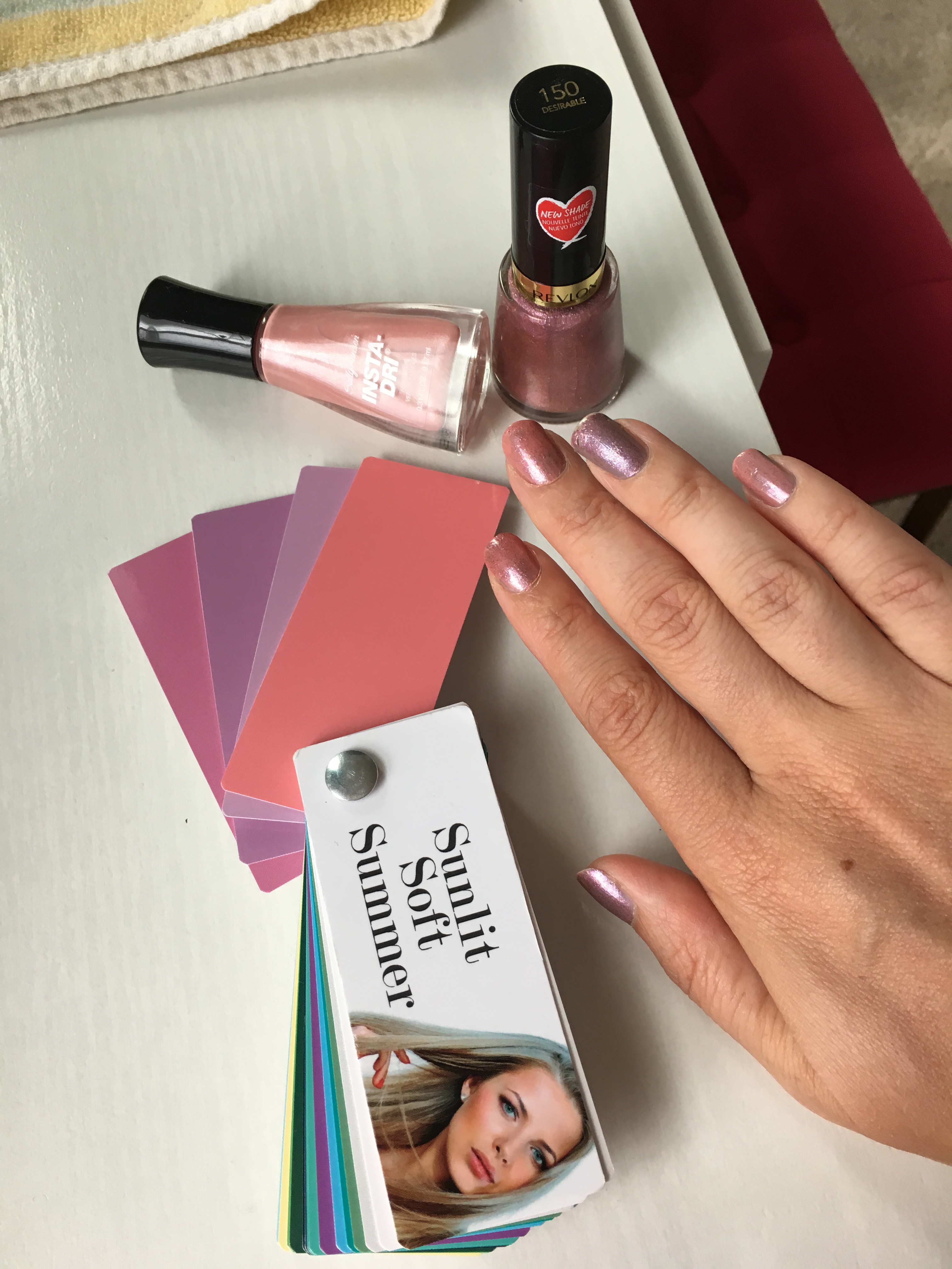
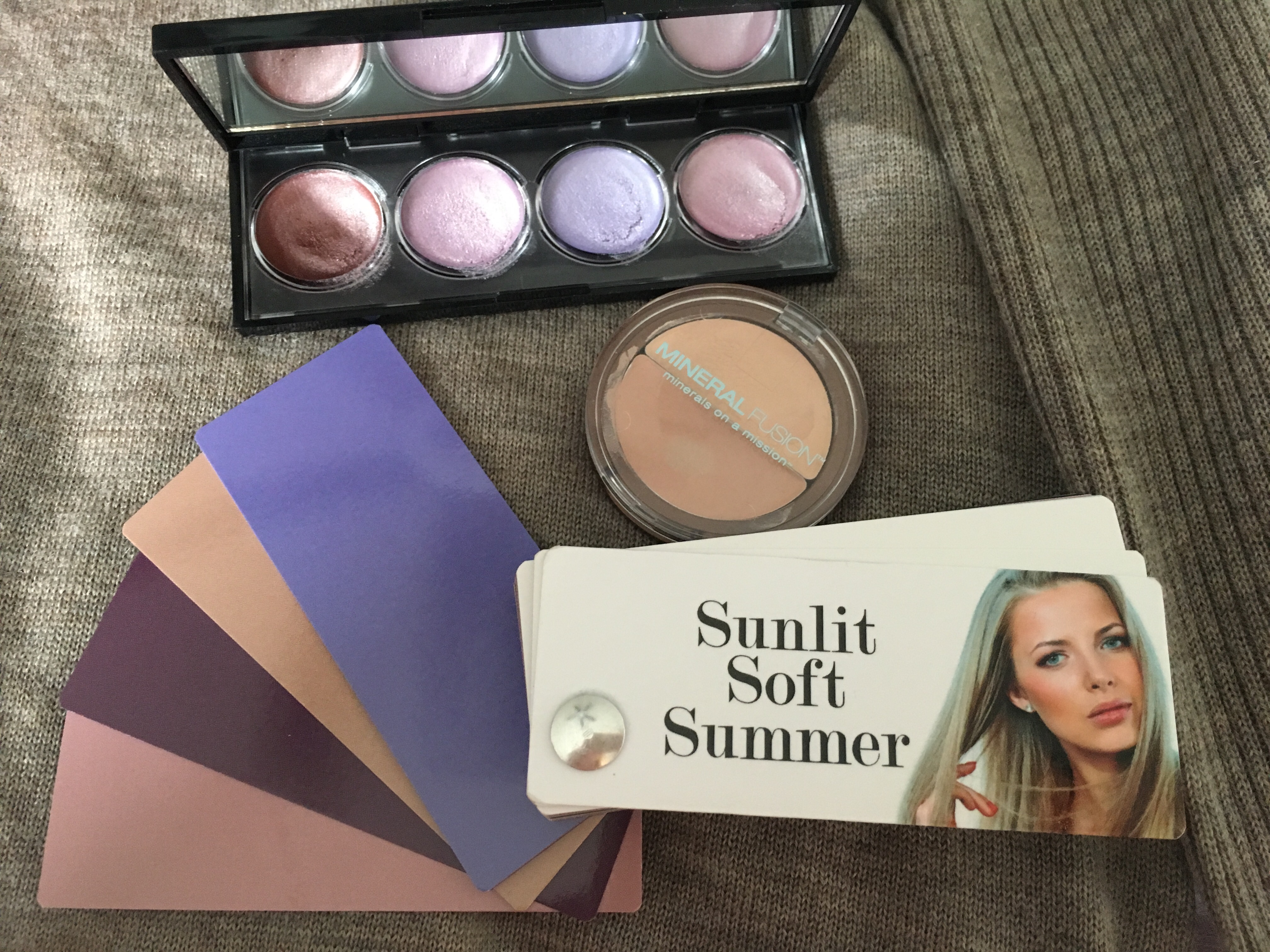
Julie also wrote down the makeup that I used. I really liked the Plum lipstick!! and the Lagoon Eye liner pencil.
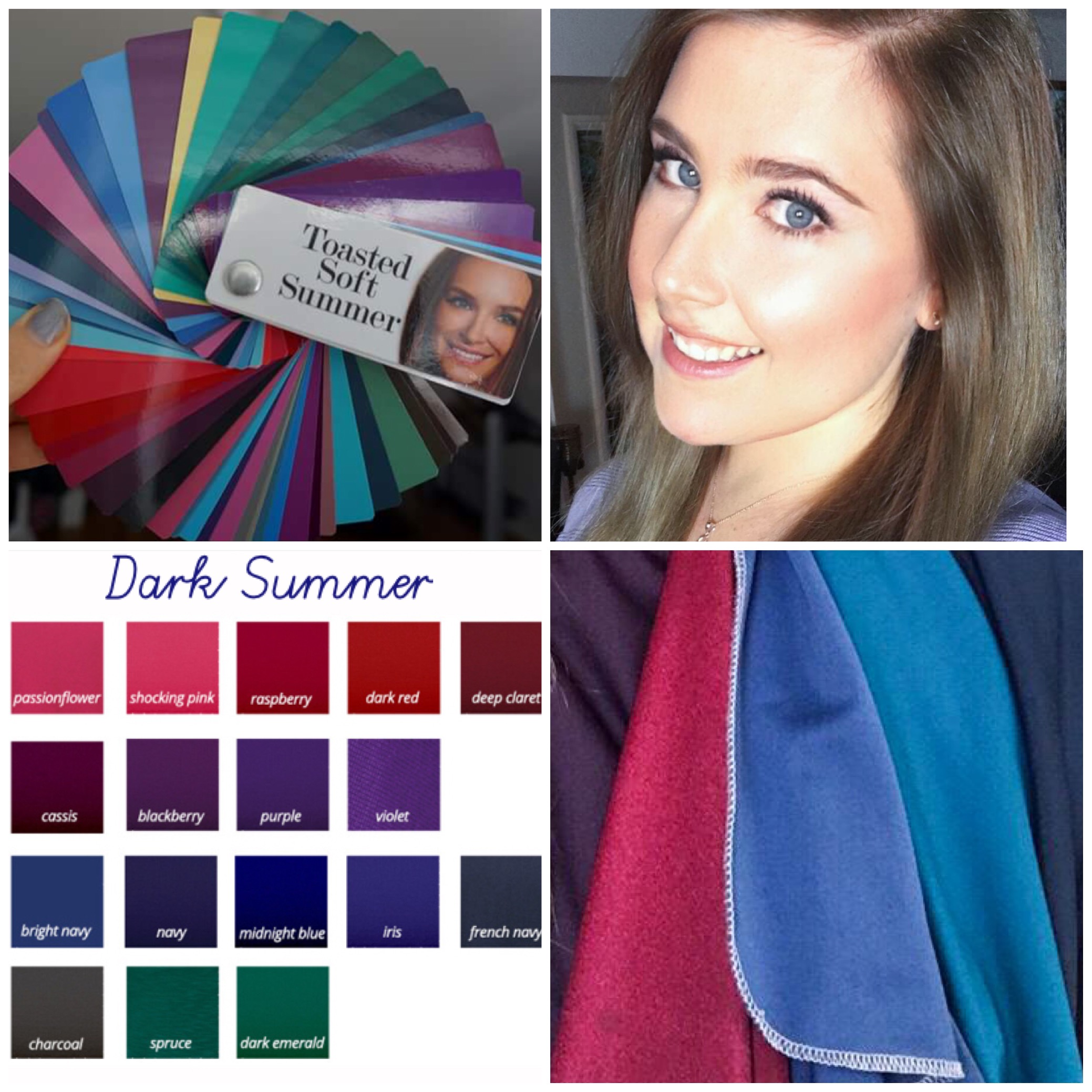
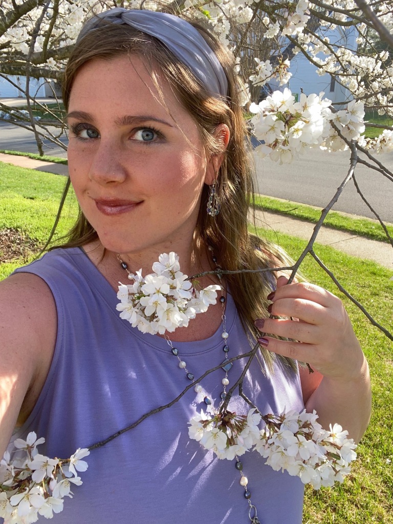
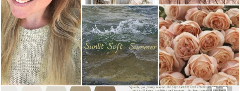
I do feel much happier with this color result! and I even noticed my colors harmonized somewhat with the Color Breeze Toasted Soft Summer fan. In this collage my hair was dyed a bit darker to a closer to natural shade and you can see how much my face glows when my hair color is good next to my face!
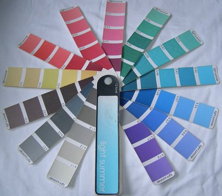
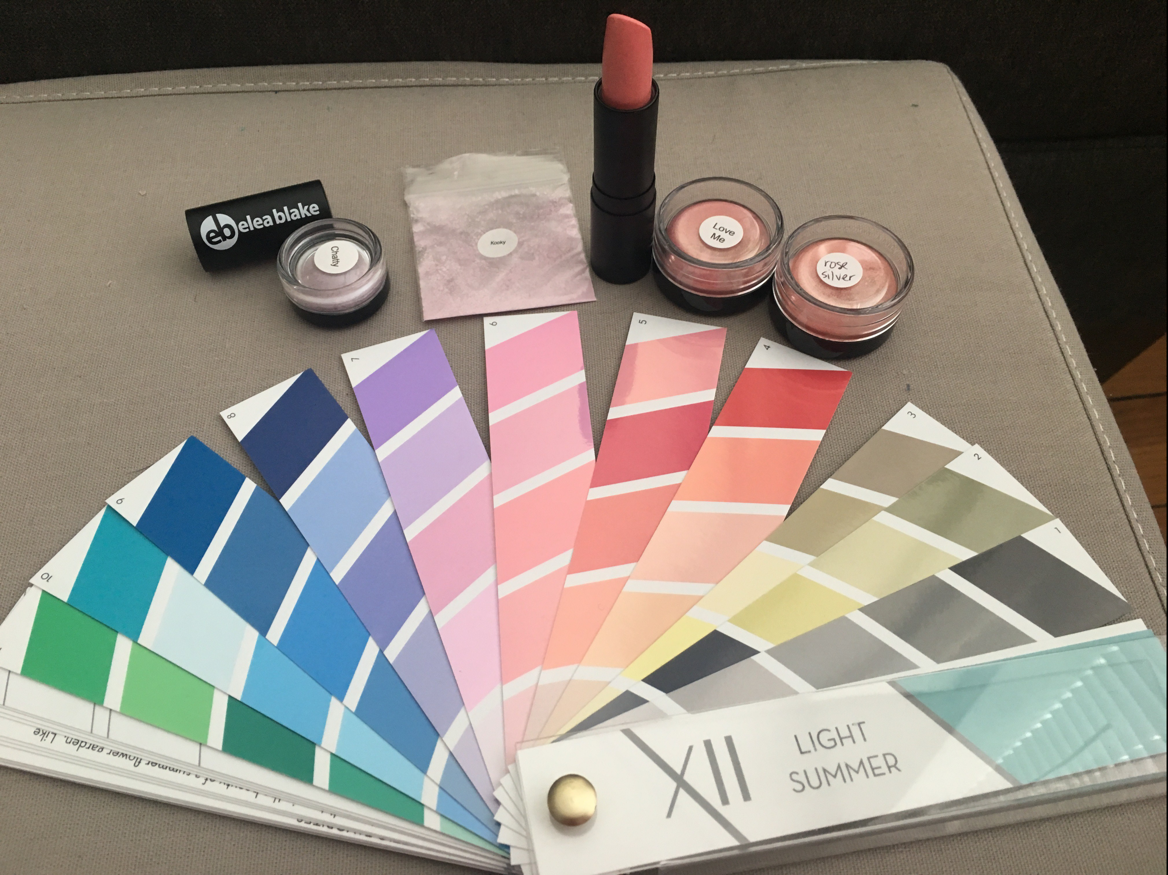
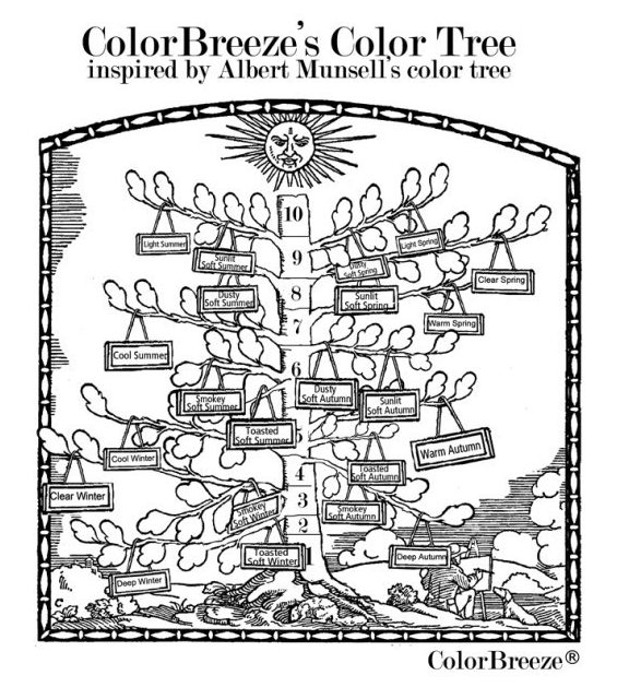
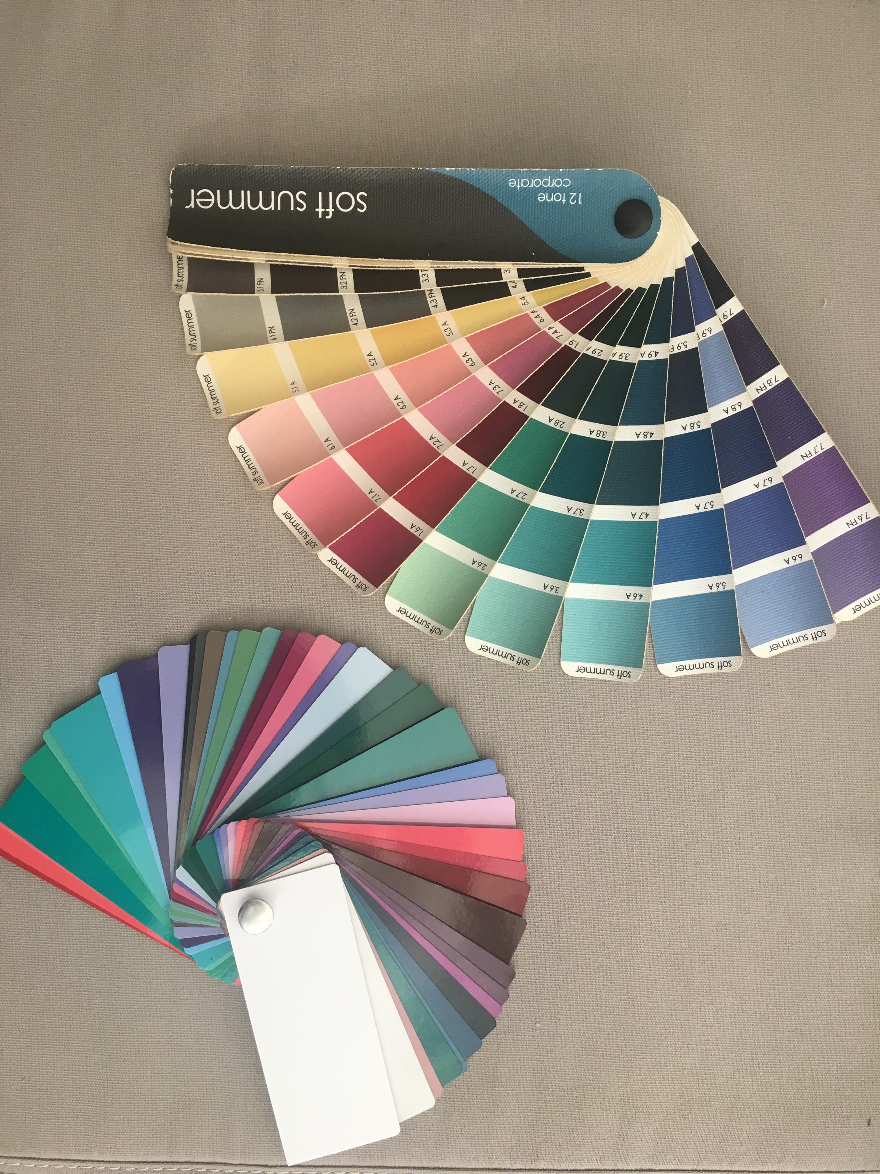
Which fan to use for Dark Summer?
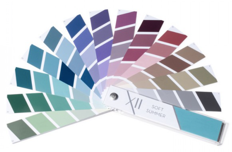
I asked Julie about the color palettes, and she was not a fan of the Soft Summer Prism Xll palette for me, she said it did run too warm and in my opinion it is too soft for me however it is a gorgeous looking palette.
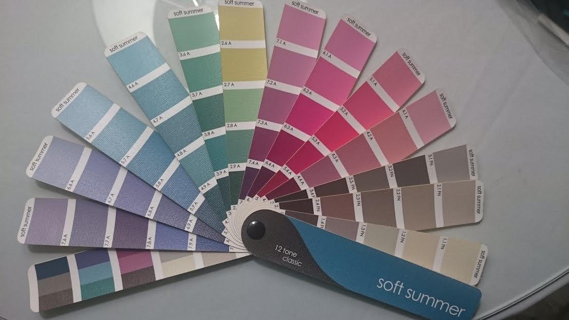
She also wasn’t a fan of the 12 tone Soft Summer fan for me, she didn’t like the grays for me or the yellows which I thought was so spot on! I told her when I used the 12 tone classic palette to shop and purchase clothing, it just seemed to buy me results that were too dusty on me.
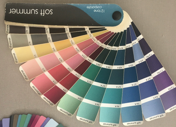
Julie thought the 12 tone Soft Summer corporate palette was okay, just that I need to be aware of the yellows/grays. My thoughts were that I needed to avoid the dusty colors at the tips of the fan just like Heather Noakes pointed out in my first sci-art analysis with her.
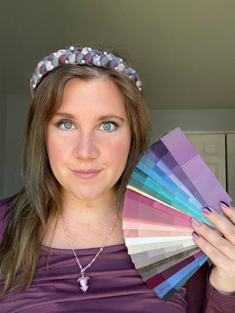
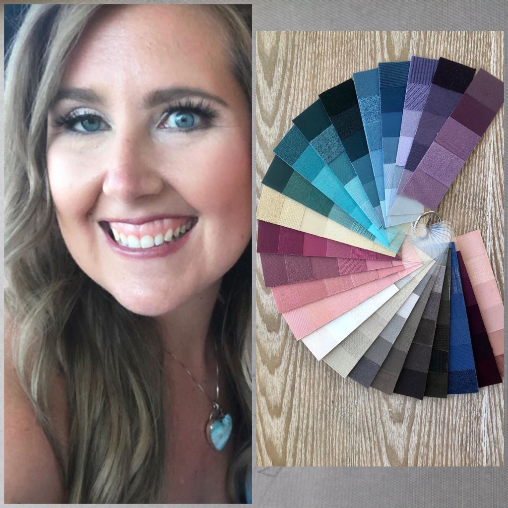
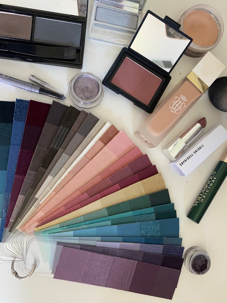
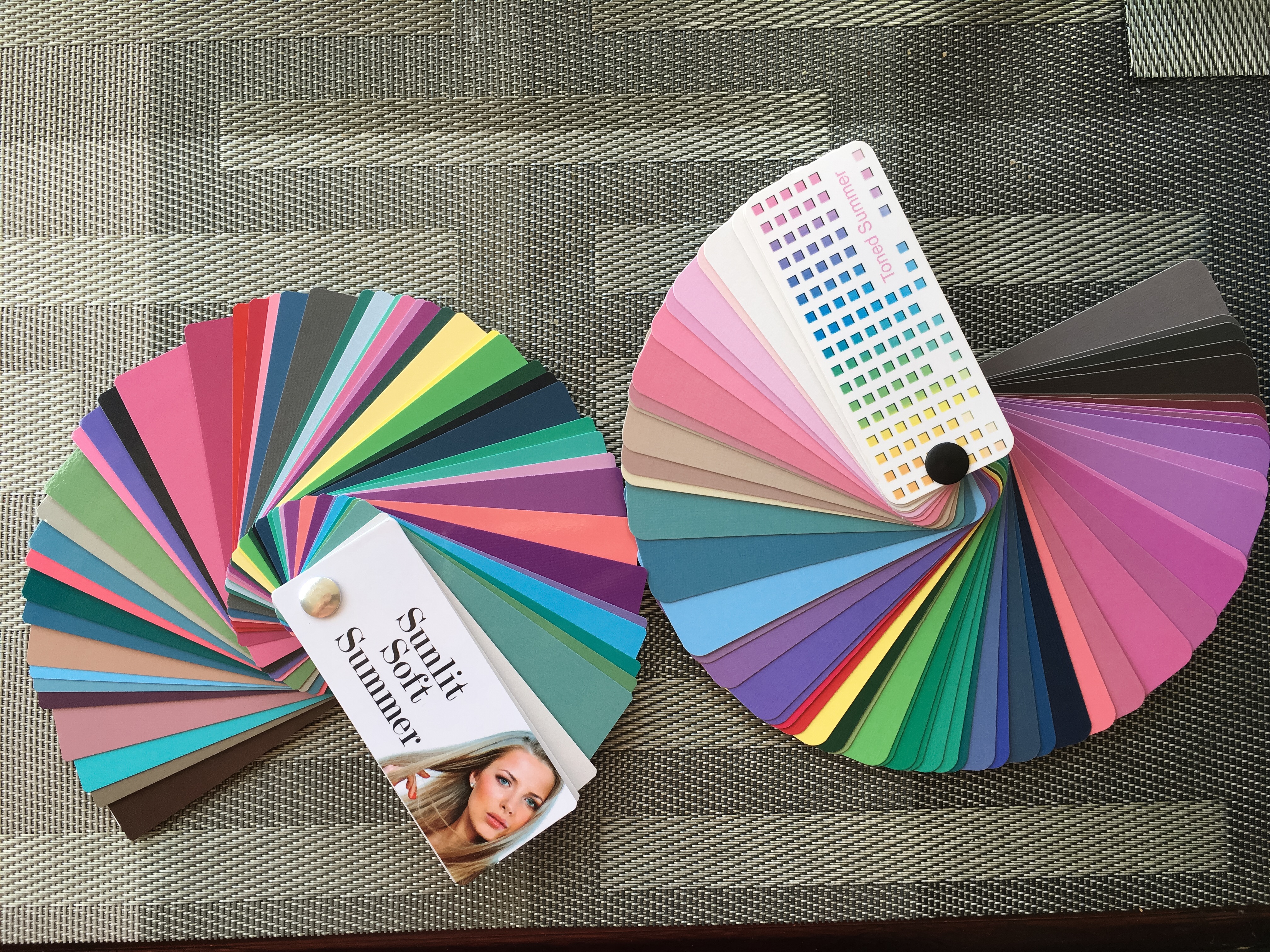
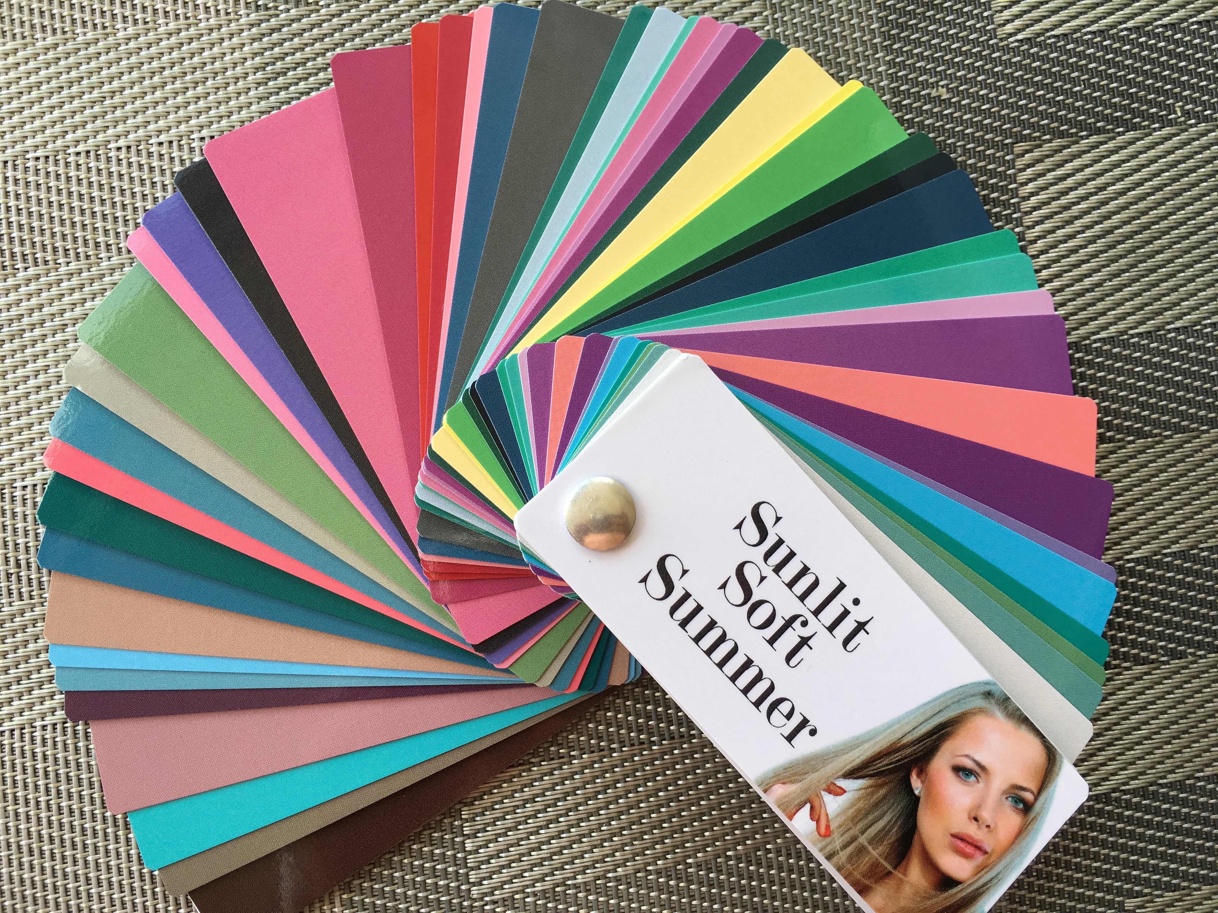
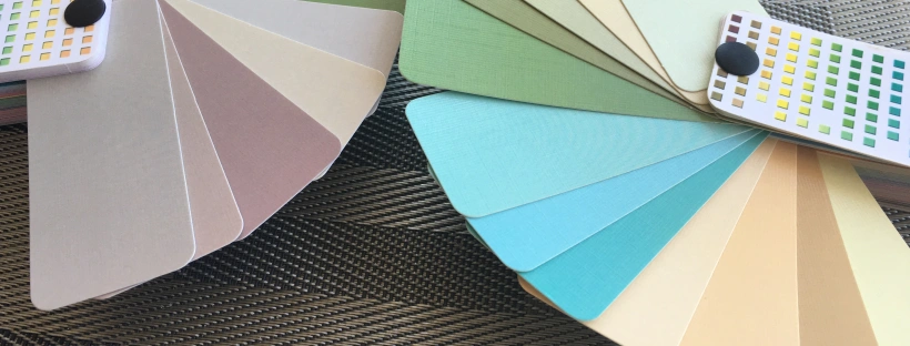
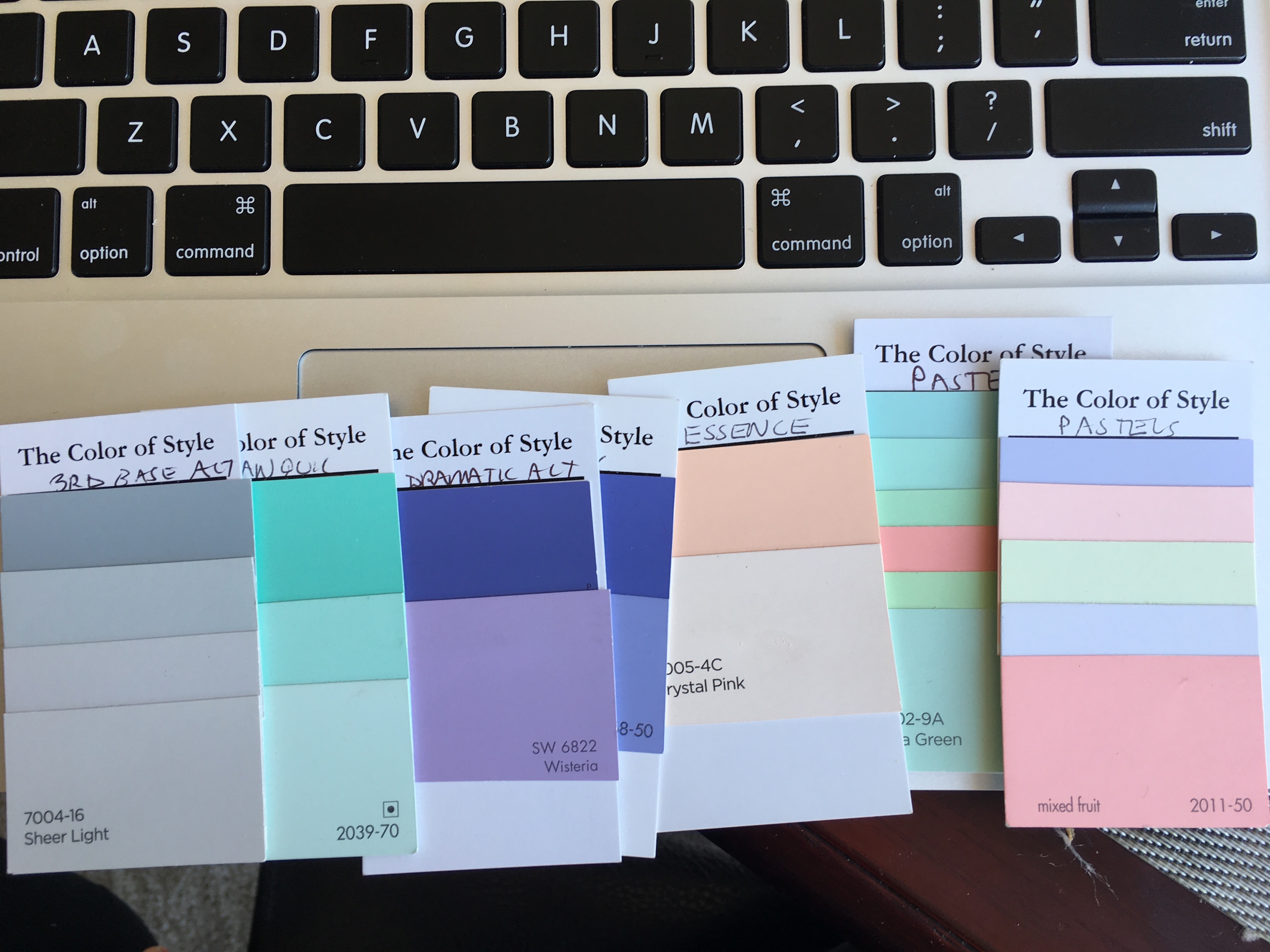
I decided to make my own fan, even though I could just use the HOC Summer color wallet that correlates with many of my colors from my Rating Booklet and with the online Kettlewell shop. The wallet was included in the price of the color analysis. I decided to make my own color fan and took apart 3 Color Breeze color fans to do so. I didn’t want to just be a “toasted soft summer”. I wanted my own unique color fan custom made by me and only my best colors!
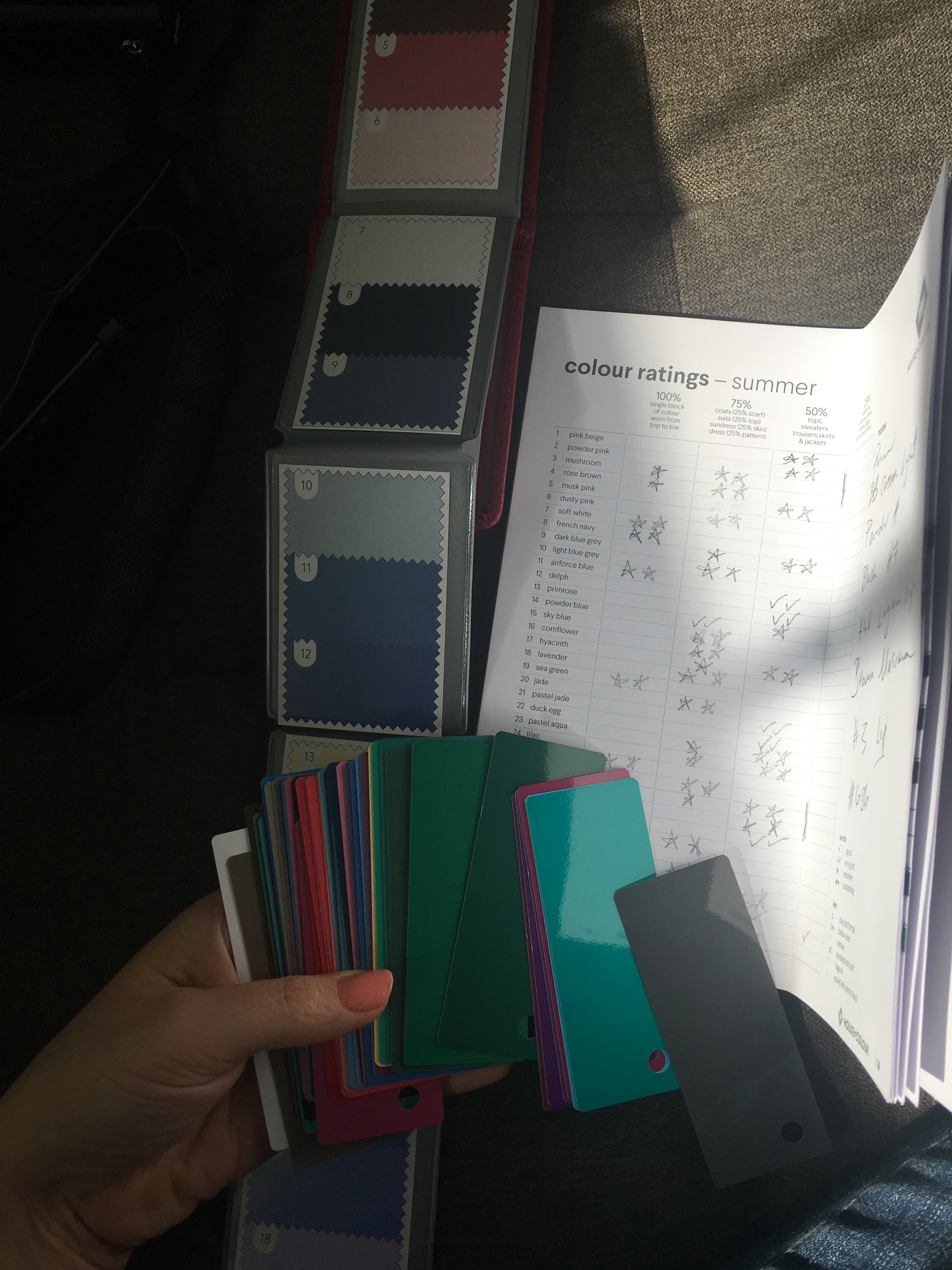
I took apart the fans and compared to my Colour Ratings Summer book and my HOC color wallet. I used the star rating scale to match or at least harmonize my best colors.
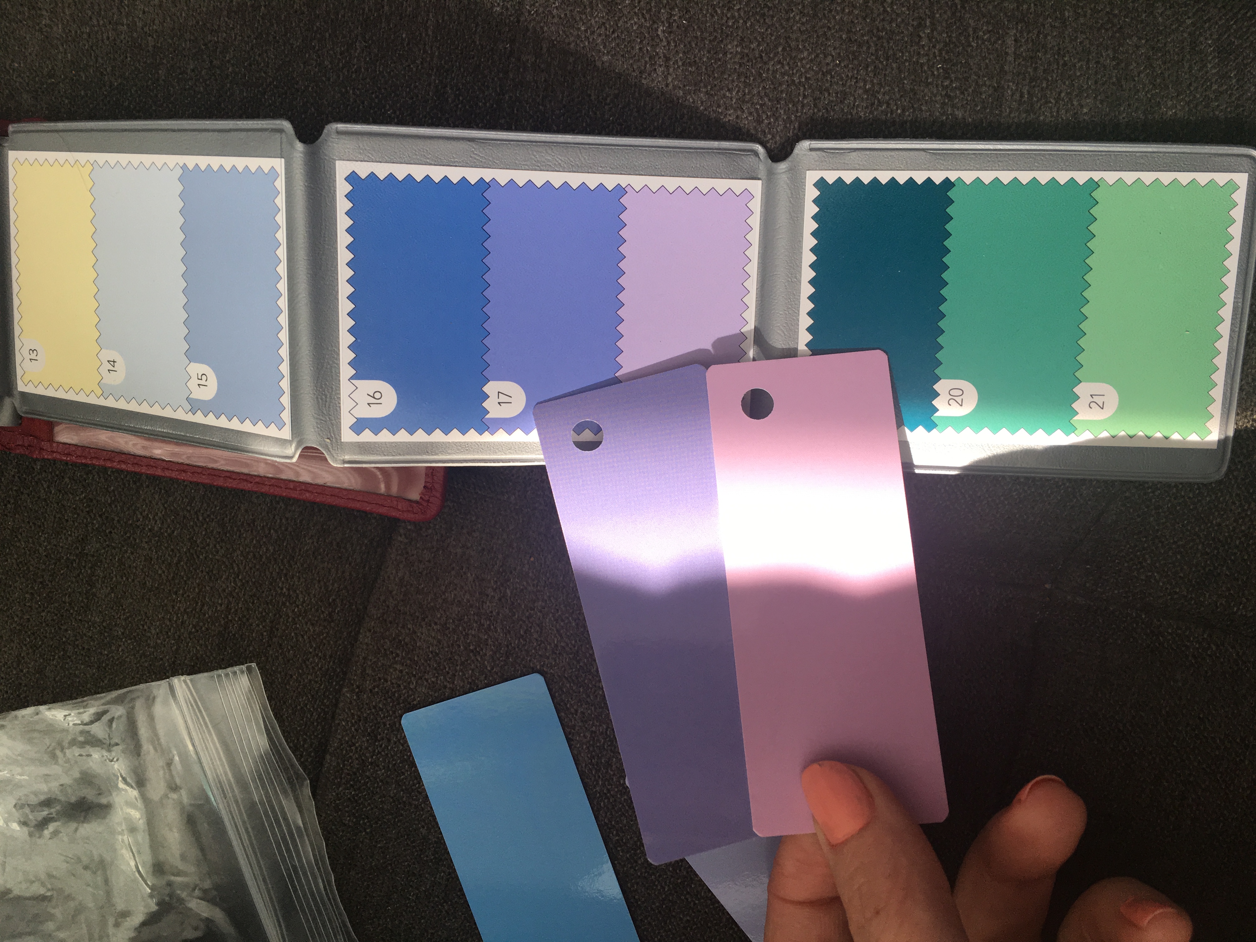
Harmonizing here!
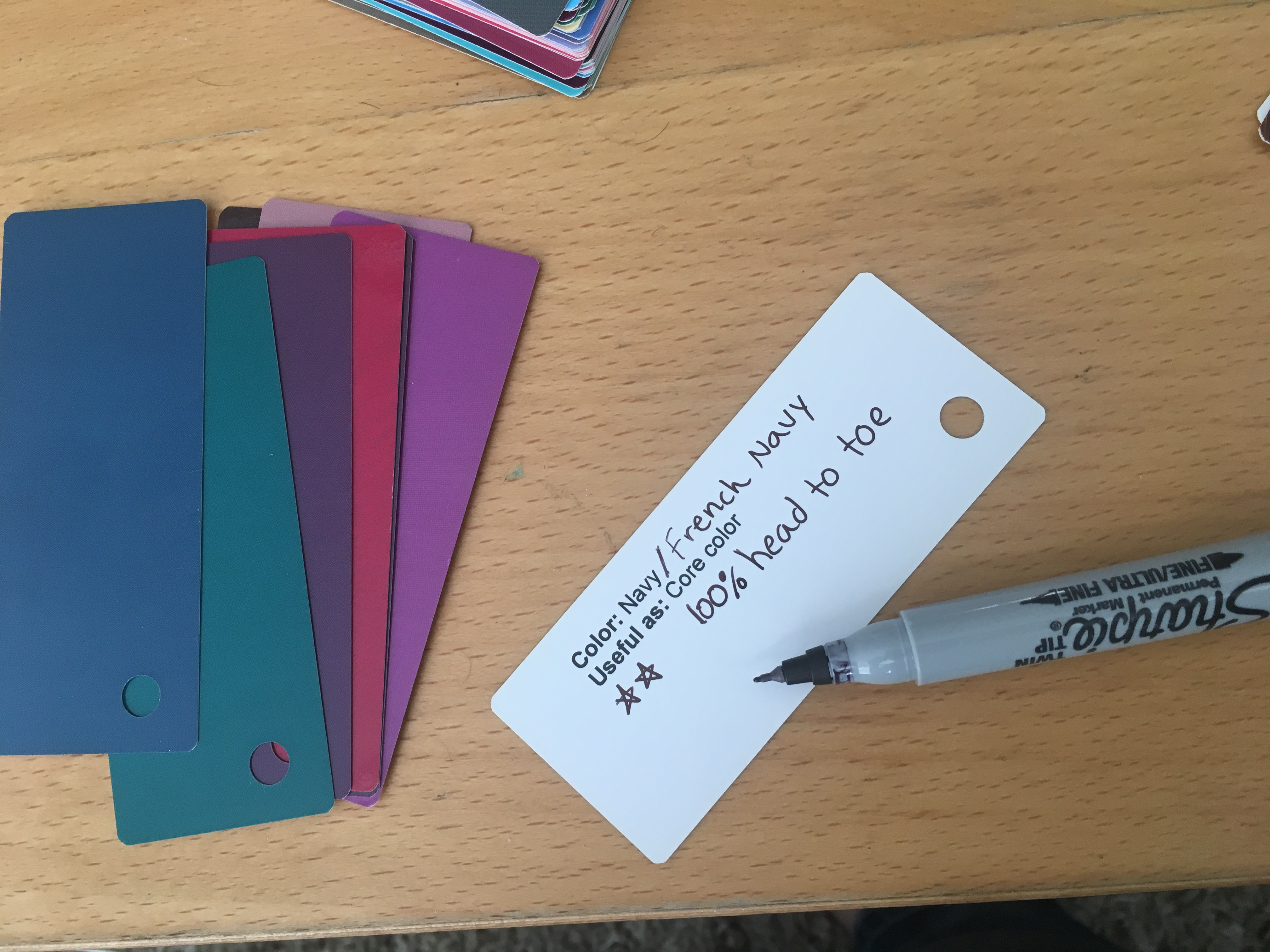
Writing down important information on the back of the swatches.
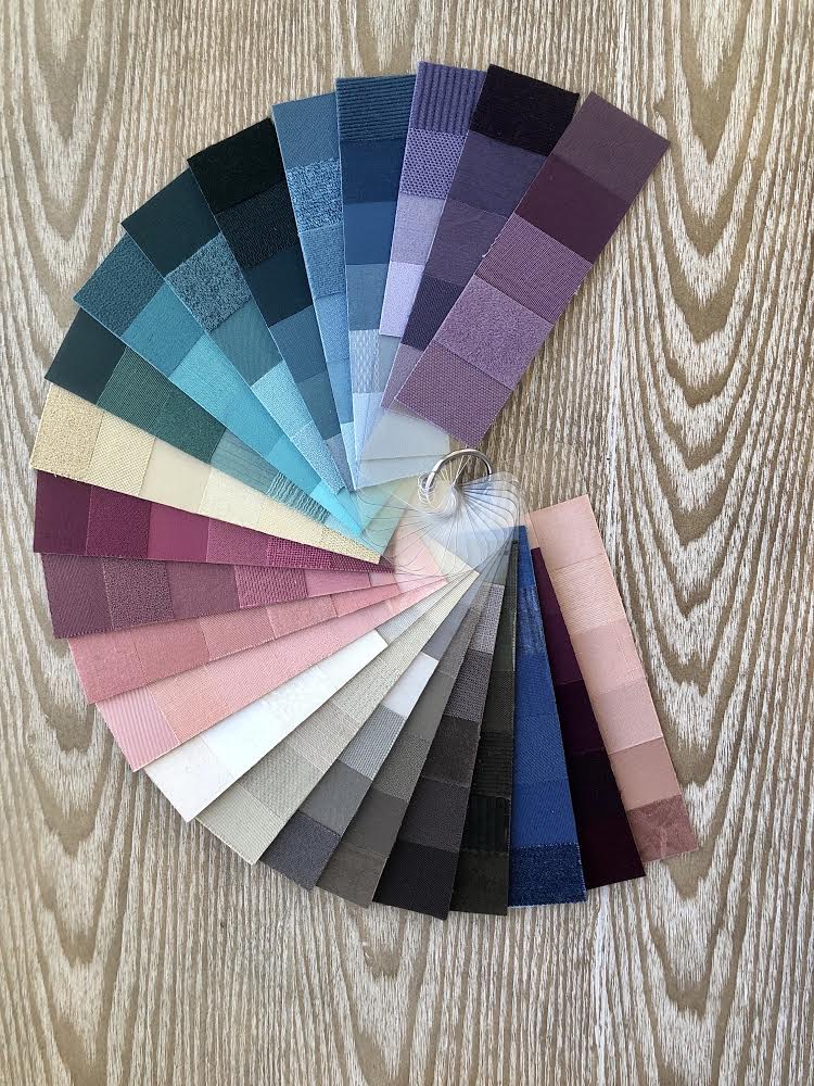
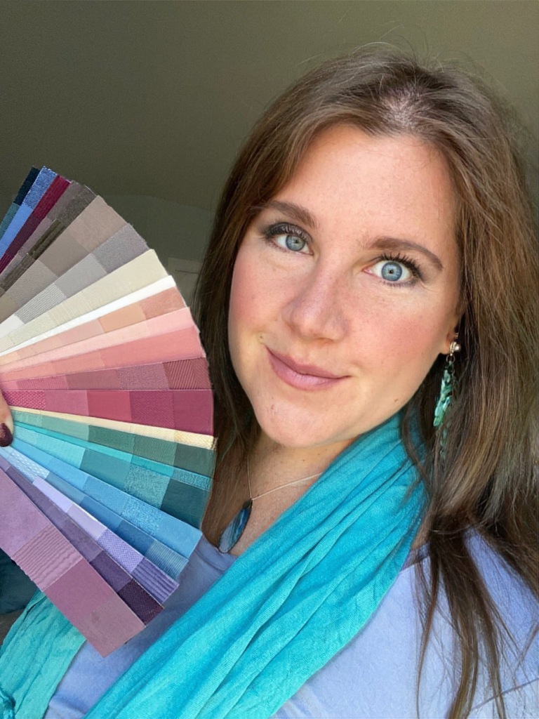
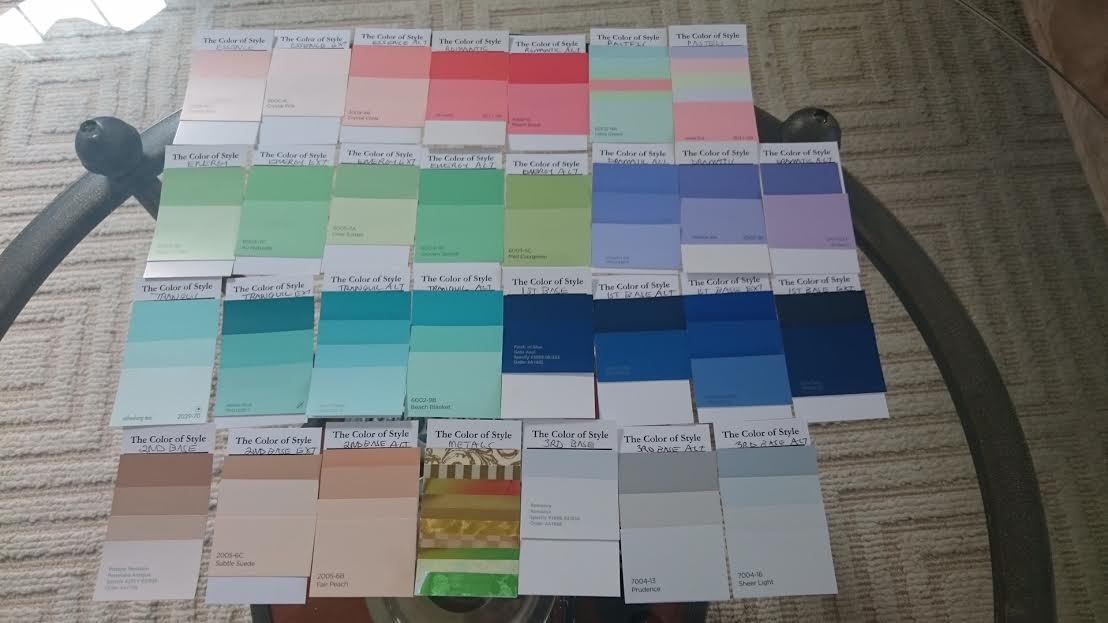
Here I am organizing the loo% at the front of the fan, the 75% next, then 50%, then added some more neutrals, and some of the brighter colors for color pops in my outfits to use as the 25% of my outfit.
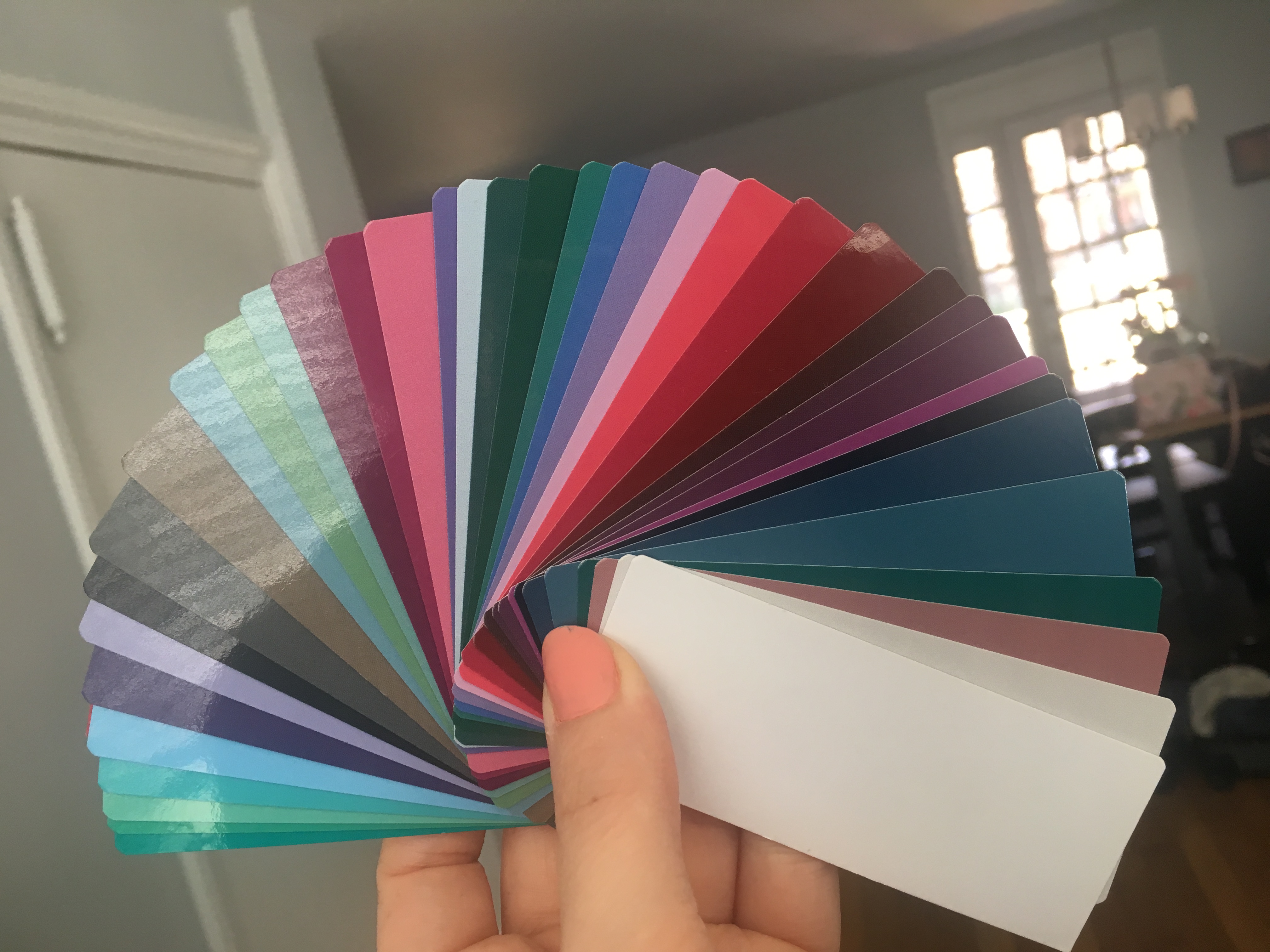
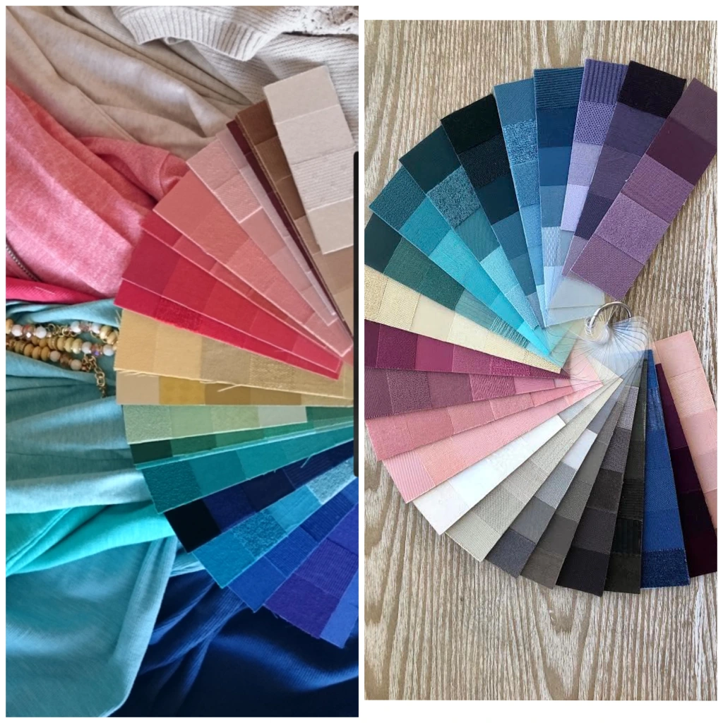
And here it is! Still a work in progress, because I would like to add more darker blues and blue variations. But you can see this is more vibrant than the typical 12 tone classic soft summer fan, and no wonder I always felt dressed in neutrals when I fan matched to it. But now I suspect and hope I find colors with the right level of saturation with my new custom fan.
My new custom fan harmonizes nice with the drapes! and I left out the yellows, which never looked good on me, even in small patches. So I didn’t want to include them at this point in time.
Comparison of 12 tone corporate Soft Summer fan and my custom palette based on HOC Dark Summer:
It is nice to have the custom fan so I can avoid colors from the 12 tone fan: the too dusty colors and also avoid the yellows and some of those grays.
I do give a lot of credit now to Heather Noakes for seeing me as a darker soft summer first. I couldn’t really understand it at the time, but I now realize she did a great job for what season limitations their are in the sci-art system. In the Color Breeze season this is considered Soft Summer Deep but I’d never get analyzed as a Deep in that system.
Final Reflections:
-I loved the technique that House of Colour uses to determine warm and cool
-I love the open mindedness of being able to wear the colors from your broad season
-I love the fact that HOC uses natural lighting for the analysis.
-I also love the rating scale and finding your best colors in your season based on how they individually look on you as the unique individual.
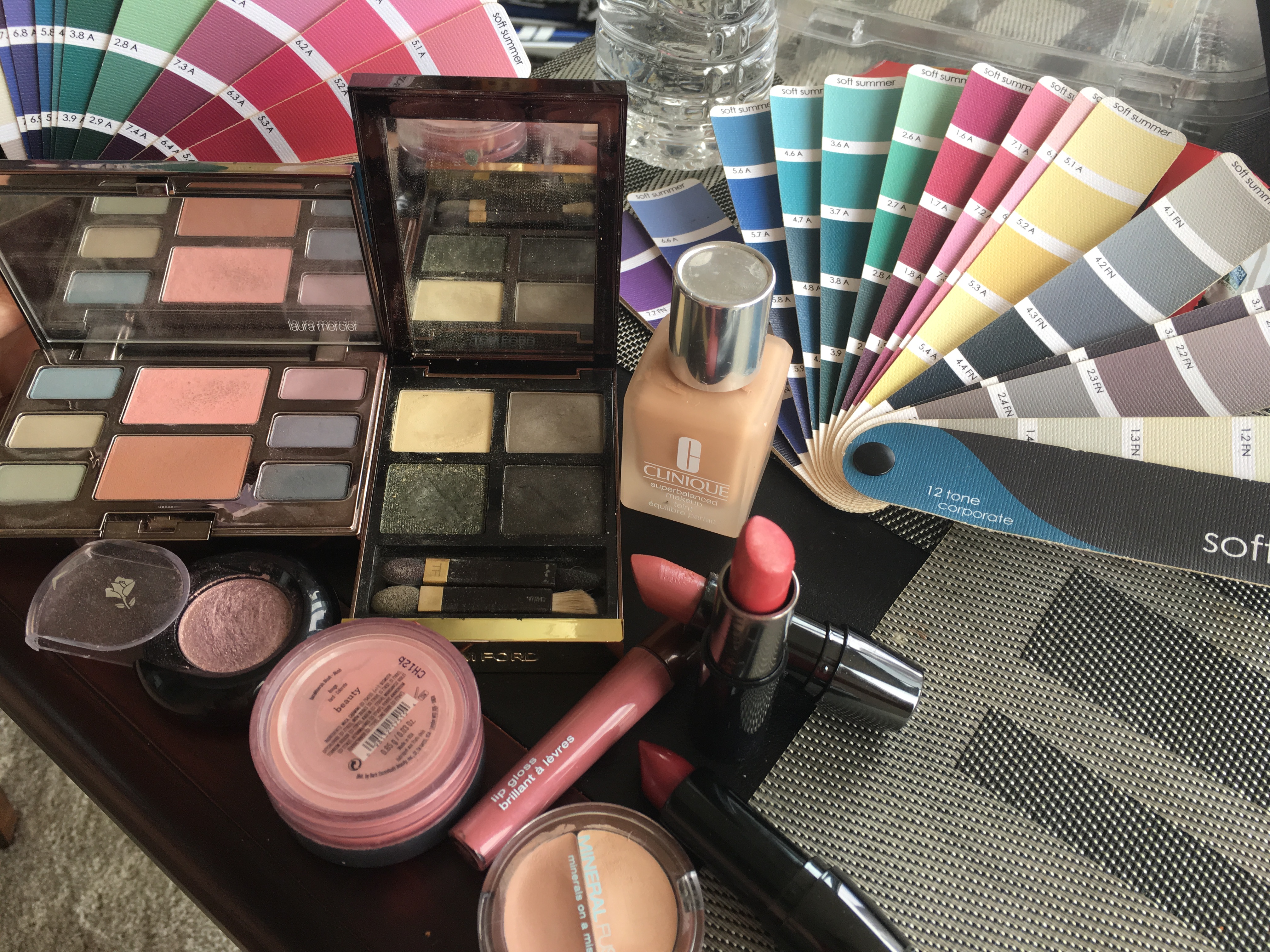
-The Color Rating Scale Reference Book, Color Wallet, Kettlewell website for purchasing clothing (that matches your colors), the HOC online makeup store, and the Kettlewell blog are all great tools.
Shop at Kettlewell
The House of Color analysis gives the client way more tools to be successful after they leave the color analysis. I also really loved the quality of the drapes and how they looked on me. I finally felt that “wow” feeling that other’s feel when getting draped for the first time that I hadn’t experienced entirely, with colors that felt vibrant on me.
These darker and more vibrant Summer colors look great. I really do believe now I have a color home and it feels amazing to finally have found it. I finally feel like I am wearing colors that pop on me, instead of colors that feel like dusty neutrals. A huge thanks to Julie Shields and House of Colour for finally figuring out my best colors!
~Heather
NaturalColorMosaic