
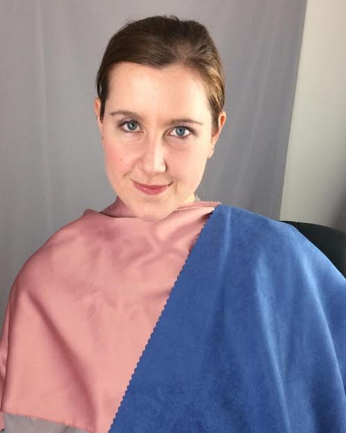
Soft: Warm and Cool plus Textures!
This is one of my favorite looks from my 12 blueprints draping. Warm and Cool. Soft Seasons, being a neutral season, have both warm and cool in their coloring. It looks amazing when gold and silver is mixed or a silvered gold is found in jewelry. Gorgeous how the pinky-reds and silvery-blues look together in clothing and accesories.
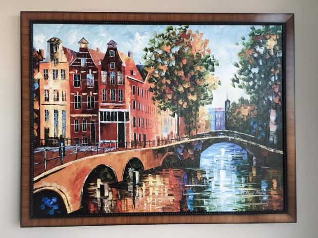
Here is some warm/cool inspiration from my favorite painter, Leonid Afremov…

Warm and Cool in Nature…
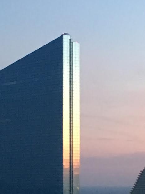
A sunset reflecting off of a silvery building making blue and pink pearly colors…
Patone’s Colors of the year:

Warm and Cool this year for Pantone….
Warm and Cool
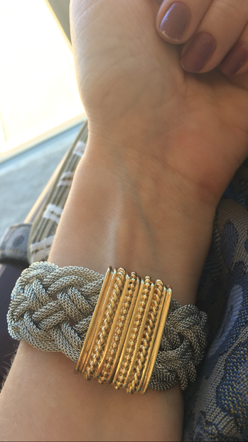
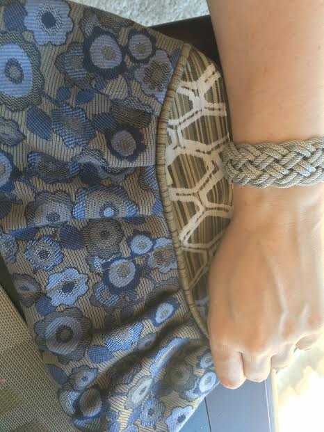
Bracelet with silver and gold, both soft and gold florentine, looks less yellow in real life.


This pearly pink doesn’t capture the greatest on camera, but is is like that warm pink drape almost peach but not peach, on the darker shade.


This dusty pink and purple are the most beautiful color combinations I have seen.


Lots of warm in cool accessories! Warm pink and Gray necklace, warm soft red nail polish, and cooler blues and grays in the purse and tops.


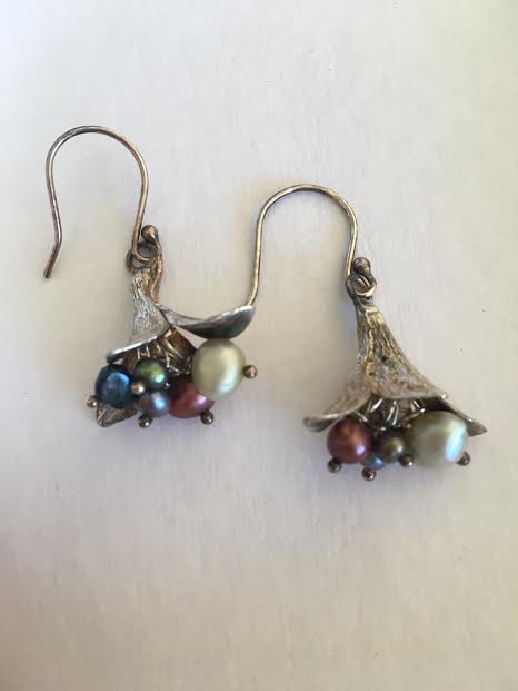
Warm and cool pearl earrings strung in blue, green and burgundy-pink.
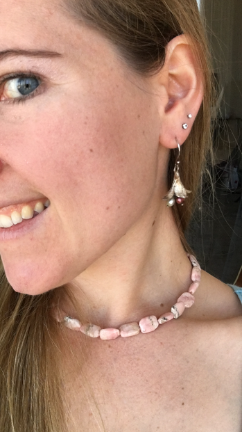
Warm pink pops in the necklace, blush, and pinky shimmering eye shadow makes my cooler blue eyes pop!
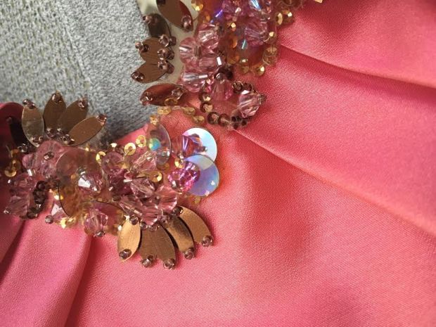
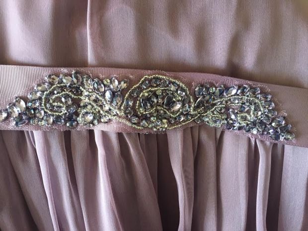
Intricate Textures
Thank you for Reading!
~softmosaic
