If you haven’t already heard I have a new website!!!
Please check out my new blog post/website here and please follow!
To get full blog post and story please visit blog @ naturalcolormosaic.com
Thank you!!
~softmosaic

If you haven’t already heard I have a new website!!!
Please check out my new blog post/website here and please follow!
To get full blog post and story please visit blog @ naturalcolormosaic.com
Thank you!!
~softmosaic


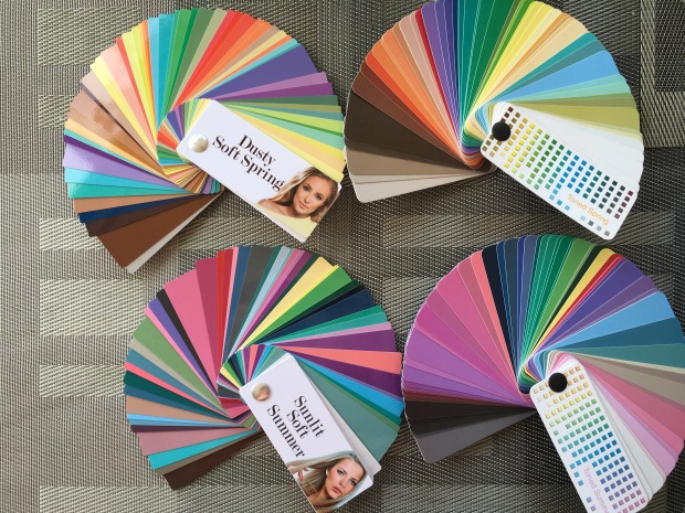
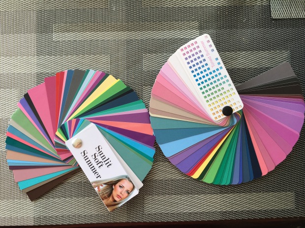
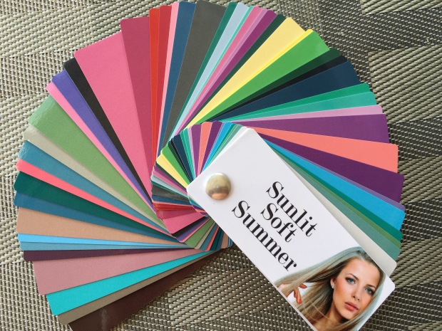
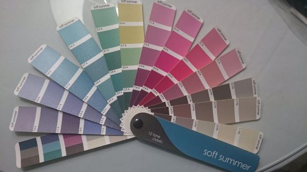
I’m exploring Soft Summer again during a trip to Europe. I found that I had some disappointments with the Cooler Soft Spring palette, Dusty Soft Spring. It’s still to saturated, bright, warm and I can tell it changed the colors in my face to less flattering hues. Sunlit Soft Summer is definitely the better palette for me. However as much as I liked the PYW fans, I am back to using my sci-art 12 blueprints (12 tone fan). Go figure!


12 tone fan….
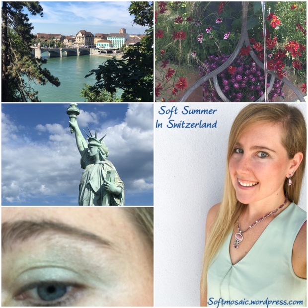
Soft green shades, beautiful with purple accessories. With the statue of Liberty (France) this is a mixed Swiss/French inspiration idea.
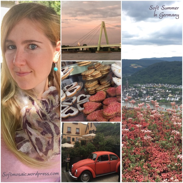
Shades of soft red, purple, and pink. I love this card it has this movement that is interesting and reminds me of the heart pastries with the white and purple jam filled center.
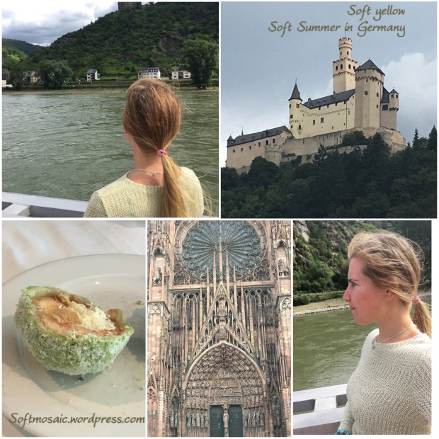
Soft yellow with texture like the cathedral. I usually don’t wear this much texture, however it is fun and yet still soft.
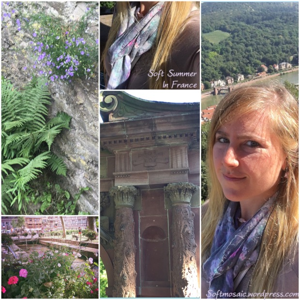
Pinky-Purple greyed brown top with a floral scarf much like the color in the castle’s archway.
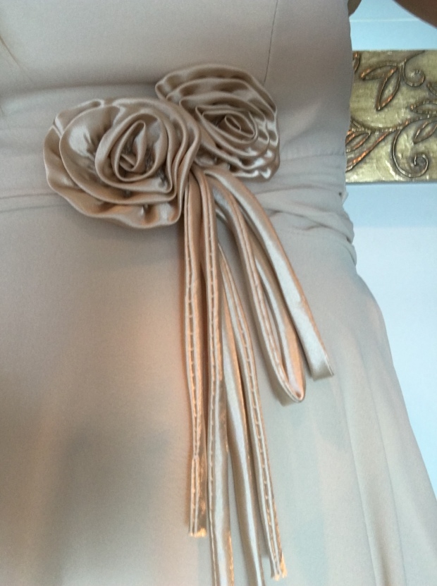
Detailing in a French dress…
So what about my beloved Zyla palette? I think it will work great still, and especially in the Fall when all the leaves turn gorgeous colors and I want to play along. I can wear some of those peachy-pink-oranges. Some of those brighter Zyla colors are fun to include in accessories. Some of the palette goes already with my fan or near close but some are not. I really think the 12 tone fan palette is my best. But yet draped twice was not good enough, I had to REALLY see it myself and compare all other options available especially with the new colors systems out there. User error was my main issue with this fan and for me that yellow strip is one of my saving graces when comparing “clean” or “dirty” yellow as being a good indicator when checking fabrics.
~Softmosaic

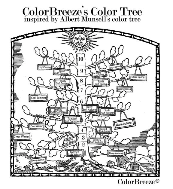
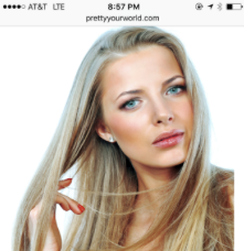
Photo credit to Lora Alexander from Pretty Your World.
Please visit Lora’s website for a full explanation. Below is a snippet:
“Then there are the Soft’s. Soft seasons are not the lightest, the deepest, the warmest or the coolest. They certainly aren’t the clearest. Using our tree example, they are close to the center of the tree. The closer it is to the tree trunk, the more ‘grey’ or desaturated it becomes. The sun doesn’t hit the interior of the tree much. This is where the Soft’s reside. There are lighter and deeper soft seasons. There are softs that are more warm than cool (toasted) or more cool than warm (toned).
It is the discovery of these wide range of soft seasons that ColorBreeze© was born! One cannot just be considered ‘Soft’ now and feel they know their season. Are you the lighter or darker, warmer or cooler Soft? ColorBreeze will find the perfect spot for you on the tree”
-Lora alexander (Color Breeze System)
The Sunlit Soft Summer can think and others can be most convinced that they are a Spring. I felt a huge connection with the description of the sun and lightest of the Softs. A lot of Soft Summer was too heavy and dark on me, not to mention I made swatching mistakes that had me purchasing Dark Winter and Cool Summer which both are pretty harsh on my complexion. It is understandable how Light Spring Soft would be great on me compared to my inaccurate Soft Summer purchases.
When draped again by Rachel of 12 blueprints I really loved the luxury drapes, however there was a soft autumn brown I liked and a Light Summer yellow I fancied. I thought well, why is this?
Now that I see that the Sunlit Soft Summer sits near the top of the tree near the sun I understand why I was so frustrated with Soft Summer before. I can see how one might think that narrowing a palette can cause limits, but If someone perceives themselves a certain way and I saw myself always as “sunny” its very confusing when your wearing clothes that seem too serious, heavy, dark and make you feel waited down. It makes sense that those colors are in the same realm but much farther down the tree towards the trunk. I am not that far down, I am towards the sun. I’m next to Light Summer but not that bright, makes sense why I like some Light Summer colors, and I am neighboring with Dusty Soft Spring which is the cooler soft spring. This makes sense why I have always adored and been able to pull of those colors pretty decently since it would be a neighbor season. Personally I’d prefer a palette/fan like the Sunlit Soft Summer because I am not going to accidentally purchase Dark Winter clothes with them and so on. It’s specifically my best and there is a lot of ranging mixtures of colors in that smaller honed realm.


This picture on the left is too heavy and slightly too saturated as well. Could be Dark Winter or maybe a darker soft summer could wear this. On me it’s not right. Now the second pictures I am wearing grey-green yellow and it’s much better. I am for sure lighter and towards the sunshine. Keep in mind the Left picture I am wearing makeup and the right I am wearing none.


These looks are very sunny. This is why they are so awesome on me.


Another really good example of how Soft Summer really can be split because what’s on the left is so not me.


Another really good example, the left drape is glowing and just looks like something I’d love to wear, the right seems heavy and I feel like someone else, not the me I’ve always known. Another great thing about the drapes on the left is the color combinations. Just 1 color or a neutral looks pretty boring on me, I need at least 2 colors for color contrast. I’d also like to point out these left and right photos all though not taken the same year were both taken in the winter time. This is due to wearing correct makeup and wearing my best colors that the left pictures showcase a glowing and healthy look.
Pictures below from Lora Alexander’s seasonal catalog:


This is a perfect example of why the Soft Seasons can be broken up. My current theory is I am a Sunlit Soft Summer and I am testing it out. This why I love the lighter and brighter colors on me and not the darker side of the palette better for Toasted or Smokey Soft Summer.


These pictures make the same point as the ones above.


Here are some great examples from Lora’s website catalogue on Sunlit Soft Summer colors. The are wonderful and they are definitely that sunny top of the tree colors that I thought I should be.
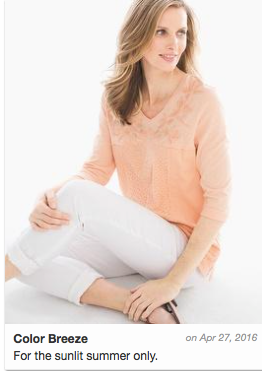

For the Summers, this photo is exclusive on Lora’s site for Sunlit only. I have a love of this color… and now I know why. I think there are some summers that can wear soft peach shades. This is a shared color with the Dusty Soft Spring, so I see how I keep thinking I could be a Soft Spring especially when some other colors systems don’t allow a peach on a Soft Summer.

Zyla is right, these are excellent shades on me and one that just seems to work so well.


Here you can see the resemblance of some of the Zyla colors. The Zyla swatches are coming out a bit more saturated then in real life but this is the idea when compared to Sunlit Soft Summer. Some of the bright colors like the top turquoise I prefer as a color pop in jewelry more then a whole garment…

In small doses the brighter colors are awesome and create a unique “personality” style that is more me and possibly works week for the Sunlit Soft Summer considering their place on the tree in near the sun and close to L. Summer and neighboring Dusty Spring.


Here are some Soft Spring shades from Lora’s site including the Dusty Soft Spring. I might be able to pull of some of these but that last one seems way to neon green for me. Zyla didn’t give me yellow although he thought about it. He said stay away from grass greens as well, and non of my colors look as highlighter as that last shirt.


So who would better wear my custom palette? Of course I would wear it best because it’s custom.
I’m very curious what the Sunlit Soft Summer palette will be like once the color fan arrives!
~Softmosaic

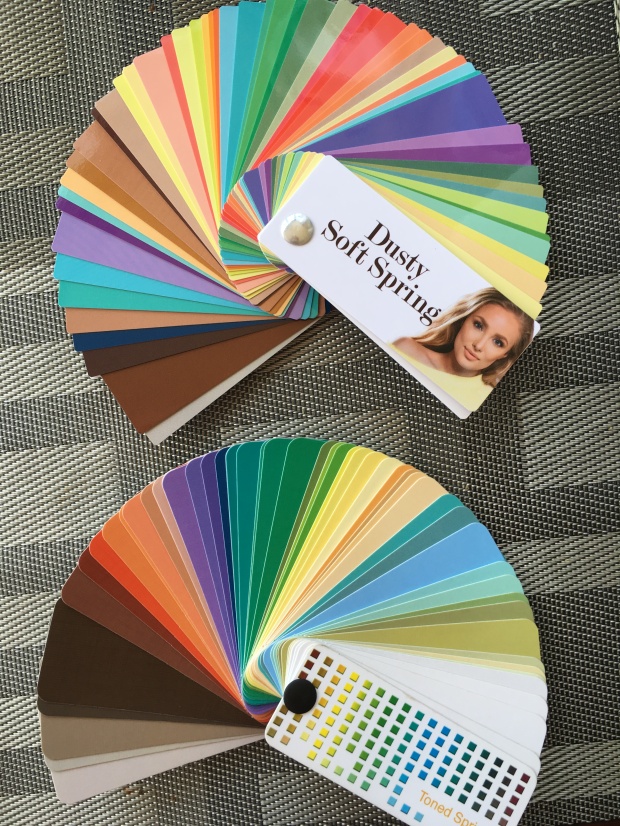
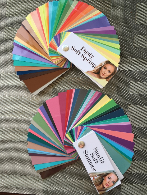
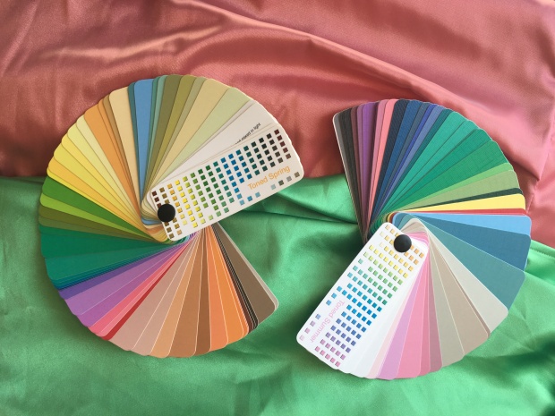
I’ve done a lot of work trying to compare the Toned Spring and Toned Summer palettes. I realized though I am using the old system. I have ordered The Dusty Soft Spring (a cooler spring) and the Sunlit Soft Summer (a lighter value Soft Summer) and am excited to compare my favorite colors to those fans!

Curious too about this…and how different the colors will be from the Toned Summer fan.

This Spring has blue eyes and looks cooler and a lot more like me. I am curious to see if these colors are better on me and match my personal found best colors closer. I’m very curious too because in my Soft Summer 12 blueprints draping, there was a Light Summer yellow that looked good on me and curious to know if it really was it’s relation to Dusty Soft Spring yellow that we were seeing work.

Another angle of my favorite green. It’s close but the fan sits a bit with the Toned Spring fan, I wonder if the Dusty Soft Spring will match better. I can’t wait to find out!

The palette (Toned Summer) sinks in, so it’s a better match for me then Toned Spring.

Even with that subtle orange sheen that made me think it was originally Toned Spring, the Toned Spring fan here does sit a bit and isn’t fully sinking in…

Again, another better match! Sinking in with Toned Summer fan. So curious as to how Sunlit Soft Summer will look to this favorite pink color of mine and how it will also compare to the Dusty Soft Spring.


These were my favorite draping colors from my most recent experiment. When I receive the new fans I will swatch and share right away.
I am so happy there is a cooler Soft Spring, and that there is a lighter Soft Summer. Those palettes, I am already positive will be superior for me, to these old palettes I’ve been using. I am also very curious on how they will match my personal custom color palettes…
Thanks for reading!
~Softmosaic

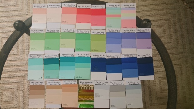
Ever since I have studied color I have hoped to crack the color code. Is is naive to believe one system is correct? Yes. But one could be “more’ correct for a particular individual. As well, that I’m not convinced that everything has been accounted for. For example, environmental factors (e.g. lighting, window tints, view on “full spectrum” or “natural” lighting) and within the developed system itself. Some systems only have 12 seasons where some have many many more seasons and more options for softer seasons.
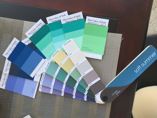
This is the Soft Summer fan in entirety. This fan has a mix of softer and slightly more saturated swatches. Overall the clothes I pick out tend to be too muted. The overall fan seems to buy me these results. Let’s look at another Soft Summer fan in another system called “Color Breeze” by Lora Alexander.

The Color Breeze Toned Summer fan, which is also known for Soft Summer Light. It’s more saturated then the fan posted above. I like this fan a lot more. Also, it does not feel as “chilly” or more cooler toned colors to my eye and has some warmer options.


My best colors are soft or muted. I am neutral, neither all warm or all cool in coloring. Toned Spring is neutral warm with an “autumn” muted roasting of Light Spring. Toned Summer is the neutral cool lighter side of the Soft Summer palette. These are combination palettes which means they could be used together or may share some similar colors but have distinct differences.
My custom Zyla palette…

If you took and broke down my Zyla palette, you would get a split between Toned Summer and Toned Spring.
Some of these toned spring colors look pretty good with the 12 tone (12 blueprints system) Soft Summer fan. But you can see the Zyla palette is slightly more saturated and if I were to use them to purchase clothing I guarantee they would buy different results in clothing colors and even outfit combinations.

I see the Toned Spring colors in my skin. 12 blueprints system would say these are “overtones” and incorrect bad color reactions on skin that is cooler then the palette creating “yellowed skin”. Other systems would believe this “IS” the colors of your skin.

My Kathy palette is a system like this, that intact looks at the colors of your skin, eyes, and hair and gives you colors based on what is seen visibly.

Here are my more preferred colors on the Toned Summer fan.

Here is the whole fan. I like the depth, one that Toned Spring seems not to have for me.

I much prefer warmer pinks of Toned Spring to cool mauve of Toned Summer and the warmer grey or browns of Toned Spring to the cooler grays of Toned Summer.

I feel divine in that orange pink that much more Toned Spring then Toned Summer. Bit it is so close on the line between the two seasons. Toned Summer does not go soft orange. I find seashells all the time that have this silvery orange color that is amazing, probably my favorite color since I was a child. Where would that color fall on a season? It’s soft but more neutral.
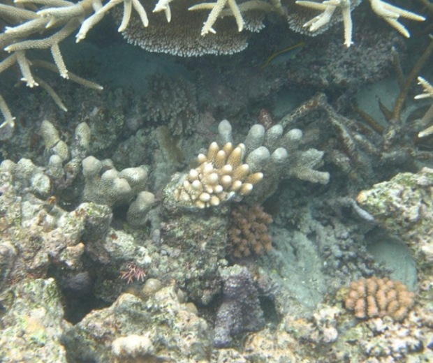

These two seashells are orange. At the beach recently, I realized that orange I love in seashells are a soft orange. And what palette does that exist in? Not muted enough to be Soft Autumn right? It’s like that Marigold color, clearer then autumn and gentle like Toned Spring.
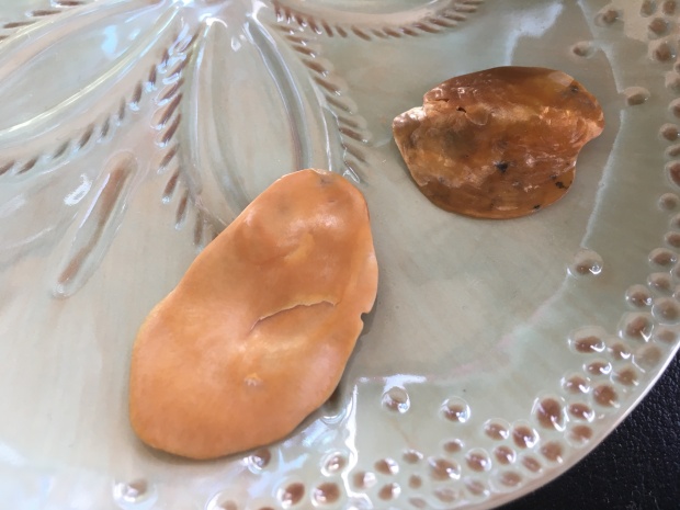
The one shell on the right has a shine to it, but it’s not too shiny. If it were jewelry it would be the perfect amount of shine I could handle as a Soft Season person.


The shells harmonize very nicely with the Toned Spring fan. Looks clownish on the Toned Summer fan (neutral cool) which does not have orange or milk chocolates.


See how the seashells are too muted for the light spring fan and too bright for the soft autumn? These are 12 tone (12 blueprint system fans) That is why they fall into Toned Spring (Light Spring Soft) which is a different system.


The soft orange sinks into the Toned Spring fan (R.), and sits on the Toned Summer fan (L.)


The other side of the soft orange seashell has orange and a cooler gray. This seashell is a perfect example of the existence of a mix of Toned Spring and Toned Summer. But when harmonized with the whole fan which color palette fits in the best?

My Zyla palette has this mixture of Toned Spring and Toned Summer…If this is a real life example then why does this or can’t this exist in people?

Here is a collage I made comparing myself to the 16 seasons, Toned Spring. My hair is very similar to these people and so is my coloring. I think the main difference is that their eyes are warmer looking as in more visible soft gold/yellow.


My eye is a neutral blue or you could say blue/gray/green coloring with a star pattern and wavy lines that start at the pupil outward.

With refraction my eyes have a warmer look almost seafoam and moss…

The water above and a close up shot of my eyes below.


Toned Summer fan comparison to my eye color. It has the right depth.

Toned Spring eye colors. It has the right warmth.
Here is the common theme again, Soft Summer or Toned Summer has correct depth but Toned Spring has some colors with correct warmth.

I might have all of these colors in my eyes. Most color systems would say that okay, that’s fine, you can be neutral cool but have warmer eyes or even neutral warm and have cooler eyes or a mix of both. 12 blueprints focuses on the skin. The thing is my skin is much finicky like my eyes where it’s split I believe between palettes. The question is which one is stronger, if you had to pick one? Or why pick one, that’s what the custom palette is for…
So let’s honor 12 Blueprints system and look at skin reaction with drapes. No makeup, just skin reactions to the colored draped clothing.


Toned Spring Vs. Toned Summer Greens. L. Toned Spring and R. Toned Summer. The bottom green is almost split between Toned Spring and Toned Summer, tricky!
It looks like it could fit into either. Your eye tries to automatically make the similar swatches in the fan connect to the clothing articles being examined, so hide them…but it’s still so hard to tell…


Toned Summe dark grey Vs. Toned Spring Chocolate browns. The dark chocolate is an eyebrow color match and both browns a hair color match. The light chocolate is the natural highlight in my hair. So if my hair has these colors, I’d say that those colors should be a part of my palette, why not?


Toned Summer top and Toned Spring bottom.
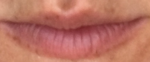

This was the in-between pink which does posses some orange Toned Spring if you can make it out but also a tad cooler looking purple mauve shimmer that could be why it also seems as if it could be Toned Summer. It’s the color of my lips…That’s why it is so awesome.


In the side by side, the Toned Summer top and Toned Spring bottom. Is one washing me out a tad because it’s too warm or is one yellowing me a tad because it’s too cool for my skin?
My two favorite colors seem to encompass elements of both Toned Spring and Toned Summer right precisely almost on the boarder or paradox of the season. If we compared 12 blueprint fan then these colors are not Soft Summer because it doesn’t go this saturated but the Pretty Your World 16 season Soft Summer version Toned Summer does go this saturated…


Here the 12 blueprints fan doesn’t go as saturated or as warm as Toned Summer/Toned Spring. Therefore it cannot provide me my best colors.


Here the colors are the right saturation and warmth the yellower in the green shimmer and the orange shimmer in the pink.


Here the colors are the right saturation and just a tad warmer in the green and pink but has shimmers of color that tie it close to this fan such as a cooler green and slight purple mauve shimmer.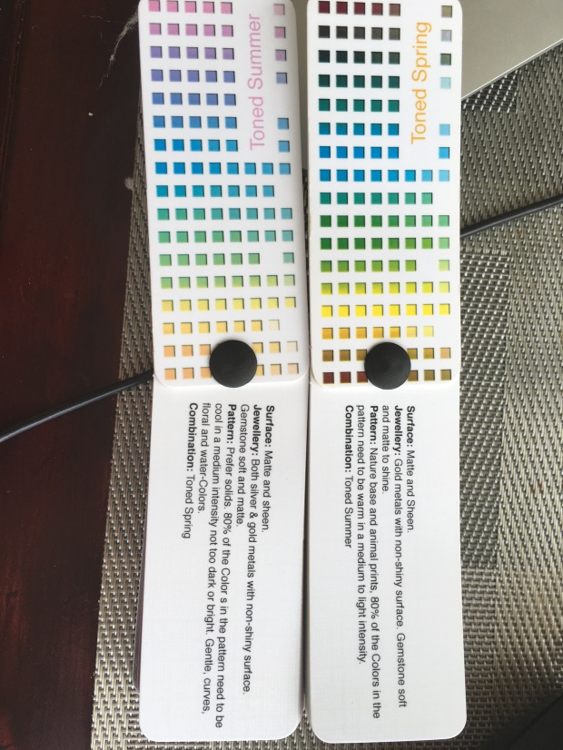
80% needs to be in that season and 20% can be its neighbor. So wear 80% Toned Spring with 20% Toned Summer or vise versa 80% Toned Summer with 20% Toned Spring.


L. picture majority Toned Spring w/ T. Summer charcoal, R. picture majority Toned Summer with T. Spring chocolate.

Majority Toned Spring with T. Summer green.


Left picture animal print (Toned Spring), Middle Picture Toned Spring scarf, Right picture Toned Summer scarf.
Thanks for reading!
~Softmosaic
