

Revlon “Wink for Pink” is a Light Summer rec. I thought I’d try it. I was recently analyzed again by Kim Bolsovar who gave me Light Summer. She said that I would generally fit the bill as a Soft Summer in the 12 season system however that my eyes were unusual. I will get to that later. Also she took into account my personality which is a “yellow” Spring personality with a “Blue” summer secondary.

Here I am wearing the “Wink for Pink” LS rec. I thought after I have been told so many times that LS was too bright for me in my sci-art drapings that this color should be bright. But I didn’t feel that way at all wearing it, it seemed normal to me. It is a color I would have picked before I knew anything about color analysis and before I was drawn to certain color palettes like Toned Spring were I developed a wanting to be warmer and avoid cool colors.
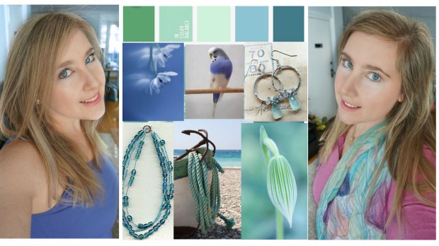
Kim recommended to me to explore more purples, blues, and aquas. Many of these colors in the collage I made are in my Zyla palette. Although a major difference would be that my Zyla palette goes pretty warm with my version of red which is definitely Toned Spring. But here I find myself really liking this raspberry Light Summer color (on right of collage). These are some of my favorite colors for sure.
 This is a similar look I wore years ago with this raspberry hoodie and the water color hand painted scarf. My lipstick here is Cairns “Coral Tulip” which is a bit of a L. spring and L. summer crossover color. I feel like I have cooled down a tad since a few years ago. I still like Cairns “Coral Tulip” but do think it might be a tad orange and think that the L.Spring cooler color of “wink for pink” is a bit more natural, and again just a different look.


Kim took an eye color and pattern course a while ago. And she said that my left eye is spring color, pattern and clarity but my right eye is for sure summer and cooler. I thought how interesting! This exactly describes my frustrations with colors being too bright and too muted and too cool and too warm. I kind of look good with cool and warm colors paired together to balance this out and maybe even softer and brighter colors paired together to balance this out.


(Soft Summer left, Light Summer right)
This is also were I can ask myself, is the balance better? When I look at the Soft Summer drape I see muted color underneath and when I see the Light Summer color I see more of a balance of my skin brightness and the color. To me the Soft Summer color looks more like a neutral even though it’s a color, and I think that is due to the muted quality. And alas that is always how I feel in Soft Summer, like I’m always wearing neutrals.

In my opinion, this is my best color. It’s a purple periwinkle and it also is my Zyla dramatic color. I think it’s Light Summer, don’t currently have a fan to compare because I sold all my LS fans a long while ago but I did just order one but yet to come in the mail.


Here yet another example of the Soft Summer a tad muted on me on the left and the Light summer brighter and more level with my brightness. Zyla also said I need crisp colors and L.summer would be closer to the description of crisp then Soft Summer.


The drapes I did like from my Soft Summer draping were the ones with the shine. I like shine and sparkle, and of course the right levels of it. I notice a lot of the Soft Summer’s I talk to do not really like shine or sparkle and I do.

This is an older picture and not great lighting but here is a great teal and aqua color on me with the scarf and the scarf has a shimmery glittery fabric. I do like sparkle and I also wear sparkle on my eyes.


You can see that the eye shadow color I like is a shimmery orchid color, Stila “Cloud”. I also notice how some of the colors are similar that I custom picked out for myself on my blazers without looking or comparing to any color palette. It does have resemblance to L. summer fan.
I have another custom palette I have made I am interested to share this as well to see how it compares.

Perhaps the L.S. scarf it light and candy on me, Zyla also never liked pink on me as he said “candy” and that’s why he chose the warmer peaches, peachy-pinks, and corals. However I do say even if candy I do have a liking to this scarf and to the orchid color.
Until my next post where I share my custom palette and have a Light Summer fan in hand to test some of my favorite colors out!
Thanks for reading!
