Soft Summer.

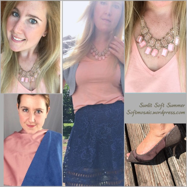
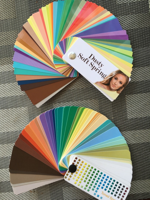
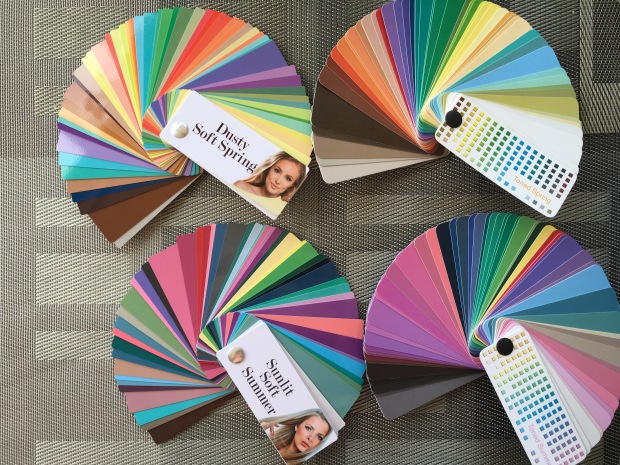
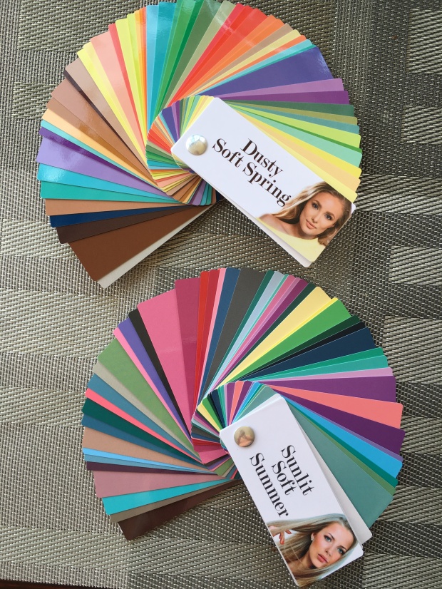
I’m exploring Soft Summer again during a trip to Europe. I found that I had some disappointments with the Cooler Soft Spring palette, Dusty Soft Spring. It’s still to saturated, bright, warm and I can tell it changed the colors in my face to less flattering hues. Sunlit Soft Summer is definitely the better palette for me. However as much as I liked the PYW fans, I am back to using my sci-art 12 blueprints (12 tone fan). Go figure!

12 tone fan….

image

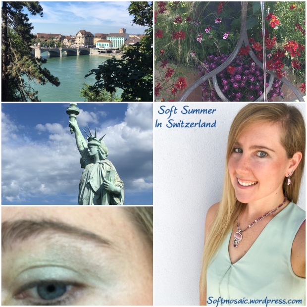
Soft green shades, beautiful with purple accessories. With the statue of Liberty (France) this is a mixed Swiss/French inspiration idea.


image

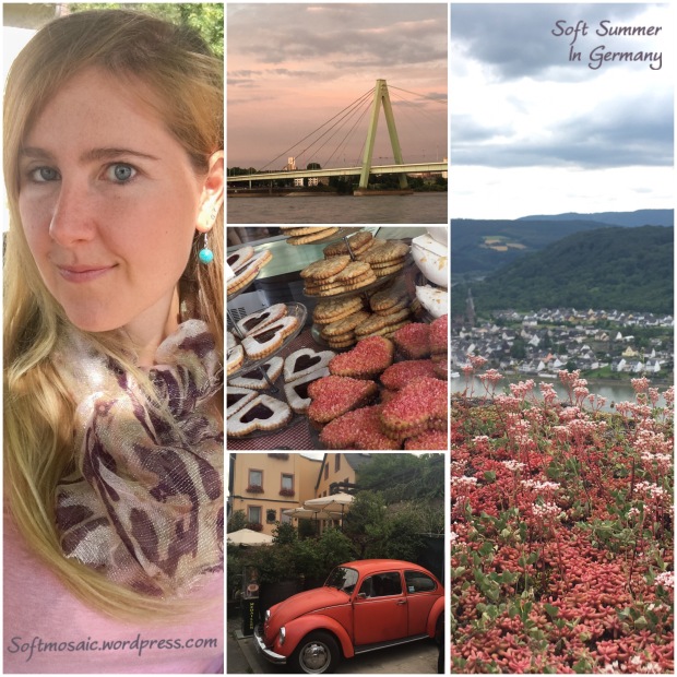
Shades of soft red, purple, and pink. I love this card it has this movement that is interesting and reminds me of the heart pastries with the white and purple jam filled center.

image

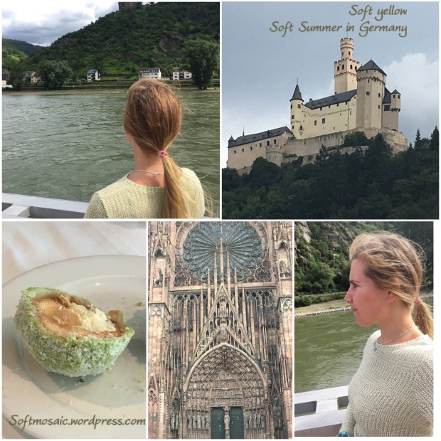
Soft yellow with texture like the cathedral. I usually don’t wear this much texture, however it is fun and yet still soft.

image

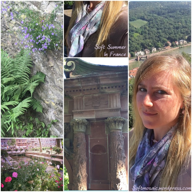
Pinky-Purple greyed brown top with a floral scarf much like the color in the castle’s archway.

image

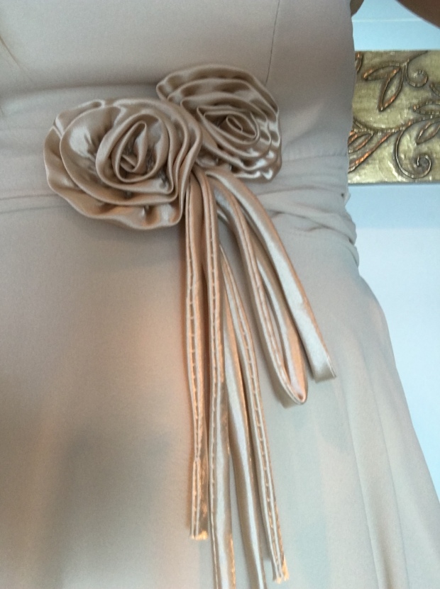
Detailing in a French dress…

image

image

image

image

image

SM7

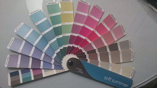
So what about my beloved Zyla palette? I think it will work great still, and especially in the Fall when all the leaves turn gorgeous colors and I want to play along. I can wear some of those peachy-pink-oranges. Some of those brighter Zyla colors are fun to include in accessories. Some of the palette goes already with my fan or near close but some are not. I really think the 12 tone fan palette is my best. But yet draped twice was not good enough, I had to REALLY see it myself and compare all other options available especially with the new colors systems out there. User error was my main issue with this fan and for me that yellow strip is one of my saving graces when comparing “clean” or “dirty” yellow as being a good indicator when checking fabrics.

~Softmosaic


Sunlit Summer Sneak Color Palette

As I eagerly await for my Sunlit Soft Summer palette in the mail, I have done some exploring and creating!

IMG_7768

I found this palette on Pinterest. It is the warmer colors of Soft Summer photoshopped. However, I will say that where are the purples? They clearly are missing and I’d be supposed when I get the Sunlit Soft Summer fan that it wouldn’t have purple.

I always thought I had a touch of light brown on my skin more so then other Soft Summers but that had me thinking I was a Toned Spring or Soft Autumn which I may find Toned Spring is too bright/warm overall and Soft Autumn is too muted/heavy on me.

IMG_7764

My skin is like a peachy-pink with a touch of light brown like the flowers in the collage. So my skin looks bright, tricky because it looks very Spring season. My eyes have a brightness too like a Spring person, but the saturation is lower and the colors a bit cooler blue-green with hints of yellow-taupe like speckles and star shape. My hair is like drift wood  from the beach, in that it is multi-tonal in warmth. It comes in like a mauve silver brown and lightens into a soft golden color in the sun that can get as light as soft yellow. My eyebrows resemble Soft Summer rust color, warm yet still cool. There is no question, when I look at this palette, I see my natural coloring reflected in them.

IMG_7830IMG_7630

This model on the right, her hair is coming in ash but warms at the bottom. That is exactly like my hair color. As well, she has very similar colored eyebrows and has a “rosy” quality to her that I have as well in my skin.

2

This model for Dusty Soft Spring lacks that “rosy” quality that I seem to have. I’m not throwing in the towel yet on Dusty Soft Spring until I see the palette. It after all  would be my “sister season” and one of my best “cheat” seasons if you will that I could pull off in the Color Breeze System. Having more options and changing up a look is fun, it’s more open-minded in a sense. We can color outside the lines and add elements and pops of colors from outside configured color space that could enhance or improve our look/make it unique and interesting.

IMG_6957

This collage I posted a while ago in another blog post. I wonder if these women are still considered Toned Spring with the new Color Breeze System? We have similar complexions although if it’s just the quality of the camera, there skin seems much more “saturated” then mine does.But  I do notice a similar rosy cheek color in both models.

Sun and Sky look:

IMG_7852

This might be one of my favorite looks I have put together. Mixing warm and cool.


IMG_7795

I feel very at home in these colors. Hopefully the palette I ordered is of my standard or expectation, hopefully it exceeds it.

Before I started this blog, on a previous blog: Lightmarigoldspring, I knew Soft Summer palette on the 12 tone fan is hard to use and it is not individual enough for my taste. I think that’s why custom palettes are superior in that sense however it doesn’t mean custom palettes are exactly correct either, it’s more an art vision. What is correct is what is correct to you as the individual. But I think we can get closer and need to listen to our instincts. I felt some colors to chilly, too drab, too heavy in many cases on my 12 tone fan. I think that a more specific palette would help the consumer stay away from those choices. Why are the luxury drapes so awesome at a draping yet the fan can’t seem to get results anywhere close. It’s  user error, it’s the fan, it’s where your looking to buy clothes, etc.

~Softmosaic


Color Breeze System: Dusty Soft Spring Vs. Sunlit Soft Summer Part 1

I’ve done a lot of work trying to compare the Toned Spring and Toned Summer palettes. I realized though I am using the old system. I have ordered The Dusty Soft Spring (a cooler spring) and the Sunlit Soft Summer (a lighter value Soft Summer) and am excited to compare my favorite colors to those fans!

IMG_7630

Curious too about this…and how different the colors will be from the Toned Summer fan.

IMG_7631

This Spring has blue eyes and looks cooler and a lot more like me. I am curious to see if these colors are better on me and match my personal found best colors closer. I’m very curious too because in my Soft Summer 12 blueprints draping, there was a Light Summer yellow that looked good on me and curious to know if it really was it’s relation to Dusty Soft Spring yellow that we were seeing work.

IMG_7620

Another angle of my favorite green. It’s close but the fan sits a bit with the Toned Spring fan, I wonder if the Dusty Soft Spring will match better. I can’t wait to find out!

IMG_7614

The palette (Toned Summer) sinks in, so it’s a better match for me then Toned Spring.

IMG_7579

Even with that subtle orange sheen that made me think it was originally Toned Spring, the Toned Spring fan here does sit a bit and isn’t fully sinking in…

IMG_7571

Again, another better match! Sinking in with Toned Summer fan. So curious as to how Sunlit Soft Summer will look to this favorite pink color of mine and how it will also compare to the Dusty Soft Spring.

These were my favorite draping colors from my most recent experiment. When I receive the new fans I will swatch and share right away.

I am so happy there is a cooler Soft Spring, and that there is a lighter Soft Summer. Those palettes, I am already positive will be superior for me, to these old palettes I’ve been using. I am also very curious on how they will match my personal custom color palettes…

Thanks for reading!

~Softmosaic