This is a pretty cool view of my Soft Summer eye. Summer pattern with the film webbing overlay, and a soft neutral-cool blue. Obvious hints of autumn neighbor with the warmer flecks.

This picture if of my right eye which often appears slightly more muted and slightly warmer with a more hint of “golden blue” another sign of Soft Autumn being my neighboring season. Also notice this eye has a different pattern, one with more texture. I notice when I wear a soft autumn olive top this eye actually glows but my left cooler eye does not relate to the color.

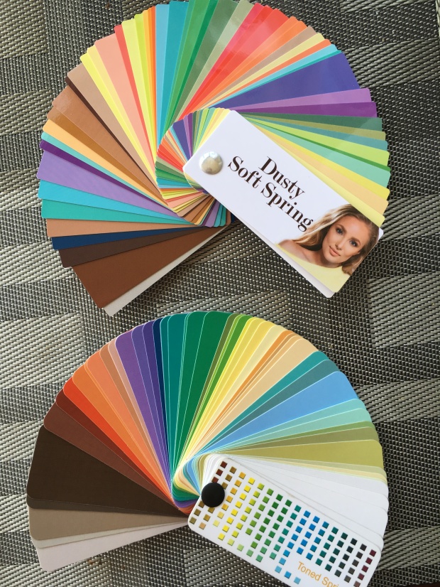
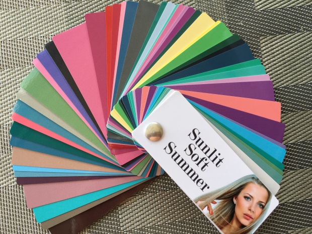
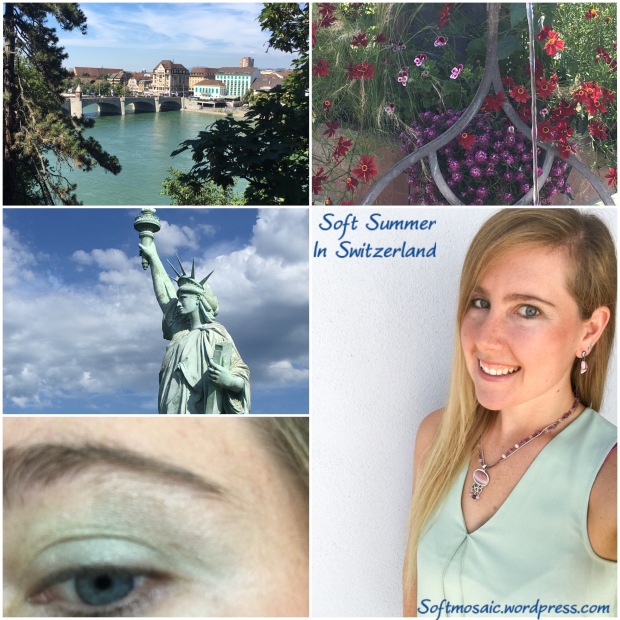
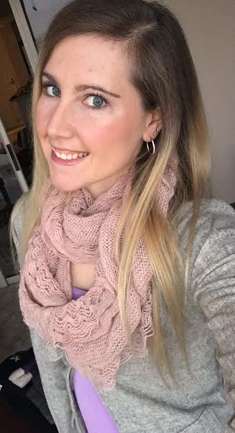
Here I am with the soft summer palette, 12 tone classic fan.

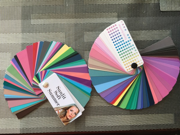
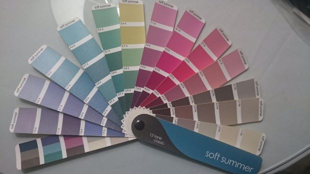
Here is the 12 tone corporate fan.

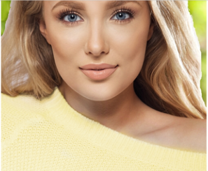
You can definitely describe my skin as peachy. The importance is finding makeup that is a cooler peach.
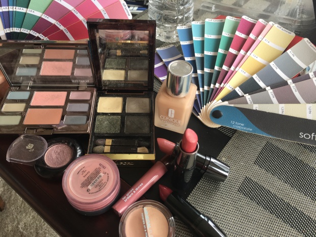
Peachy Complexion Soft Summer Recommendations, Foundation: Avon “Shell” and/or Clinique “Cream Chamios”. A cooler peach is key, Concealer is Mineral Fusion “Cool” and/or Mary Kay “Ivory 2”. Avon “Lavender Gray” eye pencil and Almay “Plum” mascara, Lancome 311 “You got the Look” eyeshadow, Bare Mineral “Beauty” blush or Mary Kay “Cherry Blossom” Blush, and Lips are Lancome “Vintage Rose”, “Curtain Call”, and Mary Kay “Pink Satin”. Another eye-shadow I highly recommend is Laura Mercier “Water Color Mist Eye and Check Palette”. This palette is very soft and gives the feeling of “warm” with still being Soft Summer.
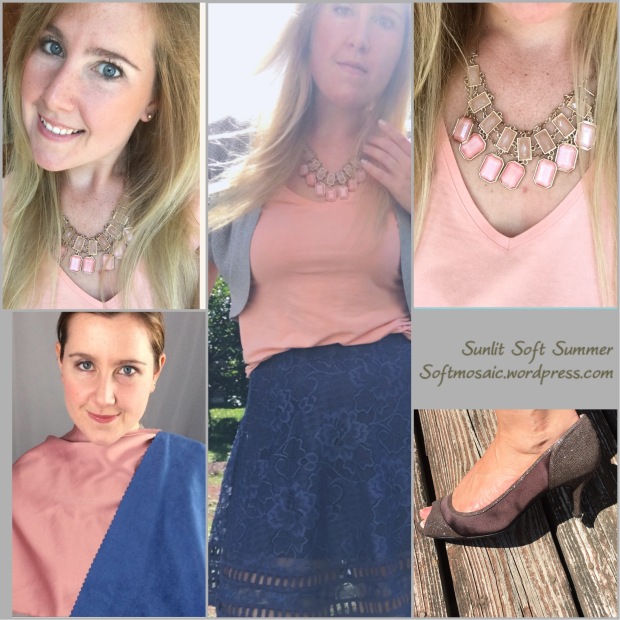
Here I am wearing some shades from the “water color mist” eye palette.

For the person that feels that Soft Summer mauve is hard to adjust too, then try this lipstick Mary Kay “Pink Satin”. Matches the corporate Ssu fan.

Here with the brass and yellow toned out of my hair my complexion is less grey and uneven and more present and peachy.


The difference in hair color is not astronomical but the yellow is greying and yellowing my face and so is the white and blue striped blazer. Sometimes you can’t tell until you compare it side by side. Peachy skin on left and yellow-grey skin on right. So very unlikely dying my hair yellow will put me into a warmer season.


The middle picture has the taupe hair (cooler hair and also no makeup) and the outer two pictures have a lot of yellow in the hair. The left picture I am wearing warmer colors and warmer makeup and the right picture cooler colors are being worn with cooler makeup. You can see how the peachy soft summer can kind of pull off other seasons except, not exactly. The orange colored shirt on the right is a bit off looking. Since it belongs to the autumns, it looks somewhat familiar on me just not completely natural. It’s more subtle on a neutral cool person then orange on a true cool person however it’s not right, the facial features go a little flat.


Here is another example. So the left picture my face is turning the color of the shirt, my face is turning orange. Also these colors are too shiny (springy) and they are lacking depth. Soft Summer has more depth then light spring. The right picture is better because the fan has a matte finish however, there is that slightly clownish look, it’s too warm and light and bright.

Here is a perfect example, on the left the palette colors sit on my skin (seam separate) and I really cannot find these colors in my natural coloring. On the right, it seems to be a great match, very present colors in harmony that blend.
Depth
I’ve been dressing in so many pastels I actually miss wearing some of the deeper colors. Living in Light Spring Soft for a while, I forgot what it was like to wear colors that actually matched my light to darkness levels. Often the eye is a great indication. See picture below:


The rim of my eye is darker however it is not black but can handle more darkness for sure. When you look at my eye, you can see medium contrast. See how in this picture the drape matches the rim of my iris? Closer look below:
I can wear a navy a bit darker then this but this picture illustrates my point so well.
Now makeup being too light aside, these are some gorgeous draping pictures. The peachy soft summer needs foundation a shade that keeps the “peachy” glow visible without washing it out.


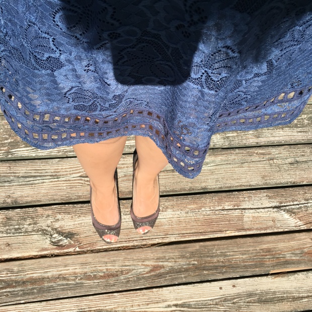
Blue, a summer’s power color.


Some purples from the fan.


Here are some colors that I’d love to find that are for sure missing from my wardrobe.


Even with attempts to match my natural hair color, it just can’t come out that desaturated silvery mauve taupe hued color below:


Natural hair color pictures showing range of light and dark in hair.

See how the depth of my eye all matches with the light to darkness level of my natural hair color.
Dying hair can be a hard maintenance because often if hair needs to be more ash, over time it will warm and brass up by simply washing hair over time, chemicals in products, and sun exposure. Also dying hair can change the balance of depth, so making my hair an unnatural overall lighter blonde doesn’t give me a full dimensional look. Naturally my hair ranges from an off-white to a light smokey brown so its so variable in light to darkness that it could never be captured with a hair dye bottle.
Being peachy doesn’t automatically mean spring season. I think with more recognition on peachy soft summers we can finally feel at home in a season and not just drifters that can easily be thrown into other seasons unless of course that is what was personally wanted.
Another key is viewpoint. Soft Summer might have a misty look but that doesn’t mean palette colors couldn’t be brought together to create a sunnier look if that is what is desired. I think you can create a mock spring, autumn, winter look with the soft summer palette if that is what is desired. One just needs to be creative enough to mess around with Soft Summer color combinations. And if you must have that pop of brightness is can still be done, just know where it looks best or how to approach it much like the purple shirt in my picture above.
After all, we haven’t come this far to settle. We have a unique knowledge about our natural coloring that others may or may not have and that should not be downplayed.
~softmosaic