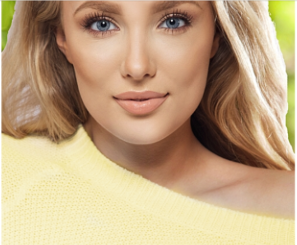
If you haven’t already heard I have a new website!!!
Please check out my new blog post/website here and please follow!
To get full blog post and story please visit blog @ naturalcolormosaic.com
Thank you!!
~softmosaic

If you haven’t already heard I have a new website!!!
Please check out my new blog post/website here and please follow!
To get full blog post and story please visit blog @ naturalcolormosaic.com
Thank you!!
~softmosaic


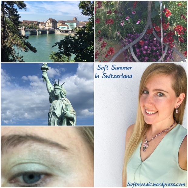
This is a pretty cool view of my Soft Summer eye. Summer pattern with the film webbing overlay, and a soft neutral-cool blue. Obvious hints of autumn neighbor with the warmer flecks.

This picture if of my right eye which often appears slightly more muted and slightly warmer with a more hint of “golden blue” another sign of Soft Autumn being my neighboring season. Also notice this eye has a different pattern, one with more texture. I notice when I wear a soft autumn olive top this eye actually glows but my left cooler eye does not relate to the color.

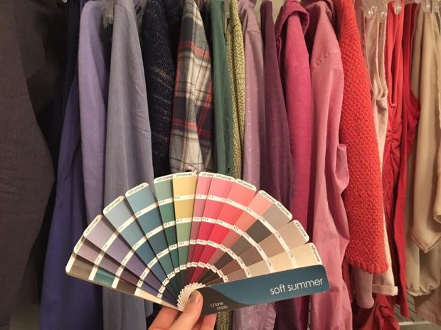
Here I am with the soft summer palette, 12 tone classic fan.

Here is the 12 tone corporate fan.

You can definitely describe my skin as peachy. The importance is finding makeup that is a cooler peach.
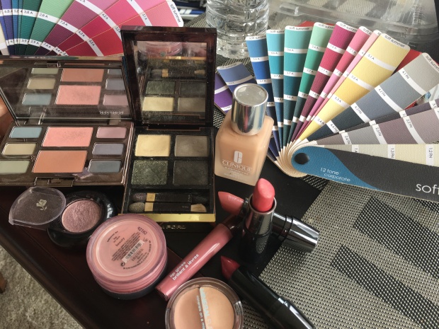
Peachy Complexion Soft Summer Recommendations, Foundation: Avon “Shell” and/or Clinique “Cream Chamios”. A cooler peach is key, Concealer is Mineral Fusion “Cool” and/or Mary Kay “Ivory 2”. Avon “Lavender Gray” eye pencil and Almay “Plum” mascara, Lancome 311 “You got the Look” eyeshadow, Bare Mineral “Beauty” blush or Mary Kay “Cherry Blossom” Blush, and Lips are Lancome “Vintage Rose”, “Curtain Call”, and Mary Kay “Pink Satin”. Another eye-shadow I highly recommend is Laura Mercier “Water Color Mist Eye and Check Palette”. This palette is very soft and gives the feeling of “warm” with still being Soft Summer.
Here I am wearing some shades from the “water color mist” eye palette.

For the person that feels that Soft Summer mauve is hard to adjust too, then try this lipstick Mary Kay “Pink Satin”. Matches the corporate Ssu fan.

Here with the brass and yellow toned out of my hair my complexion is less grey and uneven and more present and peachy.


The difference in hair color is not astronomical but the yellow is greying and yellowing my face and so is the white and blue striped blazer. Sometimes you can’t tell until you compare it side by side. Peachy skin on left and yellow-grey skin on right. So very unlikely dying my hair yellow will put me into a warmer season.


The middle picture has the taupe hair (cooler hair and also no makeup) and the outer two pictures have a lot of yellow in the hair. The left picture I am wearing warmer colors and warmer makeup and the right picture cooler colors are being worn with cooler makeup. You can see how the peachy soft summer can kind of pull off other seasons except, not exactly. The orange colored shirt on the right is a bit off looking. Since it belongs to the autumns, it looks somewhat familiar on me just not completely natural. It’s more subtle on a neutral cool person then orange on a true cool person however it’s not right, the facial features go a little flat.


Here is another example. So the left picture my face is turning the color of the shirt, my face is turning orange. Also these colors are too shiny (springy) and they are lacking depth. Soft Summer has more depth then light spring. The right picture is better because the fan has a matte finish however, there is that slightly clownish look, it’s too warm and light and bright.

Here is a perfect example, on the left the palette colors sit on my skin (seam separate) and I really cannot find these colors in my natural coloring. On the right, it seems to be a great match, very present colors in harmony that blend.
Depth
I’ve been dressing in so many pastels I actually miss wearing some of the deeper colors. Living in Light Spring Soft for a while, I forgot what it was like to wear colors that actually matched my light to darkness levels. Often the eye is a great indication. See picture below:


The rim of my eye is darker however it is not black but can handle more darkness for sure. When you look at my eye, you can see medium contrast. See how in this picture the drape matches the rim of my iris? Closer look below:
I can wear a navy a bit darker then this but this picture illustrates my point so well.
Now makeup being too light aside, these are some gorgeous draping pictures. The peachy soft summer needs foundation a shade that keeps the “peachy” glow visible without washing it out.


Blue, a summer’s power color.


Some purples from the fan.


Here are some colors that I’d love to find that are for sure missing from my wardrobe.


Even with attempts to match my natural hair color, it just can’t come out that desaturated silvery mauve taupe hued color below:


Natural hair color pictures showing range of light and dark in hair.

See how the depth of my eye all matches with the light to darkness level of my natural hair color.
Dying hair can be a hard maintenance because often if hair needs to be more ash, over time it will warm and brass up by simply washing hair over time, chemicals in products, and sun exposure. Also dying hair can change the balance of depth, so making my hair an unnatural overall lighter blonde doesn’t give me a full dimensional look. Naturally my hair ranges from an off-white to a light smokey brown so its so variable in light to darkness that it could never be captured with a hair dye bottle.
Being peachy doesn’t automatically mean spring season. I think with more recognition on peachy soft summers we can finally feel at home in a season and not just drifters that can easily be thrown into other seasons unless of course that is what was personally wanted.
Another key is viewpoint. Soft Summer might have a misty look but that doesn’t mean palette colors couldn’t be brought together to create a sunnier look if that is what is desired. I think you can create a mock spring, autumn, winter look with the soft summer palette if that is what is desired. One just needs to be creative enough to mess around with Soft Summer color combinations. And if you must have that pop of brightness is can still be done, just know where it looks best or how to approach it much like the purple shirt in my picture above.
After all, we haven’t come this far to settle. We have a unique knowledge about our natural coloring that others may or may not have and that should not be downplayed.
~softmosaic

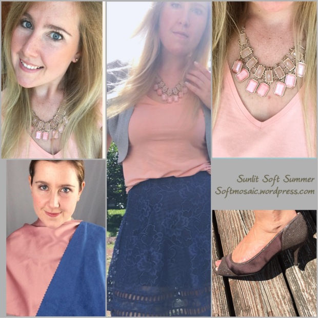
As I eagerly await for my Sunlit Soft Summer palette in the mail, I have done some exploring and creating!

I found this palette on Pinterest. It is the warmer colors of Soft Summer photoshopped. However, I will say that where are the purples? They clearly are missing and I’d be supposed when I get the Sunlit Soft Summer fan that it wouldn’t have purple.
I always thought I had a touch of light brown on my skin more so then other Soft Summers but that had me thinking I was a Toned Spring or Soft Autumn which I may find Toned Spring is too bright/warm overall and Soft Autumn is too muted/heavy on me.

My skin is like a peachy-pink with a touch of light brown like the flowers in the collage. So my skin looks bright, tricky because it looks very Spring season. My eyes have a brightness too like a Spring person, but the saturation is lower and the colors a bit cooler blue-green with hints of yellow-taupe like speckles and star shape. My hair is like drift wood from the beach, in that it is multi-tonal in warmth. It comes in like a mauve silver brown and lightens into a soft golden color in the sun that can get as light as soft yellow. My eyebrows resemble Soft Summer rust color, warm yet still cool. There is no question, when I look at this palette, I see my natural coloring reflected in them.


This model on the right, her hair is coming in ash but warms at the bottom. That is exactly like my hair color. As well, she has very similar colored eyebrows and has a “rosy” quality to her that I have as well in my skin.
This model for Dusty Soft Spring lacks that “rosy” quality that I seem to have. I’m not throwing in the towel yet on Dusty Soft Spring until I see the palette. It after all would be my “sister season” and one of my best “cheat” seasons if you will that I could pull off in the Color Breeze System. Having more options and changing up a look is fun, it’s more open-minded in a sense. We can color outside the lines and add elements and pops of colors from outside configured color space that could enhance or improve our look/make it unique and interesting.

This collage I posted a while ago in another blog post. I wonder if these women are still considered Toned Spring with the new Color Breeze System? We have similar complexions although if it’s just the quality of the camera, there skin seems much more “saturated” then mine does.But I do notice a similar rosy cheek color in both models.
Sun and Sky look:
This might be one of my favorite looks I have put together. Mixing warm and cool.
I feel very at home in these colors. Hopefully the palette I ordered is of my standard or expectation, hopefully it exceeds it.
Before I started this blog, on a previous blog: Lightmarigoldspring, I knew Soft Summer palette on the 12 tone fan is hard to use and it is not individual enough for my taste. I think that’s why custom palettes are superior in that sense however it doesn’t mean custom palettes are exactly correct either, it’s more an art vision. What is correct is what is correct to you as the individual. But I think we can get closer and need to listen to our instincts. I felt some colors to chilly, too drab, too heavy in many cases on my 12 tone fan. I think that a more specific palette would help the consumer stay away from those choices. Why are the luxury drapes so awesome at a draping yet the fan can’t seem to get results anywhere close. It’s user error, it’s the fan, it’s where your looking to buy clothes, etc.
~Softmosaic

Ever since I have studied color I have hoped to crack the color code. Is is naive to believe one system is correct? Yes. But one could be “more’ correct for a particular individual. As well, that I’m not convinced that everything has been accounted for. For example, environmental factors (e.g. lighting, window tints, view on “full spectrum” or “natural” lighting) and within the developed system itself. Some systems only have 12 seasons where some have many many more seasons and more options for softer seasons.
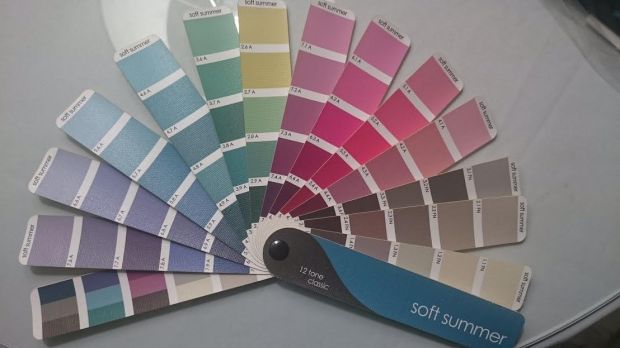
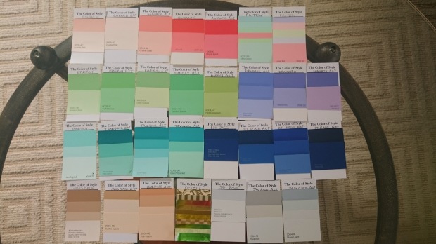
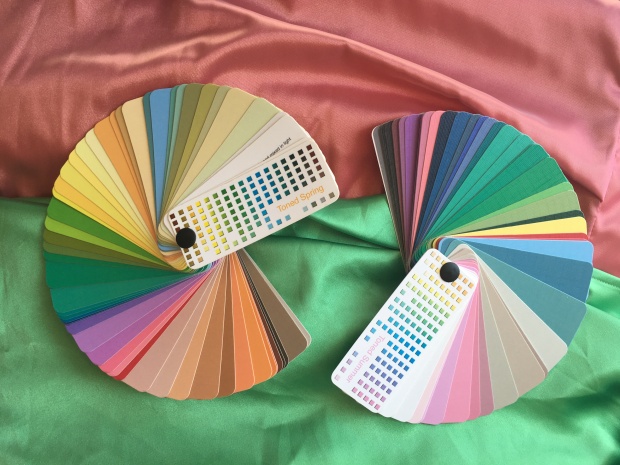
This is the Soft Summer fan in entirety. This fan has a mix of softer and slightly more saturated swatches. Overall the clothes I pick out tend to be too muted. The overall fan seems to buy me these results. Let’s look at another Soft Summer fan in another system called “Color Breeze” by Lora Alexander.

The Color Breeze Toned Summer fan, which is also known for Soft Summer Light. It’s more saturated then the fan posted above. I like this fan a lot more. Also, it does not feel as “chilly” or more cooler toned colors to my eye and has some warmer options.


My best colors are soft or muted. I am neutral, neither all warm or all cool in coloring. Toned Spring is neutral warm with an “autumn” muted roasting of Light Spring. Toned Summer is the neutral cool lighter side of the Soft Summer palette. These are combination palettes which means they could be used together or may share some similar colors but have distinct differences.
My custom Zyla palette…

If you took and broke down my Zyla palette, you would get a split between Toned Summer and Toned Spring.
Some of these toned spring colors look pretty good with the 12 tone (12 blueprints system) Soft Summer fan. But you can see the Zyla palette is slightly more saturated and if I were to use them to purchase clothing I guarantee they would buy different results in clothing colors and even outfit combinations.

I see the Toned Spring colors in my skin. 12 blueprints system would say these are “overtones” and incorrect bad color reactions on skin that is cooler then the palette creating “yellowed skin”. Other systems would believe this “IS” the colors of your skin.

My Kathy palette is a system like this, that intact looks at the colors of your skin, eyes, and hair and gives you colors based on what is seen visibly.

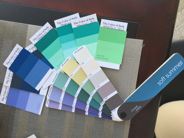
Here are my more preferred colors on the Toned Summer fan.

Here is the whole fan. I like the depth, one that Toned Spring seems not to have for me.

I much prefer warmer pinks of Toned Spring to cool mauve of Toned Summer and the warmer grey or browns of Toned Spring to the cooler grays of Toned Summer.

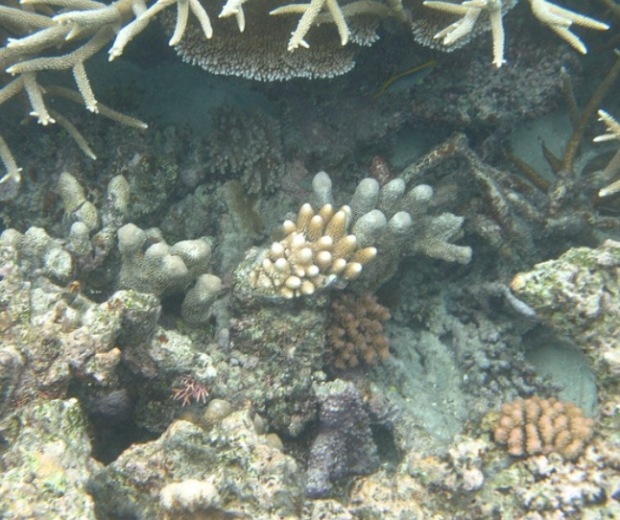
I feel divine in that orange pink that much more Toned Spring then Toned Summer. Bit it is so close on the line between the two seasons. Toned Summer does not go soft orange. I find seashells all the time that have this silvery orange color that is amazing, probably my favorite color since I was a child. Where would that color fall on a season? It’s soft but more neutral.

These two seashells are orange. At the beach recently, I realized that orange I love in seashells are a soft orange. And what palette does that exist in? Not muted enough to be Soft Autumn right? It’s like that Marigold color, clearer then autumn and gentle like Toned Spring.
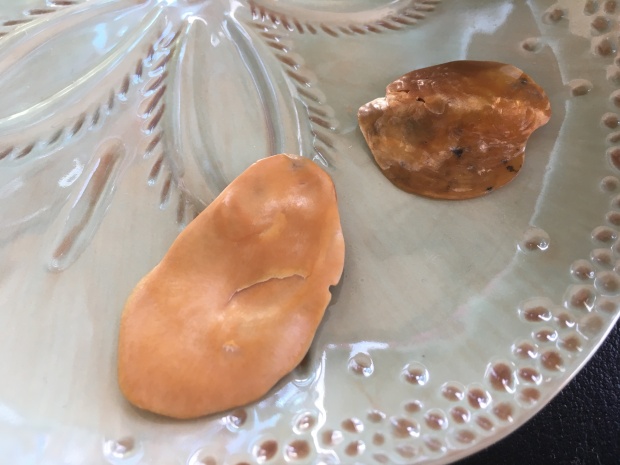
The one shell on the right has a shine to it, but it’s not too shiny. If it were jewelry it would be the perfect amount of shine I could handle as a Soft Season person.


The shells harmonize very nicely with the Toned Spring fan. Looks clownish on the Toned Summer fan (neutral cool) which does not have orange or milk chocolates.


See how the seashells are too muted for the light spring fan and too bright for the soft autumn? These are 12 tone (12 blueprint system fans) That is why they fall into Toned Spring (Light Spring Soft) which is a different system.


The soft orange sinks into the Toned Spring fan (R.), and sits on the Toned Summer fan (L.)


The other side of the soft orange seashell has orange and a cooler gray. This seashell is a perfect example of the existence of a mix of Toned Spring and Toned Summer. But when harmonized with the whole fan which color palette fits in the best?

My Zyla palette has this mixture of Toned Spring and Toned Summer…If this is a real life example then why does this or can’t this exist in people?

Here is a collage I made comparing myself to the 16 seasons, Toned Spring. My hair is very similar to these people and so is my coloring. I think the main difference is that their eyes are warmer looking as in more visible soft gold/yellow.


My eye is a neutral blue or you could say blue/gray/green coloring with a star pattern and wavy lines that start at the pupil outward.

With refraction my eyes have a warmer look almost seafoam and moss…

The water above and a close up shot of my eyes below.


Toned Summer fan comparison to my eye color. It has the right depth.

Toned Spring eye colors. It has the right warmth.
Here is the common theme again, Soft Summer or Toned Summer has correct depth but Toned Spring has some colors with correct warmth.

I might have all of these colors in my eyes. Most color systems would say that okay, that’s fine, you can be neutral cool but have warmer eyes or even neutral warm and have cooler eyes or a mix of both. 12 blueprints focuses on the skin. The thing is my skin is much finicky like my eyes where it’s split I believe between palettes. The question is which one is stronger, if you had to pick one? Or why pick one, that’s what the custom palette is for…
So let’s honor 12 Blueprints system and look at skin reaction with drapes. No makeup, just skin reactions to the colored draped clothing.


Toned Spring Vs. Toned Summer Greens. L. Toned Spring and R. Toned Summer. The bottom green is almost split between Toned Spring and Toned Summer, tricky!
It looks like it could fit into either. Your eye tries to automatically make the similar swatches in the fan connect to the clothing articles being examined, so hide them…but it’s still so hard to tell…


Toned Summe dark grey Vs. Toned Spring Chocolate browns. The dark chocolate is an eyebrow color match and both browns a hair color match. The light chocolate is the natural highlight in my hair. So if my hair has these colors, I’d say that those colors should be a part of my palette, why not?


Toned Summer top and Toned Spring bottom.
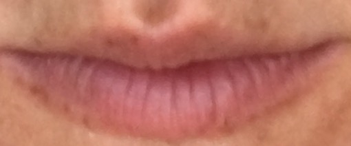

This was the in-between pink which does posses some orange Toned Spring if you can make it out but also a tad cooler looking purple mauve shimmer that could be why it also seems as if it could be Toned Summer. It’s the color of my lips…That’s why it is so awesome.


In the side by side, the Toned Summer top and Toned Spring bottom. Is one washing me out a tad because it’s too warm or is one yellowing me a tad because it’s too cool for my skin?


My two favorite colors seem to encompass elements of both Toned Spring and Toned Summer right precisely almost on the boarder or paradox of the season. If we compared 12 blueprint fan then these colors are not Soft Summer because it doesn’t go this saturated but the Pretty Your World 16 season Soft Summer version Toned Summer does go this saturated…


Here the 12 blueprints fan doesn’t go as saturated or as warm as Toned Summer/Toned Spring. Therefore it cannot provide me my best colors.


Here the colors are the right saturation and warmth the yellower in the green shimmer and the orange shimmer in the pink.


Here the colors are the right saturation and just a tad warmer in the green and pink but has shimmers of color that tie it close to this fan such as a cooler green and slight purple mauve shimmer.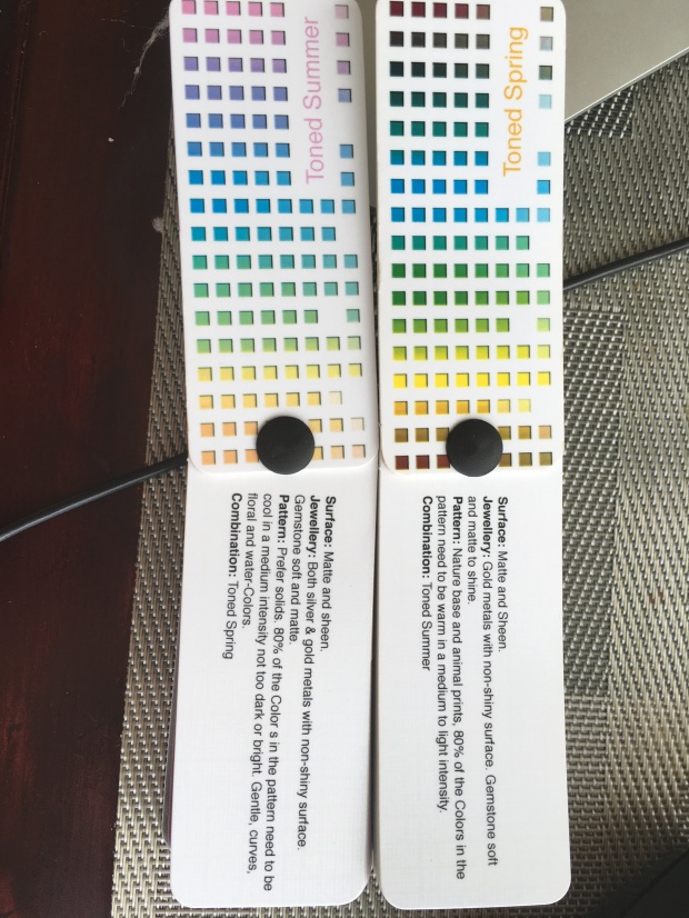
80% needs to be in that season and 20% can be its neighbor. So wear 80% Toned Spring with 20% Toned Summer or vise versa 80% Toned Summer with 20% Toned Spring.


L. picture majority Toned Spring w/ T. Summer charcoal, R. picture majority Toned Summer with T. Spring chocolate.

Majority Toned Spring with T. Summer green.


Left picture animal print (Toned Spring), Middle Picture Toned Spring scarf, Right picture Toned Summer scarf.
Thanks for reading!
~Softmosaic

Soft Mosaic is a color and style blog for those who are soft in coloring or admire soft colors. The world is full of different color combinations that create different patterns and color schemes. Let nature and the world around us inspire our eye for fashion.
Have you ever thought to wear the colors that you are in clothing, makeup, accessories? You would have to look at the skin color, eye color and hair color. If you ever bought makeup at a retail counter you might know something about warm foundation and cool foundation or you might know that you either tan or burn in the sun. This information really can only tell us so much and is minuscule in the overall complexity of actually knowing what colors are your best colors in clothing, makeup, and accessories.
Just as there are 4 seasons, people are grouped into 4 parent categories: Spring, Summer, Autumn, and Winter. Spring and Autumn are warm, the difference is Spring has clearer coloring and Autumn has a heavier muted coloring. Summer and Winter are cool however Summer is muted in coloring and Winter is clearer in coloring. There is the true center of each season: True Spring (warm and clear), True Summer (cool and muted), True Autumn (warm and muted), and True Winter (cool and clear). Then there are the neutral seasons (neutral meaning on the cusps of warm and cool) however one remains dominant in temperature. There is also the darker category to each season (Bright Spring, Soft Summer, Dark Autumn, and Dark Winter) and the lighter side to each season (Light Spring, Light Summer, Soft Autumn, and Bright Winter. Soft Autumn and Soft Summer are the softest and most muted of the seasons. Color Analysis is complex. This might not make much sense if you are new to color analysis.
My Personal Coloring and Professional Color Palettes as a Case Study:

I was recently analyzed by Lora Alexander in the new Color Breeze System Color Analysis-Analyzed as Sunlit Soft Summer. It includes the extended Soft Seasons for Soft Summer and Soft Autumn. Lora explained to me that the Sunlit Soft Summer is a Summer flowing into a Spring and is a tad bit clearer and warmer then the Dusty Soft Summer (more muted) or Cool Summer. A Sunlit Summer often has some Spring like looks to her like a starburst in the eye or something warmer or brighter about her but not enough to be a Spring and not light and bright enough to be a Light Summer. If you were to look at a Sunlit Soft Summer as a child, their hair might be highly variable in ash (cool) and golden (warm) color threaded through it-a dimensional look impossible to recreate with hair dye. This is why the Sunlit Soft Summer can play up warm and coolness and even add some clearer or muted colors to their palette in intricate combinations in makeup, hair (highlights), and clothing. This also makes a lot of sense because when I was analyzed by Rachel (12 blueprints) she said that I was the lighter side of Soft Summer (depicted in picture above).

Natural colors are beautiful and we need to stick to or only slightly enhance what nature gave us. Sometimes we can stray far from our natural look with hair dyes or makeup/clothing that is not harmonious…here we loose are natural blueprint. We must go back to when we were a child, however we can cool down a bit with age. Some people have an innate eye for harmonization while we all benefit from training our eyes. I hope my blog will help you start to train your eyes for the Soft Seasons. I chose to have this blog dedicated to the Soft Seasons, mainly because I am a Soft season and I also find them to be fascinating. We have Soft Summer, Soft Spring, Soft Autumn, and Soft Winter seasons that are a part of the 16 season system. Not everyone follows the 16 seasons system and so they subscribe to just 12 seasons with Soft Autumn and Soft Summer. The point of my blog is not to argue those points but simply to just explore the beauty of being a soft season.
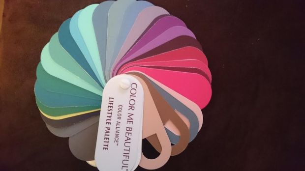
Color alliance uses the draping method and a computer software program to determine a clients best colors. My first analyst from Color Alliance had a difficult time deciding between Summer and Autumn because Soft Summer is the Summer-Autumn flow. Here was a palette based off of my coloring. The analyst chose Summer because it appeared to her slightly better. My colors are mostly comparable to Soft Summer. You can see the skin, hair, and eyes swatch with the gum shaped cut in them. The hair does appear warmer brown, again this trick of warm in the cool Soft Summer.
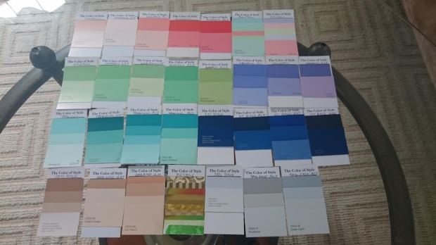
Here is the beautiful Soft Summer palette from my sci-art/12 blueprints analysis. Sci-art uses strictly the draping method of colored fabrics on a person. I had two by Heather Noakes and Rachel Nachmias. Both analysts saw something a little different in my season for me, but that was preference. Heather saw darker colors cleared my skin but Rachel saw that the lightest colors looked the most lively on me and gave me the best glow both two very true perspectives. In this type of analysis hair is pulled back from the face and is covered up. The skin is the main focus and the colors should pour out of the persons eyes when they are in the correct color.
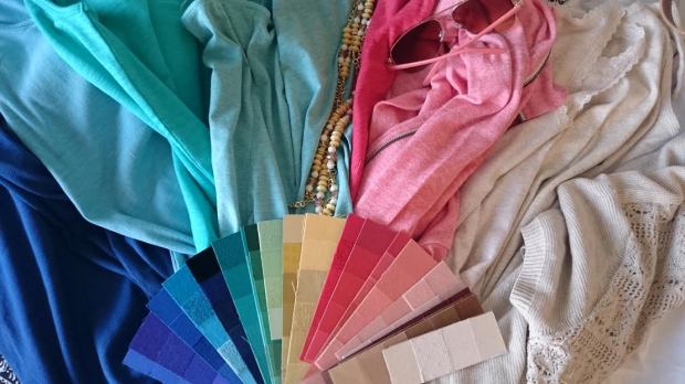
Here is my custom Zyla palette. This analyst looks for overall harmonization and includes your hair so if hair is dyed it changes your palette. A palette like this has true potential for a person of a season that is blended because they might be able to be warmer or cooler in some colors then others or more or less saturated as well. This concept gives the freedom for such a mixture. Zyla saw me with clarity but still some softness, and warm and cooler combinations which ties into Lora Alexander’s theory of the Soft Summer light who seems to be a tad clearer and warmer in the Soft Summer season.
This is my Kathy palette, she uses a very similar technique to Zyla focusing on overall harmonization including hair.
*I do not own the Sunlit Soft Summer palette from Lora Alexander’s ColorBreeze System yet, so I will have to add that image to this post at a later time.

Sometimes the world is full of a lot of bright colors and we need to adjust our focus. Here is a Soft Summer eye, which happens to be mine. Here again you can see the play of warm and cool, and you can see my eye is not clear but muted (however has some slight clarity to it, that of a Soft Summer on the lighter side of the palette.
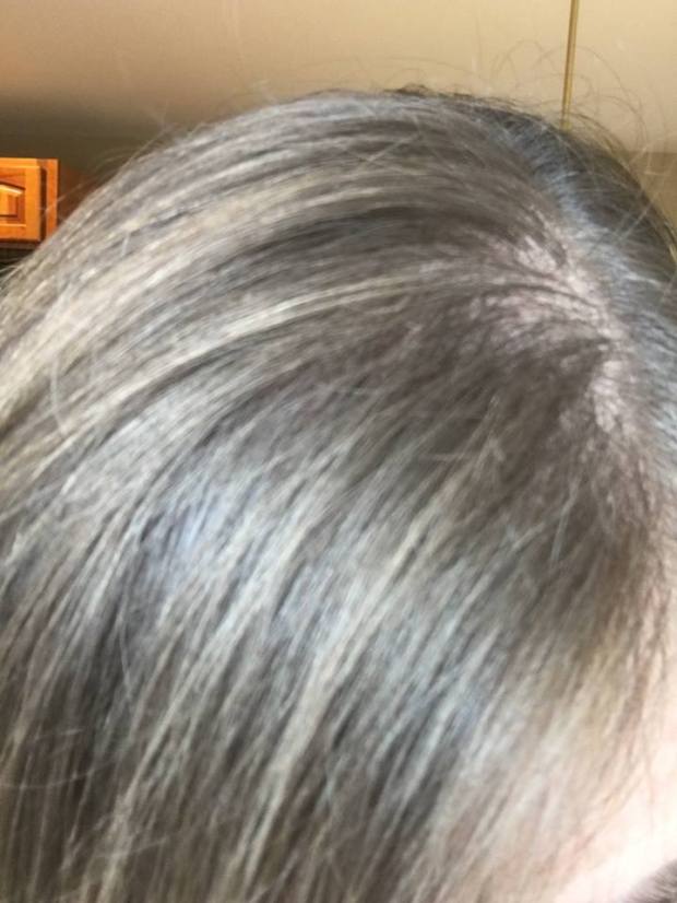
My hair seems brown in some light and in other light seems dark blonde. It also has many ash and neutral-warm tones mixed in. When we dye our hair we get a flat color. Natural hair like a Soft Summer’s is in my opinion impossible to recreate. If one must dye their hair I’d recommend just to highlight it but soft highlights and nothing too contrasting from the base color. Soft Summer’s are rich and dimensional and not represented by a flat or saturated hair dye job.
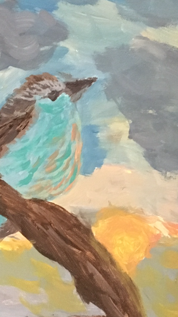
While painting this canvas, I toned every paint color with gray. Can you tell? If I put this painting against a bright wall it would be overpowered. Against a grayed wall, this painting glows.
Thank you for Reading! I hope this post opened your mind about our natural coloring. I look forward to sharing a generous amount of ideas with you!
~Soft Mosaic
